Slashdot Mirror
Domain: imgbox.com
Stories and comments across the archive that link to imgbox.com.
Comments · 9
-
Re:In other news
napkin math incoming...
(using 2010ish census data as that is the most recent census used to determine seats in congress and by extension, electoral votes per state).
u.s. population in 2010 (50 states only): 312,913,872
u.k. population in 2011 (england, wales, scotland, northern island, each of which becomes a 'state'): 63,181,775
total population: 376,095,647
(england becomes, by far, the most populated state with 53,012,456 vs california's 37,254,503)
divide total pop by 435 (fixed number of seats in the house of representatives)... then adjust up or down so a common average persists but even tiny states get 1.....
fuck it. it's not going to be napkin math by the time i get done..
https://i.imgbox.com/v8YHHVjO....
(tis just a snapshot of a small spreadsheet)california the big loser (-12 seats, down to 41) while england gets 59 seats in the house.
bonus question: can you spot the errors in the wikipedia source data? (MY math and numbers are right... theirs? heh. they might have tabulated election results in pennsylvania)
-
Sometimes flattering?
-
Re:I think you're thinking too hard and the author
I agree with most of what you said, but KDE 4 doesn'tbreak the desktop metaphor. The initial releases did, either due to being unfinished or experimental, and the developers thankfully restored the traditional 'classic' desktop a bit at a time after that, with the non-classic variants as options we can choose.
Here's a quick screenshot of my desktop, showing files I've clustered together, folders (Icould move them, but haven't felt a need yet), a trash can Ican drag them into — and to add to your description, windows layered on top of each other like physical items (with shadows to strengthen the impression), and the ability to show what's inside a folder right there on the desktop.
-
Re:Classic Desktop
Better yet, KDE's default is classic *and* can be easily customized until it's not classic, either through the activities' alternative UI setups or just manual customizations. For anyone not familiar with it, here's a quick screenshot Itook of my desktop, which seems about as classic as any out there:
http://i.imgbox.com/nf78u5eB.j...All Ican figure is that either the author either believes that it's not classic if we can customize a GUI to the point that it's no longer "classic" looking, or is judging it based on the first few releases when it wasn't fully functional as a 'classic' desktop yet.
-
Re:Calligra Words
Icons that are a good representation of their function and toolbar customization together provide the same easily-recognized features as a sidebar in a much smaller space. If users are having trouble to the point of needing labels after a few uses, that suggests that the icon designers focused too heavily on being attractive or trendy rather than clearly representing their function. It's a sadly common problem in modern-day software, regardless of its economic or source status -- a shame, since there's no lack of info on good UI design.
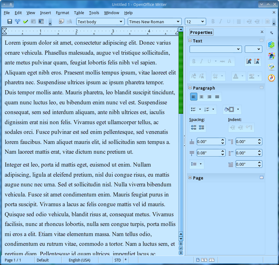
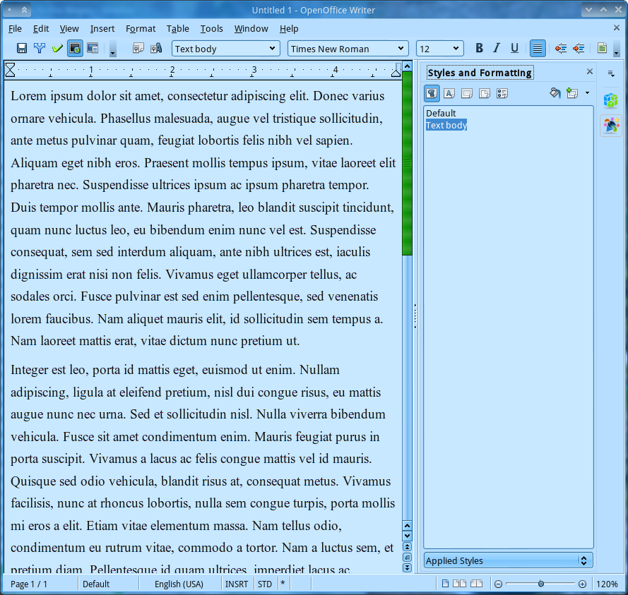
I use OpenOffice rather than Calligra, but I got to try out the sidebar approach as OO got basically the same thing in last week's release. The sidebar/text-instead-of-icons approach is okay for someone that periodically does word-processing with one document at a time -- not for people that wish to conserve screen space (e.g. to compare versions, refer to notes, or keep other programs visible) or that use it often enough to know their icons/shortcuts.
Personally, I want *any* WP window to be focused on my document and let me use the rest of my 1920x1080 23" screen for other things -- show another file, access files, use my playlist, or even stare at my wallpaper while thinking something over. As I've learned the icons I use, customized my toolbar and know basic keyboard shortcuts, it seems odd to use a relatively wide vertical stripe of my WP window to house dialog boxes that I either rarely use or that have the same stuff that's in my toolbar.
A few OO screenshots to illustrate:
My typical setup vs. OO4 w/Properties sidebar
Mine w/Styles dialog vs. OO w/Styles sidebar
Notes: That setup takes up around half of my screen, and "Styles" always looks nearly that empty as I only use 1-3 styles per document. (Have to enjoy the irony in the large sidebar-choosing icons being attractive but not terribly well-designed as UI elements, given they presumably exist in part because people can't identify the normal icons...) -
Re:Calligra Words
Icons that are a good representation of their function and toolbar customization together provide the same easily-recognized features as a sidebar in a much smaller space. If users are having trouble to the point of needing labels after a few uses, that suggests that the icon designers focused too heavily on being attractive or trendy rather than clearly representing their function. It's a sadly common problem in modern-day software, regardless of its economic or source status -- a shame, since there's no lack of info on good UI design.
I use OpenOffice rather than Calligra, but I got to try out the sidebar approach as OO got basically the same thing in last week's release. The sidebar/text-instead-of-icons approach is okay for someone that periodically does word-processing with one document at a time -- not for people that wish to conserve screen space (e.g. to compare versions, refer to notes, or keep other programs visible) or that use it often enough to know their icons/shortcuts.
Personally, I want *any* WP window to be focused on my document and let me use the rest of my 1920x1080 23" screen for other things -- show another file, access files, use my playlist, or even stare at my wallpaper while thinking something over. As I've learned the icons I use, customized my toolbar and know basic keyboard shortcuts, it seems odd to use a relatively wide vertical stripe of my WP window to house dialog boxes that I either rarely use or that have the same stuff that's in my toolbar.
A few OO screenshots to illustrate:
My typical setup vs. OO4 w/Properties sidebar
Mine w/Styles dialog vs. OO w/Styles sidebar
Notes: That setup takes up around half of my screen, and "Styles" always looks nearly that empty as I only use 1-3 styles per document. (Have to enjoy the irony in the large sidebar-choosing icons being attractive but not terribly well-designed as UI elements, given they presumably exist in part because people can't identify the normal icons...) -
Re:Calligra Words
Icons that are a good representation of their function and toolbar customization together provide the same easily-recognized features as a sidebar in a much smaller space. If users are having trouble to the point of needing labels after a few uses, that suggests that the icon designers focused too heavily on being attractive or trendy rather than clearly representing their function. It's a sadly common problem in modern-day software, regardless of its economic or source status -- a shame, since there's no lack of info on good UI design.
I use OpenOffice rather than Calligra, but I got to try out the sidebar approach as OO got basically the same thing in last week's release. The sidebar/text-instead-of-icons approach is okay for someone that periodically does word-processing with one document at a time -- not for people that wish to conserve screen space (e.g. to compare versions, refer to notes, or keep other programs visible) or that use it often enough to know their icons/shortcuts.
Personally, I want *any* WP window to be focused on my document and let me use the rest of my 1920x1080 23" screen for other things -- show another file, access files, use my playlist, or even stare at my wallpaper while thinking something over. As I've learned the icons I use, customized my toolbar and know basic keyboard shortcuts, it seems odd to use a relatively wide vertical stripe of my WP window to house dialog boxes that I either rarely use or that have the same stuff that's in my toolbar.
A few OO screenshots to illustrate:
My typical setup vs. OO4 w/Properties sidebar
Mine w/Styles dialog vs. OO w/Styles sidebar
Notes: That setup takes up around half of my screen, and "Styles" always looks nearly that empty as I only use 1-3 styles per document. (Have to enjoy the irony in the large sidebar-choosing icons being attractive but not terribly well-designed as UI elements, given they presumably exist in part because people can't identify the normal icons...) -
Re:Calligra Words
Icons that are a good representation of their function and toolbar customization together provide the same easily-recognized features as a sidebar in a much smaller space. If users are having trouble to the point of needing labels after a few uses, that suggests that the icon designers focused too heavily on being attractive or trendy rather than clearly representing their function. It's a sadly common problem in modern-day software, regardless of its economic or source status -- a shame, since there's no lack of info on good UI design.
I use OpenOffice rather than Calligra, but I got to try out the sidebar approach as OO got basically the same thing in last week's release. The sidebar/text-instead-of-icons approach is okay for someone that periodically does word-processing with one document at a time -- not for people that wish to conserve screen space (e.g. to compare versions, refer to notes, or keep other programs visible) or that use it often enough to know their icons/shortcuts.
Personally, I want *any* WP window to be focused on my document and let me use the rest of my 1920x1080 23" screen for other things -- show another file, access files, use my playlist, or even stare at my wallpaper while thinking something over. As I've learned the icons I use, customized my toolbar and know basic keyboard shortcuts, it seems odd to use a relatively wide vertical stripe of my WP window to house dialog boxes that I either rarely use or that have the same stuff that's in my toolbar.
A few OO screenshots to illustrate:
My typical setup vs. OO4 w/Properties sidebar
Mine w/Styles dialog vs. OO w/Styles sidebar
Notes: That setup takes up around half of my screen, and "Styles" always looks nearly that empty as I only use 1-3 styles per document. (Have to enjoy the irony in the large sidebar-choosing icons being attractive but not terribly well-designed as UI elements, given they presumably exist in part because people can't identify the normal icons...) -
Re:I feel better.
Wow, the sites that page links to have some really interesting things for sale—even children! Makes for a great new parental threat: "Bratleigh, don't forget, little boys and girls that misbehave at the airport are confiscated by the TSA and auctioned off to meaner parents..."