Slashdot Mirror
Domain: sourcefoundry.org
Stories and comments across the archive that link to sourcefoundry.org.
Comments · 10
-
Re:No programmers' typeface
I was also disappointed they did not make a strong monospace and even proportional font with distinctions for zero and O, sometimes one and letter I for some fonts and etc. Even for proportional writing it would be helpful.
The two fonts I have used in the past but only good for normal Latin characters are these two (below). Still can't decide what font like better in an editor though.
* Hack -- Open Source Coding Font (Free, Open Source) http://sourcefoundry.org/hack/ or https://github.com/chrissimpki...
* Monoid -- Open Source Coding Font, and my current favorite (Free, Open Source)
http://larsenwork.com/monoid/ or https://github.com/larsenwork/... -
Re:Here's the articleFrom the site:
Strategically placed serifs improve the rhythm of the monospaced text by eliminating large gaps on each side of narrow characters and help to distinguish glyphs like the lowercase l and number 1 at small text sizes.
To me, the i and the l are rather ugly. I wouldn't even call those one-sided hooks serifs. The word reminds me of "sheriff" and Wild West newspaper titles with those big bulky I-beams in capitals. Kids these days, they wouldn't know what a fscking I-beam is, given all these unmanly fonts on their Iphones (back in the day, we used capitals in the beginning of proper nouns, and only in the beginning).
With those semi-serifs on top and the lower turns, the i and the l have too much of a Z character (right, down, right). Similar hooks are OK in some fonts, but these take the idea too far.
If you really want to avoid irregular spaces, just don't use a monospace font.
-
Some issues I noticed
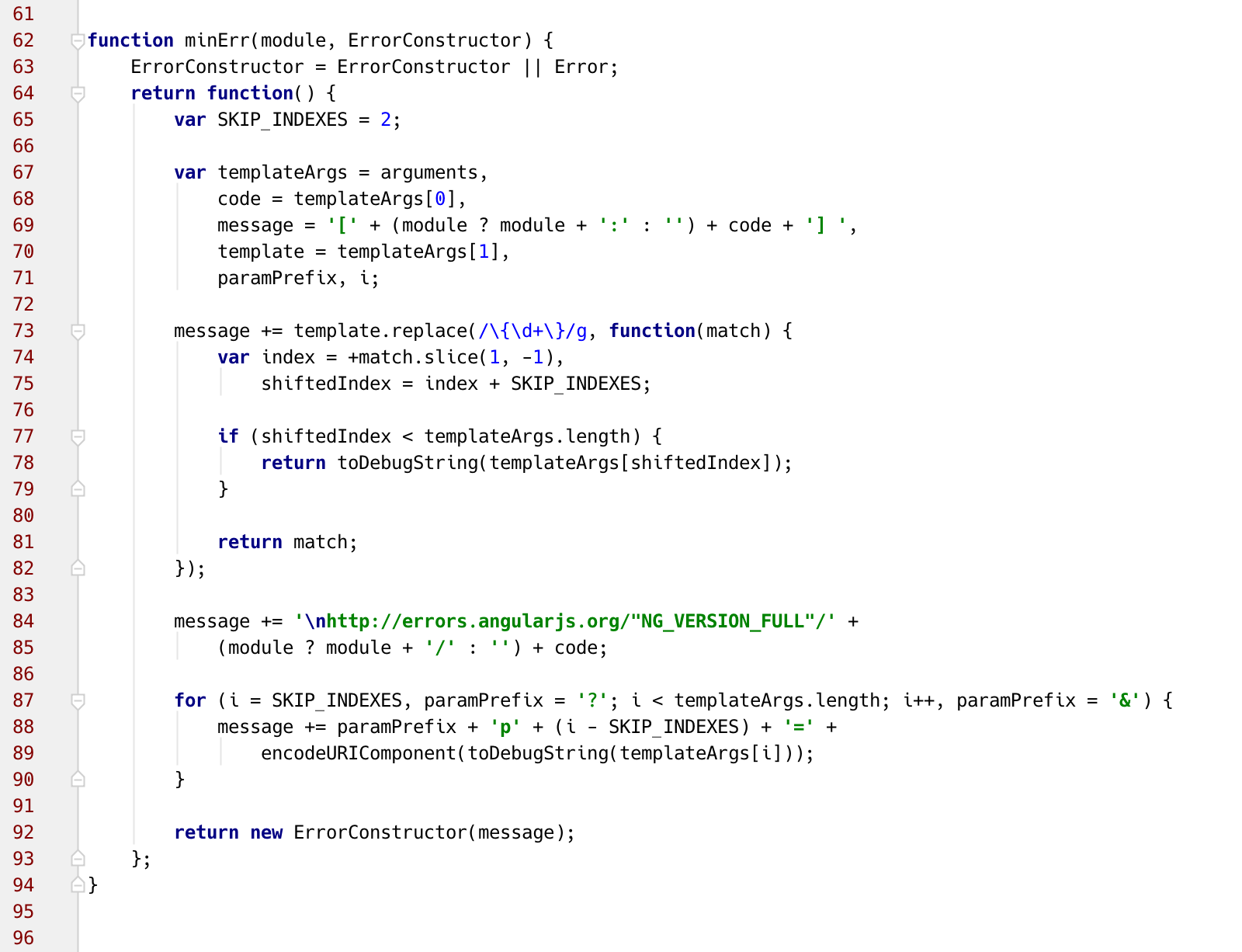
This is the example reference I am using
I'm not sure I like the "i" too much. The design is nice, but the position of it isn't so much.
I think it would be better if they moved it across 1 pixel. Considerably better. The spacing on the left side is just too weird.
Maybe even shorten the tail just a bit. 1 pixel as well would probably do it.
It is hard to get kerning right with fixed width, but this and other vertical line characters need the most love when it comes to position.Not a fan of that "g" either. I think the tail is too cramped.
Drop them legs girl. Oh, sorry, leg. So sorry, I keep forgetting the accident.
The "p" and others could probably be better with a little extra bottom length actually.Other than that, pretty damn good font really.
Will try it out on holiday and see how it goes. -
Re:non-ASCII
Nice that it includes some non-ASCII chars (extended Latin-1). But not IPA, which makes it hard for linguists. There are plenty of variable width fonts that cover IPA etc., but fewer fixed width fonts.
That said, I'm pretty sure it's a small minority of users who need this...perhaps one (me). (I used it when writing up computational linguistics in XeLaTeX.) So I'm not complaining!
A digression first:
With all the nasty data collection on today's downloaded freeware, I find it to be an awesome breath of fresh air when slashdot brings us truly no-strings attached free stuff.Its "(useful) Stupid (Unix|Emacs|xxxxxx)" series was short-lived, but it was cool. And I just can't believe it was all the way back in 2008 - http://ask.slashdot.org/story/...
*To the point, now,* this about a free fixed-width font for my IDE, specially after I've been looking for something like the Coffee font in my LG phone, but without its annoying filled-in o glyphs.
I grok IPA and though I'd never considered its need to be supported before, since my attention has been caught but Windows 7 and Kitkat's issues with more common symbols, it's a shame to hear I wouldn't be able to make use of the IPA that Wikipedia takes so seriously when I'm looking at foreign terms. The cool thing is, routing back to you and I, that on http://sourcefoundry.org/hack/ it says there are 22 contributors with 1530+ glyphs. Unfortunately Unicode apparently supports way more than 65K total chars (https://en.wikipedia.org/wiki/Unicode has some 150k number listed on the recent versions)
You probably guess what I'm asking for here... it's a lot easier to contribute "solving" even a single glyph per slashdotter to make this font what you and I need, than doing other open source bug fixes so common here. "If you don't like it, the source is there, go FIX it" is annoying, but here the nature of the problem is O(n)-difficulty menial work, rather than having some years-unresolved bug that requires x language and y libraries, then finding a rootcause, issuing a clean fix, then testing it, and then getting it approved for upstream.
So it'd be nice if appearing here would get even 1% of slashdotters doing something nice with those holes left in the font. We still have to learn font-glyphing, whatever that entails, but it's probably less menial than any coding fixes we might contribute to the world. Why aren't there more crowd-sourcing tasks of this type here on slashdot?
-
Re:That's great and all...
http://sourcefoundry.org/hack/
The letter "i" looks too much like the letter "l" in this font. It would have been better if the bottom of the "i" were straight - they mention the curved tail as a feature, but it is more of a bug...
Perhaps one could get used to it, but it doesn't seem right for source code.
-
Re:SubjectsInCommentsAreStupid
no link because code in it actually looks like ass and is hard to read, big kerning problem
-
THE ACTUAL LINK
THE ACTUAL LINK. This is where you go to download the font.
-
Re:That's great and all...
Linky here: http://sourcefoundry.org/hack/
Is there a point to having editors on slashdot anymore?
-
With Links
Ars Technica writes that "At SourceFoundry.org this week, programmer Chris Simpkins debuted the 2.0 version of Hack, an open-source typeface designed specifically for use in source code." The revamped font is "characterized by a large x-height, wide aperture, and low contrast design in order to be "highly legible" at common coding text sizes," and the font specimen shows how legible it is right down to downright tiny sizes, though Simpkins says the sweet spot is between 8 and 12 pixels.
Hack's roots are in the libre, open source typeface community, and the project expands upon the contributions of the Bitstream Vera & DejaVu projects.
-
With Links
Ars Technica writes that "At SourceFoundry.org this week, programmer Chris Simpkins debuted the 2.0 version of Hack, an open-source typeface designed specifically for use in source code." The revamped font is "characterized by a large x-height, wide aperture, and low contrast design in order to be "highly legible" at common coding text sizes," and the font specimen shows how legible it is right down to downright tiny sizes, though Simpkins says the sweet spot is between 8 and 12 pixels.
Hack's roots are in the libre, open source typeface community, and the project expands upon the contributions of the Bitstream Vera & DejaVu projects.