Slashdot Mirror
Domain: ampsoft.net
Stories and comments across the archive that link to ampsoft.net.
Comments · 8
-
Re:Takes Care of one of my pet peeves
Don't time your screensaver so aggressively. Turning the screen off after just a few minutes is useless and just puts unnecessary strain on the backlight (which takes only a limited number of power cycles, unless it is LED).
I use Ampsoft's Screen Saver Control to manually put the screen into power saving mode with Win+P (and the standard Win+L to lock the screen, if I think that's necessary). I have set the power saving mode to kick in after 2 hours of inactivity otherwise.
-
Re:Similar to Windows hate?
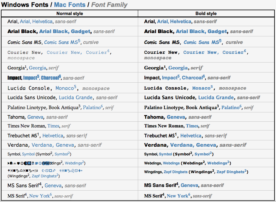
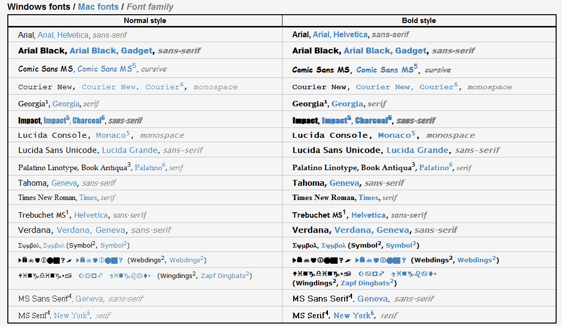
Yes, I understand the tradeoffs, but one thing matters only: which looks better (and for a few people, does it still look good when printed)? Look for yourself: here is the list of Apple fonts, and here is the list on Vista with cleartype enabled, which is where Microsoft looks the best. Check MS Serif at the bottom, it is still horrid in Vista. Check out Lucida Console, a monospace font; notice how the 'i' on the Mac doesn't look like it has tons of empty space around it? The 'i' has been slightly redesigned to look decent in a monospace font, but still be faithful to the overall design of the letters. The 'i' still looks like it belongs in the Lucida Console font. As a result, Lucida Console is a font you wouldn't use for anything on Windows, but on the Mac it looks fairly decent.
Look again at Lucida Console, but the bold fonts. Notice how on the Mac the tops of the letters are nicely curved, giving it a pleasing shape that still looks good bold? On Vista the letters look like they've been chopped off at the top. There are dozens of details like this that make the Mac look better. Yes, anti-aliasing helps a lot, but it is much more than that. Apple makes good looking fonts. Microsoft fails. I suspect this is due to better collaboration between the designers and the programmers, but I cannot say for sure.
I was unaware of the chalkboard font. I will check it out, thanks. -
Re:Similar to Windows hate?
Yes, I understand the tradeoffs, but one thing matters only: which looks better (and for a few people, does it still look good when printed)? Look for yourself: here is the list of Apple fonts, and here is the list on Vista with cleartype enabled, which is where Microsoft looks the best. Check MS Serif at the bottom, it is still horrid in Vista. Check out Lucida Console, a monospace font; notice how the 'i' on the Mac doesn't look like it has tons of empty space around it? The 'i' has been slightly redesigned to look decent in a monospace font, but still be faithful to the overall design of the letters. The 'i' still looks like it belongs in the Lucida Console font. As a result, Lucida Console is a font you wouldn't use for anything on Windows, but on the Mac it looks fairly decent.
Look again at Lucida Console, but the bold fonts. Notice how on the Mac the tops of the letters are nicely curved, giving it a pleasing shape that still looks good bold? On Vista the letters look like they've been chopped off at the top. There are dozens of details like this that make the Mac look better. Yes, anti-aliasing helps a lot, but it is much more than that. Apple makes good looking fonts. Microsoft fails. I suspect this is due to better collaboration between the designers and the programmers, but I cannot say for sure.
I was unaware of the chalkboard font. I will check it out, thanks. -
Re:Similar to Windows hate?
I have a double opinion on Comic Sans. On an Apple system, it looks great. Happy, friendly, cheerful, etc. It makes me feel good.
On Windows, it looks like a business font (unless cleartype hasn't been turned on, then it looks like someone puked on the monitor). A business font trying to be fun. Of course that's going to look bad, it's a bad mix.
The problem these guys have isn't that Comic Sans looks bad, it's that it is used in places it shouldn't be. The reason it is used in places it shouldn't be is because there isn't much choice in fonts. There are really only 15 safe web fonts, which isn't much to choose from. Comic Sans is really your only choice if you are looking for something casual, informal.
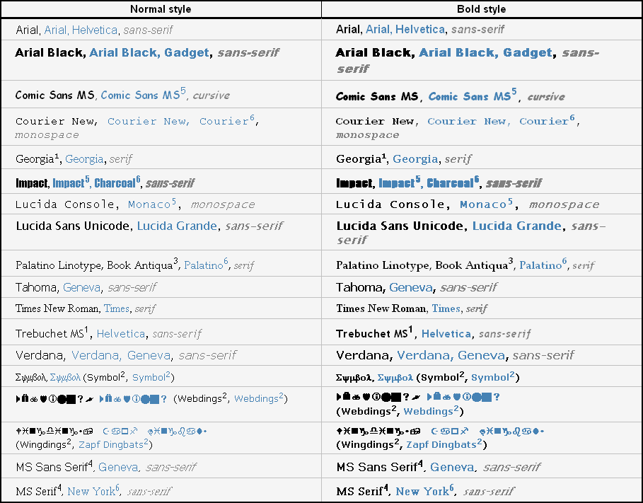
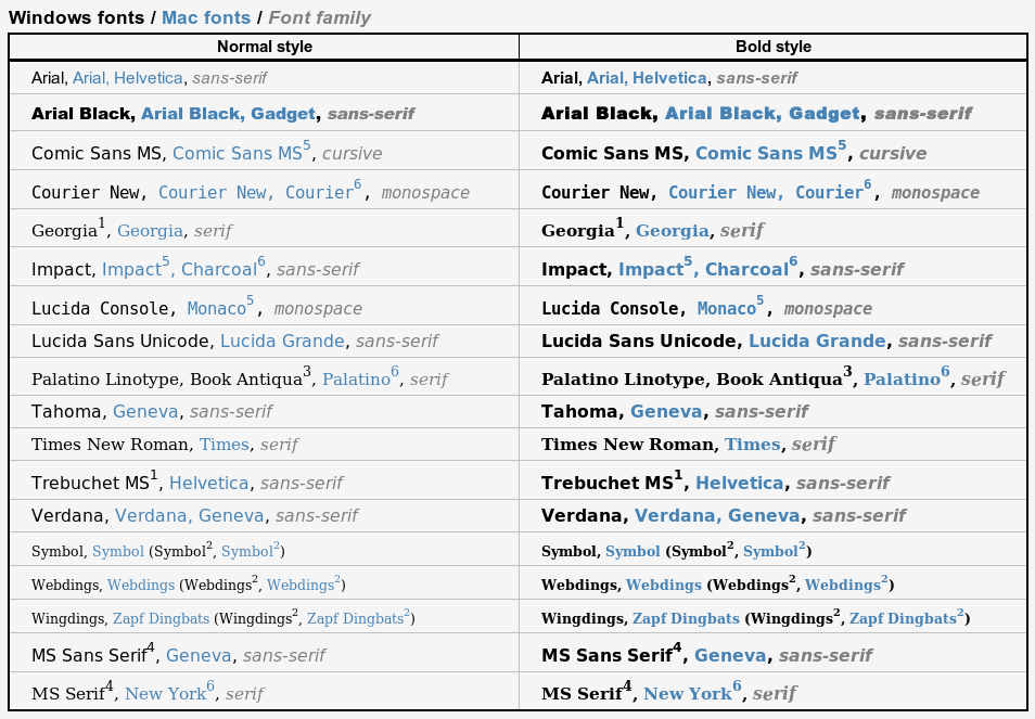
On Ubuntu, the fonts look good. They are smooth and clearly drawn. BUT THEY ALL LOOK THE SAME. Seriously, look at that list: I think Comic Sans, Lucidia Console, and MS Sans Serif are ALL THE SAME FONT. I believe this can be remedied by downloading extra font packs, I don't know if this easily possible on Ubuntu. -
Re:Similar to Windows hate?
I have a double opinion on Comic Sans. On an Apple system, it looks great. Happy, friendly, cheerful, etc. It makes me feel good.
On Windows, it looks like a business font (unless cleartype hasn't been turned on, then it looks like someone puked on the monitor). A business font trying to be fun. Of course that's going to look bad, it's a bad mix.
The problem these guys have isn't that Comic Sans looks bad, it's that it is used in places it shouldn't be. The reason it is used in places it shouldn't be is because there isn't much choice in fonts. There are really only 15 safe web fonts, which isn't much to choose from. Comic Sans is really your only choice if you are looking for something casual, informal.
On Ubuntu, the fonts look good. They are smooth and clearly drawn. BUT THEY ALL LOOK THE SAME. Seriously, look at that list: I think Comic Sans, Lucidia Console, and MS Sans Serif are ALL THE SAME FONT. I believe this can be remedied by downloading extra font packs, I don't know if this easily possible on Ubuntu. -
Re:Similar to Windows hate?
The reason to hate it is that it's the Universal "Specialty" font. If you don't want a serif font, or a plain font like Arial, the first tool of choice is Comic Sans.
That's because it's the only web safe font that comes close to looking like hand writing.
There are very limited choices when it comes to choosing fonts for the web. You can't blame comic sans, but more the lack of choice.
-
Most web sites use Windows standard fonts anyway
If you design a web site, you want it to show up looking roughly the same on most browsers. For simplicity's sake, most people use the standard fonts (and Mac equivalents).
http://www.ampsoft.net/webdesign-l/WindowsMacFonts.html
If we're going to be embedding fonts, obviously we want as few boring, cumbersome procedures as possible. Forcing us to regenerate pages to approve font use counts as one of these.
Microsoft is barking up the wrong tree on this one.
-
Re:Am I the only one> Can you just clarify whether you actually see a 5% failure rate for HTTP requests or if you made that up as a pathological example?
For the record, I've seen it once or twice; usually it was flaky DNS and a client that didn't cache properly. If you can't resolve images.slashdot.org, for instance, you have to wait a second or two until you can resolve it. Telling the browser to cache CSS pages "for a long time" doesn't often help, because in the event of failure, all that got cached after the delay is "503 - there ain't no images.slashdot.org", and if the DNS failure was transient, that's worse, because, the browser isn't necessarily gonna retry!
But to answer the meta-question, yes, it was brought up as a pathological example to illustrate the principle that requiring dozens of TCP/IP connections to multiple hosts (www.foo.com, images.foo.com, css.foo.com, a dozen "providers" of ads, assuming those aren't already pre-emptively blocked) equals more ways for things to fail.
> Because a) you were fine with the font size that was trendy with designers a decade ago and b) you aren't fine with the font size that is trendy with designers today.
That'd be fine! Tongue-in-cheek, I'd just make it "one <font size> smaller" or "one <font size> bigger". It seems that what's trendy with designers today is either (a) fonts that render as 4x6 pixel globs, or (b) font choices that show up as 8x12-pixel hugeness (1920x1600, 96dpi), with no middle ground. What's trendy with designers seems to be "whatever's either too big or too small, use anything but the default!", which makes no sense to me.
> No, the problem is incompetence. There's no make-this-unreadable: extra-web-2.0 !important CSS property, the defaults are sensible and CSS is explicitly designed for end-user control. The problem is that designers are choosing to make their designs this way. Sure, with one hand tied behind their back they aren't able to fuck things up in precisely the same way as they can today, but that's not the point is it?
No argument there. Georgia's a great font, but I'd rather see things fall back to Times Roman, where at least it looks half-decent at all sizes on all platforms. This guy's rant from 7 years ago puts it better than I did.
Here's another article with some screenshots that illustrate the problem. Those screenshots don't look too bad... but the differences would be greatly magnified at even one "font size" smaller. Augh.