Slashdot Mirror
Domain: edgecastcdn.net
Stories and comments across the archive that link to edgecastcdn.net.
Comments · 7
-
Re:White balance and contrast in camera.
You're mistaken. The proper point to look at searching for white reference is in lower left part of the image - there's a part of some other, clearly black and white dress visible, and it has obvious orange - not blue - tint. Also, it's not hard to find other pictures of the same dress. There's also somewhere a confirmation of the taker of that photo saying that this dress is obviously blue and black. https://gs1.wac.edgecastcdn.ne... http://s3-ec.buzzfed.com/stati...
-
so close!
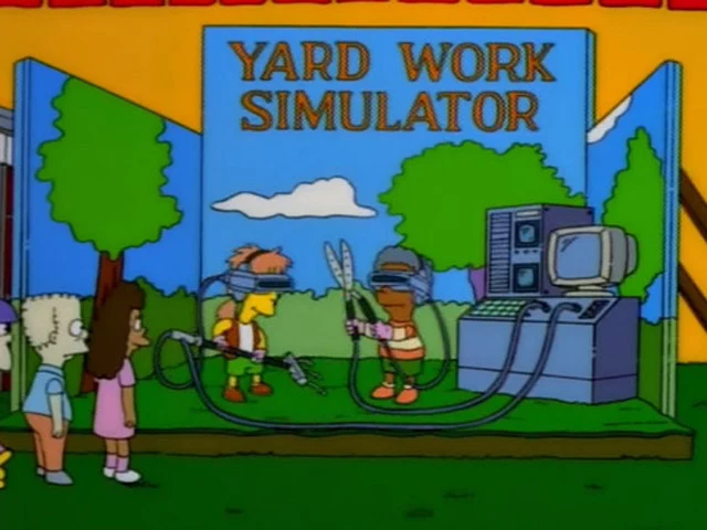
biking, running and rowing are just the tip of the iceberg! i cant wait for them to release the YARD WORK SIMULATOR!
-
Re:quick notes?
I don't think so. Having had to refine my handwriting a lot in College I think most people's notions about cursive are simply out of date. Cursive is faster than block letters, if you are using a quill pen where lifting the pen carries serious danger of splotching. With modern ballpoint pens however lifting has very little penalty. Worse, the cursive kids are taught in school is loaded down with time eating superfluous flourishes that add nothing to the legibility.
Here are some examples.
Lets start with a cursive capital A. It is yet another "loop on a line" that makes many cursive letters difficult to distinguish. It requires you to match up to the start of the original line and follow the line back down. A block letter A can be made with just two lines and very little penalty if you don't care about getting the point on the top (I don't), just a big upside down U shape and then a quick line in the middle, and if you don't get the middle line exactly right it doesn't matter too much, it's still obviously an A.
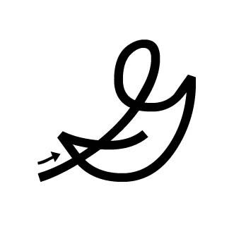
Another example: cursive capital G. First off, it doesn't look anything like a block letter G, so that's one strike against legibility. Second, it has a pointless loop, TWO hitches, and two line crosses. That's four time penalties. Compare to a block letter G that can be made with two semicircles that don't even have to touch. One penalty for lifting the pen, but that's it.
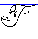
Then there's this bullcrap where cursive T and cursive F are very nearly the same letter, especially when you're writing quickly. And of course the top of both is wavy and has a loop for no damn reason and makes lining up the lines even more difficult.
Cursive is an invaluable skill if you intend to write a lot with fountain pens. It is a hindrance with any other writing implement. The only reason schools teach it as a primary skill today is inertia. -
Re:Quit apologizing for the goddamn president !
Homer: What he said is true because its in all caps. Are you gonna argue with caps?
Marge: Why does that make it right?
Homer: He took the time to press the shift key, Marge. I think he knows what he's talking about.https://gs1.wac.edgecastcdn.net/8019B6/data.tumblr.com/tumblr_m95lh53cA31r5j6uso1_r1_1280.jpg
-
Act like you don't know
Otherwise you will DIAF.
-
Re:Holy cow!!
-
Re:Short work day.
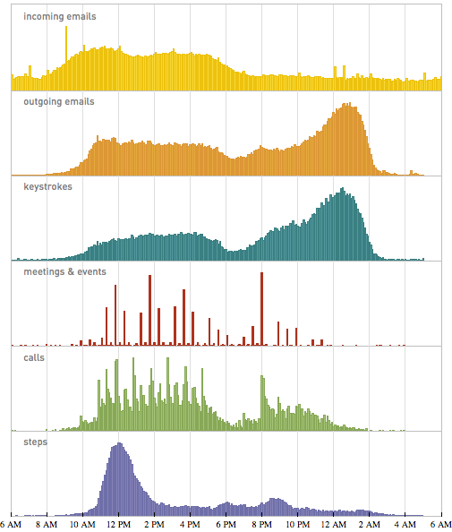
No, it's more of 10-11AM to 3AM, as he mentions just below the first plot. The last plots are more useful for drawing that sort of conclusion, though.