Slashdot Mirror
Domain: perceptualedge.com
Stories and comments across the archive that link to perceptualedge.com.
Stories · 4
-
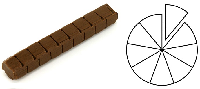
Teaching Fractions: The Tootsie Roll Is the New Pie
theodp writes "Following up on a WSJ story, data visualization author Stephen Few illustrates why using lines or bars may be sweeter than pie when it comes to teaching kids fractions. 'Although the metaphor is easy to grasp (the slices add up to an entire pie),' explains Few, 'we know that visual perception does a poor job of comparing the sizes of slices, which is essential for learning to compare fractions. Learning that one-fifth is larger than one-sixth, which is counter-intuitive in the beginning, becomes further complicated when the individual slices of two pies — one divided into five slices and other into six — look roughly the same. Might it make more sense to use two lines divided into sections instead, which are quite easy to compare when placed near one another?' So, is the Tootsie Roll the new pie?" -
Calling Out GE's Misleading Data Visualizations
theodp writes "Stephen Few never did suffer data visualization fools gladly. After seeing an oil exec (mis)use data viz to put a positive spin on Gulf Oil Spill cleanup efforts, Few felt compelled to call out BP. And now it's General Electric that's got Few's dander up: 'The series of interactive data visualizations that have appeared on GE's website over the last two years,' writes Few, 'has provided a growing pool of silly examples. They attempt to give the superficial impression that GE cares about data while in fact providing almost useless content. They look fun, but communicate little. As such, they suggest that GE does not in fact care about the information and has little respect for the intelligence and interests of its audience. This is a shame, because the stories contained in these data sets are important.' Concerned about his strong reactions to poorly designed data visualizations, Few asked his neuropsychologist wife whether he might be overreacting. She, too, agrees that GE's natural gas visualizations are maddening, which one might be tempted to dismiss as predictable, although Eyeo Festival presenter Michal Migurski also declares GE's effort 'one terrible, terrible bit of nonsense.'" -
Calling Out GE's Misleading Data Visualizations
theodp writes "Stephen Few never did suffer data visualization fools gladly. After seeing an oil exec (mis)use data viz to put a positive spin on Gulf Oil Spill cleanup efforts, Few felt compelled to call out BP. And now it's General Electric that's got Few's dander up: 'The series of interactive data visualizations that have appeared on GE's website over the last two years,' writes Few, 'has provided a growing pool of silly examples. They attempt to give the superficial impression that GE cares about data while in fact providing almost useless content. They look fun, but communicate little. As such, they suggest that GE does not in fact care about the information and has little respect for the intelligence and interests of its audience. This is a shame, because the stories contained in these data sets are important.' Concerned about his strong reactions to poorly designed data visualizations, Few asked his neuropsychologist wife whether he might be overreacting. She, too, agrees that GE's natural gas visualizations are maddening, which one might be tempted to dismiss as predictable, although Eyeo Festival presenter Michal Migurski also declares GE's effort 'one terrible, terrible bit of nonsense.'" -
Calling Out GE's Misleading Data Visualizations
theodp writes "Stephen Few never did suffer data visualization fools gladly. After seeing an oil exec (mis)use data viz to put a positive spin on Gulf Oil Spill cleanup efforts, Few felt compelled to call out BP. And now it's General Electric that's got Few's dander up: 'The series of interactive data visualizations that have appeared on GE's website over the last two years,' writes Few, 'has provided a growing pool of silly examples. They attempt to give the superficial impression that GE cares about data while in fact providing almost useless content. They look fun, but communicate little. As such, they suggest that GE does not in fact care about the information and has little respect for the intelligence and interests of its audience. This is a shame, because the stories contained in these data sets are important.' Concerned about his strong reactions to poorly designed data visualizations, Few asked his neuropsychologist wife whether he might be overreacting. She, too, agrees that GE's natural gas visualizations are maddening, which one might be tempted to dismiss as predictable, although Eyeo Festival presenter Michal Migurski also declares GE's effort 'one terrible, terrible bit of nonsense.'"