 Slashdot Mirror
Domain: visibone.com
Stories and comments across the archive that link to visibone.com.
Comments · 33
-
.bv is the country code for Bouvet Island
And Tristan De Cunha is part of four groups of island under
I made a list: http://visibone.com/countrycod...
-
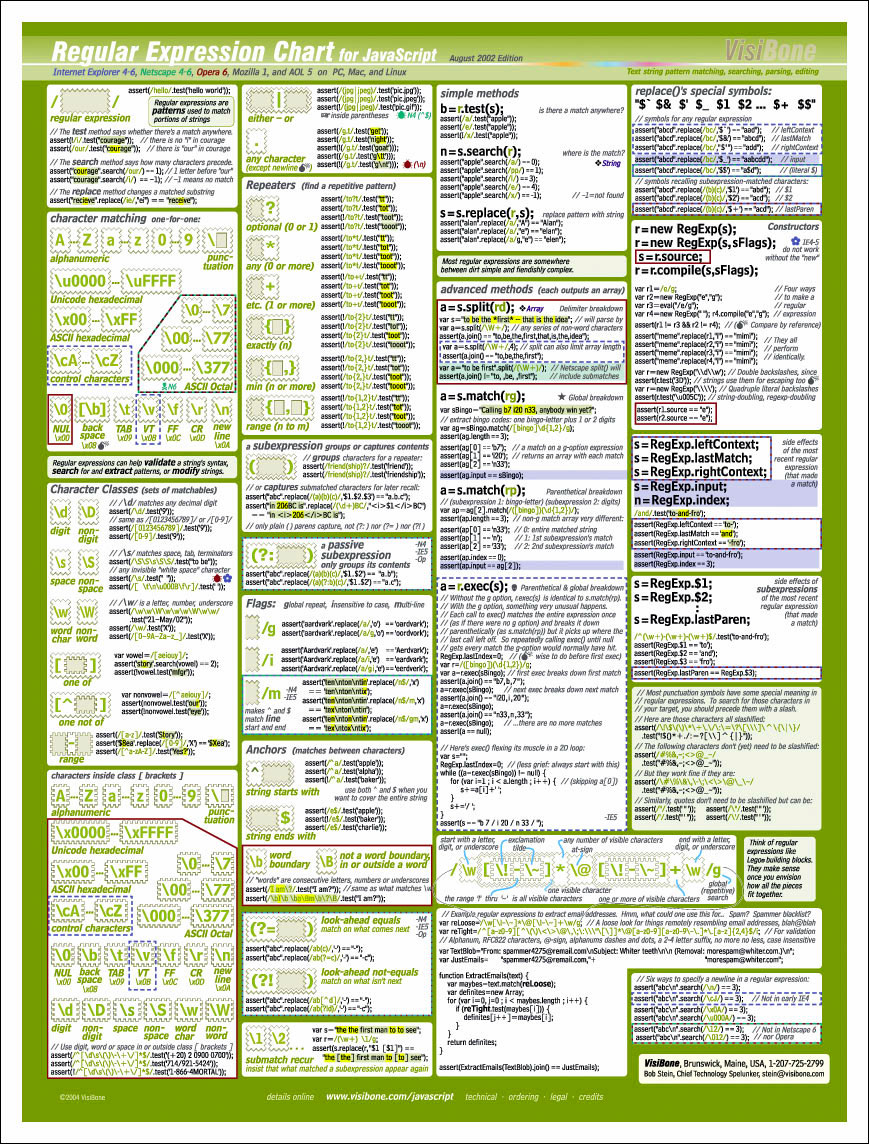
Ultimate RegExp compact reference
-
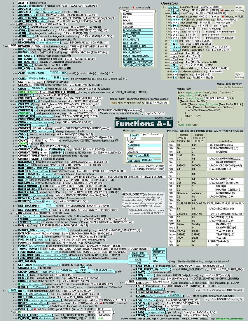
A newer MySQL cheatsheet...
Visibone has just released a newer MySQL cheatsheet. I use the Visibone Browser Book a lot. Very convenient.
-
A newer MySQL cheatsheet...
Visibone has just released a newer MySQL cheatsheet. I use the Visibone Browser Book a lot. Very convenient.
-
Re:Here's my pocket reference...
For those who like "pocket" references in addition to online ones (maybe you don't do well managing more than a dozen tabs at a time
No, it doesn't have explanations. But most is self-explanatory those of us using MySQL, and this is highly useful for those of us with tons of data in recognition memory, but not available as perfect recall.
No, I don't work for them. But I've received excellent customer service, so I figure they deserve a mention here. -
visibone.com
There's also some very nice stuff at http://visibone.com/
The value of whiteboards can't be overstated, and on-line reference material is very helpful, but we don't all have multiple 36" monitors, and as Bob ("Mr. Visibone") Stein points out, "The easiest thing to find in your office will always be your wall". -
Re:Replace it with WECANN...
Every nation should have representation based on the number of servers hosted in it's soil, amount of bandwidth generated, etc.
If they did it by registered domain names (IPs), Tuvalu could finally pass Sierra Leone, Grenada, Liberia, Somalia and French Guiana as a major world power!
(as a side note, I came across this cool map hunting the links) -
What about visibone?
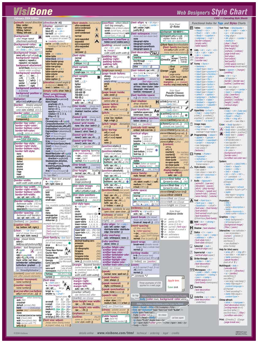
I use the visibone style guides. All the CSS tags on one page including browser compatability notes, equivalent HTML tag attributes, and some examples.
-
Re:CSS Cheat Sheet
Visibone's HTML/CSS reference card is worth the $10. Nice four-page card that goes into a lot more detail on browser compatibility, CSS property values, how CSS relates with HTML, and so forth, yet manages to fit all the CSS stuff in one page.
(They also make a good JavaScript card from which I learned most of my JavaScript, as well as those nifty color charts.) -
Re:Windows XP Home Edition say what?
As an Iranian and not being completely sure of the EXACT tone of my skin
Find it here! -
Useful information on developing...
I threw together some sites I use at work when developing websites for clients.
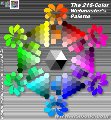
Visibone has some extremely useful color palettes and educational links.
Vischeck can convert individual images or entire websites to simulate one of three forms of color blindness.
I was going to throw in some more educational sites about color blindness, but I think you all can search Google yourselves. -
What Red-Green colorblind people see
Just to get an idea of what Red-Green colorblind people might see, take a look at the Color Deficient Vision page at Visibone: http://www.visibone.com/colorblind/. Compare the colorblind version of the web color chart to the regular vision version.
As a UI Designer, I always tell my developers that they need to use color + something else (shape, line weight, pattern, style) rather than color alone to distinguish things.
-
good reading
Visibone carries free color blind palettes for photoshop, etc...
Also, required reading for anyone wanting to see just how color blind people see.
-
Colorblindness references
Visibone has a good page dedicated to the more common forms of colorblindness, including a link to an excellent article that has downloadable color palettes (for Photoshop and Paintshop Pro, but I would assume that the Gimp would also be able to make use of those palletes) that you can apply to screenshots / mockups / etc. to simulate colorblindness. Not quite as seamless as having a "colorblindness" video mode, but still useful for determining a color palette to use.
-
Websmithing with paper tools -- why?
"I don't see why anyone would choose a paper product over a digital solution."
It's a funny thing. Reminds me of that Spaceman Spiff cartoon where Calvin tries to fire his blasters with a Windows-like pull-down menu interface.
Computers are still really cumbersome to use, like building a ship in a bottle with buttery boxing gloves. The thing I have found is that when I have an accurate color chart nearby, I'll use it, every single time, before fiddling with an electronic color picker.
-- Bob Stein, VisiBone, stein@visibone.com
-
Re:Stealing Gryffin's Color Lab idea
The gif image I was talking about was this one That's the image on the left side of the Color Lab at www.visibone.com/colorlab/. It shows each of the web-safe colors in a wheel. When you hover over them, the hex code shows up in the status bar. When you click on a color it shows up on the right, along with the 8 most recent colors clicked, along with clipboardable codes and all combinations of text / background for those 8 colors.
I also make hex and decimal color tables with paste-able codes on top of each color like the one you mention at web-source.net. The hex version is here.
However I will confess that your color references have features mine don't:
- Scrambled up by hue. A great improvement on the color wheel. It's far more useful to sort colors by number.
- Spanning eight pages so you get to lubricate your scroll-wheel looking for your color. I don't know why I didn't think of this. Showing all the colors at once does not challenge users nearly enough.
-
Re:The original was a good idea, but...
Really!? Oh boy, do I have a pleasant surprise for you. The newer poster (since 12/99) has much brighter dark colors, like burnished ceramic instead of sunbleached roadkill. And it has decimal codes on each chip. And the logo is MUCH brighter!
Please write me and tell me where to send it. I am certain you'll find it more accurate in the darker shades.
Do I understand correctly, you're saying that 1068 colors is not enough to be useful? Obviously it's a subset by a factor of 16,000. The whole of 24-bit color would take a foot-ball-field size poster.
What I tried to do in the KiloChart was spread the colors out even perceptually not mathematically. Notice how quickly the web safe colors transition from red to yellow? And how many limey greens there are that all look alike? I tried to correct that. I've tried picking from it a few times and have only once found the need to do the tweaking you mention. Once I did want a really subtle pastel color. I didn't find it on the KiloChart and had to tweak.
So my question is, can a paper color picker be useful even with only 1000 colors. (If you'll grant me for the time being, until you see it at least, that it's accurate.) Can it get you to a color that's good enough say more than half the time?
Have I understood your point right?
Say thanks for all the kind words. I'm really glad you found the poster useful. Please don't be too polite to tell me straight. I really want to get this right. If not this batch the next one. All the email I get is so schmaltzy I need to hear some thoughtful criticism.
Did I say I really want to get you the newer poster?
-- Bob Stein, VisiBone, stein@visibone.com
-
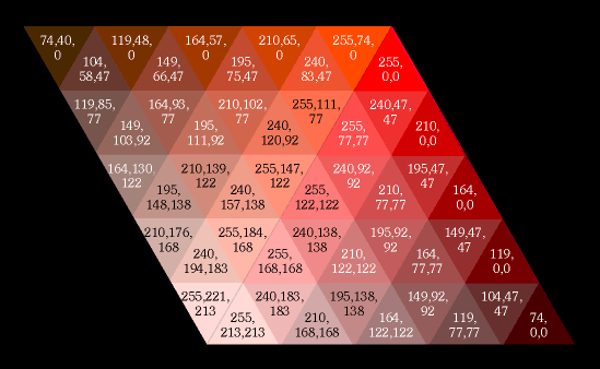
Hex is on me
For what it's worth, the Color KiloChart shows examples of using decimal instead of hex for precisely this reason:
<font color="#D2AB4D">
<span style="color:rgb(210,171,77)">
But thanks for your implicit vote for a hex reference. I am considering a Color KiloFoldout like the HTML Foldouts. Maybe one all hex and one all decimal. Any suggestions?
-- Bob Stein, VisiBone, stein@visibone.com
-
But have you *seen* them, good sir?Gryffin said: "reflective (printed) color is *never* gonna match up well to screen color."
Want to see a sample? Bet ya it matches close enough to be very useful even to your discerning eye.
The first print run (Feb 99) didn't do dark colors well. And the print run in April 2000 had the pinks a little too hot, cyans a little too weak. Those problems are still in the mouse pads and the Color Chart that are shipping today I confess. But the latest Color Poster, Color Card, and the new Color KiloChart are really great color matches.
-- Bob Stein, VisiBone, stein@visibone.com
-
Stealing Gryffin's Color Lab ideaMaybe I'm missing something, Gryffin, but it sounds like you described shockingly precisely the Color Lab I made. Why OneFix, how flattering of you. That color lab is exactly choice #3 when you search Google for "web safe colors".
It has a GIF with plain colors and nothing over them (unlike the site OneFix mentioned at internet.com which has little dots in each color sample). It has a big positively honkin' JavaScript image map so you can pick any of those, and while you're hovering over them you can see the codes in the status bar. Then when you pick colors you see all their combinations of text on background on the right (no new page, same page).
Isn't this darn tootin' close to what you were describing? It gets about 10,000 users a week.
-- Bob Stein, VisiBone, stein@visibone.com
-
Re:I would like to know...
(1) OneFix said: "How is a list of unsafe colors going to help?" Just to have a quick way to get a color you have in mind with more choices, that's what I was hoping. Web safe colors give short shrift to earth-tones and pastels for example.
(2) Re looking up a color is easier online. For me, sometimes it is easier online, sometimes it isn't. I make both (color lab). Most software when it is running and in front of you still takes twiddling to get what you want. Personally, when I have a poster in front of me I just happen to use it to pick colors. It's like the HTML Popup reference I give away for free versus the HTML Card I sell. When I have both in front of me, I reach for the card. (Was that a shameless self-promotion? Ok, I know, but do you think it was an effective shameless self-promotion?)
A chart is one way to envision all the options at once. Personally I like seeing the totality of a thing. I've never seen a color picker that does that. The best show a 2D pattern (HS or SB) with a knob for the 3rd dimension (B or H). So you can only see one slice of the choice-space at a time.
(3) Accuracy of poster versus monitor. I think you'll find the stuff I made using 8 inks matches screen colors far better than anything else. Have you seen one next to a monitor? It's way more faithful than Pantone's ColorWeb for example. First I picked six inks to match the extremes, R,Y,G,C,B,M, and added a seventh because pink is too hot to make with just red and magenta (my pink ink is very close to process magenta actually). Four of those colors were custom blended by Superior Ink. They assigned 6-character pseudo-Pantone numbers for them. The rest are PMS spot colors. Then whenever I print something I'm in the pressroom the whole time and after wrestling with the registration I get the pressman to tweak the 7 colors (plus process black) so they look like the colors between a PC and a Mac but favoring the PC. I've read a lot about monitor gamma, but actually the PC distortion of colors isn't modeled well by a gamma curve, it's very linear with a discontinuity. I wrote about that a while back here. Anyway, after the first print-run I got colorimeter measurements for all the inks and then I modelled the multiplicative effects of offset printing in order to determine the best screen percentages of two inks and black to get a specific RGB color. Ok, more information than you wanted? I just wish you would *see* the thing next to its monitor redition and tell me if you don't think it matches well enough to be useful.
(4) An excuse for decoration? Exactly! What, your walls are pristine white and free of marks or something?
-- Bob Stein, VisiBone, stein@visibone.com
-
Re:Flaw in the Visibone concept
or like this one:
Visibone Colorlab
-
No hex?
It doesn't even have the colours in hexadecimal (see here). Sorry, I'll just use the colour picker in Paint Shop Pro, it'll give out the colour in hex and I can easily cut and paste that value to my web pages. I guess I could use the RGB values as well, but I'm not used to using them yet