 Slashdot Mirror
Space Pictures From Near and Far
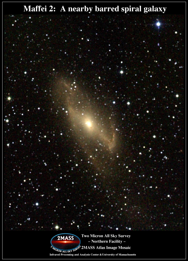
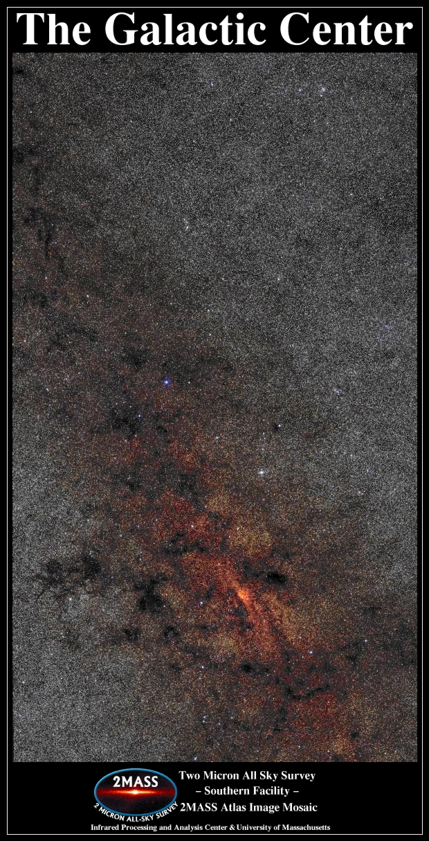
Buran writes: "The BBC News has a fine story about the how our galaxy looks from the outside according to the 2-Micron All-Sky Survey (2MASS). The article describes the shape of our galaxy (a barred spiral; all those books showing concept paintings of a regular spiral galaxy will be out of date now) and how the survey was done (near-infrared measurements of 500 million carbon stars). For the first time, we can see the center of our own Milky Way. All our worldly troubles seem so small..." That takes care of the big picture; Chris McKinstry has submitted news of much closer but just as exciting shots of Saturn -- read below for more on those.
mindpixel writes: "I was very excited when I saw this amazing shot of Saturn come up on the control room monitors of the VLT in November, and I'm even more excited that as of today the image is finally public. It is possibly the sharpest view of Saturn's ring system ever achieved from a ground-based observatory. All of us here at the observatory are quite proud of it, especially the NAOS-CONICA team."
In actuality it IS a cheap computer rendition. The Saturn image was done in the H and K bands (both in the infrared region) which people can't see. The sensors store an 8-bit sample for each pixel. If you looked at a rasterized image from one of these sensors it would just be an 8-bit greyscale image. These are rather boring to look at so the astonomers apply these grayscale images to colour channels of an RGB image. SO what they are doing is assigning a band you can't normally see (infrared) to bands you can see so you're impressed. This leads to confusion though because the final images don't LOOK anything like they would through a normal telescope. Saturn for example, the rings are super bright and crappy looking. This is because they are formed of ice crystals and dust which relfects infrared radiation pretty well. The original greyscale raster would look just as bright but the ring would be a really light shade pretty close to white in both the H and K bands. Older pictures of Saturn have usually been visual spectrum pictures so they look pretty natural. Cheaper computers have led to many a misleading space photograph.
I'm a loner Dottie, a Rebel.
As is so often the case in journalism, this claim is wildly overselling things (and is not made in the BBC article.) I was using IRAS (infrared astronomy satellite) and various earthbound surveys (including the much earlier TMSS two micron all sky survey) around 1990, and have an IRAS poster from that era at home showing our galaxy (including the core.) Similarly, we have known for over a decade that our galaxy is a barred spiral.
Is this a case of the more overblown your submission, the more likely slashdot is to carry the story?
I'm not knocking the 2MASS survey - high quality all sky surveys like this lead to huge amounts of high quality science.
Quattuor res in hoc mundo sanctae sunt: libri, liberi, libertas et liberalitas.
http://www.ipac.caltech.edu/2mass/gallery/gc_movie .html
it's of the galactic center
pretty cool
"It is a greater offense to steal men's labor, than their clothes"