Slashdot Mirror
Domain: handprint.com
Stories and comments across the archive that link to handprint.com.
Comments · 12
-
Here's a good read
in case you're interested in learning more about color perception than the links provide.
http://blog.asmartbear.com/color-wheels.html
If you like that, there's even more to read on color theory. -
Re:I KNOW! Ebert's point! It is bulshit.
Rods definitely do play a role in daylight vision, at least in terms of color . I could probably cite a few dozen sources on that point, as "rod intrusion" is fairly well understood (I think). For example: Implications of Rod Sensitivity to Interior Lighting Practice provides, among other things, an interesting survey of literature in the field.
As for the depth perception impact, I have only a vague recollection of having read something on the subject. I may be seriously misremembering the details.
-
Re:Great Blazing Colors
"No, I believe he's right. We see more green hues than anything else."
Don't think so.
"Take a look at a color gamut table, which is a visual representation of visible color space. Note how the distance from the neutral point to the edge of the green portion is much bigger, and how small the blue part is."
Then, please, interprete it properly: as you can see, half the spectrum is green and you can't say one green from the other, which is exactly the point. Then look at http://handprint.com/HP/WCL/IMG/vizluv.jpg which is basically the same representation only it shows the perceived spacing of spectral hues as the radial distance between hue markers. See? Now it's the green zone the shortest and the blue the largest. (Have a look at http://handprint.com/HP/WCL/color2.html section "Hue Discrimination"). As a practical matter, you can see here (http://handprint.com/HP/WCL/cwheel06.html) a "practical artist's color wheel" and see again how the blue and red zones are the largest while green/purple are the shortest).
Just to through out the numbers, maximus hue perception are around the 480 (medium blue/cyan) and 570nm (yellow) zones while minima are at the far ends (obviously) and at 520nm (green). The overall graphic resembles somehow a "W" where lower points means higher hue discriminance. Talking about wavelenght, it takes in fact about double to distinguish two greens (more than 4nm) than two blues (about 2nm). -
Re:Great Blazing Colors
"No, I believe he's right. We see more green hues than anything else."
Don't think so.
"Take a look at a color gamut table, which is a visual representation of visible color space. Note how the distance from the neutral point to the edge of the green portion is much bigger, and how small the blue part is."
Then, please, interprete it properly: as you can see, half the spectrum is green and you can't say one green from the other, which is exactly the point. Then look at http://handprint.com/HP/WCL/IMG/vizluv.jpg which is basically the same representation only it shows the perceived spacing of spectral hues as the radial distance between hue markers. See? Now it's the green zone the shortest and the blue the largest. (Have a look at http://handprint.com/HP/WCL/color2.html section "Hue Discrimination"). As a practical matter, you can see here (http://handprint.com/HP/WCL/cwheel06.html) a "practical artist's color wheel" and see again how the blue and red zones are the largest while green/purple are the shortest).
Just to through out the numbers, maximus hue perception are around the 480 (medium blue/cyan) and 570nm (yellow) zones while minima are at the far ends (obviously) and at 520nm (green). The overall graphic resembles somehow a "W" where lower points means higher hue discriminance. Talking about wavelenght, it takes in fact about double to distinguish two greens (more than 4nm) than two blues (about 2nm). -
Re:True colour
Here's a diagram showing that the long-wavelength ("red") receptors are actually just as sensitive to short wavelengths as the "blue" receptors: http://handprint.com/HP/WCL/IMG/conesens3.gif "population weighed linear cone sensitivity functions". Here's a diagram with normalized values, which shows that the "red" receptors have another peak at short wavelengths: http://handprint.com/HP/WCL/IMG/conesens1.gif Check out http://handprint.com/HP/WCL/wcolor.html for tons of information!
Btw, google for "hyperspectral imaging". Cameras that take pictures in more than three frequency bands. -
Re:True colour
Here's a diagram showing that the long-wavelength ("red") receptors are actually just as sensitive to short wavelengths as the "blue" receptors: http://handprint.com/HP/WCL/IMG/conesens3.gif "population weighed linear cone sensitivity functions". Here's a diagram with normalized values, which shows that the "red" receptors have another peak at short wavelengths: http://handprint.com/HP/WCL/IMG/conesens1.gif Check out http://handprint.com/HP/WCL/wcolor.html for tons of information!
Btw, google for "hyperspectral imaging". Cameras that take pictures in more than three frequency bands. -
Re:True colour
Here's a diagram showing that the long-wavelength ("red") receptors are actually just as sensitive to short wavelengths as the "blue" receptors: http://handprint.com/HP/WCL/IMG/conesens3.gif "population weighed linear cone sensitivity functions". Here's a diagram with normalized values, which shows that the "red" receptors have another peak at short wavelengths: http://handprint.com/HP/WCL/IMG/conesens1.gif Check out http://handprint.com/HP/WCL/wcolor.html for tons of information!
Btw, google for "hyperspectral imaging". Cameras that take pictures in more than three frequency bands. -
Re:True colourViolet is especially tricky. Its wavelength is shorter than blue, but in addition to stimulating your blue cones, your red cones are also slightly sensitive to it.
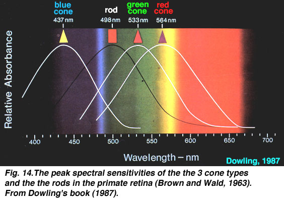
This doesn't make any sense. Red cones are not sensitive to blue light. Here is a diagram showing the sensitivities of of the three cones (S, M, and L or Blue, Green and Red) in our retina whose signals combine to create color.
Our perception of color comes from the combination and comparison of the stimulation of three different cones, each maximally sensitive to different wavelengths. The output of the cones gets combined in what are called opponent pathways, one is Red-Green, and the other is Blue-yellow. The Red-Green pathway compares the output of the Red and Green cones and the Blue-yellow pathway compares the output of the blue cone with the sum of the red and green cones. This is why you will never see a color that is reddish-green or blueish-yellow (see nick) at least in the additive sense that red+blue=violet and yellow+blue+green.
So why does extremely short wavelength light appear to contain a reddish component? I don't believe that anyone knows the answer to that yet. But the hypothesis is that somewhere along the path from cone to cortex the input from a blue cone and red cone combine which turns our perception of an extremely short wavelength light into a combination of short wavelength light (blue) and extremely long wavelength light (red). So our sensation of color becomes a continuum that loops back on itself as opposed to our sense of pitch (which is also frequency or wavelength).
Interestingly people who have had their lenses removed are somewhat able to perceive ultraviolet light. This is because the lens ordinarily blocks UV light and blue cones are sensitive to UV light but very little ever penetrates to the retina normally. Apparently they see it as lilac.
Many mammals, fish, birds, insects, and reptiles (basically everyone except us) are able to see UV light as well. It's a good that we can't for two reason. One is that there is more chromatic aberration at shorter wavelengths. Basically blue light bends more than red light. This makes focusing more difficult. Also, more importantly, UV light damages DNA which is a very, very, bad thing. This is a good resource for learning more.
-
Re:American Era artists?Not only that, but it wasn't used as an art pigment until significantly later... so no, American painters during the Revolutionary era were NOT using it.
The first modern cobalt paints date from cobalt green (PG19), discovered around 1780 by the Swedishchemist Sven Rinmann, but not used as an artists' color until around 1835.
-
Re:Score another one for creationists
Thank you for your funny post. I had a good laugh. Just in case anyone thinks any of your points have a trace of connection to reality, I'll adress them:
- Big Bang: I know this is difficult to understand, but, as time is a feature of this universe, wondering what could happen "before" the Big Bang is just nonsense. There is no "before".
- Earth "fine tuned": This is known as the Anthropic principle. To say that the universe is what it is in order for us to be here is the same as to say that the surfers in Hawaii prove that the waves and the beaches of Hawaii where created for them to surf, because if not they wouldn't be so suitable for surfing.
- Life could not have appeared in Earth: maybe I'm too simple, but I don't understand how can you say that this whole universe was fine tuned in order to support life on Earth and at the same time that life on Earth could not come into existence as the result of this universe. Henry Ford created a system to get cars to come into existence, and they were produced without him needing to act in the actual process. Surely your creator could do better in a universe created all by himself just for the purpose of life.
- Information as proof of intelligent design. Actually, the more we know about genetic code, more things we find that any competent designer could not have made: a high percentage of code meaning nothing, redundant information, bad information (that translate into illness) that is difficult to delete due to the characteristics of the system...You seem to confuse information for communication. Information have no purpose, and require no actors. Is a property of any system, related to enthropy. Communication is transmission of information, requiere actors, and gives a purpose to information.
- Fossil record: no transitional forms? have you been in any Natural History museum? You could have seen transitional forms between fish and amphibian, between dinosaurs and avians, and of course between apes and men, just to name a few.
And what should be more disturbing to you, we have found that THREE species of humans coexisted 75.000 years ago: homo sapiens (we) in Africa, neanderthals in Europe, and erectus in Asia. You should think a little bit to justify why your creator allowed these other intelligent human beings to exist at the same time as homo sapiens for thousands of years just to be later substituted by us. And please remember that neanderthals were able to produce art, and they buried their dead ones.
Just another thing: try to explain convergent evolution by creationism. Please give an explanation as to why your creator would create ichthyosarus and 50 millions of years after they dissapeared would create dolphins. -
Colour theory
The poster, in the mailing list, asked for resources on colour theory... my (artist) wife usually likes Hand Print very much.
-
Re:Color dimensions
Then why is it alway represented by a two dimensional pallet?
Always? 2 3 4 5 6 7 8 9 10 11 12 13 14
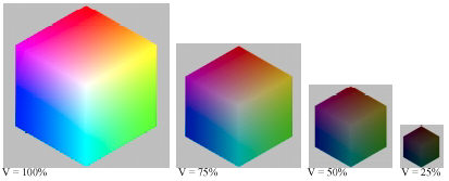
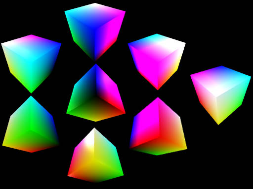
It is often represented two dimensionally because it is difficult to display it three dimensionally. Two dimensional displays most often display Hue and Saturation and completely discard Value.
Color can be coded as RGB (Red/Rreen/Blue) or HSV (Hue/Saturation/Value) or HSL (Hue/SaturationLightness) or YCbCr aka YUV aka YIQ (used in TV) or CMY (Cyan/Magenta/Yellow) or L*a*b* or XYZ. It always requires exactly three components. Note CMYK uses 4, but K is redundant, it improves the quality of ink printing.
it isn't "exact" either, since many humans are missing at least one of the dimensions.
That is precisely why I included the word "normal" in "normal human vision".
-