Slashdot Mirror
Domain: identifont.com
Stories and comments across the archive that link to identifont.com.
Comments · 8
-
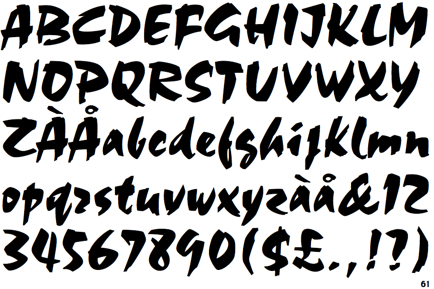
How about a picture of the fucking glyphs?
God, I hate fluff pieces like this.
TL:DR; Some crappy looking font becomes popular because "it bears a resemblance to the calligraphic forms of Asian writing systems." No Shit, Sherlock. News at 11.
Here is a texture atlas (picture) of all the glyphs in this shitty font since the author was too fucking lazy.
1. You have crap like this:
But Choc is full of irregularity. Its lowercase "r" resembles a "z." Its "g" looks like a capital "S." And its "h" crouches forward as though in starting position for a race, whereas its more heavyset uppercase incarnation is on the verge of rolling backward.
Uh. how about SHOWING us the glyphs instead of textually describing them and making us look them up so we can understand what the fuck you are going on about???
2. The popularity of Comic Sans and Choc "proves" that the general populace doesn't give a fuck about well designed fonts. Why is this news?
And yet, Choc is everywhere.
3. So it is "everywhere" in New York. No one gives a fuck about this font except some pretentious stuck-up typographer.
Talk about a slow-news day at the NY Times.
-
Re:Computer modern
The reason for Computer Modern's ugliness isn't apparent until you know what it's imitating. This is a comparison of CM and Bodoni 12, a font from the early 19th century. So-called "Modern" typefaces were frequently used for setting professional and mathematical treatises (and Slashdot's had an article in the past about how being difficult to read slows down the reader and gives them time to absorb the material.)
Essentially, the problem with CM is that it has straight flat parts on the sides of curves (e.g. the bowls of d and b), which make the font feel synthetic, like Chicago. The rigidity of the figures makes the letters feel as though they were assembled out of parts (which they were), rather than organically drawn.
-
Re:wake-up call
MEMORANDUM TO ALL EMPLOYEES OF THE DHS AND US INTELLIGENCE SERVICES:
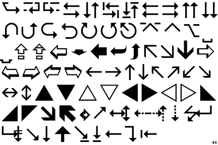
So as to counter the terrorists' latest methods for conducting espionage against our great nation, all official documents will now be composed in a combination of Wingdings 3 and MS Comic Sans.
Sincerely, The Management -
On a related note ...
The Attorney General's office will now be using Fraktur as its official font.
-
Re:Yeah, nice use of taxdollars.
Years of research went into Computer Modern for TeX. It's probably the most beautiful and readable font available. Not surprisingly, it's Free, too
And if you look hard there are TT* versions.
* TrueType AND Teletype -
Re:Yeah, nice use of taxdollars.
When I was in the military we were required to use a font called OCR-A. It was optimised for the OCR readers they had at the time (the late 80's early 90's). I was nearly 100% accurate when OCR'd - pretty good when you consider that we were OCRing text that was being produced by typewriters that had been in near constant use for 20 years.
You can see an example of OCR-a it here.
-
Re:TeX is about that old...
Also, I know there must be a way to choose a better font, but everybody who uses TeX seems to use the same set of (butt ugly) fonts for everything. It's rather telling that most tech people can instantly tell when something was typeset in TeX.
You mean Computer Modern. It's the font that Donald Knuth designed to be used together with TeX and METAFONT. I guess it's a matter of taste whether you like it or not, but at least it's a well designed font and serves its purpose. People tend to use it since it's the default font (just like 90% of all Microsoft Word documents use Times New Roman), and because it's the only free font for TeX if you want to typeset math (AFAIK). The alternative is to buy e.g. MathTime.Anyways, texts typeset in TeX are easily recognized IFF they use CM (since nobody seems to be using CM outside of TeX), if they aren't, it's pretty impossible to tell.
-
Re:Initial thoughts on Vera
Here's a great resource for fontspotting. Type geeks go nuts!