 Slashdot Mirror
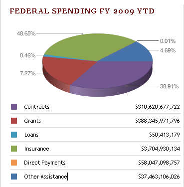
Serious Design Failure At USAspending.gov?
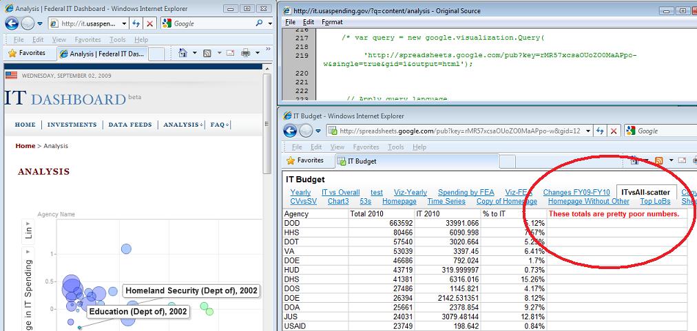
theodp writes "Over at Intelligent Enterprise, Seth Grimes declares the Federal Government's USAspending.gov website a travesty, calling it 'almost a parody of a government-transparency site.' Among the faults cited by Grimes is a botched 'Federal Spending FY 2009 YTD' pie chart that graced USAspending.gov's home page. Not only were the sizes of pie segments not in proportion to the percentage labels (due to a Google Chart API error), the colors in the pie chart didn't even match the colors and values in the table immediately below the chart. Lucky for the Feds, Grimes didn't get a chance to look behind the curtain at the Federal IT Dashboard, where they forgot to remove a (commented) reference to a Google spreadsheet that states 'These totals are pretty poor numbers' (Google workbook). Oops!"
Having never done this before, the government is bound to have problems. All of them do when they try new things. I can bear with them for some incorrectly rendered pie charts or -- gasp! -- an informative comment about the numbers being pretty poor. Sorry to sound so apologetic but I'll give the idea of transparency and A and the implementation a C-. So what? The numbers are there.
Because what did we have before? Data via third parties that had to use a FOIA and sit and wait for it? Numbers that were years old? Or we had to visit 50 state sites that were all laid out differently and aggregate the data? And we're ripping on usaspending.gov for design flaws? Okay, from a web developer's standpoint these are pretty egregious errors but so what?
At least it reads "These totals are pretty poor numbers." and not "We really had to cook the books to get this to look right." Hell, now you know where to start looking if you want to do what you should be doing: criticizing the government based on their spending and IT (mis)management!
How would you react if the next president did away with usaspending.gov? Happy that the travesty of a parody site is gone?
My work here is dung.
its not like they are out to be serious. If they were the same government promising more openness would not be ramming near trillion dollar bills through Congress without a chance for public discussion, let alone reading of by the voting parties.
then again, change might mean soliciting bids for a system to systematically scrape all non-hidden data on popular sites like facebook and myspace https://www.fbo.gov/index?s=opportunity&mode=form&id=eec856940efb75b2b1c11e2b1d5660a4&tab=core&_cview=0&cck=1&au=&ck=
Change we can believe in, with all these CZARs the only thing apparent is that the public isn't paying attention to the other hand
* Winners compare their achievements to their goals, losers compare theirs to that of others.
If you're in IT long enough, you've probably seen a million sites and software packages like this in use at large companies. In my experience, this is usually the result of a low-bid IT contractor getting a last-minute request to slap something together. Of course, in-house resources can screw things up badly too, but high-dollar consulting/contracting deals seem to have a special knack for it. Some places have great results with outsourcing/contracting, but others make it impossible to get high-quality work done in a reasonable time.
It sucks that something as public as the federal spending-accountability website has obvious problems, but how much time do you think whoever won that contract got to get the site live?
I'd be interested in hearing from an MBA-type about what the actual rationale for hiring third party IT help is. I know it's usually driven by raw costs and the fact that "IT's not strategic." But what is it that's actually taught in business school that has every executive that drives the whole outsourcing push? Or is it really just "my golf buddy is doing it at his company."?
Disclaimer: In the government case, I can definitely see the need for contract help. Projects would probably have a really hard time surviving administration changes, internal squabbles, etc.
Certainly any real problem, no matter how minor, is more important than a non-existant problem you just made up, right?
That guys trolls about "major design flaws" on a website that was slapped together within a month of President Obama taking office... gimme a break.
The fact that a government operation was able to put that information out that quickly is just impressive and unprecedented.
I wonder if TFA author would be able to put together a website of such scope and functionality in such short amount of time... and without any bugs when he claims to have "spent way too much time" troubleshooting just the pie chart.
Maybe he works for the shop that came second on the bid?
HTML is obsolete. It's time for a new, simpler and richer markup language.
The whole exercise is a political manipulation anyway. The largest government outlays - the so-called entitlements - are omitted from the chart. Medicare, Social Security, and reimbursements to states for social services are not shown on these charts. Those items constitute more than half of Federal spending - that's where your tax dollars go - but they're completely omitted in this analysis.
Well, if the numbers are also wrong, who would be surprised? State-run media wants you to shrug and think, "The economy's down: must be George Bush' fault." So why would the numbers be right?
And just because you voted for Obama, don't mod me down again: Hear me out.
This isn't Republican versus Democrat; it's Liberal versus Conservative. And the Liberals have put us behind the 8-ball.
Remember "The most transparent administration in history"? Remember "All legislation would spend 5 days in the public before voting on it"? Remember "Earmarks will be outlawed"?
I remember "Don't read it, just vote on it!" by Pellozi. I remember TARP came with something like 8,000 earmarks. I remember Obama talking about "his version" of healthcare reform which he doesn't have.
TARP was suppossed to get us out of mad debt by offering a TRILLION dollars on things like monuments and ACORN (whose founders believe everyone on Welfare is utopia) doesn't help America. This is clearly against what's been proven SIX TIMES ALREADY.
Six times now America has learned that supply-side economics is the way out of a recession. Only the THIRD time it was tested did anyone call it "Reganomics". Point is: not experimental; not opinion.
Clearly posting accurate numbers are now a way of life. (Well, they match what the state-run media has been told to portray)
But this hypocrisy isn't out of place; it's part of the plan:
The pattern's pretty clear:
1. Congress writes code making the life of companies in an industry crazy.
2. Parts of that industry collapse. (like 74 banks this year)
3. Congress swoops in to "save" the industry with bailout money with "congressional oversight" because "capitalism ran wild" and:
-Bailout means congress OWNS that industry
-Congress decides how much money people make there
-Democrat buddies get perks, the rest get screw out of life savings
Step the above pattern on mortgage companies, then banks, and now car makers.
When it was done to lenders via the Community Re-investment Act, *any* ethnic person could ask for a $200,000 loan while jobless, then cry to congress when he gets turned down. That ethnic person could contact a congressman to shut down the bank, all assisted by ACORN. So what happened? Those banks started giving away money in buckets. Capitalism gone wild! (not)
But Obama's just the current Bobble-Head doll at the helm: the five, 1,000+ page units of legislation couldn't have been written in the months since he arrived. It's the Democrat-controlled congress. They've wanted to take these country-changing steps for decades.
Please, Slashdot-Army of Neos: think this out. The Fed can't cross it's legs without spending a million dollars and getting it wrong. These people need to pass NOTHING this term. Look at the dismal state of Medicare, Medicade, Social Security all broke by billions. And most recently the incompentence of Cash for Clunkers.
These are not the people to do these things. They've never done anything right, ever. Don't expect them to tell you how wrong they are with a "transparency website".
--- For a good time mail uce@ftc.gov
piecharts are a bad way to represent comparative data like this in the first place...3D pie charts may look fancy, but they make it more difficult to compare the actual data (which is supposed to be the whole point of plotting it)
Give that man a cigar. This is exactly what I thought when I looked at the .gov page: this is no worse than any other Power Point presentation I've sat through. The real problem isn't some error in the algorithm that draws the pie, but in the notion that tarting up a graph by making it 3-D somehow makes it better. Of course, the opposite is true—in art, perspective is used to create an illusion of depth in a 2-D medium. But illusion is precisely what we don't want in the visual representation of data! Because artistic perspective distorts the presented object (in this case, our pie), it's much harder to judge the relative size of the pieces. In fact, how do we even know that this is a circular pie? Most pies I've eaten were circular, but maybe this one is elliptical, perhaps with the major axis perpendicular to the plane surface it's been projected on.
It's not just pie charts that are misused in this way; the same thing can be said about just any type of 3D chart that's commonly used in presentations and reports for business or government organizations—the effects of perspective make it difficult or impossible to tell what is really going on. Consequently, these "visual aids" do not clarify data, but obfuscate it.
Some critics blame this on PowerPoint and similar tools (like this one provided by Google), and it's true that these tools make it easy to produce bad visual representations of data. The most vociferous and articulate of these critics is Edward Tufte, who goes so far as to blame the Challenger shuttle disaster on PowerPoint (take a look at Tufte's web page about PowerPoint, or better yet, buy his books!). I wouldn't go quite as far as Tufte; these tools are just like any tools; they can be used ineptly or deceptively, just as they can be used to clarify and enlighten. The real problem lies in the managerial culture that dominates both American business and government. This culture pretends to be rational and "scientific", as defined by whatever management fads are current, but it's not really interested in serious thought or analysis, just in keeping up appearances. So I don't think 3D charts are going away any time soon.
Great men are almost always bad men--Lord Acton's Corollary