 Slashdot Mirror
Serious Design Failure At USAspending.gov?
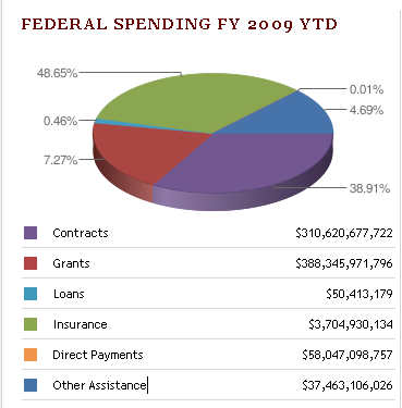
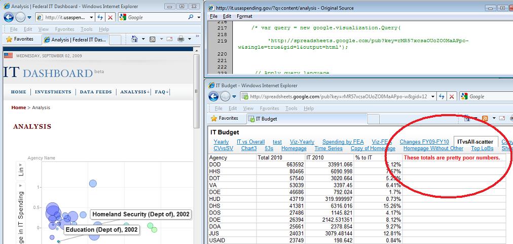
theodp writes "Over at Intelligent Enterprise, Seth Grimes declares the Federal Government's USAspending.gov website a travesty, calling it 'almost a parody of a government-transparency site.' Among the faults cited by Grimes is a botched 'Federal Spending FY 2009 YTD' pie chart that graced USAspending.gov's home page. Not only were the sizes of pie segments not in proportion to the percentage labels (due to a Google Chart API error), the colors in the pie chart didn't even match the colors and values in the table immediately below the chart. Lucky for the Feds, Grimes didn't get a chance to look behind the curtain at the Federal IT Dashboard, where they forgot to remove a (commented) reference to a Google spreadsheet that states 'These totals are pretty poor numbers' (Google workbook). Oops!"
Having never done this before, the government is bound to have problems. All of them do when they try new things. I can bear with them for some incorrectly rendered pie charts or -- gasp! -- an informative comment about the numbers being pretty poor. Sorry to sound so apologetic but I'll give the idea of transparency and A and the implementation a C-. So what? The numbers are there.
Because what did we have before? Data via third parties that had to use a FOIA and sit and wait for it? Numbers that were years old? Or we had to visit 50 state sites that were all laid out differently and aggregate the data? And we're ripping on usaspending.gov for design flaws? Okay, from a web developer's standpoint these are pretty egregious errors but so what?
At least it reads "These totals are pretty poor numbers." and not "We really had to cook the books to get this to look right." Hell, now you know where to start looking if you want to do what you should be doing: criticizing the government based on their spending and IT (mis)management!
How would you react if the next president did away with usaspending.gov? Happy that the travesty of a parody site is gone?
My work here is dung.
The site's pages don't even have a proper BODY or HTML close tags..
Jeez.
Eric
Eric Aitala
www.f1m.com
I work at the Sunlight Foundation, where we're pretty familiar with the people and data systems powering USASpending.gov. I've seen a lot of comments here saying that the important thing is that the government is publishing something, and that it's understandable that their first pass might not be perfect.
But this isn't their first pass. The underlying data systems -- FAADS and FPDS -- have existed since the 90s, and have been riddled with errors throughout their existence. Instead of fixing the problems, OMB continues to slap new coats of paint on the same lousy data.
It's nice that we've got a new USASpending.gov, and I agree that it would be a mistake to put too much emphasis on a buggy visualization. But the underlying data is terrible, and so far no one is showing the will to fix it. Just look at USASpending's "data quality" tab -- it talks about the completeness of each row. Well, that's great, but it tells you nothing about the thousands upon thousands of missing rows, nor about the rows that massively under- or over-report their dollar amounts.
At Subsidyscope, the project on which I work, we've delved into these problems in more depth. Those who'd like to learn more about the shortcomings of the data systems powering USASpending can find a discussion of the relevant issues here.