 Slashdot Mirror
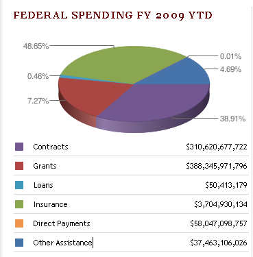
Serious Design Failure At USAspending.gov?
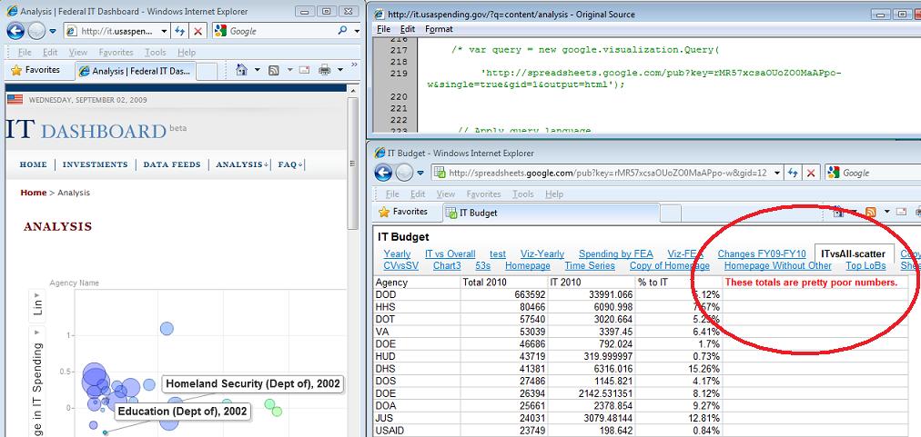
theodp writes "Over at Intelligent Enterprise, Seth Grimes declares the Federal Government's USAspending.gov website a travesty, calling it 'almost a parody of a government-transparency site.' Among the faults cited by Grimes is a botched 'Federal Spending FY 2009 YTD' pie chart that graced USAspending.gov's home page. Not only were the sizes of pie segments not in proportion to the percentage labels (due to a Google Chart API error), the colors in the pie chart didn't even match the colors and values in the table immediately below the chart. Lucky for the Feds, Grimes didn't get a chance to look behind the curtain at the Federal IT Dashboard, where they forgot to remove a (commented) reference to a Google spreadsheet that states 'These totals are pretty poor numbers' (Google workbook). Oops!"
Having never done this before, the government is bound to have problems. All of them do when they try new things. I can bear with them for some incorrectly rendered pie charts or -- gasp! -- an informative comment about the numbers being pretty poor. Sorry to sound so apologetic but I'll give the idea of transparency and A and the implementation a C-. So what? The numbers are there.
Because what did we have before? Data via third parties that had to use a FOIA and sit and wait for it? Numbers that were years old? Or we had to visit 50 state sites that were all laid out differently and aggregate the data? And we're ripping on usaspending.gov for design flaws? Okay, from a web developer's standpoint these are pretty egregious errors but so what?
At least it reads "These totals are pretty poor numbers." and not "We really had to cook the books to get this to look right." Hell, now you know where to start looking if you want to do what you should be doing: criticizing the government based on their spending and IT (mis)management!
How would you react if the next president did away with usaspending.gov? Happy that the travesty of a parody site is gone?
My work here is dung.
Read the blog article, and I think that a better title for this slashdot article would be "minor design failure."
It's good enough for Government work.
In terms of government it is considerably harder to make bring these things into existence and to remove them once they're already there. Changing it after it already exists is trivial. And that's what's important and significant about this: it exists. The general population has facilitated access to something that was obscure and hidden behind a wall of government before. This may not seem like much but I think the successful creation of this type of transparency throughout the government, and if possible embedding it systemically into government processes, that we will see a great improvement in terms of freedom, success, and efficiency of our government.
It's similar to the way open source applications always get bugs patched faster than commercial implementations--crowdsourcing is a good way to catch errors. That will undoubtedly apply to government as well, especially when many politicians make their living relying on their practices being obscured from the public.
One of the first items on USAspending's page states "A journey towards greater Transparency and Accountability...". Seems to me like the site is a work in progress and will improve with time.
Floating in the black seas of infinity without a paddle.
Light you say? Folks I think we have an Illuminatus in our midst.
its not like they are out to be serious. If they were the same government promising more openness would not be ramming near trillion dollar bills through Congress without a chance for public discussion, let alone reading of by the voting parties.
then again, change might mean soliciting bids for a system to systematically scrape all non-hidden data on popular sites like facebook and myspace https://www.fbo.gov/index?s=opportunity&mode=form&id=eec856940efb75b2b1c11e2b1d5660a4&tab=core&_cview=0&cck=1&au=&ck=
Change we can believe in, with all these CZARs the only thing apparent is that the public isn't paying attention to the other hand
* Winners compare their achievements to their goals, losers compare theirs to that of others.
If you're in IT long enough, you've probably seen a million sites and software packages like this in use at large companies. In my experience, this is usually the result of a low-bid IT contractor getting a last-minute request to slap something together. Of course, in-house resources can screw things up badly too, but high-dollar consulting/contracting deals seem to have a special knack for it. Some places have great results with outsourcing/contracting, but others make it impossible to get high-quality work done in a reasonable time.
It sucks that something as public as the federal spending-accountability website has obvious problems, but how much time do you think whoever won that contract got to get the site live?
I'd be interested in hearing from an MBA-type about what the actual rationale for hiring third party IT help is. I know it's usually driven by raw costs and the fact that "IT's not strategic." But what is it that's actually taught in business school that has every executive that drives the whole outsourcing push? Or is it really just "my golf buddy is doing it at his company."?
Disclaimer: In the government case, I can definitely see the need for contract help. Projects would probably have a really hard time surviving administration changes, internal squabbles, etc.
The site's pages don't even have a proper BODY or HTML close tags..
Jeez.
Eric
Eric Aitala
www.f1m.com
How about adding Bugzilla to that site? Here is one feature request: I would like to see contract sums by company (yes, I am interested in overall amount going to Microsoft).
839*929
I'm surprised the guy rips into the bug calling the Google API and even says "Here's the government's chart done right" without mentioning that piecharts are a bad way to represent comparative data like this in the first place 3D pie charts may look fancy, but they make it more difficult to compare the actual data (which is supposed to be the whole point of plotting it). They are even worse than 2D barcharts, at least with 2D you are only looking at data being relative to slice area, and not being rendered at an angle - look at the edge in the plot he uses, there's as much if not more purple on display as the supposedly larger green slice. What's wrong with a bar chart for visualising comparative data like this? Surely it would give the reader a much more informed quick overview of spending?
Certainly any real problem, no matter how minor, is more important than a non-existant problem you just made up, right?
How's that *any* different than now? See, what I see is people crying and whining that we shouldn't have any form of government/universal health coverage (even a 'basic' health plan, which could then be supplemented by private insurance, or if you prefer, completely opt out of the public program and buy fully private healthcare), because you make the claim that resources are finite, so therefor, someone's gonna die because the government decides it's 'not worth paying for'.
How exactly, do private health insurance companies get around the lack of infinite resources? Your statement can easily be turned around and directed at the private insurance companies: "There are not infinite resources. Some people will have their health care yanked so others will live. Surely you don't think that resources are infinite?"
It appears that, in your world, the lack of infinite resources is an insurmountable problem for a public healthcare plan, but magically, private insurance companies have infinite resources? What about all the people who are getting sick and/or dieing simply because they have no healthcare, so the only option for them is to go to the emergency room when it's already too late, and too expensive? What about the people who get screwed by the penny-pinchers at the health insurance companies who deny their legitimate claims?
Surely, a problem which universally affects both private and public healthcare plans, cannot be used as an argument against *either* of them?
That guys trolls about "major design flaws" on a website that was slapped together within a month of President Obama taking office... gimme a break.
The fact that a government operation was able to put that information out that quickly is just impressive and unprecedented.
I wonder if TFA author would be able to put together a website of such scope and functionality in such short amount of time... and without any bugs when he claims to have "spent way too much time" troubleshooting just the pie chart.
Maybe he works for the shop that came second on the bid?
HTML is obsolete. It's time for a new, simpler and richer markup language.
The govt. always gets highly critizied. Or even when someone is just making a simple obersvation it all of the sudden becomes a "slam".
Can you imagine if companies had to bear this sort of total public critisim. How many companies have stupid errors on there website, menus, marketing, or anything else and we don't get upset.
I just take it with a grain of salt and hope things get better. The govt. isn't going to be perfect becuase it's ran by human beings...just like everything else.
I work at the Sunlight Foundation, where we're pretty familiar with the people and data systems powering USASpending.gov. I've seen a lot of comments here saying that the important thing is that the government is publishing something, and that it's understandable that their first pass might not be perfect.
But this isn't their first pass. The underlying data systems -- FAADS and FPDS -- have existed since the 90s, and have been riddled with errors throughout their existence. Instead of fixing the problems, OMB continues to slap new coats of paint on the same lousy data.
It's nice that we've got a new USASpending.gov, and I agree that it would be a mistake to put too much emphasis on a buggy visualization. But the underlying data is terrible, and so far no one is showing the will to fix it. Just look at USASpending's "data quality" tab -- it talks about the completeness of each row. Well, that's great, but it tells you nothing about the thousands upon thousands of missing rows, nor about the rows that massively under- or over-report their dollar amounts.
At Subsidyscope, the project on which I work, we've delved into these problems in more depth. Those who'd like to learn more about the shortcomings of the data systems powering USASpending can find a discussion of the relevant issues here.
Like this? http://www.usaspending.gov/fpds/tables.php?tabtype=t2&subtype=t&year=2009 Or any of the other easily available charts on the site...
The whole exercise is a political manipulation anyway. The largest government outlays - the so-called entitlements - are omitted from the chart. Medicare, Social Security, and reimbursements to states for social services are not shown on these charts. Those items constitute more than half of Federal spending - that's where your tax dollars go - but they're completely omitted in this analysis.
So tell me, how much transparency do you get from your insurance company?
The correlation between ignorance of statistics and using "correlation is not causation" as an argument is close to 1.