Slashdot Mirror
Domain: yeahwrite.com
Stories and comments across the archive that link to yeahwrite.com.
Comments · 7
-
Re:Of course....Most people don't know how to use Microsoft Office properly Very well put....I think the offices I maintain IT for would be more productive replacing Word (and clones) with web forms (with some rich text capabilities like HTMLAREA or other script that uses designmode() to do underlines, boldface, etc.)...so there is a consistant look to communications and the effort is in the content of the document and not the layout.
There was a product called Yeah Write that came out a few years ago that tried to change the desktop word processor into a useful tool, but has been unsuccessful in making an impact.. -
Re:How about a word processor that smacks the user
Take a look at Yeah Write.
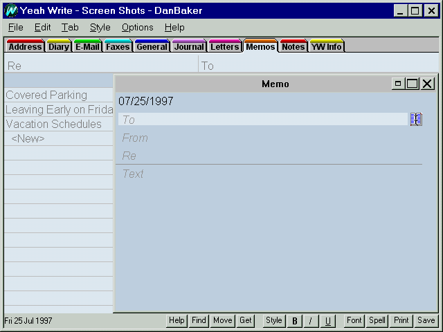
I did, and now I have a headache. 1995 called, they want their user interface design back. -
Re:How about a word processor that smacks the user
Word's on-the-fly "auto-formatter" will detect when the user does your 1. and 2., and will convert the text into appropriate formatting.
3. through 5. would require that they replace "Clippy" with "Cujo" or perhaps "Ted" (as in "Bundy").
Actually, bad jokes aside, a really styles-driven word processor would force people to make decent-looking documents, if they would actually use such a word processor. Take a look at Yeah Write.
steveha -
YeahwriteI'm a happy user of Emacs. But for my wife and kids I had set up YeahWrite. It's a shareware windows program, which is very simple to use for most writing assigments. My kids have been using it since first grade.
My son, who's now in high school, stopped using Word and installed YeahWrite (there is free-as-in-beer version) and uses that for homework.
I think I'll teach him LaTex next, so that he will be ready for college.
-
Re:All the non-free competition was killed
Well sure, there's Yeah Write and many others. But the reason MS outsells this and Word* is it's actually better i.e. more features. The only real competitor I know of is OpenOffice, which sells at an incalculable difference (can't
-
When good interfaces go crufty
In Vernor Vinges sci-fi novel A fire upon the deep, he presents the idea of software archeology. Vinges future has software engineers spending large amounts of time digging through layers of decades-old code in a computer system like layers of dirt and rubbish in real-world archeology to find out how, or why, something works.
So far, in 2002, this problem isnt so bad. We call such electronic garbage cruft, and promise to get rid of it someday. But its not really important right now, we tell ourselves, because computers keep getting faster, and we havent quite got to the point where single programs are too large for highly coordinated teams to understand.
But what if cruft makes its way into the human-computer interface? Then you have problems, because human brains arent getting noticably faster. (At least, not in the time period were concerned with here.) So the more cruft there is in an interface, the more difficult it will be to use.
Unfortunately, over the past 20 years, Ive noticed that cruft has been appearing in computer interfaces. And few people are trying to fix it. I see two main reasons for this.
-
Microsoft and Apple dont want to make their users go through any retraining, at all, for fear of losing market share. So rather than make their interfaces less crufty, they concentrate on making everything look pretty.
- Free Software developers have the ability to start from a relatively cruft-free base, but (as a gratuitously broad generalization) they have no imagination whatsoever. So rather than making their interfaces more usable, they concentrate on copying whatever Microsoft and Apple are doing, cruft and all.
Here are a few examples of interface cruft.
-
In the 1970s and early 80s, transferring documents from a computers memory to permanent storage (such as a floppy disk) was slow. It took many seconds, and you had to wait for the transfer to finish before you could continue your work. So, to avoid disrupting typists, software designers made this transfer a manual task. Every few minutes, you would save your work to permanent storage by entering a particular command.
Trouble is, since the earliest days of personal computers, people have been forgetting to do this, because its not natural. They dont have to save when using a pencil, or a pen, or a paintbrush, or a typewriter, so they forget to save when theyre using a computer. So, when something bad happens, theyve often gone too long without saving, and they lose their work.
Fortunately, technology has improved since the 1970s. We have the power, in todays computers, to pick a sensible name for a document, and to save it to a persons desktop as soon as she begins typing, just like a piece of paper in real life. We also have the ability to save changes to that document every couple of minutes (or, perhaps, every paragraph) without any user intervention.
We have the technology. So why do we still make people save each of their documents, at least once, manually? Cruft.
-
The original Macintosh, which introduced graphical interfaces to the general public, could only run one program at a time. If you wanted to use a second program, or even return to the file manager, the first program needed to be unloaded first. To make things worse, launching programs was slow, often taking tens of seconds.
This presented a problem. What if you had one document open in a program, and you closed that document before opening another one? If the program unloaded itself as soon as the first document was closed, the program would need to be loaded again to open the second document, and that would take too long. But if the program didnt unload itself, you couldnt launch any other program.
So, the Macs designers made unloading a program a manual operation. If you wanted to load a second program, or go back to the file manager, you first chose a menu item called Quit to unload the first program. And if you closed all the windows in a program, it didnt unload by itself it stayed running, usually displaying nothing more than a menu bar, just in case you wanted to open another document in the same program.
Trouble is, the Quit command has always been annoying and confusing people, because its exposing an implementation detail the lack of multitasking in the operating system. It annoys people, because occasionally they choose Quit by accident, losing their careful arrangement of windows, documents, toolboxes, and the like with an instantaneity which is totally disproportionate to how difficult it was to open and arrange them all in the first place. And it confuses people, because a program can be running without any windows being open, so while all open windows may belong to the file manager, which is now always running in the background menus and keyboard shortcuts get sent to the invisible program instead, producing unexpected behavior.
Fortunately, technology has improved since 1984. We have the power, in todays computers, to run more than one program at once, and to load programs in less than five seconds.
We have the technology. So why do we still punish people by including Quit or Exit menu items in programs? Cruft.
-
As I said, the original Macintosh could only run one program at a time. If you wanted to use a second program, or even return to the file manager, the first program needed to be unloaded first.
This presented a problem when opening or saving files. The obvious way to open a document is to launch it (or drag it) from the file manager. And the obvious way to save a document in a particular folder is to drag it to that folder in the file manager. But on the Mac, if another program was already running, you couldnt get to the file manager. What to do? What to do?
So, the Macs designers invented something called a file selection dialog, or filepicker a lobotomized file manager, for opening and saving documents when the main file manager wasnt running. If you wanted to open a document, you chose an Open menu item, and navigated your way through the filepicker to the document you wanted. Similarly, if you wanted to save a document, you chose a Save menu item, entered a name for the document, and navigated your way through the filepicker to the folder you wanted.
Trouble is, this interface has always been awkward to use, because its not consistent with the file manager. If youre in the file manager and you want to make a new folder, you do it one way; if youre in a filepicker and you want to make a new folder, you do it another way. In the file manager, opening two folders in separate windows is easy; in a filepicker, it cant be done.
Fortunately, technology has improved since 1984. We have the power, in todays computers, to run more than one program at once, and to run the file manager all the time. We can open documents from the file manager without quitting all other programs first, and we can save copies of documents (if necessary) by dragging them into folders in the file manager.
We have the technology. So why do we still make people use filepickers at all? Cruft.
-
This last example is particularly nasty, because it shows how interface cruft can be piled up, layer upon layer.
-
In Microsofts MS-DOS operating system, the canonical way of identifying a file was by its pathname: the concatenation of the drive name, the hierarchy of directories, and the filename, something like C:\WINDOWS\SYSTEM\CTL3DV2.DLL. If a program wanted to keep track of a file in a menu of recently-opened documents, for example it used the files pathname. For backward compatibility with MS-DOS, all Microsofts later operating systems, right up to Windows XP, do the same thing.
Trouble is, this system causes a plethora of usability problems in Windows, because filenames are used by humans.
-
What if a human renames a document in the file manager, and later on tries to open it from that menu of recently-opened documents? He gets an error message complaining that the file could not be found.
-
What if he makes a shortcut to a file, moves the original file, and then tries to open the shortcut? He gets an error message, as Windows scurries to find a file which looks vaguely similar to the one the shortcut was supposed to be pointing at.
-
What happens if he opens a file in a word processor, then renames it to a more sensible name in the file manager, and then saves it (automatically or otherwise) in the word processor? He gets another copy of the file with the old name, which he didnt want.
-
What happens if a program installs itself in the wrong place, and our fearless human moves it to the right place? If hes lucky, the program will still work but hell get a steady trickle of error messages, the next time he launches each of the shortcuts to that program, and the next time he opens any document associated with the program.
Fortunately, technology has improved since 1981. We have the power, in todays computers, to use filesystems which store a unique identifier for every file, separate from the pathname such as the file ID in the HFS and HFS+ filesystems, or the inode in most filesystems used with Linux and Unix. In these filesystems, shortcuts and other references to particular files can keep track of these unchanging identifiers, rather than the pathname, so none of those errors will ever happen.
We have the technology. So why does Windows still suffer from all these problems? Cruft.
Lest it seem like Im picking on Microsoft, Windows is not the worst offender here. GNU/Linux applications are arguably worse, because they could be avoiding all these problems (by using inodes), but their programmers so far have been too lazy. At least Windows programmers have an excuse.
-
To see how the next bit of cruft follows from the previous one, we need to look at the mechanics of dragging and dropping. On the Macintosh, when you drag a file from one folder to another, what happens is fairly predictable.
- If the source and the destination are on different storage devices, the item will be copied.
- If the source and destination are on the same storage device, the item will be moved.
- If you want the item to be copied rather than moved in the latter case, you hold down the Option key.
Windows has a similar scheme, for most kinds of files. But as Ive just explained, if you move a program in Windows, every shortcut to that program (and perhaps the program itself) will stop working. So as a workaround for that problem, when you drag a program from one place to another in Windows, Windows makes a shortcut to it instead of moving it and lands in the Interface Hall of Shame as a result.
Naturally, this inconsistency makes people rather confused about exactly what will happen when they drag an item from one place to another. So, rather than fixing the root problem which led to the workaround, Microsoft invented a workaround to the workaround. If you drag an item with the right mouse button, when you drop it youll get a menu of possible actions: move, copy, make a shortcut, or cancel. That way, by spending a couple of extra seconds choosing a menu item, you can be sure of what is going to happen. Unfortunately this earns Microsoft another citation in the Interface Hall of Shame for inventing the right-click-drag, perhaps the least intuitive operation ever conceived in interface design. Say it with me: Cruft.
- It gets worse. Dragging a file with the right mouse button does that fancy what-do-you-want-to-do-now-menu thing. But normally, when you click the right mouse button on something, you want a shortcut menu a menu of common actions to perform on that item. But if pressing the right mouse button might mean the user is dragging a file, it might not mean you want a shortcut menu. What to do, what to do?
So, Windows designers made a slight tweak to the way shortcut menus work. Instead of making them open when the right mouse button goes down, they made them open when the right mouse button comes up. That way, they can tell the difference between a right-click-drag (where the mouse moves) and a right-click-I-want-a-shortcut-menu (where it doesnt).
Trouble is, that makes the behavior of shortcut menus so much worse that they end up being pretty useless as an alternative to the main menus.
-
They take nearly twice as long to use, since you need to release the mouse button before you can see the menu, and click and release a second time to select an item.
-
Theyre inconsistent with every other kind of menu in Windows, which opens as soon as you push down on the mouse button.
-
Once youve pushed the right mouse button down on something which has a menu, there is no way you can get rid of the menu without releasing, clicking the other mouse button, and releasing again. This breaks the basic GUI rule that you can cancel out of something youve pushed down on by dragging away from it, and it slows you down still further.
In short, Windows native shortcut menus are so horrible to use that application developers would be best advised to implement their own shortcut menus which can be used with a single click, and avoid the native shortcut menus completely. Once more, with feeling: Cruft.
-
Meanwhile, we still have the problem that programs on Windows cant be moved around after installation, otherwise things are likely to break. Trouble is, this makes it rather difficult for people to find the programs they want. In theory you can find programs by drilling down into the Program Files folder, but theyre arranged rather uselessly (by vendor, rather than by subject) and if you try to rearrange them for quick access, stuff will break.
So, Windows designers invented something called the Start menu, which contained a Programs submenu for providing access to programs. Instead of containing a few frequently-used programs (like Mac OSs Apple menu did, before OS X), this Programs submenu has the weighty responsibility of providing access to all the useful programs present on the computer.
Naturally, the only practical way of doing this is by using multiple levels of submenus thereby breaking Microsofts own guidelines about how deep submenus should be.
And naturally, rearranging items in this menu is a little bit less obvious than moving around the programs themselves. So, in Windows 98 and later, Microsoft lets you drag and drop items in the menu itself thereby again breaking the general guideline about being able to cancel a click action by dragging away from it.
This Programs menu is the ultimate in cruft. It is an entire system for categorizing programs, on top of a Windows filesystem hierarchy which theoretically exists for exactly the same purpose. Gnome and KDE, on top of a Unix filesystem hierarchy which is even more obtuse than that of Windows, naturally copy this cruft with with great enthusiasm.
-
Following those examples, its necessary to make two disclaimers.
Firstly, if youve used computers for more than six months, and become dulled to the pain, you may well be objecting to one or another of the examples. Hey!, youre saying. Thats not cruft, its useful! And, no doubt, for you that is true. In human-computer interfaces, as in real life, horrible things often have minor benefits to some people. These people manage to avoid, work around, or blame on user stupidity, the large inconvenience which the cruft imposes on the majority of people.
Secondly, there are some software designers who have waged war against cruft. Word Places Yeah Write word processor abolished the need for saving documents. Microsofts Internet Explorer for Windows, while having many interface flaws, sensibly abolished the Exit menu item. The Acorns RISC OS abolished filepickers. The Mac OS uses file IDs to refer to files, avoiding all the problems I described with moving or renaming. And the ROX Desktop eschews the idea of a Start menu, in favor of using the filesystem itself to categorize programs.
However, for the most part, this effort has been piecemeal and on the fringe. So far, there has not been a mainstream computing platform which has seriously attacked the cruft that graphical interfaces have been dragging around since the early 1980s.
So far.
-
-
Try YeahWrite
YeahWrite is very small ( 1Mb), very fast, runs under everything from Win 3.1 on up. It probably does everything your relatives want, though it isn't completely full featured. It is also very intuitive to use; it automatically saves your files for you, opens the last document you used. It organizes documents around file folders and drawers.
Drawbacks include only one font per document, although is does support various font sizes for headings and titles. The program does not support hyphenation, endnotes, footnotes, a table of contents or an index. A document can have only one margin setting. But, I'd bet your relatives probably don't need these. There is a full spelling check, thesaurus,etc.
I've used YeahWrite for kids as they don't have to remember to save the document (a big problem). It also takes almost no instruction.
You can download the free version and try it, you can enable the full version for 15 days, and it's only $29 to buy anyway.
Yeahwrite was written by former WordPerfect programmers under Pete Peterson, one of the founders of WP.