 Slashdot Mirror
Microsoft Teases Windows 10's Upcoming 'Project Neon' Design Language (windowscentral.com)
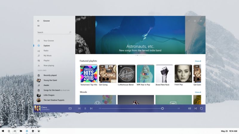
An anonymous reader quotes a report from Windows Central: Microsoft just gave developers a sneak peek at Project Neon, Microsoft's upcoming design language for Windows 10 that aims to add fluidity, animation and blur to apps and the operating system. We exclusively revealed that this was in the works in late 2016, and today Microsoft has given us a first peak at what Project Neon will look like. During the Windows Developer Day livestream, an image of Project Neon was seen the background of one of the PowerPoint slides being shown off on stage. Although not much, it's further confirmation that this is the end goal for Windows 10's UI, and Project Neon will be bringing a fresh coat of paint to apps. Project Neon should benefit all types of Windows 10 devices, including Windows 10 Mobile, HoloLens and even Xbox. We're still several months away from Project Neon being everywhere in Windows 10, and we're expecting to see more at BUILD this coming May. In fact, a lot of the Project Neon APIs are available in the latest Insider Preview builds of Windows 10, meaning developers can already begin taking advantage of these new user interfaces and design language! Animations and transitions are a big deal with Project Neon, with the goal of making the operating system and apps feel like they work together. Peter Bright does a good job summarizing the looks of the screenshot via Ars Technica: "The picture shows a refreshed version of the Groove music app on a Windows desktop. The fundamentals of the app and its layout aren't changed, underscoring that Neon is very much an iteration of the current Metro/Microsoft Design Language (MDL). The window has shed its discrete title bar and one pixel border, with the application content now extending to the very edge of the window. The search text field no longer has a box around it, and the left hand pane has a hint of translucency to it." You can view the screenshot here and judge it for yourself.
So... "shed its discrete title bar and one pixel border"... "content ... to the very edge of the window"... "search text field no longer has a box". Sounds (and looks) to me like they've just regressed still further into the tiled layout, hey let's just make everything look like a congealed mess of applications and graphics with no visual cues as to which app belongs to what style of design. Just what the world needs (or not). Oh, and "hint of translucency to it" just to add some vista bleh to the mix (though to be honest I don't mind translucency and a bit of window animation so long as it doesn't hurt performance too much).
Clearly we've moved from the innovation and real development stage of UI design to stagnation and deck-chair shuffling phase.
I studied design (admittedly not as a major and many moons ago) and I've no fucking idea what one is either.
Given what utter knobheads the UX herd are it probably means something entirely vague, utterly meaningless, or both.
Confucius say, "Find worm in apple - bad. Find half a worm - worse."
This is the new, hip phrase for "style guide". The use of the word "design" makes you think that you'll encounter stuff that is well thought out and helps you accomplish tasks rather than gratuitous meddling with the look and feel plus the removal of real design elements such as signifiers.
The search text field no longer has a box around it, and the left hand pane has a hint of translucency to it.
In other words, making it more difficult for people to figure out where the box is located to do anything. What next, will the search box be made 90% translucent and float around your screen?
We will bankrupt ourselves in the vain search for absolute security. -- Dwight D. Eisenhower
I love window borders, title bars, scroll bars, and I want text boxes and clickable buttons to look like they're not part of the background please.
Design over function is never good for a tool. But if you want your OS to look like a toy, go ahead.
Try it! Library of Babel
Everything is tone in tone, low contrast and flat and there are huge amounts of empty space. FFS, send these idiots home and give them a modern art museum to play in. The computer is a tool, not a fashion accessory.
First, can it be disabled?
Second, when are you going to fix the spying?
Everything else, please talk it into the box over there, I'll ignore later.
We used to have a Bill of Rights. Now, with the rights gone, all we have left is the bill.
Windows 10 Hot Dog Stand
love is just extroverted narcissism
Microsoft increasingly reminds me of old Soviet times, where everyone knew the system was mostly done for and artificially propped up, with everyone knowing about the huge problems despite them being denied by the party, and huge and boisterous promises being made of what we'll have "really soon now", despite everyone knowing it's not ever coming to fruition. From time to time, some "achievements" were announced which either nobody really gave a shit about or that were simply and plainly fake. While at the same time the really pressing issues were never even addressed, let alone solved. There wasn't even an attempt to solve them. Instead, money was squandered away on gimmicky, flashy show projects that could be paraded. And the jokes reflect that from
"Little Vova, where's your dad?"
"He's in orbit, but will be back in an hour."
"And your mom?"
"Oh, that could take a while, she queued for butter!"
to
"Comrades! In 5 years we'll all have cars!"
"Yes, yes, but right now, we'd really need some toilet paper."
"And comrades! In 10 years we'll all have our own house!"
"Fine, whatever, but about that toilet paper..."
"Shut up! Kiss my fuckin' ass!"
"Great, so you have a solution for yourself, but what should we do?"
We used to have a Bill of Rights. Now, with the rights gone, all we have left is the bill.
To summarise: Yuck.
it's just a move towards back to windows 2000 gui rules.
you know, like input text boxes looking like input text boxes and buttons being distinctly buttons.
they make it sound all fancy and all that, but thats what it is. basically they're reinventing the wheel they spent tens of millions dollars to research in mid and early '90s.
a good example of how the current metro design language is fucked up is just the windows 10 installer. you have _choices_ where the other choice is a distinct box and the another choice is something that looks like a hyperlink buried in the text - both of these behave the same (take you to the next screen with the choice you made) but look totally different to the point that most users aren't even aware there is a choice to install it without a microsoft account.
world was created 5 seconds before this post as it is.
Hey Microsoft, here's an idea: How about a Project Make It Look Like Windows Again, as opposed to your ongoing series of Project Graphics Arts Students Final Assignment that you've been doing since Windows 7?