Slashdot Mirror


New Windows Look and Feel, Neon, Is Officially the 'Microsoft Fluent Design System' (arstechnica.com)

An anonymous reader quotes a report from Ars Technica: Earlier this year, pictures of a new Windows look and feel leaked. Codenamed Project Neon, the new look builds on Microsoft Design Language 2 (MDL2), the styling currently used in Windows 10, to add elements of translucency and animation. Neon has now been officially announced, and it has an official new name: the Microsoft Fluent Design System. The switch from "design language" to "design system" is deliberate; Fluent is intended to define more than just the appearance, but also the interactivity. Though visually there are common elements, the system is designed to work across virtual/augmented reality, phones, tablets, desktop PCs, games consoles, using mice, keyboards, motion controllers, voice, gestures, touch, and pen, with the interactivity and input optimized to each particular form factor. Fluent is described as having five "fundamentals": light, depth, motion, material, and scale. "Light" means that the interface should avoid distracting and strive to ensure that attention is drawn to where it needs to be. With "depth," Fluent apps will make greater use of layering and the relationships between objects and interface elements. Fluent will use "motion" to indicate relationships and connections between elements, establishing context. Microsoft is using "Material" to mean making best use of the screen space and giving room to content. "Scale" means building interfaces that can go beyond two dimensions, and go beyond the size of a screen, to embrace new form factors and input methods as they arrive.

95 comments

  1. Groove by mwvdlee · · Score: 2

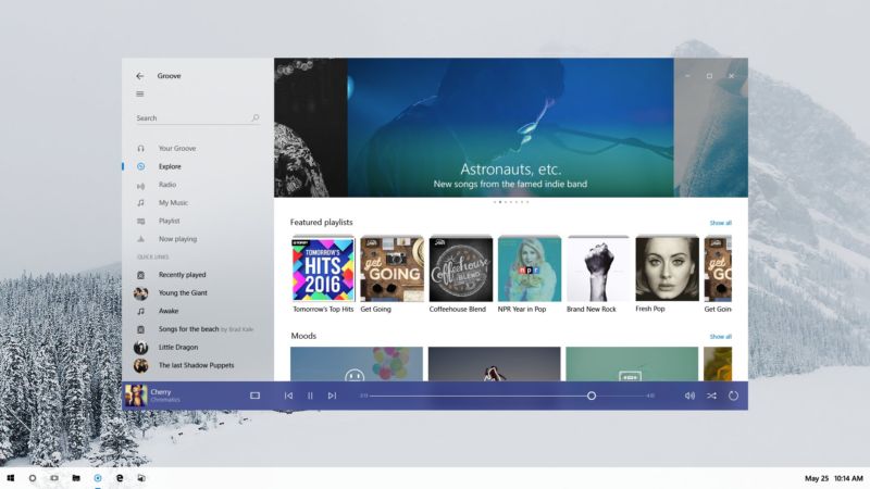
    The preview images are of an app called Groove.
    I have no idea what it currently looks like, so I have no idea what has changed.
    Guess I could start it up, since I have Windows 10, but... meh.

    --
    Slashdot social media options: AIM, ICQ, Yahoo, Jabber and Mobile Text. Why no MySpace?
    1. Re:Groove by darkain · · Score: 1

      Windows Groove? You can find tons of screencaps of it here! http://www.google.com/search?q...

    2. Re:Groove by LordWabbit2 · · Score: 1

      Well thanks for that, did not know there was a media player called groove built into Win10, trying it now.
      To be honest I probably won't use it, wrote my own ages ago, main feature is a fucken delete button, deletes a song from my playlist AND the hard drive with one little click. If I don't like a song I want it GONE! Yes I know you can do that in other players, but not with one little click.

      --
      There are three kinds of falsehood: the first is a 'fib,' the second is a downright lie, and the third is statistics.
  2. Project Neon, huh.... by SeaFox · · Score: 1

    I would think the KDE people would have some sort of trademark on that term for computer interfaces already.

    1. Re: Project Neon, huh.... by zakzor · · Score: 1

      I was looking for a post like this before I made mine. I wander if it was the KDE team that picked up the name after MS? Lawsuit?

  3. Just like MacOS by Anonymous Coward · · Score: 0

    Amazing how it looks just like MacOS with the transparency, etc.

  4. Leak by thegreatbob · · Score: 1

    Leak implies lack of intention for something to come out; did anyone from Microsoft (or anyone that would actually be in a position to know) ever actually declare this to be a leak?

    --
    There is no XUL, only WebExtensions...
  5. No no no NO NO NO NO by the_skywise · · Score: 5, Insightful

    Though visually there are common elements, the system is designed to work across virtual/augmented reality, phones, tablets, desktop PCs, games consoles, using mice, keyboards, motion controllers, voice, gestures, touch, and pen, with the interactivity and input optimized to each particular form factor.

    1000 times NO - you cannot use the same definition language across different input strata. You either end up with a least common denominator of interactivity or you sacrifice one for the utopian goals of the idealogy (That is to say Windows 8 and Metro). Its always a grand idea in theory because you immediately think "It's just buttons and scrolling.. how hard can that be?!". It's not - it's text and selection and finding the items you want vs need vs trying to recall the interface paths to access them plus the needs of the input device you're working with. A VR system isn't going to acommodate the subtleties of a touch screen (though they'll try) and a touch screen drops the finer gesture control of a pen which is simillar (but not the same as) a mouse interface. You need a CUSTOM UI and access strategy per device type that interfaces to the underlying control scheme. That's why the iOS is DIFFERENT than MAC OS and not a one-size fits all strategy like Windows 10 which does NOTHING well (and don't even get me started on that craptacular Xbox One UI)

    1. Re:No no no NO NO NO NO by mikael · · Score: 4, Insightful

      A mouse has two or more buttons that send press and release events, and also sends out motion events. A trackball will do the same, so you can do things like hover over buttons and not press them. A touchscreen will have multiple fingerpress and fingerrelease events. Then these can be combined into gestures like double slide, single slide, two finger zoom, two finger pinch, two finger rotate, two finger translate. These could go up to any number of events, such as the screen swipe with the palm of your hand to capture a screenshot. But there is no concept of hover. Something is either pressed or there is no event. You can add delays and timeouts but that's about all. With VR and AR, you can do gestures like head tilt to move or turn in different directions, various button presses using the headset buttons or stare and select. If you have a VR glove or set of globes, then there are all the hand gestures that could be made. It's easy to map these onto classic mouse events, but hard to have a single event handler for everything.

      --
      Vintage computer adverts: http://www.vintageadbrowser.com/computers-and-software-ads
    2. Re:No no no NO NO NO NO by Anonymous Coward · · Score: 0

      They need it to work across every device, the only tool they have is the hammer known as win32 applications.

    3. Re:No no no NO NO NO NO by the_skywise · · Score: 1
      Sure, you can map the events easily - that's not my point and you're falling into the same trap "it's just buttons and scrolling"

      I can easily the mouse cursor to the tilt of my head on a VR helmet but I wouldn't want to

      Interface schemes have different contexts and, as such, require thoughts of how to display the information to the user for access.

      It's easy for a music player to be "universal" (as in the example here with Groovy) because it's a few buttons and a scroll to control music playing. Now try that with different windows groups - in windows/mac that's bring up the dock bar or key combination to access the group display then select the window group you're interested in displaying. But that's silly with a VR helmet where you can store your windows groups "off screen" and just tilt/rotate your head to see the window group you're interested in seeing - then a "click" to bring it front and center.

    4. Re:No no no NO NO NO NO by Hognoxious · · Score: 4, Funny

      A mouse has two or more buttons

      Old Mac ones didn't.

      This is because the kind of people who own Macs would press the wrong one.

      --
      Confucius say, "Find worm in apple - bad. Find half a worm - worse."
    5. Re:No no no NO NO NO NO by Anubis+IV · · Score: 2

      Indeed, we fundamentally interact differently with a 10-foot UI that's indirectly controlled via a remote than we do with a touchscreen that's directly controlled with our hands. The same goes for traditional computing environments that are indirectly controlled at a distance somewhere in between and VR environments that are...sort of a weird mix of all of those.

      The notion of having a unified "design system" that can span all of them is a nice ideal to have, to be sure, but in practice neither Microsoft nor anyone else has gotten even remotely close to making that breakthrough yet. In much the same way that Microsoft was throwing anything they could think of at the wall to see what would stick with tablets and smartphones back before they were popular, but weren't able to execute until others showed them the way, they're thinking ahead here, but are delivering something that's worse than what we already have. And, as before, I suspect that until someone else figures it out (assuming it even can be figured out), they'll keep throwing UIs at the wall in the vain hope that one of them will stick.

    6. Re: No no no NO NO NO NO by ljw1004 · · Score: 1

      ??? The bit you quoted says 'interactivity optimized to each particular form factor' and you replied with a thousand NOs because that leads to a lowest common denominator of interactivity? What gives?

    7. Re:No no no NO NO NO NO by TechyImmigrant · · Score: 1

      >1000 times NO - you cannot use the same definition language across different input strata.

      Let me fix that for you.

            1000 times NO: You cannot use the same user interface across devices with and without a keyboard.

      If Microsoft did one good thing here, it was to cease calling a visual style a 'language'. You might get with the program by not calling input devices "strata".

      --
      I should use this sig to advertise my book ISBN-13 : 978-1501515132.
    8. Re:No no no NO NO NO NO by Anonymous Coward · · Score: 0

      That honestly wouldn't surprise me if it were true. There are still grown-ass people who can't figure out their left from right; and we expect them to figure out how to use a computer.

    9. Re:No no no NO NO NO NO by chmod+a+x+mojo · · Score: 1

      It's do-able, and you have a wonderful example right in front of you - responsive web pages. It's all one page of HTML / CSS, and JS that displays and acts differently depending on the screen size and inputs available.

      It shouldn't be too excessively difficult to have the OS / application know what it is being displayed on / has inputs available. You still get your custom tailored experience for the device you are using it on, but have one basic codebase that supports all - I.E. the same binary can have one display on a desktop / laptop, a different display that works with VR headsets, and even a third display that works on smaller screen touch tablets / phones ETC... all with the user never knowing that the other interfaces are there when using the device.

      Weather MS will do this in a sane way is another matter entirely to mull over, the track record doesn't look so well for them. But it isn't some monumental impossible task like you make it out to be.

      --
      To err is human; effective mayhem requires the root password!
    10. Re:No no no NO NO NO NO by Anonymous Coward · · Score: 0

      Hey, you leave Only One Kenobi alone!

    11. Re:No no no NO NO NO NO by peragrin · · Score: 1

      To be fair most people don't realize a second mouse button can do things.

      I won't even get started on basic keyboard commands like ctl-c

      --
      i thought once I was found, but it was only a dream.
    12. Re:No no no NO NO NO NO by ausekilis · · Score: 1

      The next logical step was leaked by The Onion. The MacBook wheel is the epitome of user interface. Nothing else comes close.

    13. Re:No no no NO NO NO NO by JohnFen · · Score: 1

      It's do-able, and you have a wonderful example right in front of you - responsive web pages.

      I would argue that responsive web pages demonstrate how flawed such approaches are. Responsive web design simply blows, and breaks all kinds of use cases for me. I hate it with a passion.

      It may be doable, but I can't see how it could be done and have not seen any examples of anyone successfully pulling it off.

    14. Re:No no no NO NO NO NO by TangoMargarine · · Score: 1

      But there is no concept of hover.

      I suppose you could repurpose long-press as "hover" but then you lose "right-click."

      --
      Unity? Screw that: XFCE. Slashdot Beta? Screw that: SoylentNews. Australis? Screw that: Pale Moon. UX developers DIAF
    15. Re:No no no NO NO NO NO by mcswell · · Score: 1

      Your *other* left!!!

  6. This is VERY frequent by evolutionary · · Score: 3, Informative

    Okay M$, increasing the frequencies of your "news" articles will not distract anyone from the fact that Windows 10 is a spyware "OS" with features that actually work AGAINST the user. I'm starting to think that MS is spending more time doing PR for this POS OS than development.

    --
    "Imagination is more important than knowledge" - Einstein
    1. Re:This is VERY frequent by Opportunist · · Score: 3, Interesting

      This whole stuff reminds me more and more of one of those Soviet speakers who keeps talking about the successes of Communism and how glorious our athletes, our space stations and our heavy industry is while the average worker wonders when he might get some butter and toilet paper.

      --
      We used to have a Bill of Rights. Now, with the rights gone, all we have left is the bill.
    2. Re:This is VERY frequent by mcswell · · Score: 1

      Q: Soviet Union is most progressive country in world, pravda?
      A: Of course! Life was already better yesterday than it's going to be tomorrow!

      (courtesy of https://en.wikipedia.org/wiki/...)

    3. Re:This is VERY frequent by Opportunist · · Score: 1

      Pravda... the newspaper where you can read pearls like this one:

      "In a comparison between the economies of the USA and the USSR, the USSR came in on a respectable second place while the USA could only muster the economic power to come in second to last".

      --
      We used to have a Bill of Rights. Now, with the rights gone, all we have left is the bill.
    4. Re:This is VERY frequent by mcswell · · Score: 1

      Privyet, tovarish!

  7. They left out one "fundamental" by ZecretZquirrel · · Score: 1

    "advertisement"

  8. Whatever by Opportunist · · Score: 5, Insightful

    Can we get an update where we get to decide when to reboot our machines and what info to send to Redmond? Just 'cause you paint the turd in flashy colors doesn't make it smell better.

    --
    We used to have a Bill of Rights. Now, with the rights gone, all we have left is the bill.
    1. Re: Whatever by Anonymous Coward · · Score: 0

      It also doesn't make the necrosis from a SPIDER BITE ON YOUR DICK hurt any less!

    2. Re:Whatever by Anonymous Coward · · Score: 0

      You have been able to schedule patching restarts for years. You can also decide which data gets sent to Microsoft. I assume you probably cannot disable some telemetry, which sucks, but you may want to reconsider how you define a flashy turd if those are your top two criteria.

    3. Re: Whatever by Anonymous Coward · · Score: 0

      It may hurt, but it's fuckin' pretty. The colors, man, the colors!

    4. Re:Whatever by wjcofkc · · Score: 1

      An update? They decide for me all the time when I can reboot. Sometimes more than once a day. It's... umm... umm (drinks Kool-Aid) Great!

      --
      Brought to you by Carl's Junior.
    5. Re: Whatever by Opportunist · · Score: 1

      Are you talking about the spider bite now or using Win10?

      --
      We used to have a Bill of Rights. Now, with the rights gone, all we have left is the bill.
    6. Re: Whatever by Anonymous Coward · · Score: 0

      Yes.

  9. More like "effluent" by OrangeTide · · Score: 4, Funny

    Nearly all design languages that are pushed out through a marketing department as a form of PR is a lot of ego stroking crap.

    The most apt name for this new crap is: The Microsoft Effluent Design System

    --
    “Common sense is not so common.” — Voltaire
    1. Re:More like "effluent" by MonteCarloMethod · · Score: 1

      I can't wait to be off my MEDS.

  10. What if they gave a war by Anonymous Coward · · Score: 0

    and no one showed up?

  11. A stroke of genius by Anonymous Coward · · Score: 0

    The Windows Subsystem for Linux basically excludes Linux. Better names could be:
    - The Linux subsystem on Windows
    - GNU/Windows

    I love it! It's really the best of both worlds: the power, robustness, and beauty of professionally developed Windows, and the creativity of open source hobbyists and artists.

    I have switched and dumped old-school "Linux". I recommend everyone does the same.

    1. Re: A stroke of genius by Anonymous Coward · · Score: 0

      Please keep your retarded ideas to yourself. Some of us need a non Hello-Kitty OS for serious, well paid, work.

  12. windows schwindows by Anonymous Coward · · Score: 0

    I do not want anyone to tell me how my UI should look. Some recent attempts to "improve" UI do not work for me. Fonts, colors, contrast, etc should be customizable. KDE is very good at allowing me to customize to my preference.
    What may work perfectly for a teenager may not work well for my old eyes, and I do not appreciate any "improvements" that does not allow me to change it back to whatever the fuck I want.
    Windows 10 is unusually awful. Low contrast, small size icons, etc all that should be up to me.
    You GUI designers, stock fucking around.

    1. Re:windows schwindows by Anonymous Coward · · Score: 0

      "... The new UI scheme is incredibly bland and lacks any contrast or color. Years of admiring the interface and being used it blown away by someones idea of progress. Did SW give us an option, “No”, they crammed it down our throats. Everyday I think about going back to 2015. Has the company behind SolidWorks finally become so big that they will now be like all the other big companies out there. “We know whats best and you better like it”. I think the response to all the negative feedback will soon tell us. Notice, not a word from the source so far...."

      http://blogs.solidworks.com/tech/2015/09/solidworks-2016-whats-new-user-interface-sw2016.html

    2. Re:windows schwindows by mcswell · · Score: 1

      Agreed. Already I can't tell when a Microsoft Office app has focus; it looks like in this New World editor, I won't be able to tell when *any* app has focus.

      I did manage to change the awful Win10 color scheme a bit, but no matter what I do, the default button in dialogs (usually the OK button) comes out with a washed out blue font on a slightly more washed out blue background. I have to guess which button does what.

  13. Paint the turd. by Anonymous Coward · · Score: 4, Insightful

    Shiney new shit all over the shop, but File Explorer STILL cannot handle the files with long paths *that it itself creates*.

    It has had this problem for over a DECADE FFS !

    Fix the broken windows. Then polish them !

    Captcha: "systemic" as in "bugs"

    1. Re:Paint the turd. by avandesande · · Score: 1

      Also no way to render complete path on network mounted drives
      also search results often don't allow propagate new window
      FN crap!

      --
      love is just extroverted narcissism
  14. More flat design crap by Anonymous Coward · · Score: 1

    I miss the days when buttons and text/pictures looked different.

    1. Re:More flat design crap by Anonymous Coward · · Score: 0

      I used to use right click to get a context menu.

    2. Re:More flat design crap by Tablizer · · Score: 1

      And they all use the same restroom ;-)

      Seriously, you'd think they let you have a choice: flat, flat with transparency, Windows3.1 look, Windows95 look, Windows ME look, Jewels, etc.

      I remember XP, I think, I had some choices.

    3. Re:More flat design crap by TangoMargarine · · Score: 1

      People picking other themes than The New Hotness makes them look bad, so obviously it had to go.

      --
      Unity? Screw that: XFCE. Slashdot Beta? Screw that: SoylentNews. Australis? Screw that: Pale Moon. UX developers DIAF
  15. Responsive Web as the Desktop UI by Anonymous Coward · · Score: 1

    The title says it. I skimmed through the articles and the new desktop UI is basically all the horrible web UI trends. I don't want content adjusting itself as I scroll. My keyboard has Home and End buttons. If I want to see the stop of the 'page' its one button press away. Stop wasting my screen space for your company logo or for a profile picture of me. WTF do I need to stare at myself so often? I'm ugly. Put a custom media feed there so I can watch IT porn 24x7, something like a CPU gauge, or better yet cut that shit out so I don't have to scroll past it to get to what I actually wanted.

    I can't wait until the UI fads swing back into the productive UIs. Look at those window control buttons, they are far from the window edges. No more shoot your mouse to a corner. And they're on top of active content, so if you miss it'll trigger the media underneath. "Borderless" was supposed to refer to societies, not windows. I hate trying to resize windows with thin or non-existent borders and I'm not even old yet. Thank God for the Linux's resize shortcuts.

    While I'm whining about Windows, I'll be fair and whine about Slashdot too. Why is the Preview button a button and the Cancel 'button' a link? WTF?

    1. Re:Responsive Web as the Desktop UI by JohnFen · · Score: 1

      Look at those window control buttons, they are far from the window edges. No more shoot your mouse to a corner. And they're on top of active content, so if you miss it'll trigger the media underneath. "Borderless" was supposed to refer to societies, not windows. I hate trying to resize windows with thin or non-existent borders and I'm not even old yet.

      Yes! Especially that "borderless" nonsense. Of all the copious bad UI fads in play right now, that has to be one of the absolute worst.

    2. Re:Responsive Web as the Desktop UI by TangoMargarine · · Score: 1

      I don't want content adjusting itself as I scroll. My keyboard has Home and End buttons. If I want to see the stop of the 'page'

      Silly user, finite pages are so 1998. Now we have pages that load in more crap as you scroll.

      You should check out this page (not the article itself; it's depressing as fuck). It's like Medium cranked up to 11:

      The header covers the entire screen, is an autoplaying video for no reason, and when you scroll down it fades into a picture and "sticks" for a couple scrolls until you can get past that.
      Then you scroll past that and it's the standard column of too-large fontsize text that only takes up the middle third of the screen with huge white stripes on the side.
      Then you find out later that horrid header thing is repeated for each of the seven or so mid-article chapter headings.

      --
      Unity? Screw that: XFCE. Slashdot Beta? Screw that: SoylentNews. Australis? Screw that: Pale Moon. UX developers DIAF
    3. Re:Responsive Web as the Desktop UI by TangoMargarine · · Score: 1

      I hate trying to resize windows with thin or non-existent borders and I'm not even old yet. Thank God for the Linux's resize shortcuts.

      I don't know why Linux DEs have such a hard time with window borders and their damn single-pixel-across resize sweet spot. That's one thing Windows at least does right--the resize "grab range" is like 5-10 pixels across.

      XFCE at least makes up for it with Alt+right click and drag anywhere in the window to resize. Not very discoverable though.

      --
      Unity? Screw that: XFCE. Slashdot Beta? Screw that: SoylentNews. Australis? Screw that: Pale Moon. UX developers DIAF
    4. Re: Responsive Web as the Desktop UI by Brockmire · · Score: 1

      This is probably my biggest annoyance with Linux and frustrates me to no end. Whereas in Windows, I've liked their snap and window improvements and I rarely have the same keyboard/mouse throwing tantrums as I run into frequently with Linux. Fucking adjusting windows over VNC is the worst.

    5. Re: Responsive Web as the Desktop UI by TangoMargarine · · Score: 1

      To be fair, Linux DEs had snap-to-edge for several years before Windows 7 came out. But yeah.

      This situation requires both that A) DE developers limit drag sensitivity to pixel-perfect for some reason, and B) theme designers wanting the smallest possible border on all their windows (well, technically you can run entirely without a border but whatever). Back before Unity I knew how to tweak the Ubuntu/Compiz/whatever themes to fatten up the borders, but after GNOME got flushed, doing that in XFCE would've required digging into text files IIRC.

      Windows 7 was the platonic ideal of Windows. After that it's just been an accelerating downhill slope.

      --
      Unity? Screw that: XFCE. Slashdot Beta? Screw that: SoylentNews. Australis? Screw that: Pale Moon. UX developers DIAF
    6. Re: Responsive Web as the Desktop UI by TangoMargarine · · Score: 1

      Relatedly, the number of times I've been trying to resize a window and accidentally went two pixels too far to the southwest and closed the program (since it didn't have an exit sanity check) over the last couple years is a bit embarrassing. Mostly VLC and Chromium.

      --
      Unity? Screw that: XFCE. Slashdot Beta? Screw that: SoylentNews. Australis? Screw that: Pale Moon. UX developers DIAF
    7. Re:Responsive Web as the Desktop UI by mcswell · · Score: 1

      One word: Amen!

  16. Deep inside Redmond by Imazalil · · Score: 3, Insightful

    mid-level manager 1: I love what google is doing with this material design, they cribbed some of our metro stuff but took it to a whole new level.

    mid-level manager 2: true dat, but I prefer the soft and smooth translucency Apple has in iOS and macOS.

    mid-level manager 1: hmmm...

    mid-level manager 2: hmmmm...

    mid-level manager 3: why not both?!

    mid-level manager 1: but won't we be accused of just copying their stuff?

    mid-level manager 2: just throw in some bull about holo-lens and synergy, and everyone will be distracted thinking about drawing dongs in 3d.

    mid-level manager 1: genius!

  17. Conflicted by Sloppy · · Score: 1

    When I read what they're trying to do, I like it. I am not one of those people who thinks handhelds and desktops must necessarily have different UIs. (I'm not saying I have the answers, just that I think answers exist, for solving the same problem in two places.)

    Then I look at the screenshots, and "eww." But whatever. Maybe I just don't get it. And also, it's Microsoft, so fuck them.

    Yet I think it's a good and reasonable goal, and some day, someone will succeed at it.

    --
    As copyright owner of this comment, I authorize everyone to defeat any technological measure which limits access to it.
    1. Re:Conflicted by iampiti · · Score: 1

      I do believe is very hard to make an UI that works equally well in both paradigms. Well, you can certainly just use a touch optimized UI on a desktop but it's not nearly as good as one designed specifically for mouse. You get UIs which have tons of whitespace and huge targets and thus waste lots of real state.

    2. Re:Conflicted by JohnFen · · Score: 1

      (I'm not saying I have the answers, just that I think answers exist, for solving the same problem in two places.)

      But they are not solving the same problem in two places, except at a uselessly high level of abstraction. The different environments have very different constraints that involve very different engineering tradeoffs.

      To say that you can build one UI to rule them all is like saying that it's possible to built a single sort of vehicle that can work well in all environments. It's simply not plausible. It's not even possible to build a single vehicle that works great on all types of roads, let alone also fly, travel on or under water, and travel through space.

  18. dpi scaling by Anonymous Coward · · Score: 0

    imagine the disaster for DPI scaling. Oh wait, that's Windows 10 with an external monitor, so not something new...

  19. I'd rather not have a new "look & feel" by Snotnose · · Score: 1

    Been using Windows since 3.1, still haven't gotten used to ribbons (where dafuq did the option I want that used to be here go?). Metro was a huge disaster. Not feeling chippy about a new look and feel for something I spend 10+ hours a day (work & home) working with.

    1. Re:I'd rather not have a new "look & feel" by JohnFen · · Score: 2

      Agreed. While I'm very well used to the ribbon, that doesn't make it suck any less at all.

      And it looks like Microsoft is doubling down on a few of the worst aspects of the Win 10 look and feel. It's like they're going out of their way to make the UI as annoying and difficult to use as possible.

    2. Re:I'd rather not have a new "look & feel" by Anonymous Coward · · Score: 0

      Their whole operating system is annoying. It's now got to the point that, if it weren't for work, I'd get rid of it alltogether.

      I don't want *any* flashing, moving, fancy UI crap. I do not want to use *any* Microsoft apps becuase they're all inferior or annoying.

      Give me a working file system, a task scheduler, a start menu (or at least press "Ctrl+R", "type program name", hit enter to run it functionality) Then give me control over which servicess/progams are allowed to run in the background and that's all I want from an OS. I've got a favourite browser, music player, video player, office suite etc. and none of them are Microsoft products. So let me remove *ALL* programs/services etc. that I don't want, let me turn off all animations and leave me alone.

      A computer is supposed to be a tool not a Fisher Price activity centre/baby sitter.

    3. Re:I'd rather not have a new "look & feel" by Anonymous Coward · · Score: 0

      Microsoft introduced ribbons a decade ago. Maybe computing isn't your thing.

    4. Re:I'd rather not have a new "look & feel" by JohnFen · · Score: 1

      Or maybe he just has a low tolerance for terrible UI elements.

    5. Re:I'd rather not have a new "look & feel" by TangoMargarine · · Score: 1

      If you want to write software that attempts to read my mind, at least give me the option to turn that feature OFF and do it manually.

      Imagine trying to use Swype on a phone without it giving you the list of possible completions.

      --
      Unity? Screw that: XFCE. Slashdot Beta? Screw that: SoylentNews. Australis? Screw that: Pale Moon. UX developers DIAF
    6. Re:I'd rather not have a new "look & feel" by mcswell · · Score: 1

      I've been using computers for fifty years. I've seen many good things come in that time. The Ribbon was not one of them.

  20. Microsoft Effluent by Anonymous Coward · · Score: 0

    Well named.

    Effluent :(noun) Liquid waste or sewage discharge...

  21. Disposable Toy by Anonymous Coward · · Score: 0

    It's looking more like a disposable toy than anything. We're gonna start seeing Microsoft's answer to the Chromebook (Surfacebook? Neonbook?) ship this UI, and it'll be similarly useless. These UIs are for consumers, not for builders, makers, tinkerers, or hackers. It's not a serious UI and won't bring anything legitimately new or innovative to the table. It's being peddled as new and amazing merely to gather consumer attention.

    Unfortunately hackers and programmers aren't perceived as legitimate users, so our needs are never listened to unless another hacker makes one.

  22. Star Trek Did It by FrankHaynes · · Score: 1

    Star Trek: The Next Generation did something like this. The same UI on the bridge displays, the stellar cartography big-as-a-room display, the shuttlecraft, the medical displays. I think later models of the tricorder even approximated the same layout.

    Why don't they mimic that??

    --
    slashdot: A failed experiment.
    1. Re:Star Trek Did It by Anonymous Coward · · Score: 1

      Because the Star Trek UI is crap. Lots of header and footer tiles that don't do anything, and everything has incomprehensible serial numbers. There was an episode where Picard is trapped in the turbolift with a bunch of kids and the manual door release involved a panel with five buttons on it, all with random serial numbers. The door release code was something like button 2, followed by button 4 twice. It was insane.

      The manual steering control was literally a four way D-pad drawn on a touch screen. Just like Nintendo Entertainment System. Even for the space shuttle we had joysticks with analog inputs for reaction control.

    2. Re:Star Trek Did It by Voyager529 · · Score: 1

      Star Trek: The Next Generation did something like this. The same UI on the bridge displays, the stellar cartography big-as-a-room display, the shuttlecraft, the medical displays. I think later models of the tricorder even approximated the same layout.

      Why don't they mimic that??

      LCARS is what you're thinking about. It looks pretty in episodes of Star Trek, but think it through its real-world implications. Tricorders store massive amounts of data, but they show it on a screen the size of the Apple Watch; the rest are input keys. No one interacts with the displays; it's either input or output, minimizing the utility of the space that does exist. Stellar cartography uses the same styling, but they have a massive screen (that no one directly interacts with a la Minority Report) which is controlled by a console several feet away - basically, a keyboard and a projector, but prettier. It made for great exposition scenes, but it's not like they managed to run circles over Powerpoint.

      Also, CBS is super litigious regarding the use of LCARS in actual computer usage, so even attempting to use it in a desktop or mobile program is basically asking for a C&D letter.

    3. Re:Star Trek Did It by Parker+Lewis · · Score: 1

      Lots of header and footer tiles that don't do anything

      Did you mean, Gnome?

    4. Re:Star Trek Did It by TangoMargarine · · Score: 1

      Star Trek has a weird notion of what "manual" means. There was a scene in First Contact where they had to enable the manual release for a door.

      The whole point of being manual is that you don't need to enable it if the automation fails! It still just works!

      --
      Unity? Screw that: XFCE. Slashdot Beta? Screw that: SoylentNews. Australis? Screw that: Pale Moon. UX developers DIAF
  23. faugh by Anonymous Coward · · Score: 0

    Transparency and animation? Try that through RDC through VPN. It sucks.

  24. From the UX designers who brought you by Anonymous Coward · · Score: 0

    This http://slapthebaldy.com/comics/7.html

    1. Re: From the UX designers who brought you by Anonymous Coward · · Score: 0

      I think that guy worked on windows 8

    2. Re: From the UX designers who brought you by Anonymous Coward · · Score: 0

      I think that guy worked on windows 8

      and obviously Google maps

  25. Yaaaaaaaay by roc97007 · · Score: 1

    Aero is baaaaaaackkk

    --
    Oliver's law of assumed responsibility: If you're seen fixing it, you will be blamed for breaking it.
  26. UI Approach by n329619 · · Score: 2

    The most optimized way to create a UI that works on all the different input devices is by using an always random well placed UI.

    It'll ensure that the users will always be highly interactive as they literally have to search the right buttons everywhere every time and avoid muscle memories.

    Also, remember to switch the "OK" and "Cancel" UI every other times. This will greatly stimulate the user's emotion.

    For the best results, swap the UI functions opposite to the UI, like "Cancel" is actually "Submit" and "Close" means "Restart and Upgrade". Oh wait...

  27. Meh by Anonymous Coward · · Score: 0

    In other words, nothing i would care about.
    Even though im running Windows 10, i fucked the Metro app system up the ass, so Metro apps just crash at startup now. Just the way i like it.
    Its a perfectly usable OS once you reach deep into it and cut the correct wires, no more Security Center, no more Always-On Anti-Malware bullshit, no more OneDrive crap. Ahhh, its so nice and quiet now.

    Captcha: excise
    How fitting :p

  28. So basically MS just copied iTunes UX by zifn4b · · Score: 1

    Microsoft copies Apple. Facebook copies Snapchat. I guess it's the year of copying other people's success instead of innovating.

    --
    We'll make great pets
    1. Re:So basically MS just copied iTunes UX by TangoMargarine · · Score: 1

      "The" year? Microsoft has been doing that for decades.

      --
      Unity? Screw that: XFCE. Slashdot Beta? Screw that: SoylentNews. Australis? Screw that: Pale Moon. UX developers DIAF
  29. What for? by jbmartin6 · · Score: 4, Insightful

    "elements of translucency and animation"....I hate it already. For a while there, it looked like MS was starting to understand that people use applications, not the OS. The only goal of the OS is to make it easy to use applications and stay out of the way otherwise. They sort of got the hint with the Vista fiasco. Looks like everyone who got it has retired and the latest shiny thing crowd is back in the saddle.

    --
    This posting is provided 'AS IS' without warranty of any kind, implied or otherwise.
  30. More .NET fail by sproketboy · · Score: 1

    More .NET fail as this will be unavailable with WPF.

  31. User choice by iampiti · · Score: 1

    I wouldn't care about they constantly altering the UI language if there was an option to get a "classic" grey Windows UI (think Windows 2000 or XP or 7 in classic mode). But it seems letting the user choose is too dangerous or bad for Microsoft

  32. KDE Neon by Anonymous Coward · · Score: 0

    The word Neon was first used by Linux, KDE Neon.
    The Windows Gear Icon was first used with KDE.

  33. Ugh. More minimalism. Let it die. by Anonymous Coward · · Score: 0

    Minimalism had some good points. But they long ago crossed the threshold into *lower* usability.

    Get the annoying fashion weenies out of the room and get some actual usability people on the payroll. This is fail.

  34. and others by DrYak · · Score: 1

    Amazing how it looks just like MacOS with the transparency, etc.

    ...and just like Jolla's Sailfish OS' "silica" style, for the past nearly 4 years.
    ...and also just like KDE's own style for the past naerly 10 years, as visible on their own "Neon" project demo CD. (Though that's for the general transparency effects getting popular in style. for the combo with "flat"-looking surface, these appeared more recently with the KDE Plasma 5 around 3 years ago)

    Well by now this type of style is really old news.
    Which is probably why Microsoft is introducing it now.

    --
    "Sufficiently advanced satire is indistinguishable from reality." - [Tips: 1DrYakQDKCQ6y52z6QbnkxHXAocMZJE61o ]