 Slashdot Mirror
Domain: edwardtufte.com
Stories and comments across the archive that link to edwardtufte.com.
Comments · 212
-
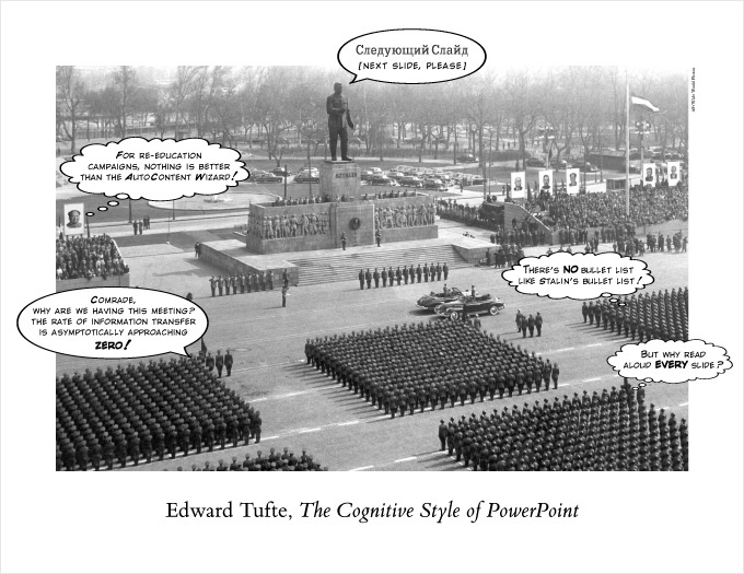
Tufte on PowerPoint
"Power Corrupts. PowerPoint Corrupts Absolutely."
Though I'm sure I won't be last to reference this, Yale's professor emeritus Edward Tufte has been writing about PowerPoint for a while. This piece in Wired helps explain how the cognative processes encouraged by PP presentations are subtly (and not-so-subtly) corrupting the way we perceive data. And you can purchase his whole essay here.
Whether or not you agree with all of Tufte's work, he is among the seminal thinkers about how we disseminate information. And having sat through too many years worth of PP presentations, I think he's dead right about this. I fact, I do my presentations from notes, using nothing more than dry-erase markers and a whiteboard. It never fails to impart an order of magnitude more information than a static bullet-point presentation ever could. -
Sounds like the PowerPoint Method to me.
Color me skeptical, but I find it hard to believe that complex issues can be reduced to a simple 2x2 matrix. My initial impression is such a method will do nothing than promote false dichotomies to the detriment of real analysis.
It does, however, sound like the ideal method to present choices in PowerPoint.
That's not a compliment, just so we're clear. -
Cute, aside from the chartjunk
Of course, "chartjunk" as defined Edward Tufte. Apparently, the deriviations and timeframes of the various languages wasn't interesting enough by themselves.
-
A heretical notionI checked out the site pretty thoroughly and it looks like professionals aren't going to jump on this bandwagon.
As Edward Tufte points out in The Visual Display of Quantitative Information, Envisioning Information, and Visual Explanations, the meaningful display of information is about removing visual clutter, not introducing it.
Just as a PowerPoint presentation doesn't really increase our ability to grok the quarterly sales figures, the visual fluff of metaphorical buildings and busses doesn't help us understand traffic data. Simple bar graphs do not introduce the distortion of perspective. They're not sexy, but they do not make it more difficult to discern relationships between data elements, the way a 3d urban representation does.
I'm also reminded of good old Microsoft Bob, and some of the more antiquated websites from the 1990s that forced a metaphor onto something that didn't need one in the first place. Back in those days, Web designers felt that people wanted an "experience" when what they really wanted was an attractive and clean interface to information, organized in a way that would be useful.
Professional web developers and marketers (I know, they're all stupid, they all want dumbed-down visual information, blah blah blah) need information they can drill down into quickly and easily without a lot of superflous distraction. There are already several good tools, like Summary and FunnelWeb, on the market. I don't think this experiment will make it in an already saturated market.
-
Re:Missing the point?
Did someone just discover that data can be graphed? What is the innovation here?
As Tufte can tell you, how the data is graphed is important. (Among other things, had certain engineers graphed the data they already had properly, then January 28th might not be a day we remember with sorrow.) -
Re:How about a little consistency...
The author should read this.
-
Every other graph rotated
Did anyone else notice that the orientation of each graph was different than the preceding one? Was this done to deliberately make it harder to compare results?
I can't see what possible motivation there was in this decision. I'm also having a hard time imagining how much more WORK it was to arrange the graphs so.
I think that he could use a refresher with Edward Tufte's The Visual Display of Quantitative Information-- quite possibly the best book on graph theory every written. -
Bad graphs
I wish he'd make his mind up on whether to put his bars horizontal or vertical - I'm getting a seriously cricked neck.
And then a couple of 3d ones, just for fun. Sheesh.
He should read some of Edward Tufte's stuff. -
Re:Pie Charts???
Exactly. The pie chart makes it wasy to determine the relative scale of one result to the others, but makes it impossible to determine which result is which. My thought was "what's wrong with a simple table of results?"
The very excellent Edward Tufte has a lot to say about presenting data. -
Re:The cyberspatial compass
Isn't that diagram a scan from Edward R. Tufte's "The Visual Display of Quantitative Information"
-
"Powerpoint Mastery"
Since using spreadsheets is often only one step away from PowerPoint mastery.
Erm
Yes, I know it was discussed here before (as I guess), but still - it is worth a mention.
CC. -
Re:In related new
Yes, the fact that the dialogs don't follow an established STANDARD does hurt the usability, but I don't think that they are BAD.
Yes, that is pretty much the definition of a bad GUI program.Some of the most usable UIs don't conform to an established standard. For example, there are shopping cart apps that can be used by people who've never used a computer before, yet they don't get in the way of the expert user much either. Some custom-designed kiosk systems serve their purposes very well without following any standard other than "touch me".
Apple and Microsoft seem to throw out their own guidelines whenever they feel the need to "innovate". There's no hope of improving usability if no one's allowed to experiment.
Check out Alan Cooper's books if you want some solid reasoning behind this (better than I could give you). Edward Tufte is also a classic.
-
Go With Tufte Re:My Gift list
Pick any book by Edward Tufte at EdwardTufte.com and you'll make your geek happy with something that's interesting to read and beautiful to look at. Who knew the visual display of data could be so gripping?
-
$200,000
If you look through Tufte's website you can find the page on his sculpture where evidently you can buy an instance of one of his pieces online for only $200K. Yup, you can "add it to shopping cart" and then type in your credit card number and buy the thing. I somehow doubt my credit card company would appreciate my attempting it though.
-
Here's the full story:
All the comments I've seen missed the full story. Look at a GIF image of the original Boeing PowerPoint slide and analysis (GIF, 130 kB) to see why NASA did not understand the danger of high-velocity damage to the heat tiles. If the slide is Slashdotted, the text of the slide is shown at the bottom of this comment, imperfectly formatted.
The Columbia Accident Investigation Board said, "... it is easy to understand how a senior manager might read this PowerPoint slide and not realize that it addresses a life-threatening situation."
The analysis of the Boeing slide was taken from Edward Tufte's pamphlet The Cognitive Style of PowerPoint which was excerpted on page 191 of the CAIB report (PDF, 10 MB) (or page 15 of Chapter 7 (PDF, 0.5 MB)).
Tufte suggested that a more appropriate title would be "Review of Test Data Indicates Irrelevance of Two Models."
Check out this humorous HTML page of a PowerPoint presentation of Tufte's book: PowerPoint Remix.
Text of Boeing PowerPoint Slide
The existing SOFI on tile test data used to create Crater was reviewed along with STS-107 Southwest Research data- Crater over-predicted penetration of tile coating significantly
- Initial penetration to described by normal velocity
-- Varies with volume/mass of projectile(e.g., 200ft/sec for3cu. In) - Significant energy is required for the softer SOFI particle to penetrate the relatively hard tile coating
-- Test results do show that it is possible at sufficient mass and velocity - Conversely, once tile is penetrated SOFI can cause significant damage
-- Minor variations in total energy (above penetration level) can cause significant tile damage
- Initial penetration to described by normal velocity
Flight condition is significantly outside of test database
-- Volume of ramp is 1920cu in vs 3 cu in for test - Crater over-predicted penetration of tile coating significantly
-
Re:n-e-w-s ?
I should have mentioned that the work described above seems to be that of Dr. Seth Powsner along with Dr. Tufte. I presume that Powsner was one of Tufte's students. In any case, there's much more information about the graphical chart in Powsner and Tufte's paper, including a picture of the same chart I was looking at above.
Powsner and Tufte have another paper with a chart design that's tailored for psychiatric patients. There's less space devoted to graphs, and more space for background, notes, and other textual data. -
Tufte poster
We have this poster from Tufte posted outside some of the conference rooms at work.
-
Re:Criticality One Failures
The problem with NASA is that as reports were sent higher up the managerial chain, they were dumbed down. Presentations were stripped of crucial data, replaced with interpretations of the severity (and poor interpretations at that!).
I've had the benefit of going to Edward Tufte's "Presenting Data and Information" seminar, and he makes a point of reviewing the shuttle disaster's pre-failure reports (Challenger and Columbia). The quality of the presentations given to the higher-ups is appalling, especially since you know somewhere there is an engineer at NASA who's life will forever be weighed down with the thought that he/she could have prevented the disaster.
For those interested, his (Tufte's) essay "The Cognitive Style of Powerpoint" profiles the Columbia disaster, and Challenger is featured in "Visual Explanations". -
Cheap and flashy graphics
I'll ignore for the moment the question of the quality of their data. I'm sure others will endlessly debate it (and I'll probably join in). Let's look at something else: The quality of their presentation.
First, let's take a look at the most recent Netcraft server survey. Let's see, clean display. The scale grid is subtle and doesn't draw attention to itself, but makes it easy to see exactly where a line falls. There is little wasted pixel data. It's easy to see trends and make comparisons. For the curious the exact numbers for the last two samples is listed (regrettably one two samples are listed). The graph labels the data it shows ("Market Share for Top Servers Across All Domains August 1995 - November 2003") leaving the reader to form his own opinions. On the down side, the scale confusingly marks 7% increments and the yellow line for Netscape/SunOne almost disappears into the background. Still, a well above average for graph. Definately room to improve, but better than most people expect to see.
Now let's example the Port80 server survey. Wow, what a difference. The grid is a much more dominant element. The 3d effect means that bars further in the back appear taller (by up to 15 pixels, or about 7%) and makes it hard to compare a specific data point against the scale. The complexity of the 3d bars complicates things, the "top" of the bar is actually larger than the month to month shift in the numbers. The "area" of the bars implies size (intellectually you know it isn't, but your gut says otherwise), this means that the largely obscured middle bars (Netscape and Apache) seem smaller. Ultimately bars are the wrong choice, we're examining points over time (suggesting a line chart), not clusters of data. The chart is labeled with a conclusion ("Microsoft IIS Maintains Dominance Of the Corporate Web Server Market"), suggesting interpretations to the reader. On the up side, they provide heavily broken up information for the most recent sample point (regrettably it's a graphic). They include a worthless pie chart. If you want to show market share a line chart showing historical data would be much more enlightening.
Conclusion? Port80's graphs suck. Hard. It's a stunning example of how not to create high quality graphs. The creators need to be beaten with copies of Tufte's information display books until they get it. This is the sort of amateur crap I expect on PowerPoint slides from people more interested in being cool than being useful, or perhaps from the graphics department at USA Today. As an engineer I'm disappointed.
-
Re:Window metaphor considered harmfulI think you're mixing two different things. MS's virus problems stem from the notion that documents should contain executable code, not from a document-centric computing metaphor.
To more closely model the real world, we should be able to simply open a document and have its application boot up to handle it. I shouldn't have to care what app I need to get my job done. The difficulty for software designers is that we still haven't developed a good way of handling this kind of functionality--Symphony and Framework being early, failed attempts.
What I'd like to see are different work organization systems (scroll to the third message) realized as software implementations, which we could then pick and choose from as our needs and personalities require.
-
Edward Tufte Award
The website deserves a Tufte award for Excellence in the presentation of visual information. Very impressive effort!
Though, no, such an award does not yet exist. -
Re:Great Theories-- but not for Everyone
...Tufte with his "man, these things suck compared to paper" defeatism.
Probably a fair assessment.
I was struck by the fact that his Anti-PowerPoint book didn't really discuss what you should do, it mostly harped on what not to do. After a bit it dawned on me what I should be doing (That is, the exact things my high-school public speaking teacher was saying), but the lack of any real direction on how to move forward was surprising. All the more surprising given that he is widely praised as an excellent speaker. He does come across as a bit defeatist. Fair enough. Still, his work is strong enough that it's a valuable read for everyone, and defeatist attitudes aside, much of what he says applies to computer screens as well.
-
Re:Great Theories-- but not for Everyone
But when you actually try to adapt anything he does, one quickly find out that most of his examples of visualizing repetitive data are predicating on using high-resoltuion output -- like paper.
True enough. Tufte discusses this a bit more in his book The Cognitive Style of PowerPoint . (It's summarized online in "PowerPoint is Evil".)
One of his points? Modern computer screens suck. The human eye is capable of distinguishing fairly high resolution data. He does have a bit of a fuzzy spot when thinking about modern computer displays. Fortunately there is still lots of need to make high quality displays of information on paper. And as he points out in PowerPoint, if the screen sucks, put it on a handout so people can appreciate the real thing.
-
Re:A Vey Useful Book
Just like, uh, get a few sentances, put bullets next to them and *BAM*, you have a presentation for everybody. Just add some swirlin graphics and some sound, and the information really stands out. To boot, since you can spend less than a minute per slide, make like a 100 of them, and then, here's the kicker, make your audience print the whole damn thing! That way they don't have to take notes or think even.
An excellent summary. I recently read Tufte's book The Cognitive Style of PowerPoint (His online article, "PowerPoint is Evil" summarizes the book quite well). It's a good book and forced me to rethink how I do presentations. As Tufte says, PowerPoint is a fine slideshow program, but lining up your thoughts into slide after slide of bullet points leads to uninspired, hard to understand talks.
While discussing it with a coworker, he pointed out something Tufte only briefly touches on. Sure, the rampant abuse of PowerPoint makes life less pleasant for the audience. But that's not why PowerPoint caught on. PowerPoint became popular because it makes life easy for the presenter. When it's an hour before you're to present a talk it's not the time to start assembling a handout of reference information. No, you need something fast, something acceptable. Slide after slide of bullet points might be crap, but it's crap that is accepted as the standard. Doing it the right way takes more time.
-
Re:Coffee Table Book for PowerPoint Jockies
I somehow doubt that a man who wrote the article "PowerPoint Is Evil," (itself a summary of his book The Cognitive Style of PowerPoint ) would be popular with "PowerPoint Jockies."
While Tufte is definately interested in usability, he's no Nielsen. Nielsen focuses on the usability of computer interfaces. Tufte isn't terribly interested in computer interfaces (although he does discuss them), he is more generally interested in making high quality displays of information. Take a look at the majority of charts and graphs with a critical eye and you'll see deception, errors, and generally a waste of space. Tufte wants to show that a chart or a graph can be a powerful visualization tool, but we squander it. We create charts that can be understood by a first grade student, but fail to enlighten anyone.
-
Re:Great Theories-- but not for Everyone
Good presentation of information IS being pragmatic. Too often people substitute the word "pragmatic" for the word "lazy".
Speaking of the PowerPoint generation, as a software developer who actually tries to study information presentation from the likes of Edward Tufte, Jakob Nielsen, and so forth I still get real frustrated when the PHB's dictate requirements with no insight at all. Often times colors choices are made just by picking the prettiest color amongst the 32-color palette available in the MS Word toolbar or something silly like that. I find that in the real world it's not that Tufte is not very pragmatic, its just that the people making the decisions have not even heard of Tufte.
-
Re:Good Book!The other two books are called Envisioning Information and Visual Explanations. I recommend all three of them, although there is some overlap.
Have a look at Tufte's sculptures too.
-
Re:Details about what's different since 1st editio
"This is the second edition of The Visual Display of Quantitative Information. Recently published, this new edition provides excellent color reproductions of the many graphics of William Playfair, adds color to other images, and includes all the changes and corrections accumulated during 17 printings of the first edition."
From his site. -
Tufte's website
Check out www.edwardtufte.com for more information about Tufte's work. The story of how he had to publish his own books to get them looking exactly how he wanted (important when your thesis is about ideal visual display!) is very interesting. The "Ask E.T." section is also well worth a read.
-
Re:Details about what's different since 1st editio
info from the author and publisher on what's different since the 1st edition is here.
-
Re:Silk? - Edward Tufte comment on ppt
"Alas, slideware often reduces the analytical quality of presentations. In particular, the popular PowerPoint templates (ready-made designs) usually weaken verbal and spatial reasoning, and almost always corrupt statistical analysis. What is the problem with PowerPoint? And how can we improve our presentations?" Edward Tufte ppt poster
-
It' just bandwidth
Of course it raises productivity, it raises the most important bandwidth limitation in the whole system: the one between the user & the machine.
Hands using the keyboard & mouse going one way, and eyes watching the monitor going the other way, is a pretty limited interface. (Yeah, I know there are speakers and printers and such, but most of the information channel is keyboard, mouse, monitor.) Not a lot has happened on the keyboard/mouse end to raise input bandwidth since around 1984, but the output bandwith had grown a lot, from hopeless 10" VGA monitors (or TV's) to having things like 2 21" 1600 x 1200 monitors.
Higher monitor resolution (that's total resolution, not just screen density) makes a huge difference in how fast and how well you can obtain and comprehend information from your machine.
The GUI helps with this too- GUI's are just compression algorithms to compress information in order to pump it through the narrow bandwidth of the screen-eye-brain pipeline. It uses more machine resources in order to present things in a manner that lets your brain recognize things faster, because brains are better built for dealing with graphics than text in many ways.
More monitor space also increaeses input by compressing it (or eliminating useless steps)- if you can see more windows at once, you spend less time using your narrow input pipeline to rearrange things, and more time inputing directly where you want.
See Edward Tufte, who is always upset about people tossing out bandwidth in stupid interface design. Notably, he bashes web browsers, which usually use screen space up on
1- the OS's menu bar & other widgets
2- the web browser's menu bar, toolbar, link bar, & other widgets
3- the sites' title bar, ad banner, navigation bar, sidebar, etc.
This often leaves a couple of square inches of screen space to cram in the information on the site you're actually trying to get too, mostly wasting huge portions of your bandwidth, especially on lower resolution monitors, because all the other widgets stay the same size, and it's the content space that shrinks down to the size of a pea. -
Re:Tufte's commentary is apropos
He also has done an analysis of a couple of the Columbia powerpoint foils engineering presented to management here.
"BTW, our models are based on real data from a 3 cu in piece of foam hitting the wing. We think the piece of foam that hit the wing was actually 1920 cu in" -
Tufte's commentary is apropos
When engineers and managers clashed over the 1986 Challenger launch, the managers pulled rank.
What a dark, yet utterly true statement. Do the NASA and contracting company managers sleep well today knowing that in 1986 their decisions cost lives?
Edward Tufte, author of some amazing books on information display, wrote in Envisioning Information on the Challenger disaster. Looking at the materials prepared by engineers, he saw that they had correctly correlated temperature with O-ring failure. Yet their materials, hastily prepared during the 11th hour, failed to convince managers to abort the launch. Tufte shows a design of a simple graph that shows temperature on the abscissa and burn-through on the ordinate, and any manager could draw a line through the points and extrapolate out to the bitter cold Florida day that cost the shuttle.
Having my own share of bad managers, I have to wonder, would it have made any difference? -
Hardware is better; software ain'tIn 1982 I told some friends that what the world needed was a small one-square-inch nonvolatile memory chip that could hold an hour's worth of high-quality music you could pop in a player and carry with you.
Well that happened. A little late maybe, but it happened. The iPod even exceeded it.
But I'd never have guessed we'd still be using a shitty 1960s era operating system (Unix) as our reference standard. And even worse, that it would still be way better than all the commonly-available alternatives (unless you count BeOS as "commonly-available"). Nor would I have predicted that software would still be developed in death-march sweatshops led by clueless pinhead bosses, to end up being just as buggy and fragile as it ever was. Nor that we'd be rehashing crap like virtual machine interpreters and reference count garbage collectors, dressing them up with new chrome nameplates and trying to pass them off as anything but the old, tired, failed ideas they always were. About the only thing good about software today is that at least nobody uses Ada any more.
Electrical engineering has advanced by leaps and bounds in the last 20 years. Computer science pretty much stopped dead in 1985. It's easy to blame this on Microsoft, but that's overly simplistic. Microsoft, the ubiquity of commodity (lowest-common denominator) computing, and the overarching need for backward compatibility were certainly big factors. But we also need more Feynman-type thinkers to continually remind us when we have our heads up our asses, so new computer scientists won't think the pablum they're taught is as good as it gets. Dijkstra was the best we had at this, but he's dead now. At least we still have Tufte, Gabriel, and these guys.
-
Bad Documentation Kills.> It seems perfectly obvious to "monday-morning quarterbacks" that the foam was a problem, but five years of experience suggested otherwise.
Five years of experience, or One Fucked Up Powerpoint Slide?
Just like poor presentation of temperature data killed Challenger, poor presentation of the foam data killed Columbia.
Stupid goddamn PHBs and their fucking PowerPoint slides.
-
Analysis of the evidenceWhile the Columbia was in orbit, the Boeing engineers made a presentation to NASA about their prior tests of how much damage the foam might do. Edward Tufte has analyzed the slides and illustrated how not to present scientfic data. Basically, the actual foam chunk was far larger than anything they had used in testing. But poor wording and misleading statements obscured that important point.
Tufte also examined the Challenger evidence in his excellent book Visual Explanations.
AlpineR
-
The Tufte version
Edward Tufte is a demigod in the world of information-design, and he made an interesting case recently that bad PowerPoint design in Boeing's report contributed to the misinterpretation of the analysis. Eg, the way the ppt-slide was laid out almost completely concealed the fact that the test was on a small cube of foam.
-
Re:ANY that implement Tufte's suggestions?
There's also a discussion of graphics packages on Tufte's website (which is worth visiting in its own right, as well).
-
Re:ANY that implement Tufte's suggestions?
There's also a discussion of graphics packages on Tufte's website (which is worth visiting in its own right, as well).
-
Re:Check out the animation I did of the sensor dat
Great job. You may be interested to know that Edward Tufte describes in one of his books how data that could have saved the Challenger was available before the flight, but no one had done a proper presentation that showed clearly the relation between o-ring failures and ambient temperature at launch. Possibly, someone will find also data regarding tile damage that, if properly organized and presented, could have shed some light on the Columbia disaster as well.
-
Re:The inmates are running the asylumI am not familiar with that particular Covey book, but I agree wholeheartedly with the premise. The UI designer is considered a luxury on almost any development team except the largest or best-funded. Without a UI designer, the job of interface design usually goes to the developers themselves, and without specific direction or guidelines, they have a propensity to produce random and arbitrary interfaces that often are just thought through enough to show the code behind them works. Sometimes the client sees the results in beta, freaks out, and starts giving UI direction to QA, which makes matters much, much worse.
(BTW, I do not consider the people who work in ad agencies or web design shops by and large to be UI designers. Usually these people are graphic designers who have no background in software usability, but instead delight in creating pretty image buttons, rollover links and the like. Having one or more of these folks on the team has no correlation to producing usuable products.)
How can we improve our UIs if we can't afford to hire UI designers on the project team?
- Educate the analysts, architects, developers and QAers on design for usability. There are two resources, classics in the field, that make great starting points. Although neither directly addresses software development, both books present a theory and logic system that can be readily applied to UI design. The first is Donald Norman's book The Design of Everyday Things, which mostly addresses designing products that are manipulated with controls (of one kind or another). The second book is Edward Tufte's The Visual Display of Quantitative Information, which covers designing information displays for maximum clarity. Tufte also gives seminars around the country where he gives an intro to his philosophy of design.
- Establish UI standards in a document that can be referenced by your developers when creating interfaces. There are references by Apple and Microsoft which are good starting points, but your UI manual should cover material specific to the domain your team is working in. For instance, if you're a securities firm, you should standardize on how you represent security names, prices, and labeling of market data points (e.g., "52Hi" vs. "AH" vs. "YrHi", etc.).
-
Re:OverclockersClub Graphs