 Slashdot Mirror
Domain: woodfortrees.org
Stories and comments across the archive that link to woodfortrees.org.
Comments · 409
-
Re: What an empty life
Er... the parent was trying to use a dataset that ends in 2014 to prove that 2016 is not the hottest year. I think you mean facts don't matter because denial? Here are the facts (Including 2016 YTD)
-
Re: What an empty life
2016 is the hottest year on record" is fake news if you don't include the error bars in your measurements.
2016 is so far ahead of previous records that it is well beyond the margin of uncertainty. Nevermind 1/100 of a degree. This year is over 1/4 of a degree warmer than the previous peak.
-
Re:Can we execute the Climate Deniers in Sweden th
Oh, yes, very definitely a record-breaking temperature drop, the like of which has never been seen before!
-
Re:Can we execute the Climate Deniers in Sweden th
-
Re:Too early to celebrate
No correlation at an annual timescale. Seasonal factors drive CO2 over that timescale. CO2 goes down in the northern hemisphere summer (as plant growth absorbs CO2) and up during northern hemisphere winter as plants die off and release CO2. The cause of the long term trend however is obvious and confirmed with carbon isotope analysis.
-
Emissions vs airborne fraction
Last week a study suggested earth's plant life is absorbing a greater percentage of global CO2 emissions -- although reductions in China could also be significant.
That sentence seems to confuse two different phenomena. This story is about emissions - how much we emit. The previous story is about the airborne fraction - how much of what we emit stays in the atmosphere vs. being absorbed by plants or the ocean.
The green line here shows the trend in atmospheric CO2: http://woodfortrees.org/plot/g...
-
Re:good for them
That slowdown is on the second derivative. The acceleration has slowed if the paper is right. Here's what that looks like: http://woodfortrees.org/plot/e... . The red curve is CO2.
-
Re: OK I believe you this time
For what it's worth the summer arctic sea ice extent did fall to half of the 1981 to 2010 average in 2012.
Good point. Here's a graph of Arctic summer ice extent: Fairly stable until 1995 and then it seems to have fallen off a cliff. 2016 isn't shown here but it was the second lowest value on record after 2012. http://woodfortrees.org/plot/n...
(Middle of the road models may have been spot on...)
In fact the IPCC report projected much less arctic ice loss than has occurred.
-
Re:Historical context
It does appear as though the hotter the world gets the worse things get for the coral. The bleaching events coincide with the hottest years on record.
-
Re:What about forest management practices
Hotter years typically have more forest fires.Years are getting increasingly more hot.
-
Re:Surprisingly XKCD is wrong !
1) Take one dataset, such as the RSS 6 data used to generate this
http://woodfortrees.org/plot/u...
2) Remove El Nino (since they are not man-made, unless somehow you think they are ?)
3) Plot against the IPCC prediction curve using their most-likely TCS.
4) What is the statistical significance of the observed value versus the ensemble of IPCC predictions ?
5) Repeat for UAH
6) Repeat for the weather ballon data
7) Repeat for well-sited surface stations, after removing those contaminated by UHI and all the estimate data (which is nearly 50% these days), then correct for the lapse rate (since we're talking about the LTT).In all cases the IPCC models overestimate the warming because they don't model the complexities of water vapor correctly and water vapor is the dominant greenhouse gas - and the principal determinant of the TCS. Hence, the alarmists predict way to much warming, at too great a rate. CAGW, which is the position of the IPCC (and yourself), is falsified.
You are aware that AGW/CAGW is not really about CO2, right? it is about **water vapor** - but 'clouds' don't sound scary enough for the taxpayer shakedown the unelected anti-democratic United Nations control freaks have planned.
-
Re:we were just heading back into an ice age.
No. Since the last interglacial 120000 years ago (the Eemian, warmer than the current) and the one we're living in (the Holocene) there has only been a glacial period (cold
My mistake. Thanks for correcting.
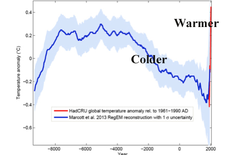
"Current global temperatures of the past decade have not yet exceeded peak interglacial values but are warmer than during ~75% of the Holocene temperature history."
XKCD would have done well to include the error bars. They do illustrate this additional variability towards the right side between 16,000 and 15,500. If you include the error bars you can see that there is no contradiction. Even still, Marcotte was published in 2013. We're about 0.3C hotter now than the hottest observed temperature at that time: http://woodfortrees.org/plot/g... . That may very well exceed even the error bars and cover that last 25%.
-
Re:GPS Pilot, right-wing wanker
There is the fact that the 1930s was the hottest decade of the 20th century
That's what a little knowledge will do to you. You're way in over your head and you don't even know it. Looks like they're removing stuff now. I used to be able to find the paper that Hansen had to admit the 1930s was the hottest decade of the 20th century. He lied about it and got caught, though he claimed it was a Y2K error and not a lie. In my humble opinion, his successor is lying a lot more. That's why every month this year has been a "record." Even featured here on slashdot it's so suspicious, so it's a captain obvious moment. I know true blue cool aid drinking believers believe it.
This site has actual photos of newspaper articles. Those stubborn facts again-
https://stevengoddard.wordpres...Yet another analysis:
https://wattsupwiththat.com/20...Did you look at their last graph from 1880 on? That doesn't line up with the CO2 levels worth a damn.
The cyclical variations from PDO/ENSO/etc on top of the secular warming from CO2 explain each peak and valley in the temperature record quite well. It is naive to think that you would have a monotonic rise in temperatures that matched the monotonic rise in CO2. This is certainly not what the models show.
Here's a neat tool you can use to explore this. Set CO2 to 2.4 and PDO to 0.13 and you already have a pretty good match to the temperature record.
I understand you're not a scientist. However for God sakes, look at the data! Go into the distant past to present! Analyze it! Come up with a theory! You'll see in short order CO2 falls apart as a cause, clearly. Another clue is they want to put people in jail that disagree with man made GW. Classic sign they're wrong and they know it. Otherwise, they'd present real science. You know, using the scientific method. Data, results, you can do it too and come up with the same results.
What's very frustrating to me is I've predicted this for 20 years that their models wouldn't hold up and I've been right. They continue to fail as long as they're based on CO2.
Wonder why I haven't been responding? I have a recipe to save anything from you off to the side. I don't even see it. I came across this one by chance. So I figured I'd try to enlighten you again even though I'm sure I failed. You have a really big problem. You have to overcome those stubborn articles from the past that show MMGW is bullshit. Good luck with that.
-
Re:GPS Pilot, right-wing wanker
we're really returning to where we were about 1000 years ago.
We've blown past where we were even 6000 years ago at the peak of the current inter-glacial. And FAST! It's all occurred since industrialization.
There is the fact that the 1930s was the hottest decade of the 20th century
Did you look at their last graph from 1880 on? That doesn't line up with the CO2 levels worth a damn.
The cyclical variations from PDO/ENSO/etc on top of the secular warming from CO2 explain each peak and valley in the temperature record quite well. It is naive to think that you would have a monotonic rise in temperatures that matched the monotonic rise in CO2. This is certainly not what the models show.
Here's a neat tool you can use to explore this. Set CO2 to 2.4 and PDO to 0.13 and you already have a pretty good match to the temperature record.
-
Re:So global warming started...
The problem is the trend, starting from the early 1800s, is actually quite steady, even though population growth (and co2 emissions) has grown exponentially.
http://www.woodfortrees.org/pl...
https://ourworldindata.org/wp-...
This smells like the thorny attribution problem.
Ugh. Just because you can calculate a "linear trend" doesn't mean the actual trend is linear. You can also calculate a "linear trend" for population.
-
Re:So global warming started...
The problem is the trend, starting from the early 1800s, is actually quite steady, even though population growth (and co2 emissions) has grown exponentially.
http://www.woodfortrees.org/pl...
https://ourworldindata.org/wp-...
This smells like the thorny attribution problem.
-
Re:Wow! Let's give them more money!
Here's hoping! Maybe we can get something sustainable in my lifetime.
The sooner the better! I have some more bad news on our bet. Last month was the hottest July on record. In fact, every month this year has set a record. Take a look at the current peak compared to the previous one in 2010. We've had about 0.25C warming just over the last 6 years!
You were quite confident that 2016 would be cooler than 2015. Any thoughts on why things are turning out so much different than you had anticipated?
-
Re:Stupid bet...
We will see more La Nina years, but as the GP points out, it will never again be as cool as it was in 2008 because.... global warming.
-
Re:Foolish for another reason.
Betting that any given year will be hotter or colder than any other given particular year is stupid, there's too much chance for something else to go wrong
2008 was a La Nina year, so it was already below average. Because of global warming, any year after 2008, regardless of annual variability, was bound to be warmer tan 2008. Even the strong La Nina in 2011 was warmer than 2008.. Pick any La Nina year where the temps are well below average and you'll notice that the temps never fall that low again.
The bet was hedged by a climate scientist who was willing to give 5 to 1 odds that 2015 would not be cooler than 2008. He would have had to be quite confident to give those odds and it is not luck that he won.
if you're really looking to test the climate change bit, would have been something like "The 10 year period starting in January 2008 will be, on average, warmer than the 10 year period starting January 1998
Fair point. That is even more certain to show warming. Here is the 10 year running mean since 1998.
-
Re:The Jurassic period. O2 in atmosphere was 130%
even the "polar icecaps are melting" crowd admit that it will takes hundreds to thousands of years.
Look at the trajectory of summer sea ice area in the arctic: http://woodfortrees.org/plot/n... . We have about 1/2 of what we had just 30 years ago and the loss appears to be accelerating.
-
Re:Some interesting information on that topic
I've replicated the work in your link but included data from the last few decades. Temps continue to diverge from solar output since the 80's: http://woodfortrees.org/plot/s...
On top of the observed warming, something has been compensating for the falling solar output over the last few decades. Since solar output is cyclical, we should expect temperatures to warm even faster once the sun recovers.
-
Solar output is dropping - causing cooling.
I did some looking into the effects of solar changes on global and solar-system temperatures, because I wondered how much of an effect it might have, if any.
Solar output has been dropping over the last several decades. The sun does (obviously) affect the surface temperature, but to the extent that it does it has been driving temperatures DOWN: http://woodfortrees.org/plot/s...
That means something else has been not only counteracting the cooling effect of the sun but also warming the planet at a rate unprecedented in the last 10,000 or so years.
Meanwhile Mars has been coming out of an ice age for the last 370,000 years (according to TFS). There are other factors at play here than just the sun.
-
Re:Nobody Gives A Shit
All that is nice but still doesn't explain WHY FUCKING SATELLITE TEMPS ARE NOT USED???
Even if they were used they wouldn't help your argument. The UAH lower troposphere has been setting monthly records for the past 6 months. Here's the graph.
-
Re:Semantics
The satellite record pretty much agrees with Cruz, hasn't been any statistically significant warming (as in temperature) for over 18 years in the satellite data.
Actually if you extend your WoodForTrees graph for just a little bit into 2016 it shows a completely different picture. Take a look at this. Of course your starting with 1998 is a huge cherry pick. If I change the start year to 1997 it looks like this. And if you extend it to a climatologically significant 30 years you get this.
-
Re:Semantics
Actually both satellite temperature series have set new records recently for temperature. Here's the graph.
-
Re:Semantics
Incredible cherry picking. I changed the start date to 1995, just because. Oh look a ise perfectly in line with global warming models. Now here is one starting at 1975. The trend continues.
Fancy that. Pick the highest point on the graph as the start and no warming trend. Pick any other point and the climate models for human-generated CO2 fueled global warming are spot on.
Now the real test: That cherry picked data is at +3. How high will this honest post get?
-
Re:Semantics
-
Re:It's wrong not to burn fossil fuels
The NOAA adjustments have REDUCED the warming trend evident in the raw data. Here's a comparison of the two: https://criticalangleblog.file...
Here's the NASA land based measurements compared to the satellite temperature reconstruction by skeptics Spencer and Christy: http://woodfortrees.org/plot/u...
-
Re:More science
It's the sun
The only problem with that theory is that solar output and temperature have been going in opposite directions for the last 40 years: http://woodfortrees.org/plot/g...
-
Re:Equivalent to 500000 cars over what time period
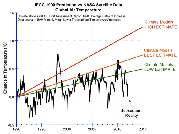
Yes, vindicated. For those of you who didn't click on link it shows the "enviro-left" IPCC predictions vs actual temperature measurements. Not even close. If they practised science at this point you would trash your hypothesis and come up with a new one. Since they are anti-science and reality doesn't matter, only their agenda, they ignore this reality and tell you the models are what matters and reality is only an inconvenient truth to them.
Of course climate models model the surface temperature while you're comparing them to satellite temperatures that convert proxy readings for somewhere up in the troposphere to temperatures. Also, the satellite temperature graph stops in 2013. It would be interesting to see what an up to January 2016 graph would show.
I went to Wood For Trees and the current UAH plot up to January 2016 looks like this. Just eyeballing it I'd say the January 2016 temperature is above the "Climate Models Best Estimate" line in your graph. I expect February 2016 to be even a bit warmer.
-
Re:The problem with this story....Here's tropospheric temperature trend as measured by the UAH satellite reconstruction: http://woodfortrees.org/plot/g...
You will notice a large increase over the period. Satellites measure the troposphere though. That isn't really what sea level responds to. Take a look at ocean heat content over the period: https://www.nodc.noaa.gov/OC5/... .
-
Re:It's the trend.
Yeah. If you're a climate nerd it's exciting to see such a large excursion, but by itself it doesn't really tell you much. http://woodfortrees.org/plot/g...
-
Re:YAA (Yet Another Anomaly)
Part of the bias towards reporting heat records vs cold records is due to the fact that we haven't had any record cold months in over a century. The last time we had a record for the coldest month in recorded history was 1893 The last time we had a "warmest month in recorded history" was December. The prior record was October.
-
Re:Data [Re:What scientists do]
temperatures have not been "remarkably steady for the past 19 years or so"
They have been compared to the previous century.
http://woodfortrees.org/plot/h...
Highly inconvenient, I know.
-
Re:That was pretty stupid.
Great. We will use the UAH version 5.6 since you do not trust the surface station record. (6.x is currently in beta and changing too often to make any predictions with). The data can be found here: http://vortex.nsstc.uah.edu/pu... - see the "Globe" column. In the event that UAH5.6 is no longer available we will need to defer to the RSS satellite reconstruction. The data for rss can be found here: http://woodfortrees.org/data/r...
What's all this? Either it is or it's not. If it is, I'm sure it'll be all over the news. This isn't that hard. Let's not make it hard. Heard me laugh? Well you'd be right. I think this is the first time someone has used something from Alabama to prove their point. While I don't want to belittle them or anything, they aren't exactly known for being at the forefront. Woodfortrees.org? Now if I used a site like these I'd have a feeling it would be a conspiracy site or something.
I think I have an advantage in that you appear to get your science reporting from conspiracy websites. I could be wrong, but based on previous comments I believe it to be the case.
Ok, apparently I flew right over you like a 747 at altitude. Maybe Jim's article will enlighten you - http://www.giss.nasa.gov/resea... ? Here he admits the 1930s was warmer. While I'm sure if you read it you'll be like - eh? What's the big deal, this really was a big deal. Note that he was also wrong in his prediction about the 2000s.
Conspiracy web sites? That just doesn't even make sense why you would say that. This is to be expected in my case, I've been doing science, numbers and such for over 30 years. I have a feeling you're new to this. Look back, say over the past couple of hundred thousand years. Look back over the past 10,000 years. You'll understand why Man isn't responsible if you do. You'll understand how they're lying to you. Understand this isn't a 5 or 10 minute thing. You'll be looking at this stuff for a while.
Maybe you meant something like this, with those crazy Astronaughts and scientists?
http://dailycaller.com/2016/01...I know, I know, pay no attention to them (there is no man behind the curtain), right?
Time will tell
Heh, certainly will. However understand that even if there is an increase, a year doesn't prove the point. Right now they're trying to explain away the previous 15 years. Often by questionable means, such as the sea is much warmer - gee, where have we heard that before? Ever deal with liars and confidence men? I've run across men that can make people so confident that they can convince everyone that they're an attractive woman. Men that can lie with such a straight face and no feeling that they can say anything. They'll think nothing about cleaning out your bank account if you you give them a chance.
Never the less, I think I should reiterate that I think things are warming up. It's not due to man and that's clear. Clear to me at least.
-
Re:That was pretty stupid.
So what's the bet? That 2016 will be warmer than 2015, is that your assertion? I'd like to make it clear it's not mine. I'm betting 2016 will not be warmer than 2015.
Great. We will use the UAH version 5.6 since you do not trust the surface station record. (6.x is currently in beta and changing too often to make any predictions with). The data can be found here: http://vortex.nsstc.uah.edu/pu... - see the "Globe" column. In the event that UAH5.6 is no longer available we will need to defer to the RSS satellite reconstruction. The data for rss can be found here: http://woodfortrees.org/data/r...
You either have no clue what you're doing (one might say you drank too much of the cool aid) or I have a feeling you think you know something I don't.
I think I have an advantage in that you appear to get your science reporting from conspiracy websites. I could be wrong, but based on previous comments I believe it to be the case.
To me there's almost no question. The safe bet is 2016 will not be warmer than 2015.
Time will tell
-
Re:Deniers?
It is hardly a secret. If you don't know something, then you should not hesitate to ask. That is always a better option than being obnoxious. (you catch more flies with honey than with vinegar don'tcha know.) A quick look at woodfortrees can verify: Look at the divergence at about the year 2000. Look at the difference in the trends: http://woodfortrees.org/plot/r...
Here is Carl Mears who developed the RSS Satellite reconstruction: "...surface temperature datasets, which I consider to be more reliable than satellite datasets (they certainly agree with each other better than the various satellite datasets do!)." - http://www.remss.com/blog/rece...
The guy who developed one of the two satellite reconstructions says that the surface station record is more reliable. So no, we shouldn't disregard the surface station data in favour of the satellite data. The satellite records do not agree with the raw surface station data as the GGP had asserted (but the corrected surface station records DO), in fact, the satellite data do not even agree with each other.
-
Re:record-shattering recording instruments
What are you talking about?
Well, then, be specific. What specific data were you showing in that Wood for Trees graph? And why did you include UAH land only, when the others were all global? Are you claiming that was an accident? Or were you trying to make an impression?
My point was that you weren't showing the finished results of UAH, but some intermediate data before further processing. And I really don't think it takes a genius to figure that out from what I wrote.
You're link is to a beta version of UAH that has different adjustments.It's the version they're using. It's "beta" only in the sense that they called out for constructive comments. There is a link to a discussion of it on the same page, if you're interested.
Which is right? The currently published one or the beta version?
Presumably the newer version. There is reason to think so.
Are you sure that satellite is the gold standard?
I never claimed that it was. But there are lots of very good reasons to believe they're better than current surface temperature datasets.
Are they really 'constant' and unchanging?
Why do you ask? I didn't say or even imply that they were. My comments were about your later statements:
And which of the two data sets should we use? The difference between the adjustments applied by the two teams are quite large. UAH shows MORE warming than land based measurements while RSS shows less... http://woodfortrees.org/plot/u... [woodfortrees.org]
One of my points was that your graph was messed up, because you used UAH land-only, vs RSS and UAH global (including sea). Your graph was misleading, intentionally or otherwise. I questioned your honestly not because of the uncalled-for attempts at personal slams, but because based on my past experience, my guess was (is) intentionally.
It should look more like this.
The bit about "unadjusted" was intended to mean that these curves are of instrumental data, not model outputs. Before being run through much processing. So "RSS MSU lower trop. global mean" is relatively unaltered MSU data.
We get your point that some are adjusted more. That has little to do with whether particular adjustments are proper or improper. -
Re:record-shattering recording instruments
Are you sure you're not a 911 truther? http://slashdot.org/comments.p...
Are you sure you don't deny basic physics? http://dumbscientist.com/archi...
Either way, Tamino doesn't refute Christy's & Spencer validations of UAH emperature data sets. That is true. The UAH satellite record actually shows MORE warming than the land based measurements. http://woodfortrees.org/plot/u... . Tamino shows that RSS satellite record does not line up with tropospheric temperature measurements. Shall we disregard UAH, land based measurements, tropospheric measurements, and only trust RSS?
-
Re:record-shattering recording instruments
You are right that method of adjustment on satellite data is in flux. The difference in trend between each version is quite large. How do you know that the current adjustments are the right one if they are always in flux? And which of the two data sets should we use? The difference between the adjustments applied by the two teams are quite large. UAH shows MORE warming than land based measurements while RSS shows less... http://woodfortrees.org/plot/u...
-
Re:Deniers?
Here are the corrected vs uncorrected temperature reconstructions. There is really no difference in the trend between the two: https://climatecrock.files.wor...
Satellite models don't agree with each other let alone with the uncorrected surface trends: http://woodfortrees.org/plot/r...
and they don't agree with radiosonde data that takes actual measurements in the troposphere that the satellites are attempting to derive a temperature record for: https://tamino.files.wordpress...
-
Re:Newsflash
They are?
-
Here's the 10000 year view
Slashdotters love data, right?
Here is the 10000 year view of the situation:
http://jonova.s3.amazonaws.com...Here's the data from the Arctic:
http://ocean.dmi.dk/arctic/ice...
http://ocean.dmi.dk/arctic/old...Here's the RSS satellite trend since the big El Nino of 1998:
http://www.woodfortrees.org/pl...Here's the RSS satellite trend since the big El Nino of 1998:
http://www.woodfortrees.org/pl...Here is a correlation between CO2 and various surface and satellite data-sets: http://www.woodfortrees.org/pl...
Unfortunately the global temperature range is of the order of 100 K from poles to equator, and the uncertainty in the measurement data is at least +/- 0.2 K, so increases of fractions of a degree are not particularly significant. Here is a paper discussing the same
http://multi-science.atypon.co...
http://wattsupwiththat.com/201...There is Global Warming for sure. We would expect warming after the Sun increased magnetic activity after the end of the Little Ice Age. Some component of that warming is due to human-emitted CO2. Whether the dominant effect is natural or human is still being debated (particularly since CO2 effects are weak and the IPCC's models that the CO2-induced water vapor effects would increase the temperature further appear to be falsified by experiment). To de-industrialize and impose punitive 'carbon taxes' at this stage does not look like it can be supported by the data. The difference between surface and satellite observations has not yet been resolved satisfactorily (the 'science is not settled'). If you think the science is settled please refer to the data I have provided in your response (you need to explain it). Thanks.