 Slashdot Mirror
Domain: asktog.com
Stories and comments across the archive that link to asktog.com.
Comments · 347
-
Pie Menus are better than Screen CornersPie menus address many of the complaints of this article, and they've been around a long time.
I'll start by comparing screen corners to pie menus:
To quote Tog on Fitts' Law: "The time to acquire a target is a function of the distance to and size of the target." He points out that "the screen edge is, for all practical purposes, infinitely deep."
But the advantage of "screen corners" is just an indirect and wasteful application of Fitts' Law, which pie menus exploit much more directly, efficiently and flexibly than "screen corners". Tog's "screen corner" argument is just an ex post facto application of Fitts' Law: an after-the-fact rationalization, not the reason they originally designed the menu bar that way. If Fitts' Law was really the reason Apple designed their menu bar that way, then why aren't there four menu bars, one at each edge of the screen? Apple never mentioned Fitts' Law in their infamous menu bar patent.
Pie menus "slices" are better than "screen corners" or "menu bars" because:
Screen corners and edges are static and fixed in number, so they only enable a small fixed number of global commands at once.
Pie menus are dynamic and context sensitive, so each pie menu can have multiple slices, with a different set of functions associated with each, including submenus. The screen only has four corners and four edges, but pie menus are extremely reliable with eight items, and can support up to 12 items reliably.
Pie menus also support submenus, so you can have an infinite combination of pie menu items, depending on the context you click on, instead of just four screen corners or four menu bars.
Each pie menu item is easier to hit than any screen corner, because every pie slice target area starts directly adjacent to the cursor and extends all the way out to the screen edge, and beyond!
Screen corners and menu bars flaunt Fitts' Law by requiring you to physically move the mouse a large distance, and they usually leave the cursor far away from the object you're manipulating.
Pie menu target area "slices" extend all the way out to the edge of the screen and beyond, so their area is quite large, but you don't have to actually move all the way to the screen edge to select them. You simply move the cursor outside of the small inactive area in the pie menu center. Each "slice" target area starts out directly adjacent to the cursor, in a different direction, and occupies a large area extending out to the edge of the screen.
Fitts' Law relates the target seek time and error rate to the target area and distance from the cursor. The bigger the target and the closer the target, the faster the seletion and fewer errors. Pie menus maximize the target area and minimize the target distance, so consequently they minimize both the speed and error rate, as Fitts' Law predicts.
Pie menus have been empirically proven to be 20% faster than the linear menus, and about half the error rate ("A Comparative Analysis of Pie Menu Performance"; by Jack Callahan, Don Hopkins, Mark Weiser, and Ben Shneiderman; Proc. CHI'88 conference, Washington D.C.)
Screen corners are worse than pie menus, because they actually have smaller target areas than pie menu slices, and actually maximize the distance from the cursor by putting the target as far away from the cursor as possible.
Tog claims the screen edge target area is "infinitely deep", but in practice you never move the cursor an infinite distanc
-
Re:Cost of Quality
Throwing bodies at a problem generally makes schedules slip even in the design state
excellent point, it's amazing how many managers do not understand that. It's amazing how many people have not heard of The Mythical Man-Month. It should be required reading for anyone dealing with large projects (learn from someone elses mistakes in this case IBM's).
Also not entirely on topic, but more programmers need to read The Design of Everyday things. There are way too many poor user interfaces out there, and DOET has a lot of great information of interfaces (from door knobs, to kettle handles and menu structures) and making them usable.
And as long as I'm ranting read some Ask Tog, especially this if you haven't. -
Menu bar
In related news, seeing the menu bar, Microsoft has finally discovered Fitt's Law. Only ten years too late....
-
Re:How about a fast way to lock the computer?
1) System Preferences -> Security-> [x] Require password to wake this computer from sleep or screensaver
2) System Preferences -> Screen Saver -> Hot Corners. Set one to 'Start Screen Saver' (I have that in the bottom left, and bottom right is 'disable screen saver', which I think were the old (AfterDark) conventions.)
Now: wanna lock your computer? throw the mouse into a corner. The screensaver will come on and you need a password to return to the desktop. Voila--locked! Once you start using it, you'll find it's even easier and faster than c-a-d+enter/space. Windows-L (in XP only) is as fast but requires accuracy on the keyboard. The Mac way requires you to push the mouse any distance in a general direction. Put those mile wide croners to use! -
PRobably doesn't really
But eye candy is what many people are all about these days. OS-X proved that eye candy is good marketing in OSes. There's a number of things in it that aren't the best from a design standpoint, like the dock (see Tog's commentary on it http://www.asktog.com/columns/044top10docksucks.h
t ml) but look cool. There's plenty of that, and not just in computers. Often companies will do things that sacrifice some usability for cooler looks. -
Re:Comparisons with OSX and Windows
I concur.
You're not the only one who has moved to OSX. A few linux buddies (who used to run it on the Desktop) have all moved to OSX.
When you're 20, tinkering around with Linux was great way to spend time learning.
When you're 30, you just want an OS that works -- so you can spend time on your REAL passions.
With OSX, I get the best of Windows + Unix.
BTW, you'll probably wan these essential Mac UI apps...
PathFinder
http://www.cocoatech.com/
- WindowShade X
http://www.unsanity.com/
- ASM (Application Switching Menu)
http://www.vercruesse.de/software
- FruitMenu
http://www.unsanity.com/
- DragThing
http://www.dragthing.com/
(Four out of the Five are mentioned by here)
http://www.asktog.com/columns/060MonsterMac.html
(Tog was one of the orginal designers on the Mac UI)
Peace -
Oh no. Not the Dock.I've never been a big fan of the Dock on OS X. It has a lot of problems, famously enumerated by Tog. I'm a big fan of OS X for a number of reasons, but the Dock should go.
If you want the user to be able to determine what Taskbar/Dock type thing they want, you might want to check out DragThing as a third option, which lacks the visual style of the Dock but works a whole heck of a lot better.
I'm not a big fan of highly customizable interfaces, but man I wish I could just turn the Dock off once and for all.
-
Re:Looks like FireFox
... which is somewhat amusing, since having a menu bar at the top of the screen is actually better design.
-
Re:Menus are per-window instead of universal.
The hugness of today's monitors is really impacting the benefits from Fitt's Law Even though the menu ajacent to the top of the dialog is a large target (because you don't have to worry about going past it in the Y axis when you're mousing) you're still covering a lot of distance. Depending on the work you're doing, making the round trip from the object being manipulated and the menu, this can get tedious.
-
Re:Menus are per-window instead of universal.
You are thinking of Fitt's Law. Some platforms get it right and some don't
-
Re:or not...
Executive Summary: The mouse is faster than the keyboard.
Or not.
Here is the article where Tognazzini describes his test. Tognazzini writes:
The test I did I did several years ago, frankly, I entered into for the express purpose of letting cursor keys win, just to prove they could in some cases be faster than the mouse.
Note, "cursor keys", not "keyboard".
I typed in a paragraph of text, then replaced every instance of an "e" with a vertical bar (|). The test subject's task was to replace every | with an "e."
Never mind the absurdity of reporting the times to four significant digits. He said, again, "cursor keys", not "keyboard". He had the users move the text cursor with the arrow keys alone, from one "|" to the next.
Here's another way to do it, using the keyboard. Got your stopwatch?
?^$?;//s/|/e/gSix seconds, independent of the length of the paragraph or number of changes. (That's ed(1); "ed is the standard text editor".)
Even if you constrain the user to move the cursor to each "|", one by one, the keyboard is faster: for instance, in vi(1), "{/|^[re" and then repeat "n." But why would you make the user do that? That's not just ignoring the utility of the keyboard, but of the computer itself. So the mouse is faster than the arrow keys at performing task X forty-two times? If you use the computer as a fucking computer instead of crippling it to the level of a typewriter, then you don't do it forty-two times; you do it once. Tognazzini's test suffers from Mac System 6 tunnel vision.
It might be argued that automated repetition defeats the true purpose of the test -- that it isn't about replacing "|" with "e" forty-two times, that that isn't a real-world editing task but just a stand-in for forty-two different tasks.
Better for the keyboard! A keyboard does have keys other than arrow keys -- it has keys that bear the very same characters that appear in text. There is an obvious correspondence between a character on the keyboard and a character in the document, one about as "intuitive" as you can get. This lets the user press the keys to locate the corresponding character in the document, either individually, or sequentially to magically form composites we call "words" that have meaning within the user's task.
Using the keyboard, the user can have the computer find the correct location, rather than being forced to do it himself, visually, with the possibility of error. What if Tognazzini's test had not involved finding the vertical bars, which are visually distinctive in text, but, say, replacing "blue" with "green" throughout a ten-page document? How many instances would have been missed? Do you want to cut the blue wire, or the green one? Are you sure?
(Oh, I'm sorry. Did I say "|" was visually distinctive? Here you are, user: take your mouse and change every "|" in this Helvetica paragraph. Don't touch any "I" or "l" or "1", though.)
The mouse ignores the semantic content of the characters and symbols, words and keywords, blocks and sentences.... It even ignores the symbols themselves; it wanders haphazardly over a picture of the document (a static picture, if you're lucky; ever try using a mouse to select something that doesn't hold still because the window is being written to?)
Revised Executive Summary: The mouse is faster than the keyboard that has nothing but four arrow keys, when errors don't matter.
-
Ask Tog: Apple re$earch says mouse is better
Apple-raised interface theorist, Bruce Tognazzini, http://www.asktog.com/ believes (and claims to have tested and proved) that keyboard-based, chording shortcut users engage in a momentary lapse of consciousness in which they recall and then position their hands for the keystroke, and that although they *think* they're faster than a mouse, they're not.
See his 1991 book "Tog on Interface", where he claims in the 80s Apple performed $50M in tests that showed that people consistently reported believing that keyboarding (using shortcuts, etc.) was faster than mousing, yet the stopwatch consistently showed that mousing was faster than keyboarding.
His explanation for this is that deciding among abstract symbols is a high-level cognitive function, and that this decision is not only boring, but that the user experiences near-amnesia in the approximately two seconds needed to remember the chord keystroke. On the other hand, Tog also argues that two-handed chords (think the handy cut-and-paste CTRL/C
Around page 180, where in fact he discusses Raskin's Cat interface and the decision to use a single dedicated key for operations such as "Find", Tog admits was actually fifty times faster than the Mac's mouse-move.
This reminds me of the old joke about voice interface word processors: "Up, up, up, left, left, left, left, no right, stop, yes, right
there
Want to learn something? Go Google "therbligs". -
or not..."We've done a cool $50 million of R & D on the Apple Human Interface. We discovered, among other things, two pertinent facts:
- Test subjects consistently report that keyboarding is faster than mousing.
- The stopwatch consistently proves mousing is faster than keyboarding.
From: http://www.asktog.com/TOI/toi06KeyboardVMouse1.htm l
(via http://www.cs.bell-labs.com/wiki/plan9/Mouse_vs._k eyboard/index.html) -
Oh?
-
Re:More good than harm.
I'll give you a simple example which is typical. The big picture concept is that Apple has traditionally designed the Mac user interface on the basis of real user studies, not merely what a group of engineers think would be best. The result is objectively superior usability - you can measure the improvement for all users, even those who don't realize that they're now working faster. Now to the example:
Mac OS computers have always had a single menu bar. Mac window title bars do not have, and have never had menus in native Mac OS applications. The reason is user testing. Fitt's law states that the time to acquire a target - in this case the menu - is directly proportional to the distance from the mouse pointer to the target, and inversely proportional to the size of the target:
T = k distance/size where k is some per-user constant
This law has been backed up by numerous real user tests.
It turns out that there are 8 screen targets that are effectively infinite in size - the top, bottom, right and left sides, and the four corners. Why? Because they can be acquired by simply slamming the mouse in one of these 8 directions without regard for overshooting the target - it simply isn't possible to overshoot these 8 targets.
This means that the time to acquire the menu can be reduced to almost 0 if you put the menu in one of these 8 locations. The 4 corners are impractical - not enough area to present many menus. Since most roman scripts read left to right, top to bottom, this leaves only the top of the screen. The bottom would force the listing of the items in each menu in reverse order since you obviously want the most commonly used menu items first - they're faster to acquire that way.
Now notice how Windows gets this wrong.
1. Window title bars have menus. Some engineers at MS might have thought that this would make them easier to use - after all they're closer that way. But it turns out that menu acquisition time is longer for window menus than for a single screen top menu bar. This is why you do real user tests - users' perceptions of what is or might be faster are often counter-intuitively wrong.
2. The early versions of Windows had a task bar whose buttons did not extend to the bottom of the screen. This defeats the whole purpose of putting a click target on a screen edge - you can no longer acquire the target by simply slamming the mouse down to the bottom. You must slow down and make sure you don't overshoot the button's bottom on the task bar. You've now effectively pessimized click target acquisition - you've put the click target as far as possible from the center of the screen, but made it impossible to acquire by simply pushing the mouse all the way to the bottom.
I can't tell you how many Windows users insist nevertheless that window menus are faster - that's their perception. But when I time them with a stopwatch they're all surprised to learn that they actually acquire the menu faster on a Mac than on Windows.
Mac OS computers are objectively more usable because the Mac UI has always been based on real world user testing, not some engineers' notion of what would work best.
For more on the basics of usability see Bruce "Tog" Tognazini's site. -
Funny how you can change the meaning...It's really funny how you can change the meaning of something just by making subtle choices of language or juxtaposition. Consider the following from the Slashdot article:
The timing is not coincidental with Apple's Tiger release, as Allchin pointed out some advantages that Microsoft had over Apple's OS: 'High on the list of features are security enhancements, improved desktop searching and organizing, and better methods for laptops to roam from one network to another.'
The way this is written implies that this is a list of features that Longhorn has which Tiger does not have.
If you read the actual C|Net article, it's not written quite so slanted. First off, nowhere in the article is security said to be an improvement over OS X (any version), but rather, over previous versions of Windows. Allchin does state his belief that Longhorn's searching is better than Tiger's Spotlight feature -- mainly in ways you can do useful things with search results. (Then again, Tiger is due out this month, a full year before Longhorn, and no doubt Apple will offer incremental updates to the feature set via Software Update.)
Laptops doing network roaming is something that's been well-supported in OS X for quite some time now, so again, this isn't something Microsoft can claim as an advantage. Certainly anything is an improvement over WiFi support in XP (though I'm told SP2 fixes some of the worst problems).
The icons representing actual file contents (or folder contents, for folder icons) sounds great at first -- but this is the kind of feature that, if poorly implemented, could really kill performance. There's a reason that icons traditionally are an abstracted representation of the type of file data or the application to which the file belongs.
If Microsoft implemented this feature right, it wouldn't be too much of a performance hit -- basically, they'd only have to cache a thumbnail image of the file's contents (or the first page of the file's contents), and only update the cache when the timestamp on the file is newer than the timestamp on the thumbnail. But judging from past Microsoft coding efforts, I sincerely doubt that they coded this feature anywhere near that efficiently.
My real objection to the new icon rendering paradigm in Longhorn is the same objection I have to Microsoft UI gaffes like dynamically hiding lesser-used menu items, and it has to do with interface consistency. Bruce Tognazzini has expounded on this at length, so I won't repeat the things that he's said. But he's written some excellent articles on how Microsoft has repeatedly broken the menu bar paradigm with this and other misfeatures. (He explains why putting a menu bar at the top of the screen is far better than attaching a menu bar to the application window, as well.)
Then again, Microsoft can't be bothered to do real usability testing and hire real human factors experts. If they did, their UI wouldn't have so much brain damage. But it seems that Microsoft is doing what it always does -- they look at the competition, and they duplicate the eye candy without putting thought into duplicating the features that actually make something work right. (It's as though Steve Jobs ran amuck without any usability or human factors considerations to keep him in check.) And Tog isn't a Windows-basher. He wrote an article citing 10 reasons why the OS X dock sucks, though at least one of those reasons can be negated if you pin the dock to the right hand side of the bottom of the screen. (Hint, doing this keeps the trash can in a consistent location so you can rely on muscle memory.)
At least Longhorn will give you the option of using an interface minus all the eye candy; if only Microsoft gave you the power to permanently disable the hiding of menu items that are seldom used. (Having menu items that appear and disappear sabotages your ability to rely on the order that items appear in a menu. Furthermore, hidden items are more likely to be entirely forgotten by users, even experienced users.) -
Re:Computers shouldn't lose data
For those of you interested, I found that information in the Ten Most Wanted Design Bugs.
Posting anonymous this second time for not karma whoring. -
It gets press because
1) Slashdot loves Apple.
2) Slashdot loves Google.
3) It looks kinda nifty.
4) It's not something most people expect HTML to be able to do.
I mean your same criticims apply to the actual dock. Tog (Bruce Tognazzini, founder of the orignal Apple Human Interface Group) did a writeup on the dock and complained about it as being a nice tech demo but not good for usability. One of the reasons was no labels on icons (http://www.asktog.com/columns/044top10docksucks.h tml if you are curious).
However, seems clear in the case of Google it was just a tech demo. Some guy showing off some nifty stuff with DHTML. Doesn't look like Google was at all serious about actually using it as theri new interface. They've long maintaned a very simple, clean, compatible interface and this would break from that.
But ya, neat though it is, not sure it's front page -
Re:MudflapAnd I'm getting sick of bozos like you implying that simply changing the language we use will suddenly make software secure. Because for every shop that switches from C to java, there's some fuckwit using static members to store username and password in the webapp's user authentication code.
We're not clamining that. All the classic mistakes will still be there. We are claiming though that making a C program secure is hard. You have to be an expert not to screw up. And if you slip just slightly, you end up with an exploitable condition. Just look at all the libraries that are plagued by security problems.
That's not true of modern languages such as Erlang to pick just one example. You really have to be ignorant or make an honest to god mistake to screw up.
Not all interfaces are created equal. Whether they be programming languages or aircraft cockpits.
-
Re:Duh!
Bingo.
May the author be remembered. -
Good resource
Bruce Tognazzini's site.
He founded the Apple Human Interface Group and acted as Apple's Human Interface Evangelist. He's also written two books on UI design. -
Re:Xgl
Yeah, and in OS X, the continue to use the crappy dock, despite the known flaws it its design with respect to usability.
Seriously man, Apple is great, but give it a rest. We don't need any more zealots around here, we have enough already.
-
Re:XP
The start menu doesn't keep track of my most commonly used apps.
That's the very first godawful thing I turn off when I'm forced to use an XP machine. Then it's the shitty oversized blue-n-orange window borders, the "web view" control panel etc folder views, the task bar icon grouping (damnit! don't keep changing how the icons are arranged on it! it slows me down!), and the background. Oh, and mouse shadows and all the menu/list/etc animations have to go too. Please see here.
My Computer isn't on the start menu.
screw that, [windows key]+E or a shortcut bar explorer icon!
There's no tab completion on the command line.
As others have mentioned, Tweak UI.
One more annoying thing, not that it makes much of a practical difference, the license for XP (and Win2K >= SP3...) says that M$FT is allowed to lookit what programs you have installed and screw with them in order to guarantee WiMP DRM security. -
Re:I think you found your answer
When a company with monopoly power writes software that accepts broken, non standards compliance input, it's creating a new standard, one that isn't published, since people will generally only work on their software until it produces an output that works with the monopoly's software.
This is a non sequitur. Forget the fact that probably 60%+ of the internet is stillusing HTML 4.0 (which is non-compliant) - people are going to create invalid input regardless.
Also, I don't really even get what you are asking - you want the *browser* to throw and error to tell the user that the HTML compliance *on a website he doesn't own or control* is invalid? How is that supposed to help anything?
People *always* create invalid input. It is the job of the engineer to handle this input the best he can. No, this does not always include spitting out an error and saying "give me the input THIS way".
I suggest you read this (specifically, see number 6).
-
Security D'ohLTs
Bruce Tognazzini has covered this kind of stupidity before.
"I've been watching security people for years as they've slowly increased the security of everything they can get their hands on until any idiot can wander in.
(...)
My wife, the Doctor, was working over the summer at a local hospital. They are fiercely into security, requiring no fewer than four sets of passwords to navigate their system. And why not? There are confidential patient records on those systems! By golly, they ought to have eight sets of passwords, and really make things secure!"
Read it: http://asktog.com/columns/058SecurityD'ohlts.html. Better yet, have the people who are implementing this policy read it. Point out it's by one of the leading usability experts in the world. Odds are it won't change anything, but hey at least you tried...
-
Re:Look, I'll tell you why they use a one-button m
But here's the funny part.
The designer of the Mac's interface says himself that (1) Apple should have long ago switched to a two button mouse
http://www.asktog.com/readerMail/2000-01ReaderMail m l
(2) Apple should have added the scrollwheel
http://www.asktog.com/columns/035SquanAdv.html -
Re:Am I the only one who thinks Windows is fine.
Yes, it can get much more efficient than Windows.
The folder system may be straightforward, but it's not really geared towards making information accessible. Applications like iPhoto and iTunes show that there are ways to order information other than folders.
Check Bruce Tognazzini's column for more ideas on improving the UI.
The task bar can stand improvement as well. Try running more than 5 applications, and the task bar entries become unreadbly narrow. The Start menu isn't great, either.
-
This is great
Raskin's work is based on Fitt's Law and Hicks' Law.
-
How about getting the basics right first?
1. Interface design
We haven't seen a quantum leap since 1984 (Macintosh). Even Apple isn't doing any 'pure' research in this area anymore, and for now is too busy tinkering with OS X to think about real breakthroughs in how we interact with computers.
Current metaphors like the desktop are showing their age, and are less and less suitable for dealing with the huge amounts of information our computers hold now.
2. Reliable computing
This is covered in part by the 'dependable systems' challenge. I'll add my 2c:
Losing information due to power loss/crashing is trivial to prevent (autosave, keystroke logs etc.), yet this prevention still isn't included with OS X or Windows. This is about 10 years overdue.
An application crash shouldn't be able to bring down the OS. Granted, we're better off than 10 years ago, but VMS-like uptimes are still too rare.
3. Keeping up with Moore
Processor speed has seen huge increases. Other parts of the computer haven't kept up, with busses on the motherboard routinely running at 1/10 the speed of the processor. Cache techniques notwithstanding, this means huge inefficiencies. It's like using a garden hose to fill a lake.
Permanent storage (harddisks etc.) speed in particular is lagging. -
From the "Duh" department
Of course most of those guidelines are still valid. Human behavior hasn't changed, and that's what these guidelines are based on.
The real trick is getting people to follow the damn guidelines. Programmers should have them tattooed into their foreheads. They should be able to recite them verbatim, and show examples for every guideline.
Apple got it right with their Macintosh Human Interface Guidelines (and associated Thought Police). Following these guidelines shouldn't be an option or an afterthought, it should be at the core of everything a programmer does. -
Re:Smart Folders
Err, nope. What was described as "piles" in one rumor was actually Exposé. The Apple developed interface concept called "Piles" is actually something different. And the "rumors about a mouse with a wheel on it" are based on an Apple patent named "Mouse having a rotary dial" that describes a "user operated input device includes a housing and a rotary dial positioned relative to an external surface of the housing. The rotary dial provides a control function."
-
Re:Smart Folders
And they'd be right.
Apple was working on non-folder groupings of data they called "piles" in the early 1990s.
"a pile is a loose grouping of documents. Its visual representation is an overlay of all the documents within the pile, one on top of the other, rotated to varying degrees. In other words, a pile on the desktop looked just like a pile on your real desktop."
The BeOS took this a step further (the ability to create/maintain piles automatically with a search).
more info -
A very good (and humorous) article on the subject
Bruce Tognazzini (of Macintosh and Nielsen Norman Group fame) has an excellent article where he contrasts *actual* security with perceived security here. Well worth a read, and one the pages I most frequently refer to.
-
Re:Also
Sorry, no, I don't.
There is OSX's dock. It has its problems but it beats the taskbar. There are a bunch of other apps arround to do more than what you want. (in OSX)
Between that, window scaling, transparncy, single menu bar, expose, etc I have found the OSX GUI more productive than windows, with the added benifit of looking more stylish than a 5 year old with a crayon.
No I don't work for Apple and no I don't make anything from their products. -
/. ed already?
Well here's the google cache!!
10 Bugs -
Re:I have doubts...
Of course it's blindingly obvious, we have seen it for 50 years. The question is, was that interface obvious before it got invented? Remember the golden rule that intuitive == familiar.
-
Re:Tabbed browsing not importantHitting "back" is an incredibly crucial and common task in web browsing. We click on links to go forward; we click "Back" to go backwards (assuming we don't use the keyboard). Fitts' law says bigger targets are easier to acquire with the mouse, so people will use them faster and with less error; see, for example, this column.
Of course, as that column notes, the easiest target to acquire is the one currently under the mouse cursor. Once upon a time (Netscape Navigator 3), right clicking brought up a context menu which always had "Back" as the first entry, so it was incredibly easy to select (it became a sort of "mouse gesture"). Despite efforts documented in bugzilla, attempts to "fix" Mozilla and Firefox by putting "Back" in that location, and to fix the context menus under Windows which don't display the menu until mouse up, have failed, apparently because the developers don't believe "Back" is actually used enough to justify such extravagances, or, in some cases, because they were asshats.
-
Re:Not jaded at allMany old-Mac afficianados rightly point out that the user interface on the old Macs was in many regards much better. Yes, good virtual memory is great; yes, true multitasking is great; yes, protected memory is great (although there was this one cool old Mac program which would let you change numbers in memory--thereby allowing one to cheat wildly at games): but those are just things which should be under the covers. There's no fundamental reason that the old-Mac interface couldn't have had them.
As for the brushed metal interface, that's just a theme, and themes do no good useability make. Check out Ask Tog or Jakob Nielsen for some work on what real useability means.
Hey--I'm a Unix geek, and I think that it's cool that Macs now have a Unix layer. I just think that it's sad that they've lost much of their original UI advantages.
-
It was NOT 96% successfulI'll bet you're only counting one class of error: the "hanging chads". Butterfly has the additional problem of misvotes and overvotes.
In Palm Beach County (home of Terry's Butterfly Ballot) there were 32000 errors out of 450000 votes. That's over 7% error rate. Note that typical error rate for non-butterfly punch cards is 4%, whereas optical-scan (aka pencil & bubbles) is well under 2%.
It was a usability disaster. -
Re:Not very subtle, these folksThose flip-book punch ballots had been in use in Florida for years but that layout was an anomaly. In my years voting there I'd never seen a single voting issue split across two sides. You can look at the ballot over at Tog's site for some idea.
Personally I agree that there's a certain standard of effort people should be held to with something as important as voting. However I think there's also a standard we should hold to in trying to accurately collect the voter's intention. If we really don't give a shit about the answer we shouldn't ask the question since we're going to be held to the results.
As far as the electoral college system I'd encourage you to read a number of the articles in defense of it. There may be some issues but the ones we'd create in simply abolishing it without compensating for state size and population in elections would be worse.
-
Re:For Some reason...
Actually, the reason for big buttons (which is what I think you mean by "fischer-price") is simple: Fitts' law: The time to acquire a target is a function of the distance to and size of the target.
In other words, it's a hell of a lot easier for a user to press a big button than it is for user to press a small button. (Even better than big buttons are the edges of the screen, which are effectively infinitely wide/tall).
Unless you're on a tiny screen and need to maximize real-estate, you're much better off with big buttons. Hard to believe I know.
(I used to be a fluxbox/ratpoison kind of guy myself, but I've discovered GNOME + good key bindings + F11-to-go-fullscreen-when-I-need-it is really much easier to get around)
-
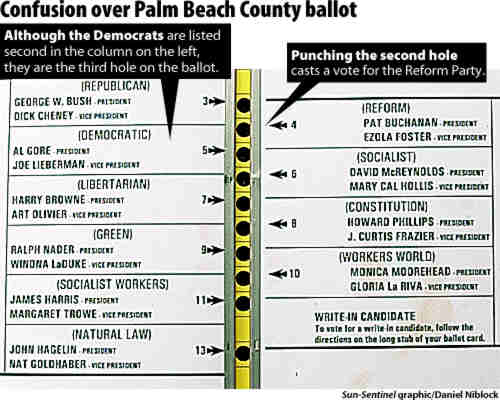
Re:I have said it before, and I will say it again
You would not have had the "alignment" problem.
The second hole down did not correspond to the second candidate down on the left side, but the first candidate on the right side. That is what confused people. See here. Have the same ballot marked with a pen and you have the same problem.
You do not need to validate the voter on the ballot at all.
You misunderstand. I am talking about verifying the voter's intentions on the ballot, which was another problem in the Florida election, but happens all over. If the voter's intentions aren't clear, the vote is invalid. I am using "validate" as in "validate the input", ie. confirm the choice with the voter if it isn't clear. You can't do that with a paper ballot and maintain voter anonymity.
-
Real geeks don't use bookmarks
While Google Groups and the Usenet search are probably bookmarked by any geek out there
Real geeks don't use bookmarks, they use Google Web Search to return to sites. -
Re:Thanks a lot, Florida
It's pretty sad that someone who doesn't know the difference between "too" and "to" disses Florida. Have you ever even seen a butterfly ballot? Their design is idiotic to begin with, so it's no miracle that some people voted Reform instead of Democratic by mistake.
-
Do some research!
This is a bald-faced "Urban Myth" go back and review the facts of the 2000 election and you'll find the Supreme Court in reality ended up being a non-factor in the outcome of the election.
Ummmm. Nope. Sorry. You're the one who is mistaken here.
The Supreme Court ordered that the recount be stopped (and, that is the ONLY recount, not "multiple recounts" as James Baker and the Republicans claimed over and over again during the press coverage of the 2000 election fiasco) and that the totals from the election night be certified. This DID have a huge effect on the outcome of the election, because, as was found by a group of eight news organizations that did a recount of the Florida 2000 votes, Gore won in a number of different recount scenarios, even if you don't count the extra illegally counted absentee votes that pushed Bush over Gore's vote total.
Your facetious "can't make an X" statement shows how little you know about what happened. The main problems with the 2000 election in Florida were:
1) Tens of thousands of people were incorrectly put on the felon list and removed from the voter rolls
2) The "butterfly" ballot debacle that caused thousands of votes (3:1 of which were likely to go to Gore) to not be tallied. These were punch ballots, and not "X marks the choice" ballots.
Now, were the Consortium recounts widely reported as a Gore victory? No. Why? At least partly because they were completed in November of 2001, while the majority of the country was in shock after September the 11th. I'm not saying this as some sort of conspiracy theory, but a LOT of the news coverage at the time was pretty soft on anything related to Bush, because many, many people (look at his approval ratings from that time period) thought that we needed to support our President during the traumatic times.
Next time, before you call something an "urban myth", why don't you do some research? -
Re:At least
I also think that a three second delay is both arbitrary and unsafe. There are plenty of hunt-and-peck typists that would look at the keyboard for three seconds trying to find the 'l' and 'y' keys.
I hadn't thought of hunt-and-peck typists when I suggested the delay. You're absolutely right.
I don't have a better suggestion, except perhaps bringing the confirmation up in a popup that doesn't steal the focus. I don't think a website can trick somebody into switching windows and hitting 'y'.
That would be annoying, since you'd have to focus the window manually, and wouldn't solve the double-clicking version of the attack.
I'm liking a suggestion by Microsoft more and more. The suggestion is to show a new toolbar instead of the security dialog when a site tries to install software. Clicking the toolbar brings up a normal security dialog with a complete warning and Install/Cancel buttons. Since installing software would then involve going through browser chrome, it would be more difficult for sites to make you accept the software installation dialog without your consent.
Using a toolbar instead of a dialog would also protect against sites that try to force you into accepting ActiveX by repeating the dialog until you accept.
Not only would a toolbar be more secure, it would also be less annoying. Users don't like to wait. I suspect users don't like to wait for the same reason that users prefer keyboard interfaces even when they are slightly slower than mouse interfaces, and for the same reason that I spend an hour writing a program to do something for me that I could do myself in ten minutes.