 Slashdot Mirror
Domain: edwardtufte.com
Stories and comments across the archive that link to edwardtufte.com.
Comments · 212
-
Re:Ancillary titles to TFA
Not really, some of the analysis following the Challenger disaster at NASA concluded that the use of Powerpoint limited the ability to put enough relevant information on the screen to allow analysts to make the necessary connections to identify risks.
http://www.edwardtufte.com/tuf...In a similar study performed by the Army, the conclusion was that all of the necessary detail that would have been included in a whitepaper was trimmed away for the 5-bulletpoints that they could put on the screen, to quote the article:“It’s dangerous because it can create the illusion of understanding and the illusion of control,” General McMaster said in a telephone interview afterward. “Some problems in the world are not bullet-izable.”
http://www.nytimes.com/2010/04...Horsecrap. I can present a single word on a single slide which sums up everything the engineers came up with: "NO". Powerpoint had nothing to do with the challenger disaster and is nothing more than a blame sharing exercise. What caused the disaster was that the information exchange between engineers and managers was poorly facilitated. If the engineers at any point recommended not to launch (which they did) then the fault lies squarely on the other side of the table for not seeking all the relevant information. If the powerpoint had nothing but pictures of rainbow unicorns on it you can still extract all relevant information you need as the information was available in the room at the time. If the decision was to be made after it should have been made from minutes not from presentation slides.
-
Re: Ancillary titles to TFA
-
Re:Ancillary titles to TFA
Not really, some of the analysis following the Challenger disaster at NASA concluded that the use of Powerpoint limited the ability to put enough relevant information on the screen to allow analysts to make the necessary connections to identify risks.
http://www.edwardtufte.com/tuf...In a similar study performed by the Army, the conclusion was that all of the necessary detail that would have been included in a whitepaper was trimmed away for the 5-bulletpoints that they could put on the screen, to quote the article:“It’s dangerous because it can create the illusion of understanding and the illusion of control,” General McMaster said in a telephone interview afterward. “Some problems in the world are not bullet-izable.”
http://www.nytimes.com/2010/04... -
Edward Tufte
Also has railed about this at length LONG before this article came out, and some of this article referenced him. http://www.edwardtufte.com/tuf...
Plus, no one can top, "There are no bullet points like Stalin's bullet points!" -
Anyone Ever Read Tufte?
I don't agree with him on everything, but he's rich and famous on his merits, and I'm not, so I guess it's all sour grapes on my part...
In any case, he's all about developing UX to present complex data in a manner that provides a strong "signal to noise ratio," and that helps to afford the correct interpretation of data.
I'd say that BI data fits that profile pretty well, as it can mean billions of pounds/dollars/yen/ruble, and thousands of jobs.
I see that someone posted his attack on PowerPoint, but some of the other work he's done is pretty relevant to this discussion.
-
Re:Thanks Obama!
The Powerpoint Ranger creed
Discussion of the US Military's love of PPT on Edward Tuft's site. "Mustaches for everyone!" -- actual quote -
single biggest threat to STEM education
Yes. THIS.
The single biggest thing that renders useless an otherwise-great STEM education is the lack of ability to write well.
Legion are the devs who string together many words, but forget to have a verb or period at the end. Innumerable are the IT wonks who can't scrape together a coherent and concise summary of 1000-page compliance reports. I swear, the collective plural noun for some of the security analysts at work is "a shimmer of tin foil hats" or "a fuckery of subjectivism"
Can I *PLEASE* have a critical thinker and good writer in the house???? Anyone??
Science does no good if you cannot express a coherent hypothesis, imagine a threshold, or string together a sequence of actual actions for testing. In medicine this costs lives.
Technology is an interchange, it does no good if you cannot listen to a problem, and express understanding back. At this moment in software, we're awash in UX implementations that aren't traceable to a functional problem.
Engineering compounds the problem later without functional expression and holistic and temporal views. Ask a Boeing maintenance tech about the plethora of could-have-been-shared 1-off components in 20-40 year old jets.
Math does no good if you cannot draw a picture. Ask the Morton Thiokol guys about their reports on the o-rings on the space shuttle.Among other "humanities" like history and writing/composition, Tufte ought to be mandatory for high-school seniors in a STEM program.
-
TufteThe Visual Display of Quantitative Information, because you'll probably to do it eventually.
-
Re:This is misguided, at best
My suggestion: get better speakers.
My suggestion: study Edward Tufte's site [http://www.edwardtufte.com/tufte/]. Read some of his books ("The Visual Display of Quantitative Information" is especially good), then get back to us. -
Read Tufte
http://www.edwardtufte.com/tuf...
I've read the booklet and I found it persuasive.
Tufte (and iirc, Feynman) also cited reliance on Powerpoint on the Columbia disaster
I think it's important to understand what powerpoint is good for. It is good for helping an average presenter guide the delivery of low-bandwidth information into a low-attention span audience who are not subject matter experts.
In other words, it's good for 90% of the people, 90% of the time.
If you are trying to send people to space, or create controlled black holes on the European mainland, do not use it.
Another situation where PP can be used effectively is to present visual information - photos, charts, etc.
Ironically enough, I borrowed the Tufte powerpoint rant from the Microsoft Library here at work
-
Re: "Organic visualization"
The "organic visualization" thing and its jargon are described in this thesis done at the MIT Media Lab. This is what happens when postmodernists try to improve on Tufte. Some of it is pretentious bullshit. But there may be the genesis of some new phone apps in there.
Here's a good, but unrelated, example of "organic visualization": BitListen This is a little HTML5/JavaScript page which depicts transactions on the Bitcoin block chain. An older example is Muckety. This can be done well, but most attempts in this direction are duds.
-
Re:More missing elements, to to be discovered.
A more complex table with an extra dimension or two of symmetry might be able to capture more patterns, giving us a more detailed model that produces better, more subtle approximations than the Mendeleev-derived model can yield
Yet the table still couldn't predict the properties of gold. Understanding many of the elements requires models - approximate theories that make falsifiable predictions like relativity and electron shielding - that explains the electrons in the outer shells of gold atoms are compressed. Unlike other atoms in that period, gold has very weird properties. Not just the gold color from absorbing the "wrong" frequencies of light but also forming bonds like AuXe4 that a model based on Mendeleev's table can not predict.
The crux of the matter I think you put it best:
the table's implicit model
Tables, like other language artifacts are good for communicating ideas, but are not ideas in and of themselves.
To paraphrase Edward Tufe, not only can tables be used to explain, but also they can be used to missexplain.
The real value in the alternative tables is if they explain better those underlying theories their creators have in their heads. And as a bonus, compared to many of the alternative tables, Mendeleev's table is easy to draw.
-
Re:CLI vs GUI
Eclipse? Usability? Same Paragraph?
Wow. Now I've seen everything.
Eclipse is an awesome program. A real Swiss army knife.
However, as you seem to infer, it tends to be a little difficult to use. I suspect one reason is that it tries to be All Things to All Men.
UIs are completely context- and audience-dependent.
If you've ever ready any of Tufte's stuff, you have seen some truly hairy interface elements that require training to understand. However, once you understand, the UX is extremely immersive, intuitive and useful; feeding you a great deal of complex data.
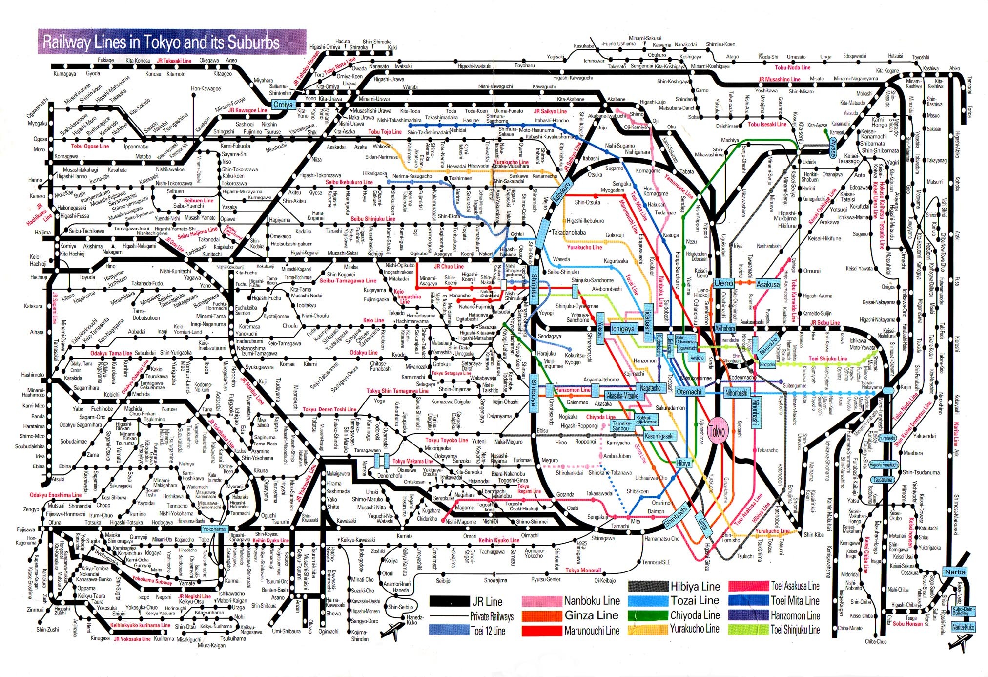
For example, This is actually a highly usable data display. Millions of people use it, or displays just like it, to navigate all over the world's largest metropolitan area.
Then, there's just plain dumb.
"Dumbed-down" is often mistaken for "usable."
-
Re:Antipattern #1
Edward Tufte in Cognitive Style of Powerpoint has a lot to say about slides their format and content and is against their indiscriminate uset. This is from a perspective of an information designer. http://www.edwardtufte.com/tufte/books_pp "Alas, slideware often reduces the analytical quality of presentations. In particular, the popular PowerPoint templates (ready-made designs) usually weaken verbal and spatial reasoning, and almost always corrupt statistical analysis. What is the problem with PowerPoint? And how can we improve our presentations?"
-
Re:Simple is not ugly.
Warning: Pleasing aesthetics may interfere with your ability to interpret information.
*Remember the "flashy thingy" from Men in Black?*
Edward Tufte has plenty say about this in his books. He has a lecture circuit as well, one stop along the way is Seattle, 23 July, in case you Microsofties need some pointers on declutterification.
His focus is on presenting information, and he lambasts the corporate brand mentality for subjugating content to elevate brand.
-
Re:Something that everyone can understand?
How about, Oh, I dunno. A pictorial map? With a human skull marking each site? They may dig up one, but after that they should be able to figure out what the other sites are.
I was going to suggest asking Tufte but your idea definitely deserves a "6" because it was certainly one smarter than the rest so far...
-
Re:Did you know weapons can be TOO lethal?
or just down to not having enough to eat and the weather too cold
the famous graphic:
http://www.edwardtufte.com/tufte/posters
logistics: getting supplies to the front line, is more of a deciding factor in any war than how lethal your armament is
and the wise defender does not fight the front lines, they fight the supply lines
-
various resources
Sign up for Jakob Neilsen's Alertbox and read his past postings.
Designing with the Mind in Mind: Simple Guide to Understanding User Interface Design Rule
All of the books by Edward Tufte
Various resources available from Juice Analytics
-
Re:sue
Ah, the good ol' internet argument, here goes...
1. where do you think AI would originate from? You or IT?
You who can't grasp code or how computers work can never understand how far away we are. I write the scripts btw, without me there are no scripts, then I adjust those scripts based on business needs, so they don't just infinitely run correctly, they become obsolete.
If people in this thread are citing "advancements" in neural programming, please cite your source, until then please refer to the first sentence of my OP.
I would love to see the source code for human reasoning, I would feel blessed, I also accept I probably never will.
I did pick up an interesting argument though, some people are probably right that given a long enough time frame it may be achievable, but here's the question, if we are a bag of chemicals and make the SAME EXACT bag of chemicals to replicate us, isn't that cloning, not AI? and say we mix that bag of chemicals with mechanic parts, that's human augmentation, currently being done to amputees on some level today. So where does that leave true pure AI in terms of how do we make it?
How exactly would follow the path to making AI? how would we ever know we've completed our task? 1 trillion lines of source code? 2 trillion?
As we stand, we can't replicate a human finger, much less an eye or a brain, I know that there have been experiments in giving blind people sight through electric synopsis, but they STILL HAVE EYES, just defective, fixing a broken tail light on a car vs building a car is a completely different beast.
Then we've know this for a while....
http://www.edwardtufte.com/bboard/q-and-a-fetch-msg?msg_id=0002NCYep, computers aren't even close, this is a limit we may one day break though, but then there's all the other boundaries to pass...
-
facts versus message
Informative post, except for this:
But the one thing these all have in common is McCandless, not GE. So let's not fault megacorporations who're trying to communicate a message: let's fault information presentation gurus who care more about appearances than on information presentation.
Megacorporations are presenting a message alright, but it's not one of information. Rather it's delivering messages that make them either look good or confuse the issue, or both. Ever read How to Lie with Statistics? Megacorporations are not filled with dumb marketing people, they are almost certainly acquainted with such techniques. Are they lying to themselves as well as us? I don't know and I don't care. Fry's visualizations, and now McCandless's artsy ones, were chosen for good reason. They work. Even a person who is interested in factual information is diverted to blame the graphic designer instead of exploring the issue. My opinion is that people like Fry and McCandless, and especially the corporations who hire them, are trolling experts.
If interested in informative graphic design, check out Hans Rosling for an engaging presentation on population, or the Knuth of graphic designers Edward Tufte on analytical design and human factors. If you want to know more about fossil fuel problems, check out sources other than fossil fuel profiteers. For example Bartlett's more factual presentation on limited supplies and exponential growth.
"Good displays of data help to reveal knowledge relevant to understanding mechanism, process and dynamics, cause and effect." -- Edward Tufte
-
Don't forget Tufte..
The Cognative Style of Powerpoint Essay
* http://www.edwardtufte.com/tufte/books_ppAlso
PowerPoint Does Rocket Science--and Better Techniques for Technical Reports
* http://www.edwardtufte.com/bboard/q-and-a-fetch-msg?msg_id=0001yB&topic_id=1 -
Don't forget Tufte..
The Cognative Style of Powerpoint Essay
* http://www.edwardtufte.com/tufte/books_ppAlso
PowerPoint Does Rocket Science--and Better Techniques for Technical Reports
* http://www.edwardtufte.com/bboard/q-and-a-fetch-msg?msg_id=0001yB&topic_id=1 -
Re:No dieing to push the envelope. Plain old go fe
It wasn't even completely that. I read a fascinating excerpt of a book by Edward Tufte in college that basically showed that the engineers HAD the data, but it wasn't compiled in a way that clearnly said to any reader, "hey dumbass, nothing below this temperature is likely to be remotely safe".
A quick summary: http://www.asktog.com/books/challengerExerpt.html
The book: Visual Explanations: Images and Quantities, Evidence and Narrative ( http://www.edwardtufte.com/tufte/books_visex ) by Edward Tufte
Excerpt: Visual and Statistical Thinking ( http://www.edwardtufte.com/tufte/books_textb ) by Edward Tufte. (This is what I read in college. It's a reprint of chapter 2 of the aforementioned book. It was amazing.) -
Re:One thing not taken into account...
Yeah, true - it's not just about the whitespace, but the loss of useful succinct and quickly interpreted data per post (Score being a perfect example).
I think someone needs to go and reread the classics... The Visual Display of Quantitative Information
-
Re:What horrible graphics
I'll admit that I wrote my post while feeling a bit grouchy, so my tone was poor.
My opinions come from a lot of reading of Edward Tufte, whose career has been focused on the visual display of quantitative information. It is hard for me to see ANY graph without looking at it with the perspective of what I've learned.
I'm not trying to take away from Rosling's accomplishments in world health. Reading up on his background, I have a lot of respect for the man. At the same time, I found his graphics and presentation a bit too flashy, and it seemed that he favored style over clarity, which (in my opinion) is getting in the way of his good message.
If we could just harness your ego to power electricity we could power the continental United States... And you've accomplished...what, exactly?
Please avoid these personal attacks. Name calling and putting people down is self-diminishing. I know that my original post had some of that tone (which was my fault, and I shouldn't have done it).
Also, what I have or have not accomplished in my life is of no relevance here.
-
Re:What horrible graphicsHit submit too early:
Let's the what Tufte has to say on the issue:
Baselines
In general, in a time-series, use a baseline that shows the data not the zero point. If the zero point reasonably occurs in plotting the data, fine. But don't spend a lot of empty vertical space trying to reach down to the zero point at the cost of hiding what is going on in the data line itself. (The book, How to Lie With Statistics, is wrong on this point.)
For examples, all over the place, of absent zero points in time-series, take a look at any major scientific research publication. The scientists want to show their data, not zero.
The urge to contextualize the data is a good one, but context does not come from empty vertical space reaching down to zero, a number which does not even occur in a good many data sets. Instead, for context, show more data horizontally! .
http://www.edwardtufte.com/bboard/q-and-a-fetch-msg?msg_id=00003q
-
Re:CK12.org - Probability and Stastics - nice bookAnother quite good book on statistics is Edward Tufte's "Data Analysis for Politics and Policy", which is posted at http://www.edwardtufte.com/tufte/dapp/
(All the examples are real life examples, often quite important ones as well.)
-
Re:Too literalThis applies to VLSI cad as well, you need wide screens and lots of resolution - of course you could get by with a 320x200 display - zooming in and out, but your productivity and quailty would suffer.
Tufte talks about this:It is reasonable to suggest that there are other issues in presenting evidence than high resolution. Any other view would be astonishing. But the overwhelming truth is that much of the history of progress in science and in communication can be written in terms of improvements in resolution. That is the big idea here, and it should not be compromised away by shortrun situational considerations. -- Edward Tufte, July 29, 2001
-
Re:Hard predictions?
There is near universal agreement among climate scientists on the atmospheric physics that predicts several degrees of global warming.
Let me finish that statement for you, and see if you still agree with it:
There is near universal agreement among climate scientists on the atmospheric physics that predicts several degrees of global warming solely because of human released CO2.
I'm sure Lindzen would disagree, as well as the others at the ICCC this week, but let's say we allow that -> imagine that no matter what CO2 we pump out, the maximum effect will be an additional 2C, period, whether it happens in 1 year or 100 years. Where's the problem with that?
I'm not going to type it in here just because you can't be bothered to read it yourself.
Hey, just wanted to give you a chance to cite exactly what you wanted to cite, rather than picking through your references and finding all the ridiculously implausible and indefensible parts to lay around your neck. Do you really want to assume the entire IPCC AR4 Summary as your point of view?
For scientists, the fact that multiple approaches to modeling a system lead to the same overall conclusions increases, rather than decreases, confidence in those conclusions.
Really? The "same overall conclusion"? And what conclusion is that, if there are 23 different models that vary greatly in the magnitude of the changes predicted?
I refer you to The Visual Display of Quantitative Information, p. 76: http://www.edwardtufte.com/tufte/books_vdqi
"The main defense of the lying graphic is
Given the confirmation bias exposed by Climategate, I'm actually quite disturbed to see multiple approaches reach the same conclusions as a known falsified one. It speaks very poorly of the quality of the untainted models when they agree so well with one that has been jerry-rigged.
For this reason, some climate scientists insist that the model runs should be called "projections" rather than "predictions" because they are dependent upon guesses as to how successful we will be in limiting CO2 release.
Which, again, is an example of the anti-science policy driving conclusions, rather than letting the data lead where it may. This is the really, really big problem of the IPCC and the warmists in general -> it is a foregone conclusion that reducing CO2 emissions is good, and increasing them is bad. This is a human value judgement based on belief, not an empirical statement based on fact and observation.
I still put out the challenge to you -> given 23 different models cited by the IPCC, what observations will allow us to winnow it down to the one model which is correct?
There are indeed multiple versions of gravitation theory, of which Newton's is just one
g = GM/R^2
What's the other one? General relativity? And what kind of discrepancy do you get between the two, let's say for Mercury's orbit? What's the order of magnitude of that discrepancy compared to the 23 models you figure are all about the same?
Man, the longer this goes on, the deeper you dig your hole
-
While I refuse to PowerPoint
I work as a Systems Admin and Landscape Manager, very often being responsible for 1000+ server landscapes and millions if not billions of dollars invested in the same.
In my specific field of Client/Server CRM and Enterprise Entity Software, there are no "fall back options".
If my systems go down, the entire company goes "bye bye", often affecting hundreds of thousands of people.For all the reasons mentioned in this article;
http://www.edwardtufte.com/bboard/q-and-a-fetch-msg?msg_id=0001yB&topic_id=1I simply flat out refuse to put certain topics in Power Point format. Even at the risk of angering the very, very higher ups.
I found that in this day and age the attention span of most in top management equals that of a 5 year old.
But topics like "Backup and disaster recovery", or "System Safety and Potential Points of Attack" and even things like "Expected performance changes over the lifetime of the System" can not be squeezed into 3-5 line page "tweets".Entire books have been written on these topics, designed to be read by EXPERTS in the field, and I am to explain the same to someone who doesn't even understand the difference between a Database and a Flat File Store in under 6 lines?
I read a lot of proud pro PP statements from "professional power pointers" in here.
But have you ever stopped to ask yourself if that glazed over look in the eyes of your audience is not caused by the reflection from the projection screen, but their "tilt" light going into overdrive?! -
Re:NASA / Ed Tufte reference
Its on his posters page, but "The Cognitive Style of Powerpoint: Pitching Out Corrupts Within" is 32 pages of joy.
-
NASA / Ed Tufte reference
A long essay on the evils of PowerPoint by the man, Ed Tufte, regarding the shuttle explosions: http://www.edwardtufte.com/bboard/q-and-a-fetch-msg?msg_id=0001yB&topic_id=1
-
Re:Academics
Try reading some of Tufte's work first. Tufte's genius is just the sort of thing we need more of so that we can better make use of the torrent of information raining down on us.
If his work is used to distort rather then reveal information I suspect he will let us know. -
Mercy me...
This should be - v e r y - interesting indeed.
I have enormous respect for Tufte and his integrity. I can;t wait to see what happens.
Remember, this is the guy who put Stalin on the cover of his pamphlet on "The Cognitive Style Of Powerpoint"
I'm reminded of Feynman on the Columbia commission.
-
Re:Another miss
That link is being gone over on Edward Tufte's site, although I wouldn't expect Tufte to have any love for anything Microsoft.
I played with a prototype windows 7 phone about a month ago and they are using the paradigm of making the desktop larger than the screen almost everywhere and it is incredibly annoying.
-
Re:Typical Customer Service Department attitude
No, it would be naive to think that Toyota knows anything. Most likely clueless management has been presented with some PowerPoint presentation with slides like the infamous Columbia one: http://www.edwardtufte.com/bboard/q-and-a-fetch-msg?msg_id=0001yB and drew the conclusions that they wanted to draw.
I'm sure someone in the engineering department has known the truth for years, but they likely lost the political battle to bring the message to management clearly.
-
Re:Do not just type. Do something to help him!
Invade Russia during winter at your own peril.
-
Re:New Patent!
New Patent! Sparklines ***on the internet***!
Google's already been doing it for quite a while. Check out google analytics summary pages. It's loaded with them. There are more examples here: http://www.edwardtufte.com/bboard/q-and-a-fetch-msg?msg_id=0001OR
-
Prior art from 2005 perhaps earlier.
http://www.bissantz.de/sparklines/ Done for Microsoft office Feb. 2005 See also http://www.edwardtufte.com/bboard/q-and-a-fetch-msg?msg_id=0001OR&topic_id=1 Also the size of graphics is not implicitly small but can and could have been any size and automated by scripts the way Nicolas Bissantz did in '05
-
Not too impressed.
I wouldn't complain about Microsoft's activity when you link to Wikipedia rather than the author's own page on sparklines.
-
Re:Actually
True -
working in IT support, I see so many professors who are frustrated by students who are playing solitaire, chatting, or even doing homework for another class during a lecture. The most insecure want some kind of technology solution to shut down all the student wi-fi during classes. These tend to be the same professors reading the text copied from the publisher's PowerPoint pack in a monotone drone.
Anyone contemplating using PP or any other class presentation software/s should be forced to sit through at least one Edward Tufte lecture.. some of his proposals are a little extreme, but I've seen the lectures and bought the library. http://www.edwardtufte.com/
-
different for ESL students
Until recently, I was a vocal opponent of PowerPoint. I had read Tufte's essay and applied the assertion-evidence structure to my slides. When presenting certain types of data to an english audience, these measures are effective.
But when a relevant percentage of the audience does not understand English, or when the presenter does not speak English, writing the entire presentation down on the slides and reading off the slides is a more effective way of communicating. ESL students are more able to comprehend what they read than what they hear. What 'using powerpoint well' means is a function of the audience and the material. -
Re:Pie Charts
piecharts are a bad way to represent comparative data like this in the first place...3D pie charts may look fancy, but they make it more difficult to compare the actual data (which is supposed to be the whole point of plotting it)
Give that man a cigar. This is exactly what I thought when I looked at the
It's not just pie charts that are misused in this way; the same thing can be said about just any type of 3D chart that's commonly used in presentations and reports for business or government organizations—the effects of perspective make it difficult or impossible to tell what is really going on. Consequently, these "visual aids" do not clarify data, but obfuscate it.
Some critics blame this on PowerPoint and similar tools (like this one provided by Google), and it's true that these tools make it easy to produce bad visual representations of data. The most vociferous and articulate of these critics is Edward Tufte, who goes so far as to blame the Challenger shuttle disaster on PowerPoint (take a look at Tufte's web page about PowerPoint, or better yet, buy his books!). I wouldn't go quite as far as Tufte; these tools are just like any tools; they can be used ineptly or deceptively, just as they can be used to clarify and enlighten. The real problem lies in the managerial culture that dominates both American business and government. This culture pretends to be rational and "scientific", as defined by whatever management fads are current, but it's not really interested in serious thought or analysis, just in keeping up appearances. So I don't think 3D charts are going away any time soon.
-
Re:Ambitions have changed since 1969
Check out the Direct slides (it's unfortunately bloated compared to the rest of the files by some superfluous vids), they recommend an approach that uses a propellant depot. Direct also gives you one modular family of vehicles, like the EELV and unlike current Constellation, this is an indication of the very poor fundamental design choices made by NASA technocrats using powerpoint engineering (see Tufte). Completely scrapping the shuttle would be wasteful when it already *is* a Saturn V class launch vehicle if you don't have to lug the orbiter around all the time. Plus it is more efficient, fuel and structure-wise than the Saturn V. Going the EELV route has lots more unknown unknowns than a shuttle derivative. I think the Direct + COTS approach is a win. Direct leverages existing infrastructure/technology/workforce, SpaceX is lean and actually throwing mass.
-
Re:Intellisense and Debuggers
Charles Petzold, an author of several well-known books on Windows programming, dislikes the CASE (computer-aided software engineering) features provided by modern IDE's such as Visual Studio. He gave a speech criticizing parts of the Visual Studio, in particular IntelliSense, the code generation wizards, and drag-and-drop GUI builders, and other convenience features of the IDE.
Petzold's article reminded me of Edward Tufte's famous critique of PowerPoint.
During the '90s, Microsoft (like many large companies) had several slogans, but one that they seemed to take to heart was "Making it easier". That perhaps should be kept in mind while reading the Petzold and Tufte articles.
-
Gaming the News
It seems to me that the largest current problem with "the news" is quality. How is increasing the cost of presentation in the absence of improved investigation and analysis going to improve the quality of what is presented? This seems like yet another hopeful stab at using technology for the sake of technology with little or no regard to determining whether it is an appropriate question. News is information. If you want to understand how to improve the presentation of information, look up Edward Tufte, his work, his books and his curriculum vitae.
Rupert Murdoch & his ilk at the Tele-Virus Networks took this attitude to it's logical extreme. They played the game of ---> let's see how little we can invest in reporting and credible presentation of fact-based analysis and how much we can squeeze out of sponsors who care more about eyeballs than brain cells.
They won, we lost... (long live Walter Cronkite).
-
Re:Yes they could make it much easier.
3D pie charts that show only 2 numbers are the devil's work.
What this tells me more than anything else is that although they want to be transparent, the people who put this together know almost nothing about presentation of data.
Please, everybody, read Tufte. Even if you don't agree with everything that he says, think about his points.
Then, for the love of God, never, ever, create a 3D pie chart again.