 Slashdot Mirror
Domain: fastcodesign.com
Stories and comments across the archive that link to fastcodesign.com.
Stories · 29
-
Adobe is Reviving the Stunning Lost Fonts of the Bauhaus (fastcodesign.com)
An anonymous reader shares a report: Even if you're not a designer, you've probably heard the phrase "form follows function." That's how influential the school that espoused it, the Bauhaus, has become since its heyday in 1920s and '30s Germany. Now, some of the movement's most compelling -- but largely unknown -- lettering has been recreated from archival material, like original typography sketches and letter fragments, and transformed into contemporary digital typefaces.
The project is part of an Adobe initiative called Hidden Treasures that resurfaces design gems from the past in Adobe products -- previously, the company recreated the paintbrushes used by painter Edvard Munch for use in Photoshop. For the second iteration of the initiative, Adobe worked with the Bauhaus archives in Berlin, Germany, to bring in five design students to create five distinct typefaces, all under the guidance of expert typeface designer Erik Spiekermann. While each of the typefaces will eventually be available to all users of Adobe Typekit, two are now available online: one inspired by Joost Schmidt, a teacher at the Bauhaus who also created the famed poster for the 1923 Bauhaus Exhibition, and the other inspired by Xanti Schawinsky, who taught classes in set design at the school. -
'Why I'm Switching From Chrome To Firefox and You Should Too' (fastcodesign.com)
An anonymous reader quotes an associate technology editor at Fast Company's Co.Design: While the amount of data about me may not have caused harm in my life yet -- as far as I know -- I don't want to be the victim of monopolistic internet oligarchs as they continue to cash in on surveillance-based business models. What's a concerned citizen of the internet to do? Here's one no-brainer: Stop using Chrome and switch to Firefox... [W]hy should I continue to use the company's browser, which acts as literally the window through which I experience much of the internet, when its incentives -- to learn a lot about me so it can sell advertisements -- don't align with mine....?
Unlike Chrome, Firefox is run by Mozilla, a nonprofit organization that advocates for a "healthy" internet. Its mission is to help build an internet in an open-source manner that's accessible to everyone -- and where privacy and security are built in. Contrast that to Chrome's privacy policy, which states that it stores your browsing data locally unless you are signed in to your Google account, which enables the browser to send that information back to Google. The policy also states that Chrome allows third-party websites to access your IP address and any information that site has tracked using cookies. If you care about privacy at all, you should ditch the browser that supports a company using data to sell advertisements and enabling other companies to track your online movements for one that does not use your data at all.... Firefox protects you from being tracked by advertising networks across websites, which has the lovely side effect of making sites load faster...
Ultimately, Firefox's designers have the leeway to make these privacy-first decisions because Mozilla's motivations are fundamentally different from Google's. Mozilla is a nonprofit with a mission, and Google is a for-profit corporation with an advertising-based business model.. While Firefox and Chrome ultimately perform the same service, the browsers' developers approached their design in a radically different way because one organization has to serve a bottom line, and the other doesn't.
The article points out that ironically, Mozilla supports its developers partly with revenue from Google, which (along with other search engines) pays to be listed as one of the search engines available in Firefox's search bar.
"But because it relies on these agreements rather than gathering user data so it can sell advertisements, the Mozilla Corporation has a fundamentally different business model than Google." -
The World's First Graphical AI Interface (fastcodesign.com)
FastCompany reports: Machine learning and artificial intelligence are so difficult to understand, only a few very smart computer scientists know how to build them. But the designers of a new tool have a big ambition: to create the Javascript for AI. The tool, called Cortex, uses a graphical user interface to make it so that building an AI model doesn't require a PhD. The honeycomb-like interface, designed by Mark Rolston of Argodesign, enables developers -- and even designers -- to use premade AI "skills," as Rolston describes them, that can do things like sentiment analysis or natural language processing. They can then drag and drop these skills into an interface that shows the progression of the model. The key? Using a visual layout to organize the system makes it more accessible to non-scientists. -
iOS 11 'Is Still Just Buggy as Hell' (gizmodo.com)
It is becoming increasingly apparent that iOS 11, the current generation of Apple's mobile operating system, is riddled with more issues than any previous iOS version in the recent years. Two months ago, in a review, titled, "iOS 11 Sucks", a reporter at the publication wrote: I'm using iOS 11 right now, and it makes me want to stab my eyes with a steel wire brush until I get face jam. Gizmodo today reviews iOS 11 after living with the current software version for two months: It's been two full months since Apple released iOS 11 to millions and millions of devices worldwide, and the software is still just buggy as hell. Some of the glitches are ugly or just unexpected from a company that has built a reputation for flawless software. Shame on me for always expecting perfection from an imperfect company, I guess. But there are some really bad bugs, so bad that I can't use the most basic features on my phone. They popped up, when I upgraded on release day. They're still around after two months and multiple updates to iOS. Shame on Apple for ignoring this shit. Now, let me show you my bugs. The worst one also happens to be one I encounter most frequently. Sometimes, when I get a text, I'll go to reply in the Messages app but won't be able to see the latest message because the keyboard is covering it up. I also can't scroll up to see it, because the thread is anchored to the bottom of the page. The wackiest thing is that sometimes I get the little reply box, and sometimes I don't. The only way I'm able to text like normal is to tap the back arrow to take me to all my messages and then go back into the message through the front door. [...] Other native iOS 11 apps have bugs, too. Until a recent update, my iPhone screen would become unresponsive which is a problem because touching the screen is almost the only way to use the device. -
IBM's Quest To Design The 'New Helvetica' (fastcodesign.com)
IBM released its new bespoke typeface IBM Plex in beta this week. The company is hoping that the new typeface would become just as iconic as Helvetica in the years to come. From a Fast Co Design story: "When I came to IBM, it was a big discussion: Why does IBM not have a bespoke typeface? Why are we still clinging on to Helvetica?" Mike Abbink, the typeface's designer and IBM's executive creative director of brand experience and design said. To uncover what the typeface should express, Abbink and his team took a deep dive into IBM's archives. They were especially interested in the company's history in the postwar years, when its design-led business strategy first took shape and the legendary practitioner Paul Rand, who defined design as a system of relationships, created its famous eight-bar logo. In Rand's logo, Abbink and his team saw a contrast between hard edges -- the engineered, rational, and mechanical -- and curves -- the softer more humanistic elements. It's a reflection of the man-and-machine relationship that runs through the company's history -- a dynamic that is reflected in the final form of IBM Plex. The Plex family includes a sans serif, serif, and monospace versions. The designers also created a rigorous style guide that's akin to a digital standards manual and includes a type scale, which plays into responsive displays; eight different weights (a nod to how the IBM logo is composed of eight horizontally stacked bars); and usage guidelines, which dive into everything from information hierarchies to color and ragging. All together, it's easy to see Plex as a gentler, friendlier, more casual Helvetica for a broad range of uses both digital and print-based. -
Microsoft Has Stopped Manufacturing The Kinect (fastcodesign.com)
Manufacturing of the Kinect has shut down, reports FastMagazine: Originally created for the Xbox 360, Microsoft's watershed depth camera and voice recognition microphone sold about 35 million units since its debut in 2010, but Microsoft will no longer produce it when retailers sell off their existing stock. The company will continue to support Kinect for customers on Xbox, but ongoing developer tools remain unclear. Microsoft shared the news with Co.Design in exclusive interviews with Alex Kipman, creator of the Kinect, and Matthew Lapsen, GM of Xbox Devices Marketing. The Kinect had already been slowly de-emphasized by Microsoft, as the Xbox team anchored back around traditional gaming to counter the PS4, rather than take its more experimental approach to entertainment. Yet while the Kinect as a standalone product is off the market, its core sensor lives on. Kinect v4 -- and soon to be, v5 -- power Microsoft's augmented reality Hololens, which Kipman also created. Meanwhile, Kinect's team of specialists have gone on to build essential Microsoft technologies, including the Cortana voice assistant, the Windows Hello biometric facial ID system, and a context-aware user interface for the future that Microsoft dubs Gaze, Gesture and Voice (GGV). -
The ThinkPad At 25 (fastcodesign.com)
harrymcc writes: On October 5 1992, IBM released a laptop called the ThinkPad 700C. It sported an unusually good color screen, a pointing device called the TrackPoint II, and a distinctive black case. It was an immediate hit. And remarkably, many of the things that made that ThinkPad a ThinkPad remain true of today's models. I talked to some of the people responsible for the line -- which IBM sold to Lenovo in 2005 -- about why it's one of the few consistent brands of technology's last quarter century. -
What Comes After User-Friendly Design? (fastcodesign.com)
Kelsey Campbell-Dollaghan, writing for FastCoDesign: "User-friendly" was coined in the late 1970s, when software developers were first designing interfaces that amateurs could use. In those early days, a friendly machine might mean one you could use without having to code. Forty years later, technology is hyper-optimized to increase the amount of time you spend with it, to collect data about how you use it, and to adapt to engage you even more. [...] The discussion around privacy, security, and transparency underscores a broader transformation in the typical role of the designer, as Khoi Vinh, principal designer at Adobe and frequent design writer on his own site, Subtraction, points out. So what does it mean to be friendly to users-er, people-today? Do we need a new way to talk about design that isn't necessarily friendly, but respectful? I talked to a range of designers about how we got here, and what comes next. -
Hackers Can Take Control of Siri and Alexa By Whispering To Them in Frequencies Humans Can't Hear (fastcodesign.com)
Chinese researchers have discovered a vulnerability in voice assistants from Apple, Google, Amazon, Microsoft, Samsung, and Huawei. It affects every iPhone and Macbook running Siri, any Galaxy phone, any PC running Windows 10, and even Amazon's Alexa assistant. From a report: Using a technique called the DolphinAttack, a team from Zhejiang University translated typical vocal commands into ultrasonic frequencies that are too high for the human ear to hear, but perfectly decipherable by the microphones and software powering our always-on voice assistants. This relatively simple translation process lets them take control of gadgets with just a few words uttered in frequencies none of us can hear. The researchers didn't just activate basic commands like "Hey Siri" or "Okay Google," though. They could also tell an iPhone to "call 1234567890" or tell an iPad to FaceTime the number. They could force a Macbook or a Nexus 7 to open a malicious website. They could order an Amazon Echo to "open the backdoor." Even an Audi Q3 could have its navigation system redirected to a new location. "Inaudible voice commands question the common design assumption that adversaries may at most try to manipulate a [voice assistant] vocally and can be detected by an alert user," the research team writes in a paper just accepted to the ACM Conference on Computer and Communications Security. -
Facebook's AI Keeps Inventing Languages That Humans Can't Understand (fastcodesign.com)
"Researchers at Facebook realized their bots were chattering in a new language," writes Fast Company's Co.Design. "Then they stopped it." An anonymous reader summarizes their report: Facebook -- as well as Microsoft, Google, Amazon, and Apple -- said they were more interested in AI's that could talk to humans. But when two of Facebook's AI bots negotiated with each other "There was no reward to sticking to English language," says Dhruv Batra, visiting research scientist from Georgia Tech at Facebook AI Research (FAIR). Co.Design writes that the AI software simply, "learned, and evolved," adding that the creation of new languages is a phenomenon Facebook "has observed again, and again, and again". And this, of course, is problematic.
"Should we allow AI to evolve its dialects for specific tasks that involve speaking to other AIs? To essentially gossip out of our earshot? Maybe; it offers us the possibility of a more interoperable world, a more perfect place where iPhones talk to refrigerators that talk to your car without a second thought. The tradeoff is that we, as humanity, would have no clue what those machines were actually saying to one another."
One of the researchers believes that that's definitely going in the wrong direction. "We already don't generally understand how complex AIs think because we can't really see inside their thought process. Adding AI-to-AI conversations to this scenario would only make that problem worse." -
Nest Founder 'Wakes Up In Cold Sweats' Fearing The Impact Of Mobile Technology (fastcodesign.com)
theodp writes: Fast Company's Co.Design reports that Tony Fadell, who founded Nest and was instrumental in the creation of the iPod and iPhone, spoke with a mix of pride and regret about his role in mobile technology's rise to omnipresence. "I wake up in cold sweats every so often thinking, what did we bring to the world?" Fadell said. "Did we really bring a nuclear bomb with information that can -- like we see with fake news -- blow up people's brains and reprogram them? Or did we bring light to people who never had information, who can now be empowered?"
Faddell added that addiction has been designed into our devices, and it's harming the newest generation. "And I know when I take [technology] away from my kids what happens," Fadell explained. "They literally feel like you're tearing a piece of their person away from them-they get emotional about it, very emotional. They go through withdrawal for two to three days." Products like the iPhone, Fadell believes, are more attuned to the needs of the individual rather than what's best for the family and the larger community. And pointing to YouTube owner Google, Fadell said, "It was like, [let] any kind of content happen on YouTube. Then a lot of the executives started having kids, [and saying], maybe this isn't such a good idea. They have YouTube Kids now."
The article suggests Fadell is describing a world where omnipresent (and distracting) screens are creating "a culture of self-aggrandizement," and he believes this is partly rooted in the origins of the devices. "A lot of the designers and coders who were in their 20s when we were creating these things didn't have kids." -
Twitter Is Ditching the Egg (fastcodesign.com)
Long time reader and journalist harrymcc writes: In 2010, Twitter started representing new users with an icon of an egg. It was playful at the time, but the image has come to represent the worst of Twitter: trolls and bots. So the company is killing the egg. For Fast Company, I talked to Twitter's designers about their rationale for doing away with the well-known symbol, and the challenge of replacing it. From the article: The idea was that "eventually you'd crack out of an egg and become an amazing Twitter user," says senior manager of product design Bryan Haggerty, who worked on the project and recalls toying with the idea of even showing the hatching in progress. Nowadays, "the playfulness of Twitter is in the content our users are creating, versus how much the brand steps forward in the UI," says product designer Jen Cotton. Starting today, however, the egg is history. Twitter is dumping the tarnished icon for a new default profile picture -- a blobby silhouette of a person's head and shoulders, intentionally designed to represent a human without being concrete about gender, race, or any other characteristic. Everyone who's been an egg until now, whatever their rationale, will automatically switch over. -
McDonald's Hires Project Ara Design Team To Reinvent the Drinking Straw (fastcodesign.com)
An anonymous reader writes: McDonald's has hired the creators of Google's Project Ara to reinvent the drinking straw. Their new invention, the "Suction Tube for Reverse Axial Withdrawal" (STRAW for short), is a J-shaped device that allows the user to drink both layers of the company's dual-layer Chocolate Shamrock shake simultaneously, receiving an optimal mixture of chocolate and, um, shamrock. McDonald's announced the new product at a Facebook live event yesterday, which included a keynote by McDonald's Senior Director of Menu Innovation Darci Forrest, a Silicon-Valley-style panel moderated by Austin Evans, and interviews with engineers from NK Labs and JACE. Computational fluid dynamics simulations, 3D printing, and extensive real-world testing (drinking shakes) were required to get the design ready for its eventual unveiling. McDonald's is producing a limited first run of 2000 of the straws for distribution at restaurants across the U.S. "My first reaction was, that doesn't seem too hard. We could have a double straw -- one longer, one shorter. No problem," says Seth Newburg, principal engineer and managing partner at NK Labs, which teamed up with JACE Design on the STRAW. "Then we immediately thought, once you get halfway down, one straw is going to start sucking air... It's one of those things that seems so simple, but as we got into it there were a lot more issues exposed. It turned out to present quite a few engineering and scientific challenges." NK Labs and JACE Design were the two companies who also worked on Project Ara together, the Google initiative to build a phone with interchangeable modules for various components like cameras and batteries. Unfortunately, the plans for Project Ara were scrapped late last year. -
This Battery-Free Computer Sucks Power Out Of Thin Air (fastcodesign.com)
An anonymous reader shares an article on Fast Co Design (edited and condensed for clarity): Researchers at University of Washington's Sensor Lab have created the WISP, or Wireless Identification and Sensing Platform: a combination sensor and computing chip that doesn't need a battery or a wired power source to operate. Instead, it sucks in radio waves emitted from a standard, off-the-shelf RFID reader -- the same technology that retail shops use to deter shoplifters -- and converts them into electricity. The WISP isn't designed to compete with the chips in your smartphone or your laptop. It has about the same clock speed as the processor in a Fitbit and similar functionality, including embedded accelerometers and temperature sensors. [...] It has about the same bandwidth as Bluetooth Low Energy mode, the wireless power-sipping technology which drives most Bluetooth speakers and wireless headphones. -
MIT Reveals AI Platform Which Detects 85 Percent of Cyberattacks (zdnet.com)
An anonymous reader writes: MIT's Computer Science and Artificial Intelligence Laboratory (CSAIL) says that while many 'analyst-driven solutions' rely on rules created by human experts and therefore may miss attacks which do not match established patterns, a new artificial intelligence platform changes the rules of the game. The platform, dubbed AI Squared (AI2), is able to detect 85 percent of attacks -- roughly three times better than current benchmarks -- and also reduces the number of false positives by a factor of five, according to MIT. The latter is important as when anomaly detection triggers false positives, this can lead to lessened trust in protective systems and also wastes the time of IT experts which need to investigate the matter. AI2 was tested using 3.6 billion log lines generated by over 20 million users in a period of three months. The AI trawled through this information and used machine learning to cluster data together to find suspicious activity. Anything which flagged up as unusual was then presented to a human operator and feedback was issued.Fast Co Design has an interesting take on this. -
Cheap At $40,000: Phoenix Exoskeleton Gives Paraplegics Legs to Walk With
Fast Company highlights the cheap-for-the-price Phoenix exoskeleton, created by University of California Berkeley professor (and Berkeley Robotics and Human Engineering Laboratory director) Homayoon Kazerooni and a team of his former grad students at SuitX, a company Kazerooni founded in 2013. Set to sell for $40,000 when it goes on sale next month, the Phoenix sounds expensive -- except compared to the alternatives. For paraplegic patients, there are a handful of other powered exoskeletons, but they cost much more, and are engineered for more than the modest goals of the Phoenix, which allows only one thing: slow walking on level ground. That limited objective means that the rig is light (27 pounds), and relatively unobtrusive. Kazerooni says that he'd like the price to go down much further, too, noting that all the technology in a modern motorcyle can be had for the quarter of the price. A slice: [The] only driving motors in Phoenix are at the hip joints. When the user hits a forward button on their crutches, their left hip swings forward. At this moment, the onboard computer signals the knee to become loose, flex, and clear the ground. As the foot hits, the knee joint stiffens again to support the leg. This computer-choreographed process repeats for the right leg. As it happens, this hinged knee joint has another benefit. If the wearer hits something midstep, like a rock or a curb, a powered knee would blindly drive the leg forward anyway, likely leading to a fall. The hinge naturally absorbs such resistance and allows the wearer a chance to compensate. -
How Apple Is Giving Design a Bad Name (theverge.com)
ColdWetDog writes: Co.Design has an article by two early Apple designers on how the company has lost its way, and quite frankly, lost its marbles when it comes to user interface design. In the search for a minimalist, clean design, it has forgotten time honored UI principles and made it harder for people to use Apple products. As someone who has followed computer UI evolution since the command line and who has used various Apple products for a number of years, the designers' concerns really hit home for me.
Of course, Apple isn't the only company out there who makes UI mistakes. And it is notable that the article has totally annoying, unstoppable GIFs that do nothing to improve understanding. User Interfaces are hard, but it would be nice to have everybody take a few steps back from the precipice. -
Artists Create a 1000-Year GIF Loop
jovius writes: Finnish artists Juha van Ingen and Janne Särkelä have developed a monumental GIF called AS Long As Possible, which loops once per 1000 years. The 12 gigabyte GIF is made of 48,140,288 numbered frames, that change about every 10 minutes. They plan to start the loop in 2017, when GIF turns 30 years old. "If nurturing a GIF loop even for 100 — let alone 3,000 years — seems an unbelievable task, how much remains of our present digital culture after that time?", van Ingen said. The artists plan to store a mother file somewhere and create many iterations of the loop in various locations — and if one fails, it may be easily synchronized with, and replaced by, another. Maybe they should use FLIF instead. -
Life With the Dash Button: Good Design For Amazon, Bad For Everyone Else
vivaoporto writes: A scathing review published on Fast Company describes Amazon's Dash Button, the "Buy Now" button brought into the physical world as "the latest symptom of Amazon's slowly spreading disease", "an unabashed attempt to disconnect customers from the amount of money we're spending." The author's criticism centers on Amazon's lack of focus on customer experience, a core UI that doesn't make sense, limited and expensive product selection and a store UX "no longer designed for your convenient shopping", but rather "designed for their profitable selling." -
Will HP's $200 Stream 11 Make People Forget About Chromebooks?
theodp writes With an 11.6" screen, Windows 8.1, and free Office 365 for a year, the $199.99 solid-state HP Stream 11 laptop is positioned to make people think twice about Chromebooks (add $30 for the HP Stream 13). But will it? "The HP Stream 11 is clearly both inexpensive and a great value," writes Paul Thurrott. "At just $200, it's cheap, of course. But it also features a solid-feeling construction, a bright and fun form factor, a surprisingly high-quality typing experience and a wonderful screen. This isn't a bargain bin throwaway. The Stream 11 is something special." The HP Stream Family also includes the HP Stream 7, a $99.99 Windows 8.1 Tablet that includes the Office 365 deal. By the way, at the other end of the price spectrum, HP has introduced the Sprout, which Fast Company calls a bold and weird PC that's bursting at the seams with new ideas, from 3-D scanning to augmented reality. (We mentioned the Sprout a few days ago, too; HP seems to be making some interesting moves lately, looks like they're getting on the smartwatch bandwagon, too.) If you're looking at the Stream as a cheap platform for OSes other than Windows, be cautious: one of the reviews at the Amazon page linked describes trouble getting recent Linux distributions to install. -
Apple Doesn't Design For Yesterday
HughPickens.com writes Erik Karjaluoto writes that he recently installed OS X Yosemite and his initial reaction was "This got hit by the ugly stick." But Karjaluoto says that Apple's decision to make a wholesale shift from Lucida to Helvetica defies his expectations and wondered why Apple would make a change that impedes legibility, requires more screen space, and makes the GUI appear fuzzy? The Answer: Tomorrow.
Microsoft's approach with Windows, and backward compatibility in general, is commendable. "Users can install new versions of this OS on old machines, sometimes built on a mishmash of components, and still have it work well. This is a remarkable feat of engineering. It also comes with limitations — as it forces Microsoft to operate in the past." But Apple doesn't share this focus on interoperability or legacy. "They restrict hardware options, so they can build around a smaller number of specs. Old hardware is often left behind (turn on a first-generation iPad, and witness the sluggishness). Meanwhile, dying conventions are proactively euthanized," says Karjaluoto. "When Macs no longer shipped with floppy drives, many felt baffled. This same experience occurred when a disk (CD/DVD) reader no longer came standard." In spite of the grumblings of many, Karjaluoto doesn't recall many such changes that we didn't later look upon as the right choice. -
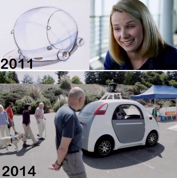
Is Google CEO's "Tiny Bubble Car" Yahoo CEO's "Little Bubble Car"?
theodp (442580) writes "Back in 2011, then-Google VP and now-Yahoo CEO Marissa Mayer brainstormed with BMW to sketch out an idea she had for self-driving 'little bubbles' that could ease office commutes. Here's Mayer's pitch from a BMW film short: 'All I really need is a little bubble that drives itself and when it runs into something, it doesn't hurt that much...and...you know, like it doesn't actually take up that much fuel because it's so lightweight and it's good for the environment for that reason.' So, with Google's newly-built, steering wheel-less self-driving car being described as a 'tiny bubble-car', one wonders if Google CEO Larry Page's "Tiny Bubble Car" has its roots in Mayer's 'Little Bubble Car,' especially considering the striking similarity of Mayer's concept car sketch and Google's built vehicle." Seems to me there's been plenty of concept art (as well as actual tiny bubble-like cars, even if they generallly have had steering wheels) for car designers to draw on. -
Designers Criticize Apple's User Interface For OS X and iOS
Hugh Pickens writes "Austin Carr notes that a number of user interface designers have become increasingly critical of Apple's approach to software user interface design. Much of their censure is directed against a trend called skeuomorphism, a term for when objects retain ornamental elements of the past that are no longer necessary to the current objects' functions, such as calendars with faux leather-stitching, bookshelves with wood veneers, fake glass and paper and brushed chrome. A former senior UI designer at Apple who worked closely with Steve Jobs said, 'It's like the designers are flexing their muscles to show you how good of a visual rendering they can do of a physical object. Who cares?' The issue is two-fold: first, that traditional visual metaphors no longer translate to modern users; and second, that excessive digital imitation of real-world objects creates confusion among users. 'I'm old enough, sure, but some of the guys in my office have never seen a Rolodex in real life,' says Designer Gadi Amit. 'Our culture has changed. We don't need translation of the digital medium in mechanical real-life terms. It's an old-fashioned paradigm.' One beneficiary could be Microsoft, where the design of Windows 8 distances itself from skeuomorphism by emphasizing a flat user interface that's minimalist to the core: no bevel, no 3-D flourishes, no glossiness and no drop shadow." -
Google Reinvents Micropayments — As Surveywall
Hugh Pickens writes "Frédéric Filloux writes that eighteen months ago — under non disclosure — Google showed publishers a new transaction system for inexpensive products such as newspaper articles. It works like this: to gain access to a web site, the user is asked to participate to a short consumer research session: a single question or a set of images leading to a quick choice. It can be anything: pure market research for a packaging or product feature, surveying a specific behavior, evaluating a service, intention, expectation, you name it. Google's size puts it in a unique position to probe millions of people in a short period of time and the more Google gains in reliability, accuracy, and granularity (i.e. ability to probe a segment of blue collar-pet owners in Michigan or urbanite coffee-drinkers in London), the bigger it gets and the better it performs cutting market research costs 90% compared to traditional surveys. Companies will pay $150 for 1500 responses drawn from the general U.S. internet population. But what's in it for users? A young audience will be more inclined to accept such a surveywall because they always resist any form of payment for digital information, regardless of quality, usefulness, or relevance. Free is the norm. Or its illusion. This way users make micropayments, but with attention and data instead of cash. 'Young people have already demonstrated their willingness to give up their privacy in exchange for free services such as Facebook — they have yet to realize they paid the hard price,' writes Filloux. 'Economically, having one survey popping up from time to time — for instance when the user reconnects to a site — makes sense. Viewed from a spreadsheet, it could yield more money than the cheap ads currently in use.'" -
Student Creates World's Fastest Shoe With a Printer
An anonymous reader writes "Engineer and designer Luc Fusaro from the Royal College of Art in London has developed a prototype running shoe that can be uniquely sculpted to any athlete's foot. It's as light as a feather too, weighing in at 96 grams. The prototype is aptly named, Designed to Win, and is 3D printed out of nylon polyamide powder, which is a very strong and lightweight material. The manufacturing process uses selective laser sintering (SLS), which fuses powdered materials with a CO2 laser to create an object. This process means 3D scans can be taken of the runner's foot so as to ensure the shoe matches the shape perfectly. Fusaro can also change the stiffness of the soles according to the athlete's physical abilities. The shoe can improve performance by 3.5%, meaning a 10 second 100-meter sprinter could see his time drop by 0.35 seconds, which is a huge time saving relatively speaking. Imagine if Usain Bolt put a pair of these running shoes on." -
Does Mega Media Control 90% of Content?
smitty777 writes "FastCo has an intriguing article on the vast control of our media by the mega corporations. In the article, Cliff Kuang disputes such claims by the the Frugal Dad that the revenue for the Big Six was over $275.9 billion, and that these companies are in cahoots to control our viewing. Just how much do these companies control?"
.jpg)