 Slashdot Mirror
Domain: wikimedia.org
Stories and comments across the archive that link to wikimedia.org.
Comments · 6,832
-
Re:Oh my, the possibilities for disaster
You can already get much of that data pretty easily from the federal government, e.g. your hypothetical racial map for Chicago.
I do think there are probably bad things one can do with demographic data as opposed to good ones, but I'm not sure you can do much by simply hiding the data. De-facto racial segregation in housing exists long after the eradication of de-jure segregation, and even if you hid the data, people who live in a city are going to notice that neighborhoods have different demographics, and if they were going to avoid neighborhoods with races they don't like, they can (and do) already do it without the app.
-
Re:Not notable
-
Ask and ye shall receive
If that's not enough, try this one: The Children.
What, you want pictures? Okay, try The Children or The Children.
-
Re:Categories
Yeah, and wasn't BDSM banned in the UK? http://commons.wikimedia.org/wiki/Category:BDSM
Of course, all those women have their faces uncovered so I'm sure it is offensive to some Muslims. -
Categories
Good thing the links are redacted! Its not like anyone with a brain could go to http://commons.wikimedia.org/ and search for "pedophilia" or "lolicon" and find exactly what he was talking about. Nothing in those categories looks like child porn to me, I'm not afraid to post the links. http://commons.wikimedia.org/wiki/Category:Pedophilia http://commons.wikimedia.org/wiki/Category:Lolicon
-
A nice lightweight OS
Last time I played with QNX, I was impressed with how light-weight it is. I understand that it's an embedded OS, but nonetheless you can run it on the desktop, and the UI is extremely fast. I wonder why it isn't used in the same role as those lightweight Linux distros, as a desktop for older systems.
It also has some rather neat APIs of its own, especially those responsible for UI ("Photon").
By the way, if you ever wanted to play with it, it is freely downloadable (yes, that is the x86 version, so it'll run on your desktop).
-
Re:Not to sound overly nationalist
My point still stands.
-
Speed doesn't replace meeting standards
Microsoft, developers of the Internet Explorer (IE) browser, said that Acid3 does not map to the goal of Internet Explorer 8 and that IE8 would improve only some of the standards being tested by Acid3.[32] IE8 scores 20/100, which is much worse than all relevant competitors in their versions from the test's release, and has some problems with rendering the Acid3 test page. On 18 November 2009, the Internet Explorer team posted a blog entry about the early development of Internet Explorer 9 from the PDC presentation, showing that an internal build of the browser could score 32/100 for the Acid3 test.[33]
On March 16, 2010, a public Developer Preview for IE 9 scored 55/100 presented on the MIX2010.[34]
https://secure.wikimedia.org/wikipedia/en/wiki/Acid4
Got to love how Microsoft appears to minimize that which it cannot muster.
-
Re:So, India + N Korea, but not Israel..
Israel is also not in compliance with the NPT.
Notice them among the "red" states? Yeah, I don't care if they didn't fucking sign it. They have nukes, and we need that to be in the open.
-
Even more eerie
The Kursk, which famously sunk in 2000:
http://upload.wikimedia.org/wikipedia/en/f/f6/Kursk_wreck.jpg
-
Re:Video
Photographer vs man with RPG, when the the back half of the image is covered and you only see the silhouette, as in the video, then they look pretty much the same. However it is clear that its a camera,
RPGs are twice as long, you never ever see the "RPG" in full and you never see the "RPG" from any other angle.The thing I don't understand is why they request permission to engage before they see the RPG, is it enough to kill people to see them walking around with an AK in a non threating pose? Also is it ok to shoot everybody that is near to an insurgent? They don't seem to make any effort to shoot the RPG guy, they just shoot everybody in sight, even the ones that come much later to the scene and never ever have anything on them that could be confused for a weapon.
-
Re:NAND?
No, it has little to do with the NAND digital logic gate -- the other person who responded to you is totally wrong. NAND flash is a circuit topology where the flash transistors (bits) are arranged in long series chains, like this:
http://commons.wikimedia.org/wiki/File:Nand_flash_structure.svg
which is similar to the pull-down side of a NAND gate. NAND flash is very high-density but is read in blocks (you turn on the whole chain and then check one bit at a time). The other type of flash is NOR flash, which uses transistors in parallel:
http://commons.wikimedia.org/wiki/File:NOR_flash_layout.svg
This means you can read any bit individually without having to turn the others on. NOR flash is commonly used for program memory in microcontrollers, where you need fast random access to any bit. NAND flash is used when you need high capacity, as in memory cards or SSDs.
-
Re:No.
True, but the gap is getting smaller.
True...
But in Uncanny Valley terms, this also corresponds with deeper. -
Example
-
Re:The face
http://commons.wikimedia.org/wiki/File:HiRISE_face.jpg
My God! It looks nothing like any face I've ever seen! Obviously the beings who created it possess an intelligence entirely unlike our own!
-
Re:The face
Actual site is down, so here's the next best thing (already taken 3 years ago, way before the public suggestions started)
-
Re:Needed crouwd thinning??Please; don't throw around Fox News memes. I mean, if I wanted to believe that the majority of the world was killing itself because of health care it's had, I'd go ahead and let Glenn Beck talk for me too.
Stupid people should die. But if that were true, Fox News would be out of business, wouldn't it?
Besides, it's not my job to demand people die. Are you saying that you want people to die just so you don't have to pay the same goddamn premiums you already pay for private healthcare?
-
Re:First DUH!!
"Something's obviously changed their mind."
Probably a desire for a few more of these: http://upload.wikimedia.org/wikipedia/commons/7/7b/United_States_one_dollar_bill,_obverse.jpg -
Re:Military industrial complex
Defense spending went down from 1970-1975 and from 1988-2001. Where is my Duke Nuke'em Forever?
Defense spending chart from wikipedia Defense spending as percent of federal budget -
Re:Military industrial complex
Defense spending went down from 1970-1975 and from 1988-2001. Where is my Duke Nuke'em Forever?
Defense spending chart from wikipedia Defense spending as percent of federal budget -
Re:Shiny and beautiful...There are 3D dark matter maps out there. This map provides some context for someone on Earth.
In this case, the white, cyan, and green regions are closer to Earth than those indicated in orange and red.
The image doesn't really help me visualize the concept, but it attracted me to the article. That's probably the intent of these kind of images, grab people's attention and explain the findings when they want to know what the hell they're looking at.
-
self-balancing
-
Re:The issue is metadata
Where did you get that number? The IETF slides say something like 0.07%.
I don't have that Google statistic, but I do know that Wikimedia run similar tests on Wikipedia. Here are the test results, updated daily. As of today, 2010-03-28, an AAAA breaks the request 0.39% of the time for Wikipedia users.
Those tests are done in the background to users at random by a snippet of JavaScript on Wikipedia articles.
This Google presentation says Google would lose 0.1% of traffic if they added AAAA, though it's not presented particularly prominently, so take that with a grain of salt.
Either way, adding AAAA's will break your website for some people. In my opinion, though, the number is so small it's not worth worrying about, but each to his own, I guess. All this pain will be over soon anyway. Hopefully.
-
Re:Really annoying
Well, it took me half an hour to convince my old boss that "1.5 minutes" in his Excelsheet isn't actually 1 minute and 50 seconds, but one minute and 30 seconds. He finally got it when I asked him to enter "1.59" and "2" so that he could see the resulting amount of money changed quite dramatically for just one second of extra work, but I doubt he ever really grasped the root of the problem.
Your old boss is obviously a moron. Anyone that presumably got through school and never understood the concept of fractions (but thinks they did) is just plain stupid. You can't argue with stupid, and you can't base any decisions around stupid. Stupid will always find a way to continue to be stupid despite your best efforts. (Oh, and I draw a hard line between ignorance and stupid).Anyway, The points you bring up that software has always changed and always will is a good one. I'm not going to address how it has and all the various ways it's been forced to do so. But it seems to me this is more a question of WHY it should change rather than if it's possible to do so. File sizes increase because people want to do new things with the machine, so that's easy to justify. The same is true with 8/16/32/64 bit machines. Endian-ness is a bit harder to justify, since it often means supporting an even wider variety of architectures.
The point being that rather than treating all computing like a passive attitude like the changes are simply inevitable and you're somehow flawed if you resist it for any reason is foolish. You need to take a more active role in evaluating which changes should be pursued, and which shouldn't. 15 years ago Intel was pushing Itanium as the next big leap in computing, and by all accounts in 2010 the x86 would be all but dead. We'd never have a 64 bit x86 processor, so just port everything to Itanium. Looking at the project sales forecasts vs actuals is very very funny. How's that working out for you, Intel?
-
Re:Lets get more rumors started.
Linus is accepting patches from NAMBLA!!
I think he's also accepting patches from NAMPLA, look how fat this penguin has become after all the abuse:
-
When you code FLOSS, you code with Chevez!
-
Re:Test, and Test Again
-
Re:Damn.....
I think Hitler had PS beat to this goal, he had a much simpler tool and when the bodies are removed, you can never really tell that the picture was photoshopped !
-
Re:I prefer complete independence, thanks
Well, Look at you, Hacker
-
Re:I was hoping it would be called...
I was hoping it would be called Her Majesty's Space Agency (HMSA), it sounds much better then UKSA.
(Great British Space Agency) GBSA* also sounds better. They picked the worst possible name from those available...
*Yes, yes I know... but how much input will come from Northern Ireland, really? -
Re:Maybe Americans just fly too much?
We have single states (equivalent to what Europeans refer to as countries) that are nearly half the size of the entire continent you live on. I could drive from one end of your content and back, and still have driven a shorter distance than to my brothers house.
Yes, you have big states. Congratulations. However, that doesn't mean it makes sense to take a job 1000 miles from your home and drive there every day, or move 3000 miles away and expect your family to visit every week.
You have bullet train rides between countries that are shorter than my wifes daily drive to work.
Perhaps that's another difference in ideology, but if someone I knew took a job and commuted hundreds of miles to another country on a daily basis, I'd call them insane.
You are a urban population. [...] We are not, we are a rural population. The majority of our people are scattered across the nation in little villages and towns.
I added up the numbers found in this Wikipedia article and found that 254,734,040 people in the United States live in what is defined as:
"one or more adjacent counties or county equivalents that have at least one urban core area of at least 50,000 population, plus adjacent territory that has a high degree of social and economic integration with the core as measured by commuting ties."
This is 84% of the estimated 301,621,157 people living in the U.S. in 2008. (source) The United States are very much an urban population - although these numbers include suburbs, too. Perhaps I should say suburban population.
You are a urban population. 90% of your people live in a handful of cities
I'm not going to do the math, but I'll reckon you're not that far off - given the 84% the U.S. scored. However, if 90% of the people work in large cities, it makes sense for 90% of the people to live in the actual city as well. The American model of surrounding cities with suburbs where everyone gets up in the morning to drive separate SUVs into the city makes little sense to me.
we have designed ourselves to be a nation that drives
You have designed yourselves to be a nation that doesn't care about the consequences of driving such distances, and in many cases flat out denies them.
Anything Europeans do thats 'good' for the environment still doesn't make up for the damage done over the past few thousand years
First of all, that's unfair. The United States have only existed for a couple hundred years, and most current Americans have European roots anyway, so anything before the 18th century is on all of us.
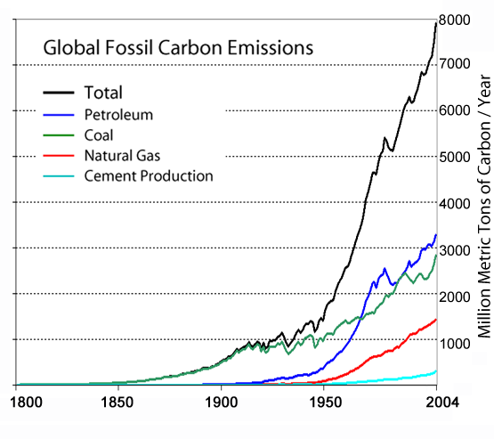
Second, as this chart clearly shows, burning of fossil fuels practically didn't start until well into the 19th century, and it didn't really take off until the 1950s. And I don't think we need to discuss the United States' part in this.
In short, you have no concept of living anywhere except your little neck of the woods. You are what Europeans typically like to refer to a 'ignorant American', except replace American with European and pull that big stick of smug out of your ass cause you're just showing everyone how clueless you are.
And I should just ignore how clueless you are? All of my statements are based on rationality. Yours are based on laziness and comfort.
And while I'll admit the U.S. are an amazing country with many great achievements, and I can't imagine the world without it, it does have significant shortcomings, and failing to see that would be a sign of ignorance us Europeans can only dream of. As the most powerful country in the world, it's your task to better that world.
-
Re:analogy
Rather: bullet-resistant vest.
In this risky situation in Iraq or Afghanistan http://upload.wikimedia.org/wikipedia/commons/1/1e/3ACRPatrol(OIF3).jpg the soldiers and the vehicle do have an excellent protection armor. But one does not want to fool with this patrol not only because of protection armor, but because the soldiers are obviously vigilant, aware of environment, and ready to respond decisively. Not only to take and resist hits.
Absolutely the same in the Internet.
-
UUCP info you need
-
Wikipedia is "open source" all right.
-
Re:Awesome
In terms of historical oil production, google came up with this chart which I was going to link to initially and shows a rather steep decline. But it contradicts the DOE's own chart even though it cites the DOE as a source. So I'm guessing the wiki chart is wrong and uses figures massaged by a peak oil advocate.
Nice assumption, but you know what they say about assumptions. The DOE chart shows "petro" values declining from a peak of 11M barrels in 1983-ish, while the Wikimedia chart shows a decline from about 9M barrels in 1985-ish. This should indicate to you that the DOE chart includes petrochemicals that are not oil - like LNG and coal.
Oh, and check the DOE's raw data for a chart that is specific to crude oil, that lines up pretty much exactly with Wikimedia chart.
-
Re:Awesome
1) About half their govt budget came from selling oil... Their wells are now in permanent, fast decline. Once its all pumped out, its gone. That doesn't mean there is no production, just like the US has been in permanent oil production decline for 40 years but still produces a little oil. Higher tech means the extraction rate is higher so the decline is faster. And producers become importers at a much faster rate than total gross production decreases. Mexico is going to stop exporting oil pretty soon. Most of which, went to the USA. Ooops. So we're out of oil and they're out of cash. This won't turn out well.
Minor nitpick, but the U.S. produces more than "a little oil". It's the third largest oil producer in the world, behind Saudi Arabia and Russia, and produces more than Canada and Mexico combined (2 of the 3 biggest suppliers of U.S. oil imports, Saudi Arabia is the 3rd).
In terms of historical oil production, google came up with this chart which I was going to link to initially and shows a rather steep decline. But it contradicts the DOE's own chart even though it cites the DOE as a source. So I'm guessing the wiki chart is wrong and uses figures massaged by a peak oil advocate. -
Wikipedia is an important research tool
In the natural sciences Wikipedia is an important tool in research. In independent reviews the accuracy was on an equal level as other encyclopedias (Britannica), see for example: http://upload.wikimedia.org/wikipedia/commons/b/b5/Wpausstellung-18.pdf (german language).
It provides a free source with fulltext search. In many cases the original research is cited, so that you can look for more detailed information.Just imagine trying to get quick information about something without. I am currently working on Quantum criticality. A quick google search provides you with tons of information, the wikipedia entry is a accurate one-page document which cites the most important theoretical papers from the past few years.
-
Re:Quick
Actually, Japan and the US are pretty similar - see this map. Most of the world is 220 ~ 240V, while North America & Japan are 110 ~ 120V.
-
Re:All that means...
This is one of those times where I really like wikipedia:
Supranational European BodiesNorway is the red, white and blue flag that is part of EEA, EFTA and the Schengen area. It's our participation in the EEA which means that we must implement EU directives, to be part of the "inner market" there must be equal market conditions in all countries - a clause interpreted at least as wide as "interstate commerce" in the US constitution. Technically we have a reservation right, but we've never used it. As you can see, there's only two countries left in our bubble, and the other is Iceland that is tiny to begin with, has mostly financially collapsed and is now applying for EU membership. The initial agreement (1994) was good but since the renegotiation in 2004 we gain nothing by standing on the outside. The EU decides, and Norway follows willingly or unwillingly and there's no economic incentive either, we pay the same as if we were EU members.
-
Re:US is in trouble
The 40 billion is for a short route. LA to Las Vegas.
San Diego to the new airport, 10 billion.
So if the going rate in 2010 dollars for Los Angeles to Las Vegas is 40 billion, figure 60 billion for LA to Phoenix. Las Vegas to Denver would be 100-150 billion. Denver to KC would be 60-80 (cheaper because it's flat).
Just to expand Acela between Eugene and Vancouver BC is going to be a half billion dollars. Tampa to Orlando is 1.2 billion.
http://upload.wikimedia.org/wikipedia/commons/1/11/ARRA_High_Speed_Rail_Grants_Details.jpg
As for fossil fuels jacking the price of air travel, that is true, but turbines are flexible, other fuels like bio mixtures, diesel and even diesel from coal dust are future options. There are literally hundreds of years of coal dust for fuel sitting around.
-
Re:Not to inturrupt your rant, but...
A goat. Why do you ask?
-
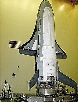
Re:The big secret is the re-entry ablative spike
Actually, there don't seem to be photos of the spike on Wikipedia. Here is a list of links:
Here is an in-flight photo of the spike.
Here is a photo (on a
Another photo of the composite fuselage and load-bearing structure.
Similar photo on
The X-40A precursor vehicle to X-37B, landing with spike extended.
Photos and drawings which do not show the spike:
This official USAF photo seems to chop the interesting area out of the frame.
A drawing used all over the web, but I'm not sure of the source. -
Re:Time Travel?
The [A]merican date format must die.
-
So easily debunked...
You don't know much about statistics, do you?
First, the "GDP per capita" can be grossly distorted by the top 0.1% to make it look like the average continues to increase while the median does not.
Second, we're talking about wealth, not income. If you think "income inequality" is bad, try looking at "wealth inequality" - it's far worse.
Third, the wikipedia article you cite turns against you quite well, despite being about median household income.
Percentage change in median household income by percentiles
http://upload.wikimedia.org/wikipedia/en/0/02/Changeinmedianbefore-taxincomeUS1989-2004.gif
Percentange change in mean household income by percentiles
http://upload.wikimedia.org/wikipedia/en/2/28/Changeinmeanbefore-taxincomeUS1989-2004.gif
Forgive me if I'm wrong, but the last bar in those charts indicates a negative percentange change in income for the bottom 50% of households from 2001-2004. I wonder what the updated charts would look like.
Okay, so that was only those three years. What about a longer trend? How about a historic graph of income broken down by percentiles, adjusted for "inflation" (probably CPI *gags*)?
http://upload.wikimedia.org/wikipedia/en/a/a7/United_States_Income_Distribution_1967-2003.svg
That doesn't look too bad...until you see the logarithmic axis on the y scale. The ones at the bottom make roughly the same amount of money for the past 30 years (Trickle Down FTL), but the ones at the top are getting exponentially increasing wealth. And they stop at the 95th percentile...they probably had to exclude the 99th and 99.9th percentiles because they would have made the 95th percentile look flat.
Sure, over 30 years, the bottom 10% of households went from $8000 to $10000. But hey, $2000 more dollars, that's a positive increase alright! Can you even imagine being one of those households that makes it by on less than $10k?
-
Prediction:
Prediction:
XKCD used all profits to rent out a C-130 Herc to drop a metric ton of Ball-Pit Balls on that location.
.jpg)