 Slashdot Mirror
Domain: asktog.com
Stories and comments across the archive that link to asktog.com.
Comments · 347
-
Re:Um...Windows 8?
> That disaster isn't, and wasn't.
Incorrect.As a graphics, UI, andU UX guru, the ribbon interface is shit. It has certain strengths but MORE weaknesses then a traditional menu. You obviously are NOT an expert or else you wouldn't be blind to BOTH the pros and cons.
The #1 goal of an UI is to empower users. Which means making it EASIER for users to do what they need to do -- NOT HARDER.
Office on OSX has done it right: You show both The menu bar AND the ribbon bar. The _user_ decides which is more convenient, not some hack UX designer who doesn't have a clue about Function over Form.
> There's a reason that interface has been widely adopted,
1. Quantity != Quality. McDonals severs BILLIONS but that doesn't make it gourmet food.2. Modern UX designers are idiots. They don't understand the first thing about good design even if Tog told them
> Presenting all options to all users at all times is frankly a disaster when learning a new system.
ONE size does NOT fit all. You are assuming that a user is _always_ learning a new system. While the ribbon bar MAY be faster for SOME tasks for a BEGINNER it is a complete clusterfuck for advanced users.The Ribbon bar is shit precisely because:
* One MUST resize the window to see ALL the options.
* One can't "detach" one ribbon bar so that _multiple_ are visible. You are stuck with this shitty "tab" system where only 1 ribbon bar is active. WTF.
* Hiding choices and therefore being inconsistent are far WORSE. Menus are _consistent_ -- they don't fucking disappear. Playing the "guess-where-my-icon" game is bullshit once you have some familiarity.
Anyone defending the Ribbon Bar doesn't know what the fuck they are talking about.
--
Want to play old-school 8-bit RPG for Apple 2, PC, and Mac?
Check out Nox Archaist -
Re:John Denver's hangar?
Here is an argument that he got killed by a bad user interface.
-
Re:Butterfly Ballot not Supreme Court decided 2000
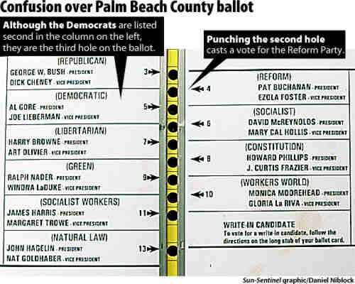
Ah, that butterfly ballot. I still believe it happened because they were driving busloads of senior citizens (or illiterates, or both) to the polls, and told them something like "vote for the second guy or your Social Security will get cut off!" Pat Buchanan was the second hole, but not the second candidate, which was Gore. The people loading them on the bus wouldn't have known that a butterfly ballot was in use at that specific polling place, thus interleaving the order of candidates.
Go look up pictures of it, it was pretty clear where you had to punch if you knew the name of the candidate and could read, but not if you were simply told to vote for the "second" candidate by someone who had not actually seen that a butterfly ballot was being used. And the double-punches? They could happen if you could read, but quickly went for the "second" hole, then made a second "oops" punch after reading. So it was a bad user interface, but it was more bad in the context of making "dirty tricks" fail.
Ironically, punch card voting systems were in the process of being removed, but due to lack of money, low-income districts, the very ones that had the most problems with them, were more likely to still have them. (see "The Low-Income Paradox") So it is entirely plausible that the party workers involved in sending busloads of people to the polls might not ever have seen a butterfly ballot themselves!
-
Re:Therac 25
don't try to get attention for merely "bad" stuff by trying to label it as "catastrophic."
Apparently a bad UI is what killed John Denver. Does that qualify?
-
Re:God forbid the law applies to elections
Don't forget that the ballot itself was illegal. The election rules were to have a simple ballot where each row of punch holes corresponds to a page of candidates.
Oddly enough for the election of the governor's brother, the ballot was coincidentally changed to a butterfly page where they alternated candidates on the two pages. On this ballot, the governor's brother somehow managed to be first, then lets have the most likely threat be third hole, but second on the page, so any confusion between second and third goes to a fringe candidate who happened to be on the other page of the (again, illegal) butterfly ballot. All this is theoretical right? I mean people wouldn't make those mistakes? Hmm, Pat Buchanan was the second punch hole, but what you may have punched if you wanted Gore. Buchanan somehow managed strong support in heavily Jewish districts, even though he is thought by many to be anti-semitic.
So, the design was the one most likely to siphon votes from the Democrat and give the state to his brother. This is never mentioned when they talk about 2000, and I never heard it mentioned at all in the Supreme Court decision. So Scalia not only didn't care about the 9 lawyers deciding the Presidency, he didn't care about the effect an illegal ballot to help the governor's brother had on democracy either.
BTW1: autocorrect corrected Scalia to scaliness. Somewhat appropriate,
BTW2: Nobody has mentioned about JEBush on one hand swearing to uphold the laws of his state, and on the other hand allowing to exist an illegal ballot to help his brother to win his state. -
Re:OLD? Stupid crap still on 10.7
Global menus
Mac OS has been like this since System 1. And it makes sense; whatever you're doing, its menu is going to be in the same place. Fitts' law indicates that the most quickly accessed targets on any computer display are the four corners of the screen.
I've read the question 5 and its answers about global menu superiority.
I would like to emphasize this:
- I've been using Macintosh, Unix workstations, MS PC (DOS,Win3.1 up to Win8), Linux PC with various WM/Desktop, etc.
- Global menu was fine for me on Macintosh Classic 9-inch display, for any task.
- Global menu is painful and irritating on 24-inch display, for most of the creative tasks.I suspect that this is not only a matter of how long the cursor travel though the screen, but also about how much you have to adjust your gaze on the area requiring your attention.
Fitts' law fails to address that point, even if you can do things quicker it might not be as productive if it's uncomfortable and tiring.
Regarding GUI, Apple has failed on several points with nowdays huge displays, for instance it tooks them years to allow window size adjustment on any border (instead of a tiny triangle on bottom right). The feature comes with Lion in 2011... That's a shame.
-
Re:OLD? Stupid crap still on 10.7
Global menus
Mac OS has been like this since System 1. And it makes sense; whatever you're doing, its menu is going to be in the same place. Fitts' law indicates that the most quickly accessed targets on any computer display are the four corners of the screen.
Single mouse click
Mac OS has supported multiple mouse buttons for at least 16 years. Even when using a now-extinct one button mouse, control-click presented a dialogue box.
Left window controls (yay for all the left handed and left eye dominant people, boo for the other 95% of the world)
Because it's easier to move a mouse up/left with your right hand, and was developed in a country that reads left-to-right.
Launchpad (how is the start menu missing causing a revolt and launchpad even exist? Launchpad is the initial SIN!)
The start menu missing is causing a revolt because Microsoft removed something and replaced it with an abomination. Launchpad - and other questionable features like Dashboard - can be completely ignored.
Finder layout straight out of system commander circa 1988.
Column view in Finder is optional, with icon and list view still available. Also, Finder has had its sorting options greatly improved throughout OS X's history.
Crap loads of docked icons you never use be default.
If you go and buy a Mac today, this is in the Dock:
- Finder: File management
- Launchpad: Access to all apps not in the Dock (And easily ignored, as previously discussed)
- Safari: A web browser
- Mail: Email client
- Contacts: An address book
- Calendar: A calendar
- Notes: Short notes
- Maps: A map of the entire planet
- Messages: Text messaging and IM
- FaceTime: Video chat
- Photo Booth: Something fun to play with on your new computer
- iPhoto: Something to talk to your camera
- Pages: Word processing
- Numbers: Spreadsheets
- Keynote: Presentations
- iTunes: Play and purchase music and TV/movies
- iBooks: Read and purchase books
- App Store: Install and purchase software
- System Preferences: Change settings on your computerThe default Dock icons cover managing your computer, using the big two features of the Internet, syncing 'organisational' information with your phone, finding locations, messaging and video chatting with other people, photography, writing, processing numbers, creating presentations, watching media, reading, and installing an app to do anything else you want your computer to do. The default Dock is a slam-dunk for covering what the majority of people use computers for, points users in the right direction to add new capabilities to the computer, and is easily customised to remove the things you don't want. (Launchpad, again...)
The Dock is setup perfectly for you to get started with your computer. Anything else you need to get to can either be accessed through Spotlight (power users) or Launchpad (for people with more experience with iOS).
A separate contact and calendar app....
Just like iOS... but also NeXTSTEP; they have always been separate apps, which makes finding what are ultimately different tasks easier *and* they also seamlessly share the same databases behind the scenes.
General iOS crap
Integration with touchpads is great. Removing always-visible scrollbars removes needless clutter. Things like Launchpad - and pretty much anything else you don't like that reminds you of iOS - are easily disabled or ignored.
Hardwired application dependency locations (the whole point of applicat
-
Re:Fuckbeta
Or you think they could learn from the reworking of Google News back in 2010. I took a tour of the beta. It has that whitespace disease that lots of UI designers seem to have contracted from Windows 8, and they've done a really good job at stripping much of the information out of it. As for this "let's retarget the site for a wider audience" marketing crap, I'll say what I've said before when this "wider audience" idea came up: The kiddies can go elsewhere.
-
Re:In other news..
Don't leave out Google. Reaction to the google news redesign was overwhelmingly negative, and all of that was ignored, the good old format never returned. (Sorry for the secondary link, in classic Google style the original forum links were not kept stable)
Google news still sucks compared to the much loved original, and recent fiddles just make it worse. The latest afront is burying links to multiple stories on the same subject behind an annoying scrolling "real time results" list that only serves to make you wait and stare until the most recent stories finally scroll up. Now, every single time I go to Google News now I think "why am I doing this to myself". Only thing is, the alternatives are worse (Yahoo news anyone? CNN? USA Today?) In no way does that make the displayed arrogance ok. Well I suppose it's all good because Google's monopoly eventually must be busted, and annoying users as much as possible makes that easier.
-
Re:Watch wearing is a declining trend
Actually, I still wear a watch, so I'd consider one.
Tog's ideas for things like NFC definitely make it worthwhile. To me, the question would be the price.
$300? No way. $200? Probably not. $100? Probably yes. $50? Hell yeah.
-
Good ideas
Bruce Tognazzini (founder of the Apple Human Interface Group) has some pretty interesting ideas about what an Apple watch should do.
Personally, I'll stick with my (practically indestructible) G-Shock for sports and my mechanical watch for everything else. The latter doesn't need charging, looks great with a suit or casual clothes and I don't have to draw attention to myself when I take it out of my pocket, turn it to the correct orientation and press the power button to view the time - but I appreciate that my views will probably differ from the general Slashdot consensus.
-
Much better read
Tog has a better take on the iWatch: http://asktog.com/atc/apple-iwatch/
-
Re:cable and sat don't have the bandwidth for it
Movies, TV and video won't drive the move to 4K screens - computing will. We still desperately need *more* pixels to make modern UI concepts work. We're on the cusp of having computers that can really handle reasonable amounts of information. WE NEED DISPLAYS TO GO WITH THEM!
By reasonable, I mean something approaching the bandwidth and resolution of a very small real-world desktop. Seriously, do the math - even at only 150 ppi (roughly the density of Apple's pre-retina iGadgets), a modest desk is far beyond 4K resolution: 48" wide by 27" deep (keeping a 16:9 mail-slot aspect ratio just because we'll never be rid of wretched "widescreens") gives a resolution of 7200x4050! Push that to "retina" territory 250-300 ppi), and you're talking serious pixels - way more than TV or movies will ever need, but exactly what we'll need to be able to really see and handle as much information as our great-grandparents did.
Computer form factors will, no, must change - the requirement for increased resolution and direct touch/motion interfaces will necessarily drive computers to looking more like the state-of-the-art high-bandwidth information desktop of 100 years ago: the original engineering workstation - the drafting table. (Possibly sweeping up into a non-touch interface area a la Tog's Starfire concept from 20 years ago...)
(FWIW, I, and most others I've asked, don't care about 4K for video, because the content isn't good enough to want better than 720p anyhow. For video, I'd rather have good color depth than higher resolution - I saw Skyfall the other day in a digital IMAX theater, and it was awful, at least partly due to compression - not only screen-doored and pixelated as hell, but with outrageous color-banding, especially in any of the sky or water shots...)
-
Re:WHY flat is BAD UI design
I concur with you assessment.
Apple has always had its "flavor of the month" philosophy. I just wish they would fix their previous UI mistakes instead of tossing them out and making even more new ones!
Tog wrote this back in 2004:
"Finally, Exposé needs to add a tiny delay before opening when the mouse is thrown into a corner. The corners are such pointer-magnets that users often arrive there by accident. Users, under OS 10.3, are now learning to slow up their mouse activities in general to avoid accidentally triggering Exposé. A delay of between 1/20th of a second and 1/10th of a second should be sufficient and will result in a significant speed increase in other nearby activities, such as accessing the Apple menu."Even in 2012, 8 years, this issue is constantly ignored.
The fact that Apple can't natively to do WindowShadeX tells me they are not interested in adding _useful_ functionality.
References:
http://www.asktog.com/columns/044top10docksucks.html
http://kevinyank.com/blog/archives/workaround-mac-os-x-leopard-docked-folder-icon-madnessWhy are UIs stuck in the 1990's ???
-
Mac top bar menus implement Fitts law
The menu bar following the app has always been a feature of the Mac OS. It's nothing to do with using one app at a time, it's to do with the muscle memory advantage of just shoving the mouse to the top of the screen regardless of which application you're using.
More specifically, it's an attempt to apply Fitts law to computer user interaction. Tog has an article on the thinking behind this.
-
Re:Might as well be a BSOD.
The difference is that it was clear with the OSX transition that the new APIs would be viable replacements for the old
I hope you check back. This was a good comment. You should get an account.
Before 10.0 was released. No it wasn't clear at all. And wouldn't be for a while. 10.0 was much rougher than Windows 8 is today and was being met with far more hostility. For example http://www.asktog.com/columns/044top10docksucks.html
Some of that stuff like multiple monitors I'm sure will be added with service packs.
Clear type is going to be replaced by high dpi monitors. I own a macbook retina you don't want this sort of rendering it looks horrible. Metro's approach is better for high dpi.
As far as "simultaneously running applications" I don't see that. Snap works fine. Possibly I'm missing what you mean?
As far as dynamic loads there are 3 methods already supported and likely more to come. -
Re:I never saw one of those
Years ago, I read a great article by Bruce "Tog" Tognazzini about Transactional Analysis and how it relates to UIs and such. I don't remember if it's in any of his books or in the Apple Developer newsletters of yore. I'm having a hard time finding it, unfortunately. But in the article, he recounts a story about selling televisions with digital remotes--back when these were brand new.
The story goes that when TVs first got digital remote controls, the salesmen would show the customer the remote because, at the time, the ability to change the channel from across the room was new and novel and pretty cool! But the customer would always say the same thing: "I'm not so lazy that I can't get off the damn couch and change the channel!" And, let's be honest, how would you respond to that? "Actually, sir, you are that lazy. Or you will be once you have this." Keep in mind that the only time you saw a TV with a remote was in a hospital or if you had older parents/grandparents who couldn't get off the damn couch and change the channel. If you were young and spry, you had no business using a remote! Having a remote was a sign that you were old...
Once they said that, they weren't interested in TVs with remotes and no amount of salesmanship would change their mind.
So the solution that Tog brought up wasn't to sell the customer on having a remote control, but to sell them on digital tuning. "Digital tuning is great! No more having to fiddle with all the fine tuning knobs to get the best picture! Just choose the channel and it will immediately lock it in! No knobs to break or get serviced--after all, you should have your TV serviced every year so that you don't end up having to use a pair of pliers to change the channel. So you'll save money in the long run because there'll be less need for service! Digital tuning is a boon to mankind!"
Once you've convinced the TV buyer that they really want a TV with digital tuning, you throw in the remote: "And the fun part is that they can then make a cool remote control to change the channels!" The idea was that you're buying a better TV that happened to have a remote (which was a smart decision) rather than buying a remote controlled TV (which was a lazy decision). In fact, so the story goes, one day the salesman neglected to even mention the remote. The customer bought the TV and salesman brought out a bunch of boxes, one of which contained the remote. When the customer said, "What's that?" and the salesman said, "Oh, that's the remote," the customer immediately started off with, "I'm not so lazy that I..."
The whole thing is presented in the frame of Transactional Analysis and the Parent/Adult/Child context (ie, you want to have an appropriate balance of smart and cool in your products) and is a very interesting read.
-
Re:NeXTStep the grand-daddy of all that is now OS
Absolutely!
Back a few years ago when OSX was new, Tog posted a good, though brief and certainly incomplete, article about the regressions from OS9. You can read that here: http://www.asktog.com/columns/061PantherReview.html
I dont know off the top of my head of a good comparison of the same type versus NeXT but one could certainly be done and it would look no better in comparison. The NeXT dock or the old Apple menu were both excellent designs, the OSX version of each is an obvious regression, confusing, inconsistent... even the windows widget layouts degraded badly. Classic Mac OS has three widgets, two on the right that have non-destructive functions, and a single button on the left with the destructive (close) function far away from the nondestructive controls. NeXT refined that a bit, with only two buttons, on opposite sides of the window, still keeping the destructive function far from the other one (and adding some 'hidden' functions for power users in a convenient spot where they wouldnt interfere with those who don use such things.) In both cases, the buttons themselves are also distinguished visually with simple, contrasting geometric shapes.
But on OSX, you have 2 nondestructive and one destructive control bunched together in one tight group without separation, "glowing gumballs" without distinctive shapes. It's unquestionably a massive regression, whether you measure from OS 9 or from NeXT.
-
Re:Shit Happens
I don't disagree, mostly. However, they had better check with the people who were paid to think before they go ahead and do something contrary to what they were instructed to do, just because they thought the instructions weren't right.
But they did do what they were instructed to do, that is to say put bolts in head up. So now they were in a situation with conflicting instructions, and they followed the "superseding one". In hindsight they shouldn't have, but that's in hindsight.
I get the feeling from your post that you assume that engineering/management can walk on water, and let me tell you that most of the time we're only slightly less full of it than the people on the shop floor. If at all. (I don't like the "not paid to think" sentiment one bit.) So blindly following orders wouldn't have worked one bit better overall. As an engineer I place the blame for this almost solely at the feet of engineering.
In fact, in the wider sense, this is an almost perfect example of an interface that kills. This design was a disaster waiting to happen. And it did.
-
Big issue with Android...
Others have pointed out compatibility issues due to differing hardware, different versions of the OS, different UI modules added by manufacturers, poor quality hardware from some manufacturers, inconsistent/poor availability of updates, etc. All of those are valid complaints. But having used an Android phone, here is what I see as the biggest flaw; the UI design is fundamentally inconsistent. It fails to follow many of the user interaction guidelines from the person who is certainly one of the top UI experts, Bruce Tognazzini, aka Tog.
Is it a touch screen system, or a keyboard system? Both, and neither. Almost everything is done using the touch screen, except "back", "menu/settings", and changing apps (plus power and volume controls). You can't complete common tasks using just one or the other, you must use both. Using a separate button to change apps doesn't interfere with normal work flow, as changing apps itself is an interruption in work flow, so it makes some sense. However, having to switch from the touchscreen to the dedicated keys to go back (a critical part of most apps), or to access a menu (e.g. add, delete, edit, change settings, etc.) is an unnecessary, and non-intuitive UI design. It's consistent in that the whole OS and almost all apps use it, but switching between touchscreen and dedicated keys for essential parts of in-app functionality is an interruption in workflow. Everything done in an app should be possible using a single UI model on the touchscreen.
Another annoyance (at least on my phone, don't know about others) is that auto-correct (and automatically adding apostrophes in contractions) only works when using swype. If you want those when typing in text, you must go back after the fact and tap the word to get a list of alternatives. Why would auto-correct only work with one input method? There is no auto-punctuation and it doesn't even offer auto-complete except in the browser.
Syncing my contacts list between the Mac OS X address book, Google contacts and the phone was a challenge. Not all of the blame for that falls on Android, but it took 2 hours to initially sync and eliminate duplicates (there were only 10 contacts in the phone to start with) because contacts and numbers were getting duplicated, and deleting them from one didn't always delete them from another, so next sync they would dup again. Once it's set up, it mostly works, but again, deleting or changing info on one may cause duplication problems next time, so it's an ongoing annoyance. An average user would probably have given up on syncing the contacts, but with 500 contacts, I wasn't going to give up easily.
Individually, these are "little" annoyances and inconsistencies, but they're pervasive and significant enough to harm an otherwise pleasant user experience. Because of these annoyances (and several others) I would much rather have an iPhone.
-
AskTog
The site design leaves something to be desired, but http://www.asktog.com/ is a really good resource that I wish more developers, _especially_ open source developers, read more often. Half of my ideas on Ubuntu Brainstorm are lifted from AskTog.
-
Re:Simple
I don't know what "ready for public consumption" was.
Rhapsody was a developer beta. Kodiak was a public beta. 10.0 wasn't much better than Kodiak.
As far as the broad public, that is Mac users. They liked it.
No they didn't. Early versions of OS X were shunned due its atrocious performance and (to many) inferior - albeit pretty - UI. Heck, Apple themselves didn't even use OS X as the default option on their systems until the beginning of 2002, and the first version of OS X that wasn't borderline-unusably slow was 10.2 (it was still slow, but at least not frustrating to use).
OS-8 was an advanced OS but things hadn't improved for a long time and OS-9 wasn't much better.
MacOS Classic, even by version 9, was only marginally more advanced than Windows 3.1.
Yes but in reality I'm a pretty good case study. I ended up buying 10.2 and 10.6.
Most Mac users I know have bought every OS X upgrade since release (even the ones that stuck with MacOS 9 until ca. 2002). Snow Leopard has been the only one they've hesistated with (though nearly all eventually cracked).
This was not helped by Apple's (typical) bad attitude to legacy support, with older versions of OS X quickly being completely deprecated and unsupported, not to mention incapable of running newer versions of apps and games.
no 4*129/6. You can't charge for 10.0 and 10.1.
10.0 or 10.1 - $129
10.2 - $129
10.3 - $129
10.4 - $129
10.5 - $129That's 5x$129, though I suppose in hindsight you could reduce it to four because any Mac that was running the original 10.0 would be unsupported (not to mention unusable) past 10.4.
So it's 4x$129 plus a new Mac.
a) You agree with the display system. Though honestly I'm not sure they really caught up with Quartz extreme in terms of offloading graphics.
It exceeded it in capabilities. Though, as with OS X, those are somewhat underutilised.
b) I had the equivalent of power shell with OS shells, and frankly better. With Applescript I had application level easy scripting.
Applescript is indeed nice, though I would argue that few use it.
c) I had movie integration features, i.e. quicktime as a low level component.
I'm not sure exactly what you mean here, but Windows has had its Quicktime equivalent built-in since Windows 95.
d) I had "virtual folders" i.e. aliases and softlinks.
Windows has had shortcuts since Windows 95.
e) Dock used applications not windows, per windows 7
And Windows 7 took a huge step backwards in terms of UI usability for multitaskers by doing so (and it started with that godawful "collapsing multiple taskbar buttons" in Windows XP, which Windows 7's Taskbar is just a logical development of). Probably best not to bring up the Dock at all, it's a UI catastrophe, especially the earlier versions (Apple short-circuited the awfulness of the Dock as a task-switching tool with Expose, though Expose also has problems once you move past a non-trivial number of Windows).
f) Bonjour which Windows still doesn't have
Microsoft implemented Zeroconf and UPNP (what Apple calls Bonjour) in Windows XP.
g) CUPS, which is IMHO less good than the print manager in Windows server but way better then what the desktops have.
I'm blown away you think having a print manager like CUPS should even be necessary on a standalone desktop. Other than pausing/cancelling jobs, and maybe selecting a different printer, just what else does a normal desktop user need
-
This is FUCKING STUPID
It does NOT make the UI easier to use. Cleaner looking, yes, but NOT easier. A button sits there, visible, inviting you to click it. You see that the option is exists and if you care to find out what it does you can click it and see what happens if you're adventurous or you can RTFM if you're not. Either way, you know the option exists. Double-clicking the title bar, however, is completely non-discoverable except by accident. Look at the screenshot at the top of the screen. The title bar has the title, a close button, and... NOTHING ELSE. Just a bunch of wasted space. Gnome devs are doing their users--present and future--a great disservice by removing these buttons.
I think they're trying to copy the super-clean look of iOS, but iOS looks super clean because it works differently, not because it is clean for cleanliness' sake. There is no close button because you press the home button to leave the app. There is no minimize/restore because that's not how iOS apps work. There are no scroll bars because you scroll by dragging anywhere. Steve didn't just say "I'm going to throw away all these controls," he said "I'm going to change the UI" and as a result of THAT those controls were no longer needed. Gnome has not changed its underpinnings--it just threw away all those controls.
Double-clicking the title bar to change the window is a great shortcut for power users who know it's there because it's a nice big target and sometimes it's easier to double-click a part of the screen close to where the mouse is, rather than going after a button. But that shouldn't be the ONLY way.
Decades ago, as a kid, I absolutely HATED the original Mario games on the NES because there was all this totally undiscoverable crap where you had to jump in just the right spot to mash your head into an invisible block to get points. I thought it was the dumbest thing in the world--how could you possibly know to do that? I didn't think it was a good way to make a game back then and I'm positive that it's not a good way to make a UI now. Gnome devs are ON CRACK if they think this is a good idea.
-
Re:No dieing to push the envelope. Plain old go fe
It wasn't even completely that. I read a fascinating excerpt of a book by Edward Tufte in college that basically showed that the engineers HAD the data, but it wasn't compiled in a way that clearnly said to any reader, "hey dumbass, nothing below this temperature is likely to be remotely safe".
A quick summary: http://www.asktog.com/books/challengerExerpt.html
The book: Visual Explanations: Images and Quantities, Evidence and Narrative ( http://www.edwardtufte.com/tufte/books_visex ) by Edward Tufte
Excerpt: Visual and Statistical Thinking ( http://www.edwardtufte.com/tufte/books_textb ) by Edward Tufte. (This is what I read in college. It's a reprint of chapter 2 of the aforementioned book. It was amazing.) -
See also...
... Starfire, a project by Bruce Tognazzini from 1992 when he was working at Sun. (He had previously been the founder of the Human Interface Group at Apple.)
-
Re:C++ is hard or easy based on knowlege and skill
I especially love it when people cite bad code as proof of poor language design. It is like saying you can prove that English is a horrible language by referencing a Rap song. Any good language can be misused, misunderstood, and abused and said abuse is not proof that the language itself is inferior or flawed.
You need to read: When Interfaces Kill: What Really Happened to John Denver
It's not about whether you can do something, it's about whether there is an impedance miss-match between the technology and the operator. It's about how easy it is to shoot yourself in the foot, not whether it is possible. To wit; if there are tons and tons of bad code in a certain language, that tells you something about that language. (Not all, there could for example be bias in the type of programmers that are active/attracted to it). Over the years, it turns out that some elements of language design are in general a bad idea, e.g. humans just aren't good at always getting tedious details right. Take for example, manual memory management. Humans will tend to forget to free memory in all cases (even the corner cases). That's not to say that e.g. free/malloc should be forbidden, there are clearly uses for it, but it's a poor default.
This is especially true as we haven't even begun to really study these aspects yet. There are still orders of magnitude to reap by choosing the right tools.
-
Re:Retarded
You know, the CLI might very well be one of the things that people feel is faster, but actually isn't. Do you have any studies to shoe that a CLI is faster for power users (by which I suspect you mean sysadmins and tinkerers mainly)? I am genuinely curious, because I often find myself pausing to remember a keyboard shortcut (or hitting the wrong one) for long enough that I could have used a mouse-driven menu to get what I want faster. I really do wonder what the best approach is.
-
Re:Must be controlled with a keyboard...
Mouse is faster. You just don't know it because it requires higher cognition and skews your perception of time.
-
Re:Why left?
While I agree that "Because the Mac does it that way" is not a good reason, Apple spent about $50 million in research (according to Bruce Tognazzini) to study some of these sorts of things. So one can probably assume that Apple actually might have a good reason.
Why do you assume mouse side on the right determines that putting scroll bars on the right is the most effecient thing to do?
There's a little thing called Fitts' Law which has two elements:
- Things that are closer to the mouse are quicker to access than things far away from the mouse
- Bigger things are quicker to access than smaller things
From this, assuming that the mouse is on the right hand side of the screen, accessing a same-sized scrollbar would be quicker if it is on the right than if it were on the left. A scrollbar could be placed on the left, but it would have to be larger in order to be as efficient as one on the right which would mean less space for data.
It is also good for scrollbars to be in a consistent place (either left or right) for motor-memory and that fact that if you have multiple scrollbars, it will be confusing as to which controls what.
That said, since most mice sold nowadays have a scroll-wheel, perhaps it's time to rethink the need for scrollbars in the first place.
-
Re:And why should they care?
OK, after doing all that now convince NASA it's too cold to launch a shuttle today.
http://www.asktog.com/books/challengerExerpt.html
Communication matters, even to engineers and failures in communication lead to engineering failures and people getting killed. Edward Tufte makes a convincing argument that if they had been better able to present and communicate their ideas they would have been able to make their engineering point in an understandable way and saved lives.
-
Accessibility != Scalability
The idea that an interface can be entirely judged by how well a user handles it in the first few minutes of exposure is, in my opinion, one of the bigger *problems* with UI design of late. A quality interface should both be immediately accessible, and SCALE WELL TO MORE ADVANCED USE CASES. In my experience, Gnome, OS X, and the bundled native applications that come with each currently fail miserably at the latter. The former head of Apple's UI team makes a pretty good case for this being a problem here, although the article focuses specifically on a facet of the OS X design philosophy which causes scalability issues, rather than the problem in general. To borrow a line from the article: "The beginner today will be the expert of tomorrow. The user with 200 photos today will be the user with 2000 a year from now. The user with 10 songs today will be the user with 100 songs six months from now. The user with one or two extra apps on the iPhone will be the user with 100 apps three months from now."
-
Re:Win 3.1
-
Re:Will always been a niche market
I think you should go back and read Tog again...that famous study showed that for some tasks, people believed that the keyboard was faster, even though it wasn't even close.
-
Re:How about some nice menus instead?
Microsoft probably did quite a bit of usability testing before launching Clippy...
Yes, just like Apple did with the Dock.
-
Re:Downside?
That's like saying the drawback to commercial aircraft is that they are designed by aeronautical engineers.
But that has in fact often been a problem. There are many aircraft accidents where bad human factors design played a major role. For just one example, check out this Bruce Tognazzini article.
-
GNOME
GNOME needs to follow suit, and soon, if GNU/Linux is to ever gain relevance on the desktop. For anyone who doesn't believe me, see the First Principles of Interaction Design and how many of those principles are broken by having two different toolkits that behave slightly differently, but are expected to co-exist (KDE apps on GNOME and vice-versa). QT is the logical choice for the One True Toolkit as it has the best development tools of the GNU/Linux ecosystem.
What's that, you don't care whether GNU/Linux gains traction in the desktop market? That's funny, you're one of the ones advocating it to people, either fix GNU/Linux or stop advocating.
-
Re:One of the early lessons of GUIs
That's great for consistency, but like half of the posters here, I can't stand the thing. The first thing I do when I sit down at a new Windows installation is right-click on the desktop and switch the "appearance" back to the "old" windows UI (Is it called "original"? I don't remember). I want the ability to do the same with the ribbon. I can't get used to it. I'm a moron, fine. But if it gets in the way of my productivity, then it's a badly designed UI. MS designed the ribbon for new Office users - people who haven't gotten used to doing things in a way that works for them and so can be "trained" in using this new interface. I'd love to know the number of brand new Office users vice people who have been using it for years and so have developed a level of comfort with how best they get things done. Look at the old Wordperfect interface with all of the function keys. Was it perfect? No. Once you got used to it and used it for a few years, did you find it to be difficult to switch to Office, a completely different UI? I bet you did. I know I did (and didn't MS have something under their Help menu in office to help people with switching from WP to Office? Maybe the differences in hotkeys or something?) If it works, suddenly changing it can grind your work to a halt.
I'm a giant Mac fanboy, but the same thing was/is the case with some of their stuff - or some of the shareware software designed by third-party developers. Even one of the early developers of Apple's UI stuff, Bruce Tognazzini, agrees that they've moved away from user-friendly design. MS is falling into the same pit. -
Re:Onboard UPS not new
Yeah. It's only been a problem for a few decades. (See bug #2.) Maybe someday, someone, somewhere will take notice and do something about it.
It's always funny when the power goes out in my building. The network gear is on UPSs and all the laptop users just keep working. The rest of us sit by the windows and take a break.
-
Good - Because the dock sucks
It is a complete usability nightmare.
And the experts tend to agree.
-
Re:so, to summarize...
You're not weird--some of the original MacOS Human Interface Guide (HIG) designers agree with you (e.g. http://www.asktog.com/columns/044top10docksucks.html -- many of your criticisms mirror his).
When I got my first Apple laptop (10.3 powerbook) it took me awhile to get used to OSX. Probably because I was used to FreeBSD/Linux desktops, I adjusted fairly fast, and almost always have a Terminal window open. I remember a lot of frustration initially though, when I couldn't do things the windows way.
Stacks (introduced in 10.5) were one of those things I didn't like at first, but now LOVE for my Downloads folder only. Making the screen corners hook to Expose were another thing that took some getting used to, but I now seriously miss when I'm using Windows/etc.
I would say that OSX and vista re equally STABLE rather than unstable...though to be fair, I haven't had stability problems with windows since Win95/98/ME...
-
Re:Full 'nix for arm?
If you really wanted to do things fast you'd use the mouse (preferably with gestures or pie menus).
http://www.asktog.com/TOI/toi06KeyboardVMouse1.htmlWe've done a cool $50 million of R & D on the Apple Human Interface. We discovered, among other things, two pertinent facts:
- Test subjects consistently report that keyboarding is faster than mousing.
- The stopwatch consistently proves mousing is faster than keyboarding.
Try timing yourself on some web browsing/text editing/file managing tasks. Keyboarding may be faster occasionally, but you'll be surprised how often mousing wins.
I am familiar with this, but it seems to apply only to GUI apps that were designed for a mouse, and have keyboard shortcuts as an afterthought. That is why the Vimperator Firefox extension is so amazing: it performs as if it were designed for the keyboard. It is not perfect, and I still need the mouse for a few things, but Vimperator is both faster and less tiring than a mouse. Of course, there is a learning curve.
-
Re:Full 'nix for arm?If you really wanted to do things fast you'd use the mouse (preferably with gestures or pie menus).
http://www.asktog.com/TOI/toi06KeyboardVMouse1.htmlWe've done a cool $50 million of R & D on the Apple Human Interface. We discovered, among other things, two pertinent facts:
- Test subjects consistently report that keyboarding is faster than mousing.
- The stopwatch consistently proves mousing is faster than keyboarding.
Try timing yourself on some web browsing/text editing/file managing tasks. Keyboarding may be faster occasionally, but you'll be surprised how often mousing wins.
-
Re:Windows 7
Jef Raskin on "Intuitive Interfaces"
Short version: when people say "intuitive" they really mean "familiar", as in, they've seen something similar before or they've grown used to the UI over time. His main argument was a linguistic one; that we should not use the word "intuitive" like that because it gives everyone the wrong idea. I don't think he goes so far as to say that maintaining the status quo doesn't have its benefits, but he does lament over some instances where what he thought was a better UI was turned down because it wasn't as immediately familiar.
Anyway, I don't think you're wrong, but I think that in design you can have a "backwards compatibility" problem too. Even if in the short term it's better to retain it, in the long term people's initial annoyance is not so much of a factor, but the cruft will be.
My big problem with the control panel in Vista is that there's just too many icons. They're really past the point where having an icon for each dialog is useful. I wouldn't stumble every time I look for "Programs and Features" if there weren't so many of them (of course, if I had to use Vista every day I'm sure I'd get used to the control panel pretty fast).
-
Re:Parallax, touch screens, stupidity, and conspir
You didn't teach your parents to use their PCs as much as you taught them how to cope with a terrable UI. There should always be instant feedback to a user's actions, otherwise it starts causing confusion.
I think user interface design is a facinating subject, but, sadly, it is often dismissed by programmers as the user's inability to use technology and not a problem with their UI.
The UseIT alertbox is an excelent source of articles on UI (primarally web based). There is also this interesting look at the 2000 Florida "butterfly ballot".
-
Re:yes, let's be honest
I think you're hopelessly biased against anything from Apple and I think you left unaddressed a great many points I made about
Yes, I am "biased" against anything from Apple, because of what the company has done and said over the past 20 years. I am "biased" against them as someone who has used their machines since the mid-80's. As for your "points", you haven't made any; you simply repeat Apple's marketing fictions.
If they're not innovative, why haven't they made it into mainstream Linux disros yet? Why are Linux implementations of them so immature and poor?
Let's turn that around: if those are such great ideas, why haven't they caught on? Doesn't Microsoft have the resources to clone each and every Mac feature? Almost every Mac feature exists in open source form, yet Linux distributions choose not to ship it--why? I'll tell you why: those features are marketing gimmicks that don't work well in the real world. It's not that people can't clone the Mac, it's that they don't want to.
Don't take my word for it, take Tog's.
Unlike you, apparently, I actually use both Linux and OS X regularly and can realistically assess where each is ahead of the game.
That's another wrong assumption on your part. In fact, I am writing this from a Mac. My dislike of the platform is based on using it and developing for it.
-
A usability issue so widespread I lost all hope
One doesn't have to look far to find small but serious usability issues in open source software.
For example, did you hear about Fitt's Law and "mile high menu bar"/ "infinite size widget" effect?
For detailed description, see e.g. this Ubuntu bug.
It turns out that while the Windows and Mac software got this right (at least with respect to scrollbars), massive amounts of OpenSource software (even high profile projects for Gtk/Gnome and Qt/KDE, like Gnumeric, Gnucash, OpenOffice, Konqueror or Kword) add an idiotic small border to their document area that seems to serve only one purpose - prevent this usability effect and make all users' lifes harder.
BTW, I highly recommend Joel Spolsky's "User interface design for programmers" - that's the very least a coder could do to educate himself in the area of usability. The book is very interesting, easy to read and quite short.
-
Re:Macs are Over-rated
What do you mean a network that doesn't exist? An NFS or CIFS mount? I've never had these problems, but I don't have any remote file shares mounted at home either.
I worded it poorly. What I mean is that my laptop was connected to a share at work, available on that particular network but on no others. I sleep the laptop, then take it onto my commuter train with the sometimes-unreliable network connection. The first time Finder tries to do anything with the fileshare, it freezes solid for several minutes.
I don't know or care what acronym the network drive was using. I just want my computer to work, and Apple's software foiled that.
The only problems I've had with
It freezes the Finder the first time you touch a
Here's a few screenshots I took:
http://schend.net/images/blog_materials/iDisk%20Sucks%20-%20deleting%20for%2012%20solid%20hours%20only%20half%20done.png
This screenshot was taken AFTER the delete operation had been run for a solid 12 hours and hadn't yet finished
http://schend.net/images/blog_materials/iDisk%20sucks%20-%20deleting%20negative%20files.png
The lovely "-133 files remaining" dialog
http://schend.net/images/blog_materials/idisk%20sucks%20-%20sync%20error.png
And, of course, there was the whole ".Mac will be free forever! Now that all your data's on it, we're charging $100 for it, suckers" thing.
Out of curiosity, what have you tried to troubleshoot these issues?
Nothing. Debugging Apple's issues is their problem, not mine. I just moved to Windows, which can cope with fileshares in a sane manner.
And from my experience, as well, they're both about equally common on both OSes.
"Yah, that was sarcasm." Is it really necessary for me to say I was being sarcastic? Of course they are nearly the same thing, what's the point? When someone's computer locks up, it's locked up. BSODs aren't the butt of so many jokes because they are BLUE, but because they were so common, particularly in Win95-98. No one needs to be told a kernel panic is the same as a BSOD to understand how frustrating it is.
Look, if you want to communicate clearly, don't type something obviously sarcastic then say it's sarcastic. Since sarcasm cancels out sarcasm, that's confusing as hell.
What are you talking about? The Dock works FINE for me! I'm really having a hard time understanding your frustration here. I really like my dock, and I have quite a bit of experience with many different OS interfaces. I don't know what to say to you. It's not the end-all-be-all UI, but what the heck is so wrong with it?
I told you to Google for it, but you didn't. Here's Tog's take:
http://www.asktog.com/columns/044top10docksucks.html
Ars Technica has had great coverage of this issue since OS -
Re:Apple Human Interface GuidelinesOSX, GNOME, and KDE are all very usable environments, but style guides mostly tell you how to achieve consistency with other applications on the platform. If the OP is really asking for a style guide of this kind, he needs to tell us what platform he is developing on. Using an Apple style guide to create a Windows program will result in a less usable design, even if the Apple guidelines are superior to the Windows ones.
For an introduction to UI design, here are some good resources:
- The Design of Everyday Things (everybody has to read it)
- User Interface Design for Programmers (the Cliff's Notes, but possibly everything you need to know)
- Jakob Nielsen's Top Ten Application Design Mistakes (somewhat web-centric)
- Tog's First Principles of Interaction Design (Tog is Bruce Tognazzini, an Apple UI legend)
- Persuasive Technology (it's not just for evil scientists)
-
Re:Pinch was in the original multitouch demo.
Ah. What you want is the famous Starfire demo. Check it out. If you don't have time to watch the whole thing, at least skim. This was made in 1992, and you'll see multitouch, and also the pinch. You will also see other great ideas. (My favourite part is when the woman puts her sandwich down on her desk and it automatically scans it, forcing her to delete the scan with an "erase" gesture.)