 Slashdot Mirror
Domain: asktog.com
Stories and comments across the archive that link to asktog.com.
Comments · 347
-
3D windowing questions+concerns
Transparency. We can do it today with various 2d windowing environments. But I was trying to figure out today what it allows you to do. I have no idea.
I agree that transparent windows look cool -- but how does this translate into usability? It doesn't seem to; at least, not that I can think of.
When I have a transparent window, it enables me to place it over another window and see both at once. Except that, from experience, you can't really see both at once -- if there's information on both of the windows, they are confused together, and you can't really read either one. The only way you get transparency to be useful is if one of the windows has a significant amount of open space in a section of it so that the other window can be read with a bland background. But if this is true then the application has been designed incorrectly -- it wastes a lot of space. Any situation I can think of where transparent windows would be useful, I realize that one application or another had a misdesigned UI instead. I challenge a counterexample.
Okay, what else do you get from a 3D desktop? Fast and precise scaling of individual windows and other widgets. Well, Mac OS X does this already, and it looks really great, in 2d with hardware. This isn't really a 3d thing, but it is incredibly useful, and a convenient side benefit.
Window flipping, rotating, etc.: It depends on how many things you can do with this. I doubt that most people will actually want/need to rotate their windows under normal circumstances. Rotating something to minimize it by its title is pretty much exactly the same as simply minimizing it to a taskbar or shading it, in whatever WM you are using. I don't know about taking notes on the back of a window, considering that you just hid the information you wanted to take notes about! But putting a "sticky" on a window, writing on it, and having it actually MOVE with the window would be a great feature -- if you shrink the window, the sticky shrinks with it, and if you rotate it, you can see that it has a note hanging off it - in 3D, so you can more easily identify windows when their sides are facing you. Also, the thickness of the windows in the screenshots bugs me -- I always visualized windows as paper-thin.
Perspective -- if the user is simply a camera in a world, should there be "sticky" icons that rotate and move with you? What about window maximization? I think Tog and the Mac people have made it sufficiently clear that the edges and corners of a screen are extremely easy to acquire for mouse users. Simply taking the "camera in a world" perspective is probably wrong, then. IMO, it is very important to have some sort of sticky widgets around the edges. Where do you draw the line? Do you have maximization? What happens when you try to pan while a window is maximized? Does a user have to learn about the fact that the environment is 3D to be able to use it? (can you still be a 2d environment). Is it possible to get "lost" in a 3d world?
I think people often have trouble visualizing a 3d interface. Can you interact with something which is "behind" the frontmost window? Is it a regular mouse cursor or some other "manipulator"? If you can move the cursor in threespace, how do you do that (maybe a different hardware sensor on the mouse)? How do you indicate to the user what "layer" his cursor is at?
I have more concerns right now but I should get back to work.
Bring it on,
Lincoln -
Re:Before you complain about the new theme...
Why do they bother wasting screen real estate? Two words: Fitts' law (for the more technical, less didactic explanation, here's the wikipedia entry).
-
Re:"Correct?"-- A bit off topic, a bit flame-y
I'd rather have it the way we have it today than have all unixes behave exactly like Windows.
Apps that have a consistant interface is a Mac OS thing, used (less successfully) in windows, Amiga OS, TOS, and nearly every GUI oriented UI but X/unix. The "mother" test is excellent test as long as it is not the only test. The book The Inmates are Running the Asylum by Alan Cooper describes the problems with UI's and offers an comprehensive method to fix them, of which having a set of diverse users "critique" the UI is a large part. Well worth the read, even though it is not easy to agree with everything the "father of Visual Basic" has to offer. Even more gui specific design (and a different view) on the problem can be found by asking Tog
The users of X have figured out how to do copy-paste the X-way and probably don't want to learn another behaviour.
Yes, that is the problem! With X, almost every app has a different behavour. You can't tell me you really use X/unix and this has never bothered you? -
Re:"Wow, this would be a great UI for me to use."Again, what's the deal with Microsoft and huge buttons and icons? Are they trying to cater to the bad eyesight but too cool to wear glasses crowd?
Fitt's Law: "The time to acquire a target is a function of the distance to and size of the target." asktog.com
This means that big icons and buttons are faster. I sometimes really don't understand why Power Users want small icons -- its actually faster to work with bigger icons!! -
Have you seen the dashboards in Motion?Don't forget Bud Tribble is back.
Jeff Raskin can take a hike as far as I'm concerned.
Apple should still be listening to Tog he has some good ideas.
-
Re:QuestionI think this style of screen layout is less justified. It's a style and some people like it, yes. There's just less of a reason to do things that way.
The reason to put the menu bar at the top of the screen hasn't changed. It's based on solid research, and a little principle called Fitt's Law.
And a hefty helping of Kudos to you for contributing your time and skills to freeasinbeerandfreedom software, but if you think good interface design is "...a style and some people like it, yes - then you're part of the problem. The user interface matters and too many programmers - Open Source and commercial - treat it as though it's just a matter of personal preference, or worse, as though it doesn't matter at all. And I'm not just talking about GUIs.
-
Re:I agree...
Have you ever heard of Fitt's Law? Perhaps you should read up on it.
-
Re:It's things like this...
I guess you are behind the times.
Even the designer of the orignal Mac OS says one button mice are crap and should be discarded.
-
Re:This is the problem
-
Re:I don't get this
You thought that "looking nice with your furniture" was more important than the spec of the system, or the OS it ran.
Yes--why is that so difficult to understand? If you have a machine in your living room, wouldn't you like it to look nice? Oh, I see, you probably don't really have a living room.
You were so taken with how much they matched your furniture that you bought 3 of them before you realised that you didn't like Mac OS.
No, I realized that after the first one. But, hard as that may be for you to comprehend, sometimes people buy machines because they need to get work done, and if that work happens to involve MacOS, then they buy a Macintosh, whether they like the OS or not. You know, just like lots of people buy Windows machines even though they don't like them. You, as a Mac zealot, should be able to relate to that, since Mac users often complain about having to use Windows machines.
Fortunately, after one is through using them for their work-related purpose, one can install Linux on both Macs and Windows machines, which makes me really happy.
"It just works" is about useability,
You mean like QuickTime? Or dragging volumes into the trash in order to unmount them? Or replacing a three button mouse with Apple-Option-click combos? Or the Top Nine Reasons the Apple Dock Still Sucks? The last one was written by that anti-Mac bigot and well-known troll by the name of Bruce Tognazzini. And then there are well-known anti-Macintosh rags like MacOpinion pointing out usability problems in OS X.
Apple is paying attention to usability, but so is everybody else. Apple doesn't have any magic solutions, and their products have the same kinds of problems that all other operating systems and GUIs have. They just make theirs look prettier and pretend they aren't there.
That doesn't make their machines bad, it just makes them not as good as Apple likes to claim.
Anyway, we both know full well that you're trolling.
No, the trolls are people like you who post to discussions about Linux that people should just use OS X instead because it "just works".
And when someone like me says that Apples are pretty nice, but that Apple, like everybody else has usability problems, you throw hissy fits. -
Re:Why is this a problem ?
I cant figure out what any logical person could have against outsourcing.
I fail to understand why any company would put contact with their own customers into another organisation's hands. They are your customers, and are your asset. The goal is better serve them, to better understand them, and to get more of them.
Other things matter a lot less. A company would be silly to grow its own coffee, or make its own furniture or do its own landscaping and gardening(*). Those can be 'outsourced' and 'offshored' since they don't really matter that much. But your customers?
However all of this is good news for the rest of us in the industry. It opens new opportunities for us to listen to customers and take them away from the big companies who seem to hate them, and we will be on top of what the customer needs actually are, and the best new products to come out with.
(*) The obvious exception is companies that are actually in those businesses. Silicon Valley realised the importance of "eating your own dogfood", as should everyone else.
Here are some good articles on the subject:
- From Tog himself
- The ClueTrain, departing daily
I have no objection, to companies that do want to outsource and offshore. They can legally do stupid things. I do think that at the governmental level there should be some constraints in place. If a company isn't allowed to make stuff here by poisoning the environment, using child labour, or treating their employees as slaves, why should they be able to so in other countries. To a certain extent that is up to other countries to decide. I think the simplest solution is to impose a tax on imported goods and services that is based on the difference between how the foreign country treats its employee and citizen rights, as well as its environment.
-
OSX is not necessarily more usableI bought a PowerBook this fall. My intention was to run linux on it, but I've given OSX about a 6 month chance. I've been very disappointed with it. I feel my Ximian/Gnome installations are more usable.
My girlfriend has her masters in human-computer interaction and has also been surprised by OSX's shortcomings.
Check out www.asktog.com for one expert's opinions on OSX.
Some things off the top of my head that bug me are:
- A normal linux distro comes with much more software (ie: OpenOffice, various browsers, &tc.) and is much more functional out of the box. Having to install lots of software is a usability issue.
- Beyond the lack of apps, their location and accessing them is silly. I have to open up a Finder window and navigate to the right folder and start the app? Or have it on my desktop or in the dock wasting screen real estate and making visual clutter and confusion? Please! I know the "Start Menu" is always the target of derision, but I find a hierarchical set of menus easier to use. Especially if the lists don't dynamically condense, so your apps are always in the same space. You quickly learn the arcs to drag the mouse through to get to a certain things. Maybe I'm just wierd.
- The OSX keybindings are longer for my common applications as the OS steals shorter bindings for things I never use.
- Mouse click / focus behaviour is inconsistent and it generally takes multiple clicks to get what I want done where linux would require one.
- Middle button paste is a huge time saver: two mouse clicks become two mouse clicks and four keys pressed. Plus the user has to remember that meta-c/v/x copy/paste/cut. There is a visual simplicity to click/drag to select and position and middle click to paste. Maybe there's a way to make OSX do this, but still you need a non-Apple-standard mouse or keyboard keys bound to "middle click".
- Closing an application's only window does not close the application. The user has to keep track of what apps are running and close them either via the top panel or with the correct keybinding if they really want them closed. The dock makes it harder to find them. I really like the Ximian panel window list which is a clone of a Mac OS feature that was dropped from OSX apparently. It uses minimal screen real estate,can be placed in an easy to hit target (screen corner) and provides complete access to your apps running.
- Like MS Windows, OSX has condensed menus that show just some subset of the choices with an arrow to click to get all of them. I've had condensed contextual menus come up that are vertically sized at over five lines to accomodate one line of text, some blank space and the arrow, when the full menu was only three options. So clicking the arrow for the full list gives me a smaller list. To be fair some linux distributors are starting to do this with their application start menus and are doing a poor job of it, but in linux customising these menus is very easy.
- The location of functionality in the top panel's multiple menus seems arbitrarily different between applications.
- The fancy OSX dock is actually a pain, for exactly the reasons Tog mentions at the above link. You really have to use it a bit to get over the eye candy but you quickly realise it decreases you productivity.
- Applications seem to crash a lot. Applications seem to be ported with lower QA than the given vendor gives to the product on another OS.
- This isn't so much an OSX issue as an Apple laptop issue, but their keyboard layouts seem to constantly change and don't have all the keys and require key combinations to do simple things (like backspace vs. delete). I understand they're aiming at simplicity, but simplicity limits the usability for the non-neophyte user.
All in all, I'd rather have linux and know I'm supporting a community that thrives on continual improvement and that bugs are acted on and usability is increasing. Apple seems t
-
Re:Gruber is staring into his blindspot
In fact, UI is not hard anymore (since we don't have to use the Xt object model, the most overengineered piece of object-oriented crap that ever came out of an ivory tower). Instead we have simple UIs and simple object -event models like KDE's components and QT's slots to hide the complexity (most of the time), and vastly more examples of consistent and market-persistent UI designs since back in the day, making UI design and implementation so dead simple the bulk of the time that any barely or even not quite competent coder is without excuse.
If, as you say, UI is not hard anymore, why are there so many applications around with sucky UIs? You seem to be implying the "hard part" of UI is getting pixels on the screen. And you're right -- that was hard, now it's easy.
But good UI design is hard. It is based on psychology and a deep understanding of human cognition. Good UI design is based on solid theory, backed up by formal usability testing in controlled conditions.
Apple has a 20 year history of great UI design because they can afford to hire people like Bruce Tognazzini and Donald Norman. They can also afford to staff a great usability lab, and they take the time to include feedback from the lab in their product's design cycles.
The OSS community needs more people like Tognazzini and Norman.
-
Re:Not Re:Predictions...Bush would have one by counting the way Gore wanted
The recounts only considered the "undervotes" (aka hanging chads), where a vote punch was incompletely perforated. This ignores the 10000+ "overvotes" where people mistakenly punched two holes (both next to Gore's name, but one of them was actually for Buchanan on the other side of the page). A triumph of poor graphic design and non-usability.
-
Bah! Poor article...
"To master modern GUIs, one must recall the operation, layout and relation
to each other of hundreds,if not thousands, of such panels. The hardest skill
being recalling or discovering the correct sequence of operations on one
control panel to access a control panel relating to a desired operation."That is the purpose of Human Interface Guidelines!
Human Interface Guidelines exist to remove the need to know anything about a GUI.
The Apple Macintosh is a prime example of this and is the inspiration for Windows, Gnome, KDE, etc.HIG allow a user to simply learn how a system works instead of learning what to click.
Visiting the site AskTog will help any reader learn about the correct construction of a GUI.
Yes, it is a science and metrics can be created for ease-of-use.Pardon the rant, but claiming that the command line is unequivably the best interface for users
is on par with claiming that the horse-and-buggy is the safest and most reliable form of
transportation. It can be for some (Mennonites, Amish, etc.) but not for all.No, I did not read the entire article -- after reading that sentence above about the difficulty
of GUIs, I jumped to the conclusion that the author was a moron. I shall now revisit the article
and possibly form a new opinion. -
Good news, but...
As an interface designer I'm happy on both a professional and personal level to see user-centric design getting press lately. On the other hand I'm afraid that a lot of MBA-types will read articles like this and figure that they can just throw a designer at a problem and expect them to fix everything that's wrong with their product.
Real UI design will not fix fundamental flaws in a product. In fact a good designer will probably uncover problems that no one had noticed before. The reason that Tivo's interface is good is because the entire product was designed from the beginning around being easy to use. I'm willing to bet that there were designers involved in the product from the very beginning.
I recommend that people interested in this sort of thing read Alan Cooper's The Inmates Are Running the Asylum. It's a bit harsh on engineers and I don't buy Cooper's zealousness regarding his techniques but it has a lot of good insight into what can go wrong and how to avoid it.
I also really wish that the press could find a better poster child for our indutry than Nielsen, whose core competency is attention whoring and getting people to pay him thousands of dollars for speaking gigs [something he excels at]. He's got some pretty smart coworkers who have actually designed products that changed the way we interact with computers. Nielsen's crown jewel is a kooky Sun skunkworks project. -
You can't just use another browser.
There is nothing about Moz Firebird that's going to make this less of an issue. The fact is that the typical user is going to see http://www.amazon.com@/fakepath/usualAmazoncrap:r
u ssianmafia.ru and think it's an Amazon URL.
Quick check: how many of you bought something online and actually checked the lock icon? While shopping during Christmas? When you were under pressure to get something done?
This is a human interface architecture issue, plain and simple. It has nothing to do with IE, nothing to do with SSL or any TLAs and everything to do with the fact that URLs and the web were not designed with security and human interface in mind.
To fix this, we need to transition to a standard way of verifying security. A quick fix to this problem would be to redesign the address bar to actually show the protocol and the host, something along the lines of:
[protocol: http, insecure] [host: www.russianmfia.ru] [user:www.amazon.com] [path:...]
A larger fix would be to transition to a set of protocols and interface standards that establish how a user chooses privacy and security options. -
Bruce Tognazzini
I'm very curious to see Bruce "Tog" Tognazzini's, him being an interaction design guru 'n' all. For that matter, I wouldn't mind seeing any of the alleged experts' from the Nielson Norman Group.
-
Re:I dont trust any format.
Normally punch cards are punched with machines that actually cut the chad right out of the card and push it into a waste bend. You don't get hanging chad with that. You might drop the card deck, lose cards, etc., but as long as you keep them in order, and don't bend, burn, or get them wet this kind will read back properly every time.
That's if you keep the card reader working right - at the college computer center where I worked in 1972, a repairman had to come in and basically rebuild the card reader once a week, or it would start chewing up the cards and spitting the mangled pieces out on the floor. I'm guessing that was a few hundred thousand cards read between repair calls. At 80 bytes per card, it was a fair amount of data in those days, but not much by modern standards. This was an NCR card reader. I think IBM makes much better ones - but you'd still need a lot of punch and reader maintenance and a truckload of cards to back up a 10Gig hard drive. If you really want to use punched media for long term data storage, paper tape might be a better bet. It's more compact, it stays in order by itself, and the machines are simpler and therefore more reliable. And you can use mylar tape instead of paper, if it will last longer.
The other kind of punchcard, used in election systems, is pre-punched to leave each chad hanging by 4 threads of paper. The voters are supposed to push the chad out with a hand-tool. In 1972, the local electric company (or something like that) was using cards like this that the meter readers punched by hand as they read the meters. That computer center had a contract to process this data, but we hated those cards. Even though the users were trained (unlike voters) in how to be sure the chad was punched clean out and not left stuck to the card, you got little bits of paper fiber coming loose and clogging up the machinery. You also got chads that hadn't been punched breaking loose or swinging sometimes, so if you ran the deck through again it would read a few more holes, with maybe one or two of the old holes covered up now.
So there were three issues in Florida. One was that quite simply this was a system with an acknowledged read-error rate around 2% even under the best circumstances. In a recount you'd get a different count every time you ran the cards through again. This had been known for decades, but no one cared until they got an election so close that it mattered.
Second, voters were not trained in using the hand-punch sticks, and the flexible backing that is supposed to support the card while you punch it may have been worn-out or misaligned in some cases so they couldn't get a clean punch on the first try. Someone who understood the system would have checked the backside of the card and pulled off any hanging chad, but with a bunch of octogenarians that have never even programmed their VCR...
Third, Palm Beach in particular had a badly designed ballot. They should have known this, because in 1996 a similar butterfly ballot apparently cost Dole 19,000 votes. It wasn't enough to change the results of that election, and the Dems that run Palm Beach didn't learn anything from it because only Repubs were hurt. (I generally love it when the Demoncrats shoot themselves in the foot, but not when they make a joke out of the most fundamental underpinnings of our republic...)
See Ask Tog's article on this. -
Re:Who uses the suite?
I like the idea of breaking things up from a technical/development/organizational standpoint but I don't like firebird UI.
I like the way the middle click opens a new window in Mozilla, and I don't like tabs. Currently I have 8 browser windows open, my xchat window is open, I have 4 eterm windows open and 4 random windows minimized. That's because I was shutting down for the day and exited a bunch of applications.
My window manager is set up so that I can take advantage of Fitt's Law to switch between windows quickly. Tabs do not take advantage of Fitt's law so they are slow by default, but after you have a lot of windows open they become unmanageable.
Most people do not have a good window manager like mine so switching between windows is slow and confusing. In that case, tabs make a lot of sense.
-
Re:They should've never been let goI disagree. Tog makes for a very entertaining writer, but usability is not the cut and dried quantitative engineering discipline he and his buddies at Nielsen-Norman Group make it out to be, no matter how much they fetichize pseudo-scientific laws like Fitt's law.
Tog also tends to be very doctrinaire. He was always in denial over the notion the keyboard might be a more efficient UI for experienced users (see this Ask Tog column)), and he bears much responsibility for the fact the Mac is not as easy to use from the keyboard as Windows or OS/2 with their CUA guidelines. The Mac doesn't implement tabbing order correctly for pull-down menus, as anyone who has used Mozilla or Safari on the Mac to fill out forms can attest.
-
I wonder...
...what Tog would make of this. It takes advantage of Fitts's Law in a way I haven't seen before, and the author claims that some Mac users think one of its task switching methods is faster than Mac OS Xs Expose. While the window resizing is a little odd (apparently the author's aware of this and is working on it), hopefully he'd approve.
-
One More Link...
In the interests of full disclosure, people taking "Tog" seriously should also read this article, in which Tog tells us why the web and everything on it should be written in BASIC.
I haven't been able to take his rantings even half-seriously since reading that load of garbage. -
Re:Two simple changes to improve the dock
Using something like TinkerTool [bresink.de] (as a convenience interface to writing the preferences) you can anchor it to the left/right edge at the bottom of the screen, so it only grows in one direction...which means applications are always in the same spot, if you anchor it to the left. Is this what you mean by 'lockable'?
Or more importantly, if you lock it to the bottom right, your trash doesn't jump around in a desperate attempt to avoid the objects you drag to it. Mousing over your app icons doesn't move them (unless you have taken the insane step of enabling magnification). Dragging objects to the trash, and missing slightly, actually moves the target (trash can), unless you pin it to the bottom right. Too bad there is no way to increase its target size so it encompasses the whole bottom right corner. Then the trash would be infinitely deep and wide (in the direction of travel): A triumph of Fitts's Law. -
How to make your computer like OS 9
Im not trying to troll here, but Tog really likes OS 9, doesn't he? Its as if he's taken personal offense for every change, and just to make it more powerful, you can add these utilities to make it just like 9 again!
-
Re:Mirror, anyone? (karma whoring)
http://www.asktog.com/columns/044top10docksucks.ht ml
Top Ten^H^H^H Nine Reasons the Apple Dock Still Sucks
by Bruce Tognazzini
Apple Employee #66, Apple's first Interaction Designer and only Human Interface Evangelist, weighs in on the scientific evidence against the Dock and the sales reality that keeps it in place.
Apple Sales is in love with the Dock. You can't go into an Apple store without seeing it splayed across the bottom of the screen, in the very configuration least conducive to computing on a Macintosh. Why? Because it's sexy and it sells. It makes that bright, shiny new Apple look simple, approachable, and beautiful. It makes for a great demo.
The problem does not lie with the Dock itself--if it makes a great demo, leave it in--but with Apple's apparent belief that it is a complete solution. The Dock is akin to a brightly-colored set of children's blocks, ideal for your first words--dog, cat, run, Spot, run--but not too effective for displaying the contents of War and Peace.
Contrary to my previously-held position, I no longer believe Apple should get rid of the Dock. It's just too pretty there in the store, and it does help set Mac apart from the more utilitarian appearance of Windows (although Windows grows more attractive with every release). You want that in sales. You want a visibly-apparent manifestation of the personality of the underlying technology. That's why automakers spend milliions making the outside of the car project an image of what's underneath the skin.
A certain class of Apple users--those who check their email once or twice a week and sometimes need to print an attached photo--may need nothing more than the Dock.
The rest of us need more powerful tools, so,
Apple, leave the Dock as the smashing demo it is, but also supply some serious, information-dense tools. You have the talent and wherewithal to make such tools as attractive as the Dock if only you will cease seeing this one single object as a complete solution.
Apple has made a few improvements to the Dock in the last three years. Items no longer jump around seemingly at random, although the size of the Dock continues to "wheeze" in and out without user control.. Items also act like buttons, so clicking anywhere within their confines will open them. Apple also quickly gave us the ability to turn off magnification, a major improvement in day-to-day usability.
The other good news is that independent solutions now exist for getting around every limitation of the Dock. Read Make Your Mac a Monster Machine to learn how to turn your Mac into a high-productivity, but still fun workhorse. Meanwhile, here are eight continuing problems with the Dock, plus a new one, a decided lack of color. Most of these are inherent, and the solution is more and varied tools. A few can be directly addressed by design tweaks.
9. The Dock is big and clumsy
The Dock by default sucks up around 70 pixels square minimum, more than four times as much vertical space as either the Windows task bar or the Macintosh menu bar. (Yes, you can set it much smaller, but then you make it progressively more difficult to identify an icon without "scrubbing" the screen with your mouse to reveal its label.) Couple that with Apple's move to 16:9 wide screens (read: short screens), and you have a real problem. For good measure, add in the Dock's habit of floating on top of working windows, and you have little choice but to hide it.
8. Identical icons look identical
This was originally entitled "Identical pictures look identical." I pointed out that the Dock's use of thumnails in small sizes made all normal text documents look pretty much alike. Apple has now dumped thumbnails in return for identical icons. My original advice still holds: "We need information on data types, file sizes ( -
I -Heart- Links
-
I -Heart- Links
-
Tog's solution to Dock problems worth checking outThis article on his site reviews a few pieces of software that fix the problems associated with the Dock.
-
Re:Sorry to burst your Bubble...
But according to Tog this principle has been patented by apple like ten years ago: Tog has been touting the "Piles" concept ever since.
Before wasting you time you may want to read a book or two. -
Re:Sorry to burst your Bubble...
But according to Tog this principle has been patented by apple like ten years ago: Tog has been touting the "Piles" concept ever since.
Before wasting you time you may want to read a book or two. -
Re:Sorry to burst your Bubble...
But according to Tog this principle has been patented by apple like ten years ago: Tog has been touting the "Piles" concept ever since.
Before wasting you time you may want to read a book or two. -
Re:What you really want...
The name GUI Bloopers made me think of this.
Example: "Explain why a Macintosh pull-down menu can be accessed at least five times faster than a typical Windows pull-down menu. For extra credit, suggest at least two reasons why Microsoft made such an apparently stupid decision."
The questions and answers are quite interesting.
-
Re:Microsoft blames human nature
What I was trying to say, is that from the point of view of the software developer, human nature should be treated as a given, a factor of the environment....and the design should take it into account. As opposed to designing something that will only work if human nature is ignored or idealized, and then blaming imperfect human nature when bad things happen.
As an aside, the airplane industry is finally catching up to that as well, realising that you cannot always blame the pilot for every mistake he makes. Sometimes it's the design that's at fault.
-
challenger statistics
The Morton Thiokol presentations regarding the O-rings were utter crap. Edward Tufte has an excellent deconstruction of their major slides, and shows how little information they contiained. He redrew the graphs, and showed that it was almost certain that the rings would fail at the Challenger's launch temperature.
The link I gave is just a summary & leaves out some parts - the original graph was organized by serial number, not launch temperature, and is filled with cutesy pictures of rockets (chartjunk in Tufte terminology). The new graph shows temperature vs. problems-found-on-recovered-orings. The Challengetr's launch temperature, 40 degrees F, is highlighted at the left of the graph, showing how different this one was versus all others.
The book has a much better presentation, and it's an excellent excellent book. This example is something that I think back to when I make any presentation -
Re:Still major usability issues...
The menu being at the top also helps to avoid a major problem with both Windows and most *N*X systems. When you slide the mouse to the top of the screen, you can't overshoot the menu bar and go into the title bar -- the menu bar is topmost. This saves time and keeps you from overshooting then backtracking down to the menu. I know KDE can do this but I haven't played with it much. I'm an OS X and KDE (and formerly enlightenment) user, and have found the menu bar at the top to be a very nice feature, especially with a trackpad (as opposed to a mouse).
Precisely! Fitts's Law in action. The top mounted menu bar makes menus infinitale tall and thus ~five times as fast to access. That is the main reason I use KDE instead of GNOME. The menus in KDE are not well organized, but at least I can put them in a useful place. A long time ago somebody wrote a library which sucked the menus out of GNOME apps and put them in the top panel, but it died on the vine. -
Usability vs. Security
Here is a good article from interaction architect Bruce Tognazzini that discuss the compromisse about security and usability. If you forget the human factor side, you don't have good security.
-
Re:nice, but...A summary for you...
- New stock icons
- Default icon size now 32x32 instead of 24x24
- Different colour schemes
- Titles are now centered
- Button widgets different (there has been some argument about this on the RHL list; they look like they're not expanded out to the corners, which is a violation of Fitt's Law, but might be changing further)
- The corners are finally 'curvy', instead of having annoying squared corners with blue grabbers
-
The Start button gap
The long answer ultimately has to do with usability studies.
Then why, in Windows 2000 Explorer as configured by default, is there a 1-pixel gap between the corner of the screen and the Start menu? It would be nicer if I could slam the mouse pointer against the upper left and then click (Fitts's Law states that the corners are among the easiest screen pixels to hit), but no. Microsoft had to put in a gap between the screen edge and the Start button that does nothing but slow things down.
And why, in the taskbar, does a selected program lighten in Windows 2000 but darken in Windows XP? That difference confuses me every time I work at an XP machine.
-
Re: good news for evolution!
and as for straightforward apps: er, have you seen the standard M$ interfaces? what makes you think your idea of straightforward bears any relation to the definition in redmond?
Read some basic principles of user interface design here.
seriously: wizards do serve a purpose, for the AOL other "training wheels needed" crowd. it's not unlike the big, friendly instructions most PC sellers bundle into the boxes for new PCs. sure, if you're l337 you don't need it, but let's face it: most people aren't.
Apple has one setup wizard which runs the first time you turn your new computer on. Yes, that serves a purpose - it configures a variety of settings before you start using the computer, to get them out of the way - what time zone you're in, for example. Beyond that, if you need a wizard for something, it's probably because the software wasn't designed intuitively enough.
M$'s entire philosophy is geared towards the mainstream, non-l337 crowd: that's why windows became so popular in the first place. that they use wizards as prolifically is not, IMHO, inherently problematic.
Oh I see, Apple targets the l33t h4x0r geek crowd. I wonder why they didn't think of making their computers appeal to average people? -
A "Grab" Button
This is ridiculous. Scroll wheels, scroll nipples, and embedded trackballs are a tendon-pain-inducing and unnecessarily complex and kludgey way to implement a hardware interface for scrolling. I second the suggestion of this guy, who would rather have a "grab button" on his mouse. Hold down the "grab" button, and you can scroll the contents of the focused (or perhaps the under-the-mouse) content by dragging in whatever direction you like. I used to have something like this rigged on my old Mac with Scrollability (shareware) and in OS X with uControl (GPL'd). I found both solutions far more comfortable than my scroll wheel, though I'd love to see this supported more seamlessly (e.g., scroll more smoothly, work everywhere (even in graphics programs), and don't make me kludge it together with mouse-button-triggered modifier keys). After all, we already have one perfectly good tracking device; why stack another tracking device on top of it? This solution should work even on trackballs. Whadday'all think?
-
Re:Clippy the ......? or "Stop trying to help me!"
The refrigerator would have noted the travel arrangements and adjusted its plans accordingly.
Sounds a lot like Project Starfire. -
You mean like this?http://www.asktog.com/starfire/starfireHome.html
This was a concept that Sun did back in 1995, long before Microsoft ripped it off for their Office of the Future stuff.
-
Re:PilesFor those of you who are unclear on piles, read this:
"Apple holds a patent on this one. Developed by Gitta Salomon and her team close to a decade ago, a pile is a loose grouping of documents. Its visual representation is an overlay of all the documents within the pile, one on top of the other, rotated to varying degrees. In other words, a pile on the desktop looked just like a pile on your real desktop.
To view the documents within the pile, you clicked on the top of the pile and drew the mouse up the screen. As you did so, one document after another would appear as a thumbnail next to the pile. When you found the one you were looking for, you would release the mouse and the current document would open.
Piles, unlike today's folders, gave you a lot of hints as to their contents. You could judge the number of documents in the pile by its height. You could judge its composition very rapidly by pulling through it."
-
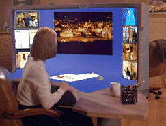
SUN's Starfire video/experimentIn a similar era the man who did a lot of the Apple Mac's user interface design ("Tog") directed a film called "Starfire" for SUN.
The idea was that it was hard to produce a next generation interface, but relatively easy to fake it.
The film is on a video unfortunately in American format (so most of our UK/EU domestic VCRs don't play it) and is good.
The major item of the workstation or office desk is a screen about 2 metres across, 1.5 m high and continuou with the desk surface, IE with a tightening curve from horizontal to vertical.
At least part of it was to be scanner, so in a nice bit of theatrical business as well as accepting paper documents and adding their image to the workspace, half a sandwhich got scanned in, and then wiped with a swipe of the hand off into the virtual rubbish bin.
It is about time that appeared as a DVD, rather than a video.
paper about their approach
-
Re:Not a camera - a scannerThis is not a device that can form an image from an object at a non-trivial distance from the display - this is a device that only images an object placed against it.
The best illustration of this use is probably Sun's Starfire video. It's an amusing short film of what the future will look like, at least according to Sun. The centerpiece of the movie is a large, wraparound console that is not only touch sensitive but will automatically scan anything that is placed on it.
There would appear to be a copy of the movie here for anyone interested.
-
Re:Organisation, Issues
The menu bar for each window was discussed by Tog.
Basically, having the menu bar at the top of the screen makes it infinitely tall, becuase you can flick the mouse to the top of the screen and click a menu. It makes a *very* noticable increase in accuracy and speed, especially for expert users.
The application vs. window issue is something that you get used to pretty quickly. If you use a mac for more than a day or so it seems pretty natural. With a modern OS with modern virtual memory, it doesn't really matter if you leave it open anyway. It actually can be a pretty nice feature, especially on a system like OS X where some apps still take quite a while to start up.
Twostep -
GUI target size [Tog]This is a good article, and if you like it, you might like some of Bruce Tognazzini's work here.He also has a book out "Tog on Interfaces".
One of his major points is the size of GUI targets. The edges and screen corners are easy to hit, but grossly underutilised by GUI designers. This causes more RSI in users than necessary. I've worked some apps with poorly chosen target locations and defaults that were just murder on my wrist.