 Slashdot Mirror
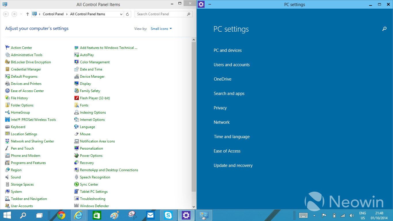
The Classic Control Panel In Windows May Be Gone
jones_supa writes In Windows 8, there was an arrangement of two settings applications: the Control Panel for the desktop and the PC Settings app in the Modern UI side. With Windows 10, having the two different applications has started to look even more awkward, which has been voiced loud and clear in the feedback too. Thus, the work at Microsoft to unify the settings programs has begun. The traditional Control Panel is being transformed to something temporarily called "zPC Settings" (sic), which is a Modern UI app that melts together the current two settings applications.
It's one thing to abuse the users with interface changes, but don't make the job for I.T. techs any harder as it it. We already got a lifetime of job security because of Windows.
Had to maintain a Windows 2012 Server system last weekend.... dealing with the Windows 8 configuration interface on a server makes me very angry.
"Have you ever thought about just turning off the TV, sitting down with your kids, and hitting them?"
I thought they were getting rid of this "modern ui" crap in Windows 10 wasn't that supposed to be the whole point of it?
It will have even less functionality than before. Because they keep trying to "simplify" things for the dumb users out there, by removing any type of "advanced" feature. Which means you will be stuck having to manually edit the Registry or gpedit or through some third party software that allow access to those now "hidden" features.
It's 2014, only idiots are still using this shitty OS
for a decent desktop experience.
Why does MS have a deletionist attitude towards icons? Also, the settings list isn't even alphabetized. How is this a good UI design?
And how exactly do they plan on dealing with Non-Microsoft items in this new settings environment? A huge part of why Windows has always won the OS wars was due to 3rd party extensibility and backwards compatibility.
This is forcing things to become non-standard, where programs are going to have to start having their own "control panels" in their own hard to find locations, rather than having a single place we all know and rely on to administer machines.
Having two different panels was shit, but mostly because when I was trying to get to a control panel that actually did something useful, the metro panel came up instead. (The only thing the metro panel is good for is wireless networks)
The answer is NOT "get rid of the traditional control panel" unless they are going to cram every last thing that was in there into the metro panel.
Even though I do not like Windows I never thought that it could ever really die. However with the absolute idiotic things that Microsoft has been doing with their OS lately I think that it might actually be possible. I cannot say how or this would happen, but I think it will be inevitable (I could be wrong here). I for one can’t stand the direction that they are taking. The only reason I still use Windows is for gaming. Maybe I should bite the bullet and only buy games that run on Linux from now on.
I don't know the architecture that well, but aren't all of these things just safe interfaces to the registry or rundll commands? Whenever the UI goes nuts, the fix almost always involves regedit or rundll. How about just giving us a safe, generic interface to regedit and rundll commands? Such a beast could be made to look like the classic control panel, or customized to look like anything you want.
For all intensive purposes, "whom" is no longer a word. That begs the question, "who cares"?
Make sure that commonly used control panel options aren't buried. For example: device manager, uninstalling programs, adapter settings, etc. Basically, there needs to be less clicks. But we also need a good search to find things.
As a Mac user, I find the "zPC Settings" categories quite similar to what Apple uses in OS X.
It's not about "dumbing down" features, it's about having clear categories at the first level. If Microsoft hides settings from level 2 and up, then it does become a problem.
Also, I find the look of those GUIs horrible, even more so than OS X Yosemite. Where did the latest GUI designers graduate from? Both OS X and Microsoft look more plain than twenty-five years ago, surely that can't be a coincidence. Are they preparing us to go back to monochrome displays?
Get free satoshi (Bitcoin) and Dogecoins
im hoping they don't do something stupid and disable the GodMode trick.
could somebody please either try that trick by creating the folder from scratch or grab https://dl.dropboxusercontent....??
Any person using FTFY or editing my postings agrees to a US$50.00 charge
As long as they leave intact the ancient, tiny, unresizable Environment Variables window that hasn't been updated since it was first introduced in Windows NT, I'll be happy. Who doesn't like editing a huge path in a tiny 40 character single-line text field?
Have gnu, will travel.
For those to young to remember...MicroSoft thought that they could get away with doing away with a whole profession - the systems administrators. They put out this "initative" to get rid of the admins...it was called "ZAW" which stood for Zero Administration for Windows. They alienated a bunch of sys admins...I moved completely to UNIX/Linux....why would I stick around in a technology that was being pushed away.
As it turns out...the Internet and server administration and desktop administration are too complex to bundled in some stupid little "control panel." This attempt to "merge" functionality will fail as well.
It's gotta work in 640x480, and it's not like it's possible to resize window content to fit it's container or anything...
If you've noticed the control panel contains configuration screens and programs that look like they have not changed much since windows 95, and in rare occasions NT 3.5.1.
This is not by accident. This is for backward compatibility. These are bits of legacy systems that will break a whole lot of things if removed.
In windows 2000 microsoft tried to replace the control panel with the MMC, but even that only sort-of worked. There are still items that are only configurable via the control panel. The MMC was a good idea too. Modular, configurable, extensible, network enabled.
If by some miracle they do away with the old control panel I'd hope they could give us two configure modes. The fuck-awful "modern UI" control panel equivlent terrible, but if it's only end-user facing that's probably fine. They NEED to expose the same configurations to another set of advanced tools (Something like the MMC but revamped), or via an interface/API on which one could build advanced/automated/networkable tools. (Probably based on powershell commands)
So they're going to add a third?
Confucius say, "Find worm in apple - bad. Find half a worm - worse."
Interactive live tiles could shine here, turning the click-fest we have now into a modern (no pun intended) take on the original Macintosh control panel.
By replacing dumb menus with interactive gadgets you could shave a click or two off most setting changes, so the user doesn't get lost in nested screen after nested screen.
Unfortunately, Microsoft's "modern" design guide seems to be a manifesto on how to make the user as lost as possible, so I'm not getting my hopes up.
How can I believe you when you tell me what I don't want to hear?
Simple answer is YES. Everything will be monochrome soon.
Have you seen Microsoft's Visual Studio lately? It is mostly a monochrome mess. You get bits of colour here and there, but I'm sure the next version will "fix" this.
Heck, you can also look at Corel for this stupidity. I think it was Paint Shop Pro X6 which by default all the icons were monochrome. They patched it later to add colour icons and then patched it again to make the colour icons the default.
Microsoft, Apple, Google, Amazon what's the difference? All steal money from devs and control with walled gardens.
If you use the settings a lot and want them to appear at the top of your menu, change the name from "zPC Settings" to "(space)PC Settings" :D
Dear Slashdot: next time you want to mess with the site, add a rich-text editor for comments.
Literally, when I go into the standard control panel for Windows 7 I can't find anything useful. All of the settings I need to change require going to the classic control panel.
I suppose it will be a fucking control panel ribbon. Fuck ribbons
Instead of "Add or Remove Programs" or "Programs and Features", I recommend they call that "Remove or Add Features and Programs".
Feedback was about NEGATIVE experience with the METRO, NOBODY wanted more of that shit. .....
Thanks M$
Who logs in to gdm? Not I, said the duck.
until systemd folks figure out how to force all to binary config format requiring an additional program to edit.
was there any problem with Control Panel that they had to get rid of it? I liked a central place to change all settings in the OS, and similar settings managers in OS X and Linux Mint.
Help! I'm a slashdot refugee.
All vestiges of reverence for Windows will be truncated to the farthest decimal.
The Control Panel's organization has been terrible. I can't think of a time when it was actually good, but it's just getting worse with each Windows release. Use to be Add/Remove Programs, then it's Program and Features but does the exact same thing. Printers got moved to Devices and Printers. Here's the thing, printers and ability to remove programs are fairly important, why make it less descriptive? While at the same time, there are applets/control panel applications that doesn't deserve their own icon at the top level: Windows Cardspace, Notification Area Icons, Indexing Options, Getting Started (really?), Folder Options, Default Programs (should be within Program and Features),
"sic" is used to indicate a quoted error. zPC Settings is spelled that way to put it alphabetically at the end of the list. "sic" is inappropriate here.
Alphabetizing the Control Panel ACROSS columns was a huge thing for me. Takes way longer to find things that way. That's not how columns are supposed to work. Idiots.
Environment Variables are better off being set via CMD.exe
Then you don't even need to reboot/logout to have the change take effect.
Or the old-school way, but you'll need to logout/or reboot.
It sucks 12 day dead donkey dick.
That's one thing I never understood, why Microsoft went GUI with the servers like they did, other than to know that they sold a lot of server OSes to people that had no business running servers in the first place...
Simple. Most business people had been exposed to DOS, then moved to Windows and found it much easier to use and understand. The Novell guy comes in and tries to sell a Netware server. Yep - looks like DOS. I came in with a Windows server. Looks just like his PC. He sees File Manager, drive letters, Notepad, Paint, and suddenly he feels like this is the more advanced system, and he is far more comfortable with it.
A lot of the Netware guys around my area were extremely arrogant, and treated their customers like crap. Once they got a server installed, the customer was clueless and the vendor would abuse that. Our business model was to be open with the system and point out that we can easily be replaced, keeping us focused on their satisfaction. With NT Advanced Server (the correct name), the business owner could actually watch us and understand what we were doing with his system. We replaced a fair amount of Netware servers in those days. And you can see who won.
Place nail here >+
How about a control panel, that melts the two together into, you know, a control panel? Why, on a regular PC, do I need to deal with Metro at all?
Oliver's law of assumed responsibility: If you're seen fixing it, you will be blamed for breaking it.
(N/T)
Amazing. I would never have believed it but is looks like MS will make their next version of windows worse than 8. They are doing their best to wipe out their desktop and business market...
You could always do work on X11/Linux and game on PlayStation.
OS X? It's been that way since OS VI. System 6 had a desk accessory called "Control Panel" that would load "cdev" applets. System 7 shifted the cdev loader to Finder, but otherwise they worked similarly. Microsoft has had a long time to copy this stuff.
Is that so? I thought Super Smash Bros. Brawl for Wii was modded to hell and back.
Administration UI not changing is important for people who need to walk other people through PC administration over the telephone.
If we're lucky, Microsoft will drive people away from all future versions of Windows. The control panel is the most useful part of the whole crappy OS.
Who doesn't want to melt Windows computer back into slag?! But perhaps they will only meld these two programs into one.
Don't know about him but I'm a stubborn old fart. The OS has a GUI. I shouldn't have to be typing command line style queries. I wanna point and click. You can talk efficiency regarding number of clicks vs number of key presses all day but once I've memorized a drill down menu, I'm pretty damned fast. Fast enough for me anyway. Also, showing me a menu shows me all of the options available in the event I forgot them, I'm new, or I was unaware of their existence. You can't search for something you don't know is there without having at least a couple characters to get the searcher started. I can't recall what I was trying to tweak last week after I installed a new SSD but the searcher had no idea what I was talking about. Maybe it was the device manager (though that seems to work on the work PC here). Anyway, I had to drill through the computer management panel to hunt it down myself. If you are an admin or some other type of person who is all up in a PC day in and day out then your method is probably better but for us simple home users, we forget stuff or may not be trained so we need some pictures.
One other reason that may actually apply to you, is that I disable Windows Search and all of its indexing garbage for performance improvements. When you do this, you can still search, but without the index it is painfully slow. I just ensure I never invoke the searcher unless I just absolutely have to.
Somebody read Wikipedia today and has to use those new words he discovered! *golfclap*
Could you show me the UI of the internet please? Oh right! There isn't one. Thanks for playing!**
**Back in the day, one could say the AOL & CompuServe programs were the UI of the internet, but thank our overlords that those walled garden style all-in-one apps were slain like the soul sucking beasts they were!
With our modern selection of RGB LEDs, you can still have any color you want but get away with using one "lamp". Now that's progress!
Are the point of toolbars to show you every possible menu item as an icon, or are they supposed to hold a palette of tools you use the most?
The new dialogs will be dumbed down so they are useless. The old dialogs will remain but have zero development effort to maintain them. So in order to find things you need to know when the OS features were added, and thus what type of dialog to use. Or know the third party apps to use, like Sysinternals used to be.
Remember that sys admins and slash dot readers are less that 1% of PC users. They are irrelevant to Microsoft. Be like Apple iPhones, that is the key to success.
Finding is easy. Open Control Panel, go to the search box, and type.
Pinning is easier. Pin the Control Panel to the Taskbar. Right click to see recently-used applets, and pin those too for super quick access.
I don't think anybody should be looking at an alphabetized listing of settings.
So, people were right about the version being changed to "Windows 10", because the even numbered versions a crap...
We were lead to believe that Windows 9 would be the one that would undo the "touch interface on a PC, desktop interface on a tablet" schizophrenia of Windows 8. Instead Windows 9 would have a touch interface on a tablet, and a desktop interface on a PC.
But if those screenshots are correct, what they are doing is getting rid of the desktop control panel on tablets, while forcing the touch interface on PC users.
If that's the case, I guess I will upgrade my tablet to Windows 10 (unless I've jumped ship to Android by then), and keep Windows 7 on my PC.
I really don't like the new UI PC Settings, it's missing about every option one might need to control, at least if you are even a bit serious about configuring your PC..
Just keep the old screen for people who know what they are doing, and the other crap for people who actually never have to use it...
One of the biggest improvements of Windows 8 was finally being able to access the control panel quickly by keyboard. (windows-I enter), something I wished for since win9x days.
While every Windows version since 2000 successively made keyboard-centric usage harder (because they have more "blob" like dialogs), this step would be a big blow, since the keyboard usability of modern UI apps suck.
Keep PC Settings as default one, and add on it an "Advanced" entry, which will raise Control Panel.
Because when your customers scream that the #1 problem with your software is the endless massive changes you implement that obscure all the common and easy to do things requiring them to approach every new release like it's a completely different product and waste endless frustrating weeks relearning everything.....
Then by all fuck means do more of that harder.
This is a terrible idea. The point is that the 'Modern UI' is designed around full screen apps. But system configuration is one thing that enormously benefits from opening up windows alongside the control panel (for example, to follow a set of instructions), opening up multiple control panels to refer to each other, and so on. Microsoft is basically directly removing usability.
..run a program that takes longer than a week to complete.
But when I do, I unplug the ethernet.
I should use this sig to advertise my book ISBN-13 : 978-1501515132.
They're going to replace the control panel with a Metro app? Damn it. I was hoping that I could just avoid all Metro apps completely. That's really irritating.
New versions of Windows are basically just make-work projects, but why can't you just stick to screwing with things that don't MATTER??
'Nuff said......
In Control Panel in Windows 8.1, you can "Change your account name" or "Change your account type" (whether user is an administrator or not). To do anything else, you need to "Make changes to my account in PC settings", which opens "the tablet-PC nonsense". To create an account, you need to click "Manage another account" and then "Add a new user in PC settings", which also opens "the tablet-PC nonsense".
Unless they are real admins using the command line.
Why does the PowerShell equivalent of sudo su - require so much typing (namely Start-Process powershell -Verb runAs according to this page?) And unlike Ubuntu, which installs man pages by default, Windows requires users to remember to run Update-Help as administrator while online before taking the computer offline.
Always made me mad that MS shuffled the CP around with every release. Might as well trash it completely.
just Submit a form W7-a to department Z sub departmant 11 division 12 catagary 99 for a type R-22-sub cubpartment 99 under item 2073-R catafory 99 on and day that starts with Arr and ends in Zed will process your request for device printer installation from a MicrorWare Certifide technichnean to turn on the power button and plug in your printer, but for printering paper you'll need yet another form to get Microsoft Approved Paper, and that should take only a decade or two
And Active Directory still isn't as good as NDS after 15 years or whatever it's been...
Really???? As if the Control Panel was so in need to being reworked at the UI level! How about ditching the decade old NTFS for a better performing file system that is not hampered by DOS era limitations. Or improving networking performance so that we don't have to wait 20 seconds for Windows to figure out that it will take 3 seconds to copy a file. Metroizing and ribbonizing the UI while making it entirely dysfunctional is clearly not a priority! This only shows that Microsoft still doesn't get anything.