 Slashdot Mirror
Domain: kmgerich.com
Stories and comments across the archive that link to kmgerich.com.
Comments · 42
-
Re:That's what I did with Firefox 2.0 for Mac
A nice firefox 2.0 theme is Pinstripe for Firefox 2.0
It's a pretty nice theme for mac, I think it makes firefox look like one of the nicest browsers on the platform. The new default firefox 2.0 theme looks like ass. Whoever signed off on the changes needs to be shot. -
Re:It looks out of place on the Mac
Check out http://kmgerich.com/
-
Re:Needs more colours
Gah. That's still *way* under-saturated. I don't understand why so many people like this theme, the icons look so washed out it really makes it look amateurish, IMHO. Winstripe had virtually no opacity change on mouseover (just like the theme for virtually every other GUI program out there), and looks MUCH nicer. What's the point in designing vivid, colourful icons if they're only gonna be in full colour 0.01% of the time (on mouseover)??
Prey tell, does anybody know of a theme that REMOVES the opacity change on mouseover, and just leaves all the icons at 100% opacity all the time? That's what I'd like. I looked into making it myself, but from that above theme it looks like quite a lot of work. -
Re:It looks out of place on the Mac
Agreed. Kevin Gerich, who was involved in creating the previous Firefox theme (Pinstripe) has an updated version for Firefox 2.0. It is a nice improvement over the new default theme. http://kmgerich.com/2006/09/27/pinstripe-for-fire
f ox-now-with-20-more-macintosh/ -
Visual refresh.
I'm amazed by the apathy about Firefox's new icons. Do they really not bother people?
I and hundreds of other people have been actively commenting, throughout the betas, that the new icons looked *horrible*. The main problem is their ridiculously low default opacity, seemingly for the sole reason that they could increase it to 100% when the mouse is over the icon. This is a BAD IDEA, and I have no idea why the developers of the theme stubbornly refuse to admit it. Those washed out icons did, and continue to, look awful.
Whatsmore, the icons themselves are nasty. They don't scale down (small icons) well, they look frankly amateurish compared to Winstripe, and any extension that inserts its own icon into the toolbar (like mine) will immediately look out of place, because its default opacity isn't about 50% like the rest of the icons. Sorry Firefox, but I think this new theme SUCKS BIGTIME. The first thing I did was grab the classic Winstripe theme. -
Re:Tweaked UI
Unless I'm mistaken, I belive the interface was tweaked a bit (the Go button and stupid "drop down arrow" hover effects on the Back/Forward buttons seem a bit darker) on the Mac version (wouldn't surprise me if the Windows/Linux versions didn't change--RC 1 was at least decent for them), though it still looks terrible for a Mac app. For example, the toolbar icons increase in saturation when you hover over them. Note to theme devs: Mac icons don't do that; this isn't Windows XP. Plus, the whole toolbar is now this light gray instead of the OS X pinstripe background. It seriously looks like a poorly ported KDE app.
That being said, for Mac users who want a theme that actually looks decent, they should try the Gerich/Holander update of the original Pinstripe theme which they created for Firefox 1. Not only is it updated for Firefox 2, but it's been tweaked a bit and looks "20% more Macintosh" according to them--though more like 200% if you ask me: http://kmgerich.com/2006/09/27/pinstripe-for-fire
f ox-now-with-20-more-macintosh/It's also available for Windows and Linux and will make Firefox look more or less like the 1.x theme.
-
Re:Camino
-
Re:Cons of Mac Firefox
I might mention that Kevin Gerich's widget set makes Firefox's HTML controls look much more presentable on Mac, in my opinion. It's not quite the same as having native Aqua widgets, but it's a start. Granted they aren't bundled with the application by default, nor do they solve any of the other OS integration issues you mentioned.
That having been said, I agree with the assessment that Firefox for Mac has a lot of catch-up to do to match Safari in terms of aesthetics. It's one of the biggest cons of choosing Firefox on the Mac platform. Safari, as Apple's own in-house effort, gets a level of fit-and-finish with the rest of the OS that third-party developers can have a tough time matching.
On the other hand, the biggest pro for Firefox on Mac (in my opinion) is the expandability. Safari doesn't have Adblock, BugMeNot, or any of my other favorite extensions. Even Camino doesn't support them. So in my case, I choose expandability over aesthetics and use Firefox as my default browser on Mac.
Ideally though, it would be possible to have both. Maybe in time and with further Firefox development.
-Frank -
Re:I wonder what MS has stolen from firefox
-
Re:Looks like iCal...
It is cribbed directly from Firefox actually. And making up part of a suite, it isn't surprising.
-
Re:Popularity
Quote from http://kmgerich.com/archive/000079.html and I think it hits the nail on the head:
"At first I found it hard to get around the "Netscape Messenger 4" feel of Thunderbird. I wish that the UI had been burnt down and redesigned from the ground up as Firefox was. There seem to be many opportunities for simplification in the menus, preferences and settings windows. Perhaps this is coming."
While the default theme has changed, the structure of the UI is more or less still the same old shit. Just look how to configure multiple SMTP servers in TB - it's a mess.
TB is nice, but its UI really needs work. I'm hoping for TB 1.1 in March 2005... -
Try this, perhaps
http://kmgerich.com/archive/000069.html
Not perfect but getting warmer. -
Mac OS X Users check this out:
Kevin Gerich (who, along with Stephen Horlander created the default theme for Firefox) has done some really nice Firefox replacement widgets at his weblog- check them out and install them, they are very nice.
-
Re:Good job for the Theme complaints, folks
Stephen Horlander and Kevin Gerich, the creators of Winstripe, blogged about the improvements to Winstripe in 0.9.1. I'm impressed with their openness.
(It might be that only one of them wrote that blog post. I'm confused because it's attributed to Horlander but is on Gerich's blog.) -
Re:here's a link to the theme itself
-
For those curious, here's a Pinstripe gallery
Here's what Pinstripe looks like. Goes to show OS X still has the most beautiful, pleasant, and clean-looking GUI around; no wonder everyone tries to rip it off yet fails:
Pinstripe Firefox Gallery -
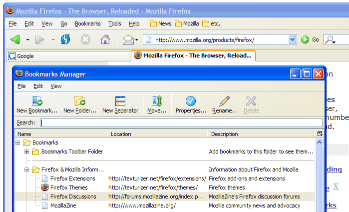
Screenshots
Um here are the important things... the screenshots of it. Who cares about reading a description of a browser theme, I mean really??
-
Re:More pics
That was Qute for 0.9. Arvid was still working on improving his theme and including icons for some of the new functions such as Mail.
Winstripe is indeed the new theme. We've been debating the decision in the IRC channel and Steven Garrity believes the theme will survive the backlash and be good for Firefox in the future. I hope he's right.
Arvid's Qute theme will still be available for download so let's hope the Theme manager has been totally bug-freed by next week.
-
Re:The new theme
And here is a complete screenshot of the new theme. I think this is a huge step backwards.
-
Complete Screenshot of the New Theme
Complete Screenshot of the New Theme
Dear God. -
Screenshot of the new theme
The author of the new theme, Kevin Gerich, has posted a screenshot in his blog:
http://kmgerich.com/archive/000062.html -
Re:More pics
here are more pics from the actual author's site.
-
Screenshot of the New Default Theme
Here is a screenshot of the new theme.
-
here's a link to the theme itself
It looks very nice!! (a work in progress, and this maybe an older version).
save to disk: pinstripe theme
use the tool here to install it. -
Re:Definately a bad choice on the part of the devs
This new theme just doesnt fit in Windows or Linux... it looks good for OSX, but just not in other OSes.
I disagree. I have been using the windows version of the theme for weeks, and it's really fine. Check this screenshot for an example.
If you really want it to look windowsish, you'd have to use those big, kitch, flashy buttons that are used in IE. No thanks, the general window interface (flashy window frames) is already ugly enough ! -
Usability
The problem is that most people who consider themselfes great skinners have absolutely no idea about usability or have the basic skills of design. Look at all the skins for Winamp, Mozilla/Firefox/TB, Windows or what ever. 99% is crap. Most of those people consider releasing a skin every week something great. Sometimes the authors have something like 30 different skins released. WTF? Do they eat their own dogfood? I do not think so.
Look at Tunderbird and Firefox for Windows. The main theme is PLAIN UGLY, who came up with that Quake activity indicator? You are trying to reach professional users or kids? If I had a boss (and Windows) he propably would ask WTF I a wasting my time on with kids software or something.
Now have a look at those examples:
Pinstripe for TB
Does it look good? It does. Does it look professional? Yes. Does it have little skulls bouncing around? No!
I do not have anything against skinning functionality in applications, I have something against people running the skin archives coz they have no clue about the basic standards of Usability and taste. They should tell those people with 30 submitted skins to fcuk off and get a life. -
Yes!
Actually, the Pinstripe theme has achieved this for some time for Mozilla, and evidently will be standard from the next release on in Firebird. I care for native controls too, and we have 'em in Firebird.
-
Making Mozilla/Netscape More Mac Like
Installing the pinstripe theme would make the reviewer's opinion of Mozilla/Netscape better, I think. It gives the browser an aqua look.
It is available at:
http://kmgerich.com/pinstripe/pinstripe.html
The best feature of Moz 1.4, though, is type-ahead-find, or whatever they call it now. Just start typing to have the typed text highlighted and that part of the page jumped to. Great for pages you come to from a search engine. -
Re:Not quite.
Camino is a lightweight OS X browser based on the Gecko engine but without the XUL interface of Phoenix, Mozilla, et al.
Phoenix for the Mac is not Camino, though they say official Firebird builds will soon be available for the Mac. -
Re:competing with camino
Well, they aren't competing any more than Mozilla and Camino compete. When you're dealing with open, free projects, there really isn't such a thing as "competition".
I imagine that people would use Phoenix on the Mac if they wanted to have that nice "one browser on every platform" feeling. I know that's why I sometimes use Mozilla on my Mac.
All this means is that Mac users have even more choice when it comes to browsers, and to me that's a good thing(tm).
By the way, Phoenix already exists for the mac (sorta).
-
Re:Multiple Homepages
There is an experimental build of Phoenix for Mac OS X, actually, which doesn't feel all that awfully experimental.
-
Phoenix isn't quite thereFrom the Phoenix FAQ:
Q: You said this was designed to be cross-platform. Where's the mac version?
A: Designed to be cross-platform doesn't mean we offer a build on every platform, it just means the code itself works anywhere. We don't officially offer Phoenix for Mac, but some people have already begun experimenting with mac versions (see this page). We may consider officially releasing Phoenix for Mac in the future, but we want to focus on Windows and Linux for now.
I seriously dig the Phoenix project. Mozilla is way too big and way more than I would ever use. Phoenix is just right (and getting better with every release).
Unfortunately for Mozilla, Phoenix isn't mature enough yet to be Mac's choice of browser. Give it a year or so and we'll probably see a Mac version of Phoenix which will rival Safari in speed and size.
-
Re:multi tab startup
From the FAQ:
You said this was designed to be cross-platform. Where's the mac version?
Designed to be cross-platform doesn't mean we offer a build on every platform, it just means the code itself works anywhere. We don't officially offer Phoenix for Mac, but some people have already begun experimenting with mac versions (see this page. We may consider officially releasing Phoenix for Mac in the future, but we want to focus on Windows and Linux for now. -
Fastest web browser
By far, the fastest web browser for MacOS X is the quick'n dirty port of Phoenix.
Quite frankly, it is amazingly speedy, although it lacks quite a lot of features. But if you are willing to sacrifice compatibility for speed, it's the way to go. Launch speed is pretty lousy, but once it's launched, boy is it fast!
-
Re:Immediate theme change?
-
link...
sorry... experimental Phoenix for OS X. p.s. I forgot to mention, it also has a Google searchbar!
-
Shunning the Mac...
For some moronic reason, they're not porting Phoenix because they think that Chimera is supposed to be the one and only "lite" browser for OS X.
However, there were already Galeon and K-Meleon for Linux and Windows, so why are they working on and releasing Phoenix at all?
Anyway, some guy did a quick and dirty 'port' of Phoenix to OS X - he changed two line of code, then built it. Almost too easy; maintaining an OS X port would be trivial.
I really do wonder why the Phoenix project leaders have been so insistent on shunning the Mac... -
Re:pinstripe theme
The API is cross-platform. This specific theme is designed to use OS-native widgets
As stated in the FAQ, the theme uses the OSX Appearance Manager to render the theme, and thus is designed only for OSX. -
Re:pinstripe theme
Note that if you're using the pinstripe theme, chances are good you're a homosexual Macintosh user.
I don't know why.
First thing I noticed. -
pinstripe theme
Note that if you're using the pinstripe theme, you've got to use the one made for nightlies.
I don't know why.
First thing I noticed. -
Re:User Interfacetry the pinstripes skin, i use it on MOZ 1.1b on OS 10.1.5. and it blends in nicely, not quite Aqua but nice. plus there a variety of other "Aqua" skins available.
IE5.5 is nice but the MOZ is better, now if pixeljerk would make an icon for it it would be perfect.