 Slashdot Mirror
Domain: guidebookgallery.org
Stories and comments across the archive that link to guidebookgallery.org.
Comments · 86
-
Re:Gimme the old interface!
-
Re:app???
No, a directory starting with a ! is "magic". It could contain a !boot file (what to do when the filer sees the directory for the first time), a !run file (what to do when the directory is double clicked), a !sprites file (containing the icons, which can also used for the directory itself). See http://www.guidebookgallery.or... for an example.
-
Re:Classic theme
Not only that, but whomever, manishs or MojoKid, made that comment in the post doesn't remember their colour schemes very well (or is too young to know better?). Win98 used two deeper shades of blue for the gradient (navy & sky?), the dark to light gradient started in Win2k/ME and persists to at least windows 7.
http://www.guidebookgallery.or...
http://www.guidebookgallery.or... - scroll down. -
Re:File manager without file, edit, view..
Yeah, that design is so original.
-
Re:File manager without file, edit, view..
You should thank them for doing something new, without simply copying other systems.
I think that a window full of icons has been done before. It is not exactly a revolutionary interface.
-
Re:Do it like Linux
-
Re:Do it like Linux
-
Re:Do it like Linux
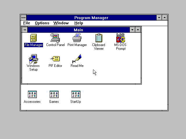
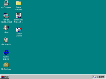
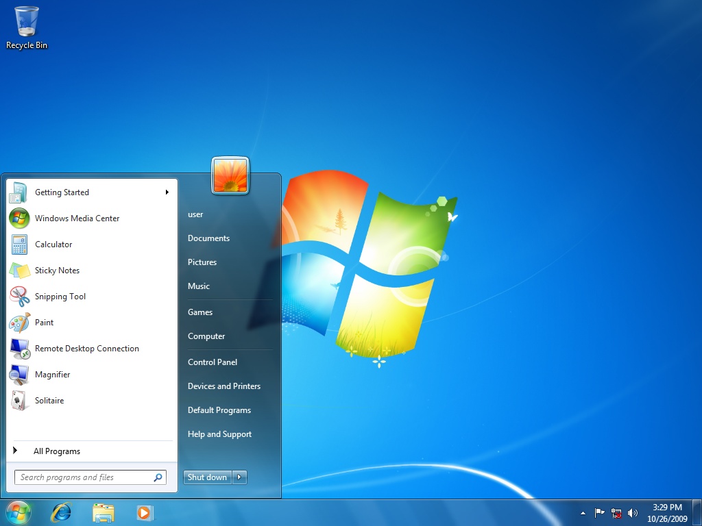
I'll throw some screenshots here so people can compare easily.
- Windows 3.1
- Windows 95
- Windows 7
- Windows 10 new icons from the article
- Windows 10 new Recycle Bin and Control Panel icons -
Re:This stuff is so stupid (and so is Forbes)
I'm still not convinced about the name, but it is interesting to consider (more below). Awesome screenshot by the way.
I read the Wikipedia page on the Lindows case, it seems the judge invalidated the trademark to Windows. And MS is certainly allowed to purchase trademarks they feel they need to ($20 million in this case).
As for the name. Microsoft is a company name trademark, and Windows is a Microsoft trademark on a software application. The two trademarks are inherently different with respects to usage and trademark applicability. I would have problems starting a software company called Microsoft, iMicrosoft (the Apple tradition),maybe even Microsoftware (not sure on that, I wouldn't chance it...), But I could create a company with Windows in the name, in fact there are thousands of such companies in the housing industry.
MS refers to Windows as Windows across its website, I can't find an instance of Microsoft and Windows combined. Google searches return "Microsoft Windows", but that is clarifying the company name (in case one is searching for house windows). My operating system is "Windows 7 Home Premium" with a Microsoft copyright notice below the name.
Here's what I see: The company name is Microsoft. The product name is Windows, and the trademark itself has basically been invalidated (I'm trying to think of ways to take advantage of this, looking for some settlement money, maybe a porn site called Sindows or something - Sin Windows, there is a Minecraft server called Sindows...).
I liked your historical screenshot a lot, here's another one (I don't know your age though, the next question may not apply). Did you use 123, Lotus 123, or just Lotus? I used the 2nd and 3rd commonly while in college, but never the first. But the software was simply called 123:
http://www.guidebookgallery.or...Fun conversation, later.
-
Re:Lisa was better than most people realize
It was also, to my understanding, much nicer for hardware technicians. The case opened up easily, and everything was handy to get at. Certainly in comparison to the original Mac (and many of the later models too) which required weird screwdrivers and had exposed high voltage parts. No one who's accidentally touched a flyback transformer in a Mac ever forgets it.
The slide-out reference cards under the keyboard were also a good idea, and were present on the Mac during prototyping but never shipped. Too bad, or was a great idea. You can see them here: http://www.guidebookgallery.org/extras/spotlights/lisa/photos/keyboardreferencecards
But it wasn't all perfect. IIRC, the Lisas all had GUIDs which they would write to install disks as a standard, built in copy protect scheme.
-
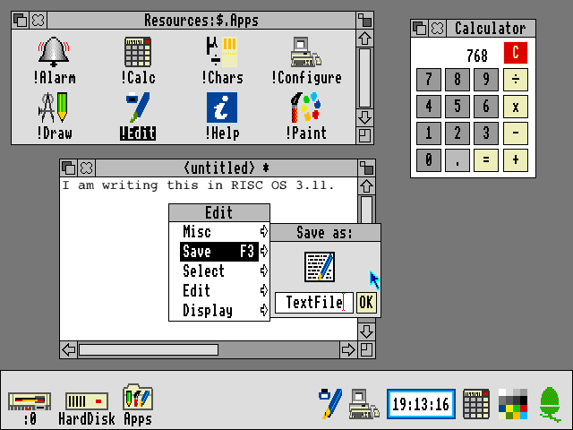
RISC OS widespread enough for you?
-
Re:As good a time as any other
-
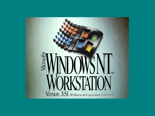
I still feel this is the BEST Windows logo
http://www.guidebookgallery.org/pics/gui/startupshutdown/splash/winnt351.png
* The one from Windows NT 3.51...
APK
P.S.=> I have always liked "3d-ish" design in things is why... apk
-
Re:At first I thought the Judge was biased
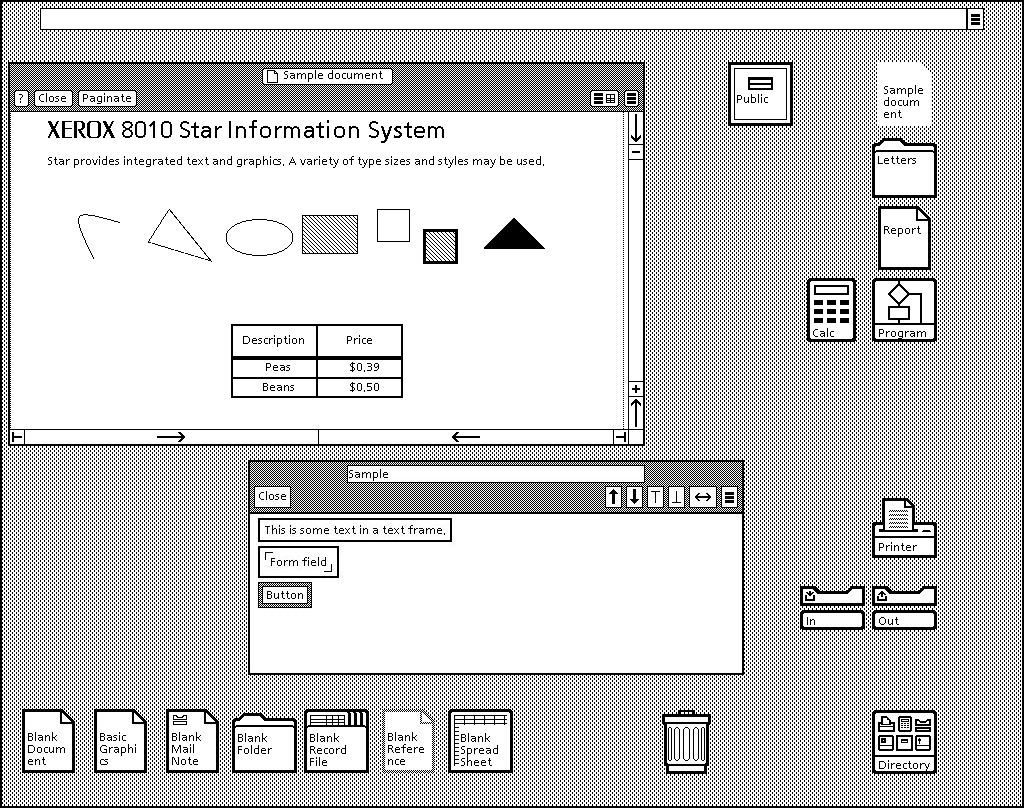
Can you provide citation or other evidence? Here is one of many reports that state the contrary. Here's another. Here are descriptions of the Xerox Star and Xerox Alto interfaces that don't seem to illustrate these features. Here's video of the Xerox Star, showing the use of dedicated keys, rather than drop-down menus, to carry out basic operations like copy, move, undo, and text formatting, the use of a "Move" key with point-and-click instead of drag-and-drop to arrange files on the desktop or move files into folders, the use of a "Properties sheet" instead of direct editing to change filenames, the use of a Delete key instead of dragging files to the trash, the use of an "Open" key instead of double-click to open a file, the absence of text selecting by dragging, etc.
-
Re:At first I thought the Judge was biased
Can you provide citation or other evidence? Here is one of many reports that state the contrary. Here's another. Here are descriptions of the Xerox Star and Xerox Alto interfaces that don't seem to illustrate these features. Here's video of the Xerox Star, showing the use of dedicated keys, rather than drop-down menus, to carry out basic operations like copy, move, undo, and text formatting, the use of a "Move" key with point-and-click instead of drag-and-drop to arrange files on the desktop or move files into folders, the use of a "Properties sheet" instead of direct editing to change filenames, the use of a Delete key instead of dragging files to the trash, the use of an "Open" key instead of double-click to open a file, the absence of text selecting by dragging, etc.
-
Re:GPL is poison to business
But as far as successful OSes with different GUIs DOS had: Windows16, Many Dos shells particularly popular was WordPerfect's.
And JavaOS (dumb phones) which is possibly one of the most successful OSes of all time has more GUIs than I can even list.You're down to counting DOS Shells and Java PHONE OSes as GUIs?!? Hahahahahahaha!!!!
By the way, you forgot the (most-excellent) GS/OS and Quark Catalyst and MouseDesk and also GEOS for the Apple
But you know that's not what we were talking about... -
Re:Doesn't everyone run in classic?
the silver Luna theme in XP was awesome.
I can't believe I just read that. The fact that you call it the "Luna" theme proves that you actually cared about the set of XP themes on some level. Well, to each his own...
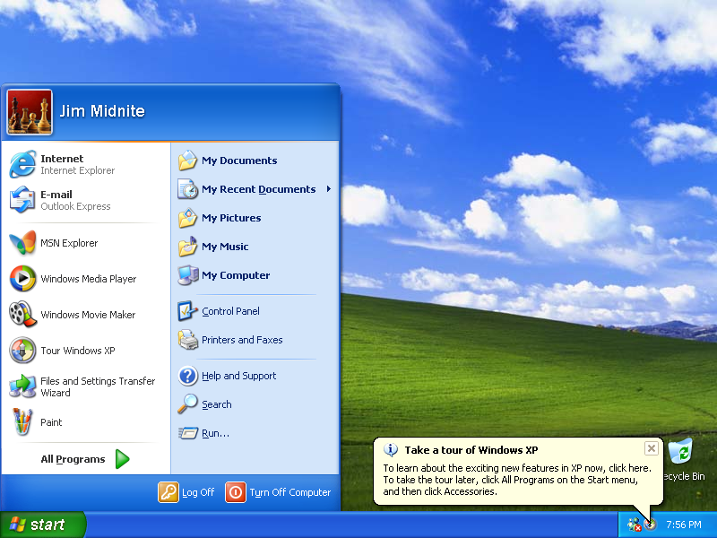
I think he's talking about the puffy blue theme with the green start button, and the pixelated picture of the green rolling hills afflicted by obvious JPEG compression. The super-default one, the one you see in most screen shots depicting XP. Like this.
-
Re:and what about xerox's stuff?
Sort of correct - the article you linked doesn't say anything about Lisa's early interface. Lisa had a GUI for applications, but it was not mouse/window-based and it wasn't system-wide See: http://folklore.org/StoryView.py?project=Macintosh&story=Busy_Being_Born.txt
Interestingly, it says: "The middle picture depicts the initial user interface of the Lisa, based on a row of 'soft-keys', drawn at the bottom of the screen, that would change as a user performed a task. These were inspired from work done at HP, where some of the early Lisa designers hailed from."
So Apple got ideas from HP too, not just Xerox.
Read this history, it is very detailed and englightening:
http://www.guidebookgallery.org/articles/inventingthelisauserinterface
-
Re:and what about xerox's stuff?
and before the Dauphin DTR-1 there was the NCR-3125 which ran PenPoint (or Windows 3.1 for Pen Computing) and had gestures --- PenPoint's user interface design guidelines are very interesting reading:
http://www.guidebookgallery.org/books/thepowerofpenpoint
http://www.amazon.com/Penpoint-Interface-Reference-Technical-Library/dp/0201608588/ref=sr_1_1?s=books&ie=UTF8&qid=1319204076&sr=1-1
(ob. discl. I'm selling some copies which I have left on Amazon)William
-
A likely story. Not.
Microsoft killed the Start menu because they want to force everyone to use Windows Phone, even if they aren't (initially) buying a Windows Phone. They failed for years to sell phones that look like a Windows desktop, so instead they're changing the Windows desktop to look like their phones, and hoping that iOS and Android end up looking "foreign" to phone users as a result.
People click on the Start menu when they want to find something to Start. Imagine that. The bottom line is that the Windows 95 UI (which is to say, Microsoft's ripoff of the RiscOS UI) was the pinnacle of personal computer desktop UI design. Everything that's happened since then has been change for change's sake and has only served to annoy users and get in their way. -
Dag Nabbit!
Back in my day, all windows had a line on the top left and two arrows on the right, and all the windows were uniform and looked exactly the same! And it should never ever change from that! Get off my lawn!
-
Re:Gnome
your professional is another mans clown show
Or another child's Fisher Price toy .
-
Re:Who gives a shit!
And that itself was influenced by Apple's Newton. It's all a mishmash of influences. What matters is that eventually Palm hit on the definitive UI in the stylus era and iPhone finally hit the sweet spot in the touchscreen era.
-
Some of you may not be aware...
... that there was an 80186 processor -- Intel's first 16-bit x86 offering. It was popular in embedded applications, but a few workstations based on it were made -- one of them being the Tandy Model 2000, a not-quite-IBM-compatible, MS-DOS-based PC which you could buy at Radio Shack. I owned a second-hand one of these, and even learned how to write assembly on it.
What I didn't learn until recently was that there was a version of Windows for this curious beast, and indeed the 2000 played an integral role in the development of Windows. Unlike its IBM cousins, the 2000 was offered with a high-res, 640x480 color graphics card as a standard option, and Microsoft was interested in implementing a full-color display for Windows. So, Microsoft developed the initial versions of color Windows on the 2000, and Bill Gates touted that fact in celebrity endorsements for Tandy ads.
The much more modular driver architecture of Windows -- a revolution in PC software at the time -- enabled it to be smoothly ported to the Tandy 2000 irrespective of the hardware incompatibilities that made it not a true PC compatible.
-
Re:GUI is still there for remote desktop and it's
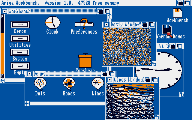
Bah. I always switch to the classic mode anyway. It updates the screen faster, is more responsive, and seeing as how I grew up with this (see links), I already think it's pretty enough - http://toastytech.com/guis/c64g.html http://www.guidebookgallery.org/pics/gui/desktop/full/amigaos10.png
Question:
Why does this flaw affect NT 6.1 and 6.2, but not 6.0 (vista)??? And why's the driver called "Canonical"?
-
Re:Say what?
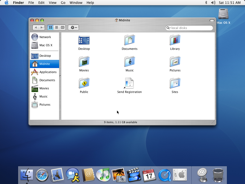
The thing I dislike about your OS X screenshot is that the fonts look like they were shoe-horned in to fit the pixels, rather than being carefully designed for the available pixels. As a result, they look blurry and non-uniform. This is most noticeable in the reverse-highlighted "Midnite" on the l.h.s. of your screenshot. The "d" stands out brightly compared to its neighboring "i" and "n". Even worse, the first "i" is dim and the second "i" is bright, because the second "i" happened align better with the pixels.
-
Say what?
From the article:
If you had found me right after I'd installed OS X Public Beta for the first time in 2001 and told me how dramatically the OS would change over the next decade, I'm not sure I would have believed you. There was a gigantic difference in feel between installing Windows XP and OS X Public Beta -- with XP you got that fun sense of having a whole new computer, fast and ready to take on whatever you could throw at it, while with OS X you just sort of stared at the huge icons and wondered, "Now what?" It was clear Apple had a lot of work left to do -- although by 10.3 or so I'd deleted my Classic partition and wasn't looking back. But hold up: OS X 10.3 looks and feels dated by today's standards, while XP looks and feels like... XP. Where Apple did an fantastic job of relentlessly improving and iterating OS X over the past decade, Microsoft set the bar so high coming out of the gate that the biggest threat to Windows 7 is the installed base of XP users who are still happy with their machines. That's pretty amazing. - Nilay Patel
This guy/gal needs to have their head examined. Even talking about the mere aesthetic nature of XP vs. OS X 10.3 (Panther), I can't see where he's coming from in the least:
OS X 10.3 Panther image vs. Windows XP. I'm sorry, but I fail to see how XP looks anything but "dated", the hideous colors/theming aside. 10.3 looks, even now, clean and fresh compared to XP. (Technologically, XP is way behind 10.3 in many ways.)
All I can read there is rabid fanboyism. Sorry, but "staying the same" for the better part of a decade, when you're the computer giant's flagship product, is not a benefit in any stretch of the imagination.
As for their list... not sure why/how the Xbox made the list instead of the Wii. There's nothing special about the Xbox 360, whereas the Wii is a "game changer". Hell, and even Windows Mobile devices (which, aside from the slick Marketing functionality and App store, has been largely comparable for many, many years) should top the list over the Treo.
-
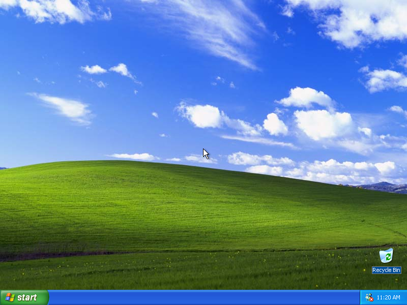
Re:What would the world look like?
That's easy: http://www.guidebookgallery.org/screenshots/win31
Does anyone else get queasy looking at Windows 3.1?
-
Re:What would the world look like?
That's easy: http://www.guidebookgallery.org/screenshots/win31
Well, that site you posted is suspiciously missing screenies of Trumpet Winsock, and Netscape in the 'internet applications' section. Maybe I was just an 'advanced' user back then...
-
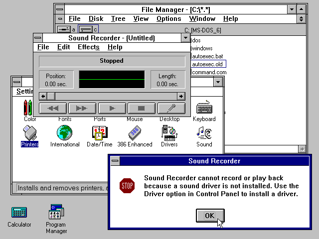
What would the world look like?
That's easy: http://www.guidebookgallery.org/screenshots/win31
-
Re:I remember that UI style
Ahh GeoWorks, the "OS" that was on my first computer. The ribbon does remind me of GeoWorks somewhat, although I think that GeoWorks did it better.
-
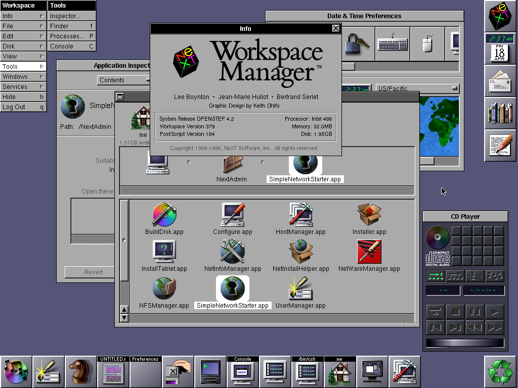
Re:so, to summarize...
Mac OS X used to be called NeXTstep, and NeXTstep had a dock which Windows 95 copied to create the task bar. The Windows 95 look which came to be called the Windows classic look which was in fact a shameless but inferior copy of the NeXTstep look from 1988.
Think Windows 95 copied from NextStep, starting with the "Recycle bin" and the recycle logo, the use of a square and a X in the title bar, bezeled window borders, etc.
http://en.wikipedia.org/wiki/Mac_OS_X_Dock
http://homepage.mac.com/troy_stephens/OpenStep/screenShots/
http://www.guidebookgallery.org/screenshots/applicationmanager -
Re:Another example of prior art.
The NEXTSTEP Dock (Byte Magazine, 1989) was first released in 1988 and predates Windows 3.0 by a couple of years, and CDE by at least 5 years.
-
White on Dark Blue
Use a non-proportional font, that's sans-serif and size it where your 80 column display is where you feel it's easiest to read.
On that font, also go for the 1:1 (square) characters, not skinny ones. That does consume some screen real-estate, but also maximizes character readability. If you've got focus problems, narrow characters will only exacerbate that over time.
For a great example, go look at this IRIX desktop screenshot here:
http://www.guidebookgallery.org/screenshots/irix53
That's an older screenie, but the colors and fonts are good to look at.
Of all the machines I've used for very long periods of time, the SGI IRIX desktop was the most pleasant. The colors and fonts and overall positioning of things really wasn't the most dense, but it was clear and not stressful.
-
Re:win 95For example, did you know that instead of having to use the Finder to find all your applications, Windows 95 had this thing called a Start Menu which allowed all your applications to be grouped in one place completely seperately from their installation directories? This is something that MacOS didn't have until quite recently. Uh...
Application manager in the Apple Menu, Mac OS 1.1, circa 1984 -
Re:Single window, please?
Sounds to me like the problem is your window manager. MDI is effectively dead; it's window managers not applications that should be responsible for managing windows. If you're stuck on MS Windows try replacing the bloated default shell with something better and faster.
PS: It's always been done like this! -
IBM OS/2
Didn't IBM do this research over a decade ago. The found a light-grey background was best at productivity and the eyes themselves. They incorporated thos colors into OS/2 2.1.
http://www.guidebookgallery.org/pics/gui/desktop/empty/os221.png
It sucked from a marketing perspective and they soon went to a similar color scheme as M$ was using.
-
Re:The point being....
The problem is sometimes that we, the users, are not listened.
My proposal: Fix the fucking GTK-file-selection box! http://www.gnome.org/~seth/designs/filechooser-spec/
Why on earth is "Browse other folders" taking huge amount of screen estate (in save dialog)???
Do hidden files work (when I type ".bashrc" will gedit open it)?
Vista: http://www.tmssoftware.com/atbdev6.htm (?)
XP: http://www.microsoft.com/library/media/1033/windowsxp/images/using/setup/tips/68222-click-save.gif
Leopard: http://www.betalogue.com/images/uploads/finder/OpenDialogBox-ListView.gif
Java: http://java.sun.com/docs/books/tutorial/figures/uiswing/components/FileChooserOpenMetal.png
Other: http://www.guidebookgallery.org/screenshots/openfile
More: http://www.raizlabs.com/interface/hall-of-shame/default.asp
There is even a theme to change it to KDE style!!!
KGtk: http://www.kde-apps.org/content/preview.php?preview=1&id=36077&file1=36077-1.png&file2=36077-2.png&file3=36077-3.png&name=KGtk+(Use+KDE+Dialogs+in+Gtk+Apps)&PHPSESSID=83fa01cf68ec222d01626c20f3ebe9af -
Re:They had something better.
I know you are just trolling (successfully I might add... bravo), but I'll feed you anyway. Here are some screen shots of Windows 1.0. Feel free to point out the task bar. Oh, that's right - no task bar until Win95. Calling Windows 1.0 the most popular OS would also be pretty, um, ignorant. Windows was just a DOS shell until 3.0 (or arguably even Win95). OS or not, it wasn't even "popular" until the 90's.
-
Re:Unbalanced article.Xerox established the beginnings of the technology, and the concept of using multiple panes of information on the screen to simulate paper. They by no means developed any metaphor; the interfaces on the Alto computers were horrendous works in progress at best. Apple created the desktop metaphor in its fullness. The Alto was not the only GUI-based computer Xerox released before Apple's Lisa. The Xerox Star, released in 1981, created the desktop metaphor. Apple's Lisa was released in 1983.
From the 1982 Byte article "Designing the Star User Interface":
- Every user's initial view of Star is the "Desktop," which resembles the top of an office desk, together with surrounding furniture and equipment. It represents your working environment -- where your current projects and accessible resources reside. On the screen are displayed pictures of familiar office objects, such as documents, folders, file drawers, in-baskets, and out-baskets. These objects are displayed as small pictures or "icons," as shown in figure 2.
-
Re:Menus at the top!
I'm a fucking idiot. That screenshot is to a Windows skin. Here's a screenshot from WP, and even better, here's GUIdebook so you can compare GUIs to your heart's content.
-
Re:Oh microsoft
Windows 3.0 came out in 1990. According to the way I use the calendar, the 1980's were prior to 1990.
The Windows look and smell substantially predates the release of windows 3.0, however. It was pretty well laid-out in Windows 1.0 and was quite completely defined by version 2.
-
Re:Oh microsoft
Windows 3.0 came out in 1990. According to the way I use the calendar, the 1980's were prior to 1990.
The Windows look and smell substantially predates the release of windows 3.0, however. It was pretty well laid-out in Windows 1.0 and was quite completely defined by version 2.
-
Re:Birth of GUIThis is complete bullshit, when Apple visited Xerox and got their inspiration, Xerox merely had a bunch of demos, not even a complete system yet (that came later)...
Xerox came up with an implementation of a new way to interface with computers, that had been talked about since quite a while, Apple made it into a usable system and came up with most of the way we interact with computers nowadays.
Your comment is mostly bullshit. Have you even heard of the Xerox Star? (It was the Alto's successor.) When Apple visited Xerox in December 1979, Xerox had completed the Star's specification (1st quarter 1978) and had been working on the Star's software for over a year (since Spring 1978). Things like doubleclicking, click and drag, Wouldn't have happened without Xerox's clicking mouse invention. pull-down menus, Wouldn't have happened without Xerox's menus invention. the desktop metaphor, The desktop metaphor was part of the Star's specification, which was completed in the 1st quarter of 1978. Apple's visit was in December 1979. The Lisa project, started before the Xerox visit, did not adopt the GUI and desktop metaphor in its design until 1980. The Star was released in 1981. The Lisa was released in 1983. copy and paste Not possible without Xerox's mouse selection invention. are all inventions that happened at Apple not at Xerox. Not all of them were "invented" by Apple and the Apple "inventions" were extentions of Xerox's inventions. You grossly underestimate Xerox's influence. You calling "bullshit" is just pathetic.http://en.wikipedia.org/wiki/Apple_inc#1981_to_19
8 9:_Lisa_and_Macintosh
http://en.wikipedia.org/wiki/Xerox_Star
http://www.guidebookgallery.org/guis -
Re:The Apple Lisa had tabs!Also detailed in an internal Apple document, here, detailing the Apple Lisa interface appearence, in 1980.
10. Folders
However, its not clear that the polaroids or the apple document are irrefutable evidence of prior art.
Each folder shows a view of a single document, and provides a structure for manipulating the view of that document by scrolling, moving, growing, and closing the folder down to a tab.
A folder may be used to group together a collection of related documents to be filed away and retrieved together. The filing system is still in design, and the grouping mechanism will be determined by it. Two possibilities are a folder containing other closed folders (only tabs visible), or a folder with a table of contents to select which document is currently visible. In any case, each folder only shows one document at any time.
11. Basic folder appearance
A folder is drawn as a white rectangle (filled in by the application) with a thin (one pixel) black border. Every folder has a tab, which looks like a tab on a standard manilla folder. The tab is always above the upper left corner of the folder. It is called the title tab.
The rectangular portion of the folder that holds the folder's contents is called the body of the folder. -
Re:Shh...poster was being smug!
The only reason OS/2 dies was because IBM was greedy and charged too much for it at the beginning of it's life, hence the beginning became the end.
Wasn't it Microsoft that set the pricing of the SDK for OS/2 1.x, and wasn't OS/2 1.x mainly sold as a Microsoft product? Who set the high prices for OS/2 again?
Remember that IBM, once it got hold of OS/2 and was able to release the 32-bit version as a product independently of Microsoft, was willing to sell OS/2 to Windows users for US$49 and to DOS users for US$99, thus making OS/2 an extremely affordable product at one of the key times in its evolution -- the time when it alone was a Windows-compatible 32-bit operating system that was completely independent from DOS.
Windows NT 3.1 (Microsoft's first 32-bit offering) wasn't released until some time after OS/2 2.0 (July 1993, over a year later than OS/2 2.0 ).
-
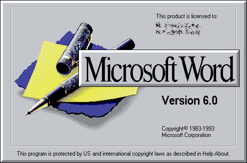
Re:3D Chess is everywhere!
I think the design of the three chess boards perfectly matches the aesthetics of their respective OS - much like Word 6's ballpoint pen matched that of Windows 3.x. Not that that's likely to be much of a coincidence.
&PHPSESSID=83fa01cf68ec222d01626c20f3ebe9af)